Spellbrand Blog
Visual Language Of Your Brand

What is the visual language of your brand?
Visual language can be defined as a set of design elements that define the visual look and feel that is unique to your brand and creates instant recognition and recall.
Your brand’s visual language is an extension of your brand’s substance and brand story. Your brand substance is the core essence of your brand and includes purpose, vision, mission, and core values. Your brand story is the differentiator and helps position the brand in the minds of your target audience.
Your brand’s visual language translates your brand substance and story into a visible and tangible brand identity format.
In this article, we take the example of an awesome visual language created by Starbucks to communicate what their brand stands for. Click here to review the complete creative expression of Starbucks.
This is what Starbucks says about their creative expression:
As we evolve to meet beautifully diverse customers all over the world, our brand has evolved too. Here we introduce a fresh new design system that maintains the core elements of our brand while keeping our customers’ experience central to creative expression.
Brand visual language usually includes the following and would form part of your brand style guide or brand manual:
- Brand Essence – Theory of the brand
- Brand Expression – Creative expression
- Primary Logo Design
- Brand color palette
- Typography
- Brand Voice – Functional and expressive
- Illustration style
- Photography style
Let’s look at each of these elements with reference to how Starbucks is implementing its visual language.
Brand Essence - Theory of the brand
Every brand should start with its brand essence. It is the fundamental building block of any successful brand and businesses that do not pay attention to their essence inevitably fail and sometimes quite miserably.
Starbucks starts their visual language document with what they call their “creative expression” and says that it spans the full spectrum of the functional to the expressive. They also say that their expression depends on where the customer is in their journey. I wrote an in-depth article on the audience journey that you may be interested in.
A brand essence typically includes the following elements:
- Brand purpose – why does your brand exist beyond just making money
- Brand vision – what the brand hopes to achieve in the long term
- Brand mission – how the brand hopes to achieve its vision
- Core values – guiding principles of how the brand would behave consistently in all situations
- Brand story – to create the right perception in your target markets’ minds
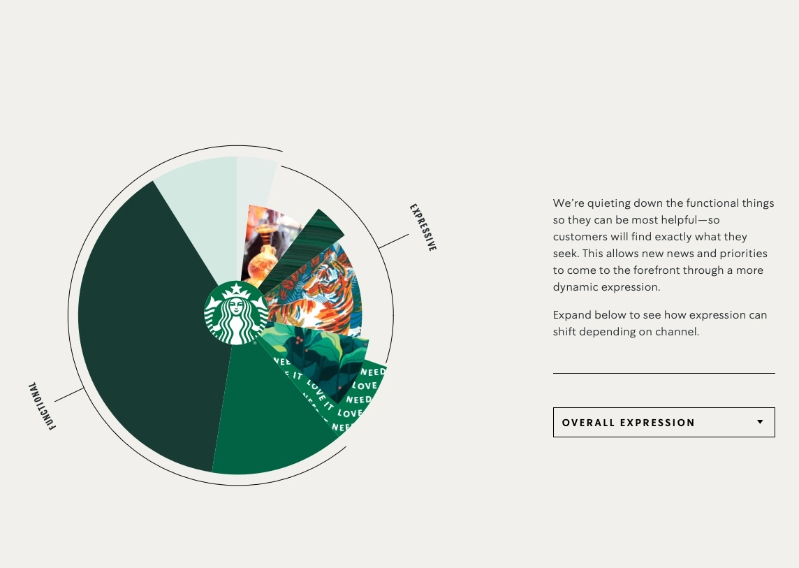
Brand Expression - Creative expression
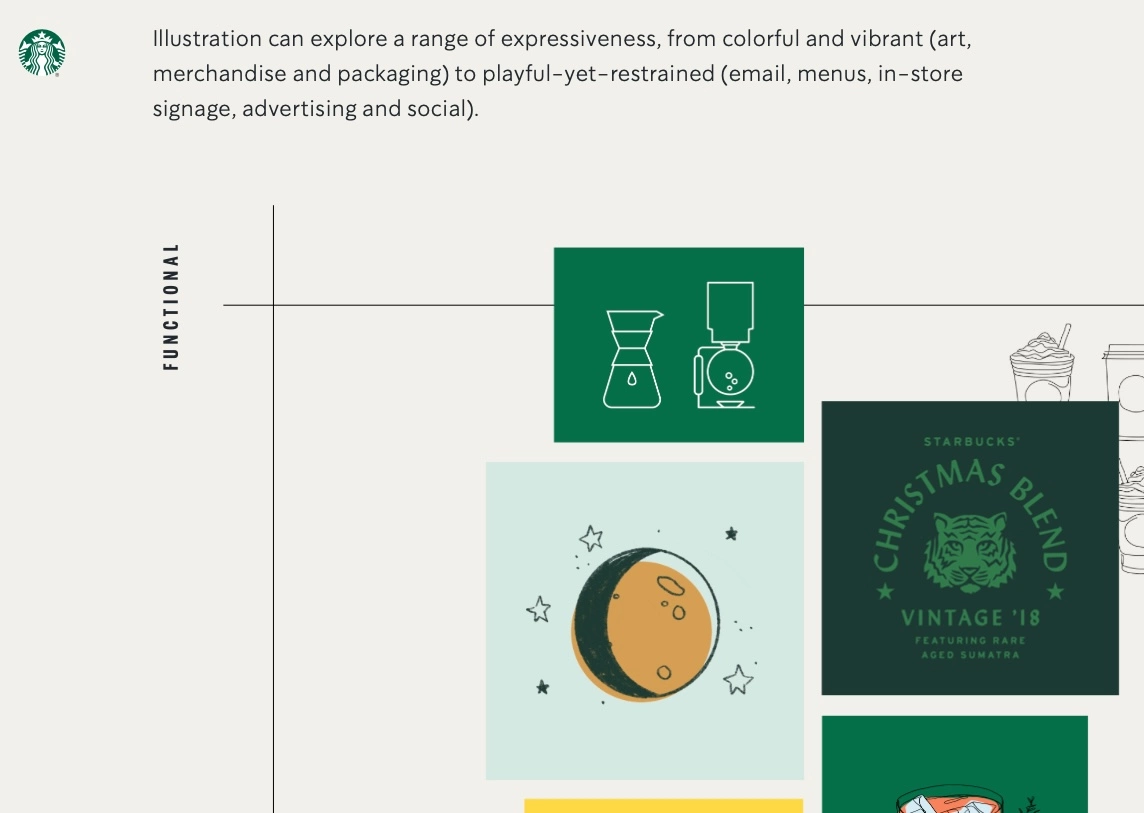
Figuring out how you express your brand is critical to the right brand messaging and for your target audience to feel connected with your brand. Starbucks has paid a lot of attention to quieting down its functional expression so that it becomes more of a helpful element rather than being salesy.
In the image above you can see how the creative expression is split into slices on the pie chart of sorts and as you choose different platforms and touchpoints, the share of each expression can be seen.
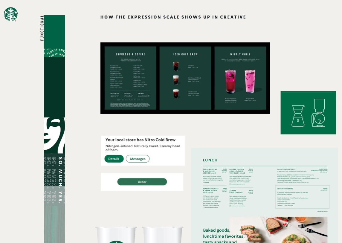
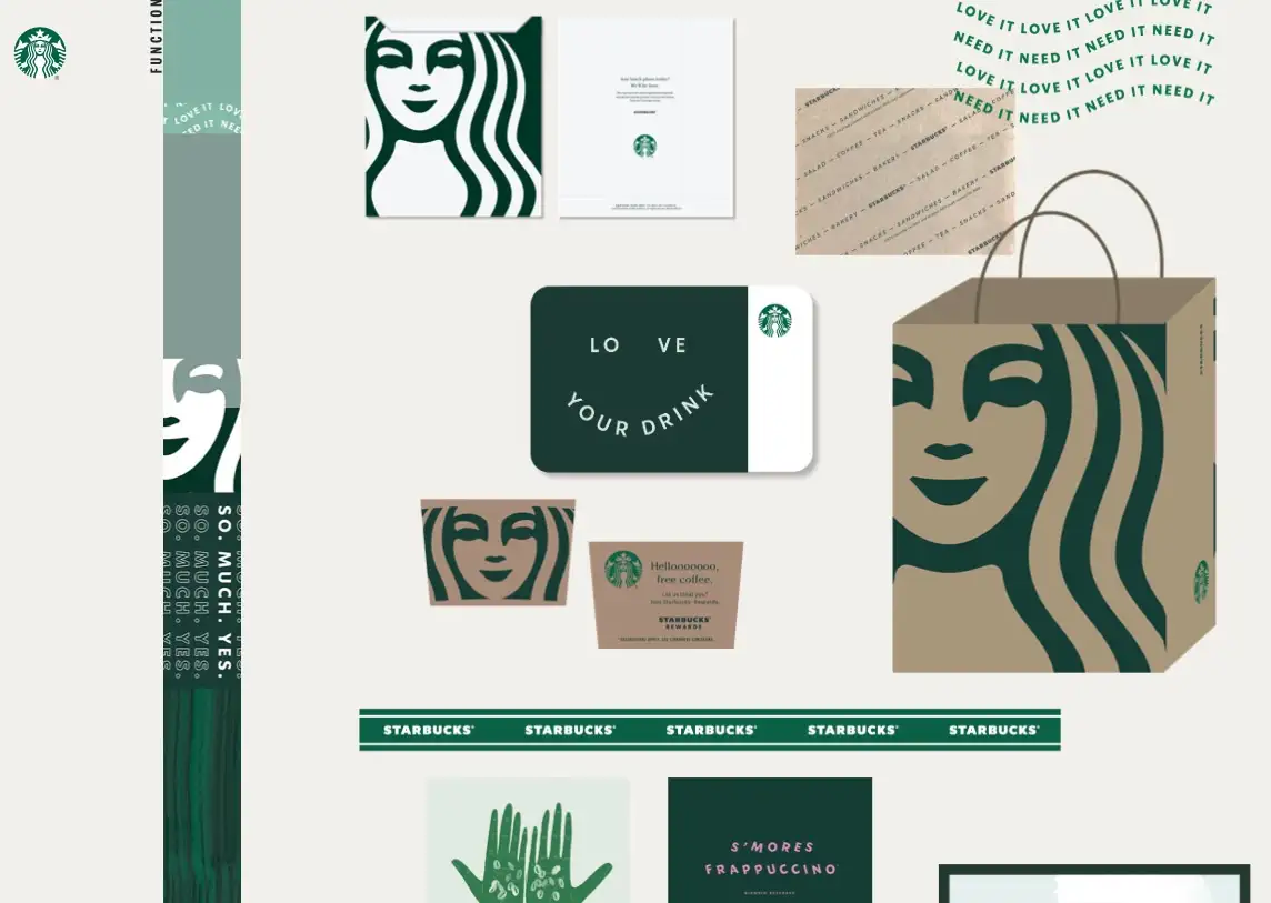
Below is an image of how these different expressions show up in creative designs.
![]()
Primary Logo Design / Brand Mark
The most apparent part of your brand’s visual language is your primary logo design or brand mark. No wonder a lot of business owners think of logo design when they think of branding. But that is not true.
The primary logo must reflect, as much as it can, the true essence of the brand. It could also reflect the nature of the product or service but that kind of literal representation is losing ground as the audience is becoming sophisticated in terms of their expectations of branding.
For Starbucks, the Siren is their muse and the primary icon of their logo. In fact, the strategy is to decouple the iconic logo of the Siren from the brand name so the meaning embedded in the Siren is given more prominence. Starbucks is not afraid to embrace what could be considered controversial – an image of a bare Siren.
This Siren illustration has evolved over the years and really showcases the longevity of a strong logo symbol that is rooted in deep essential meaning rather than just aesthetics.
![]()
Here are some examples of strong logo designs that we have created for our clients at Spellbrand over the years. Most of these projects include brand strategy and messaging which were then translated into the visual language of the brands.
Featured
Premium Men’s Grooming Branding: Dapper Yankee USA
Premium Men’s Grooming Branding: Dapper Yankee USA
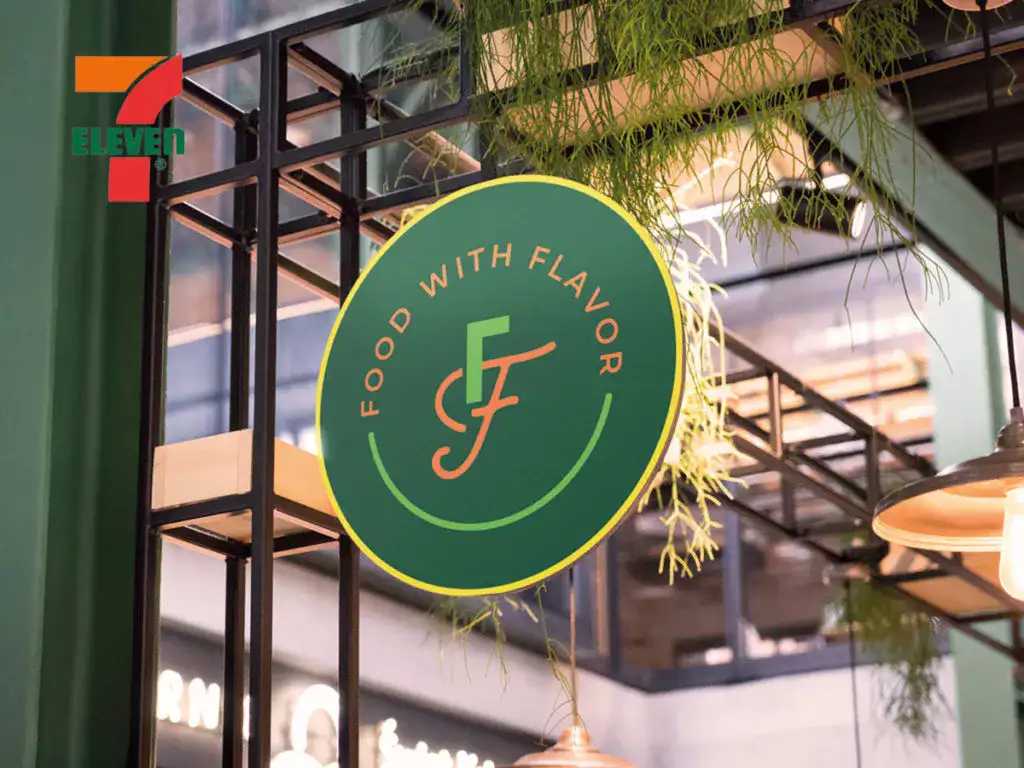
Fusion Fresh 7-Eleven Concept Restaurant Branding
Fusion Fresh 7-Eleven Concept Restaurant Branding
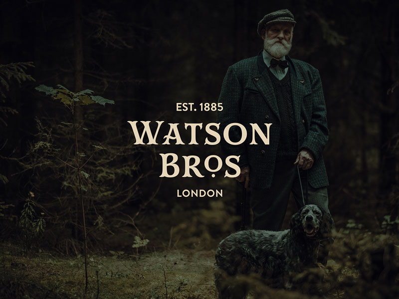
Rebranding A 135 Year Old Gunmaker Brand
Rebranding A 135 Year Old Gunmaker Brand
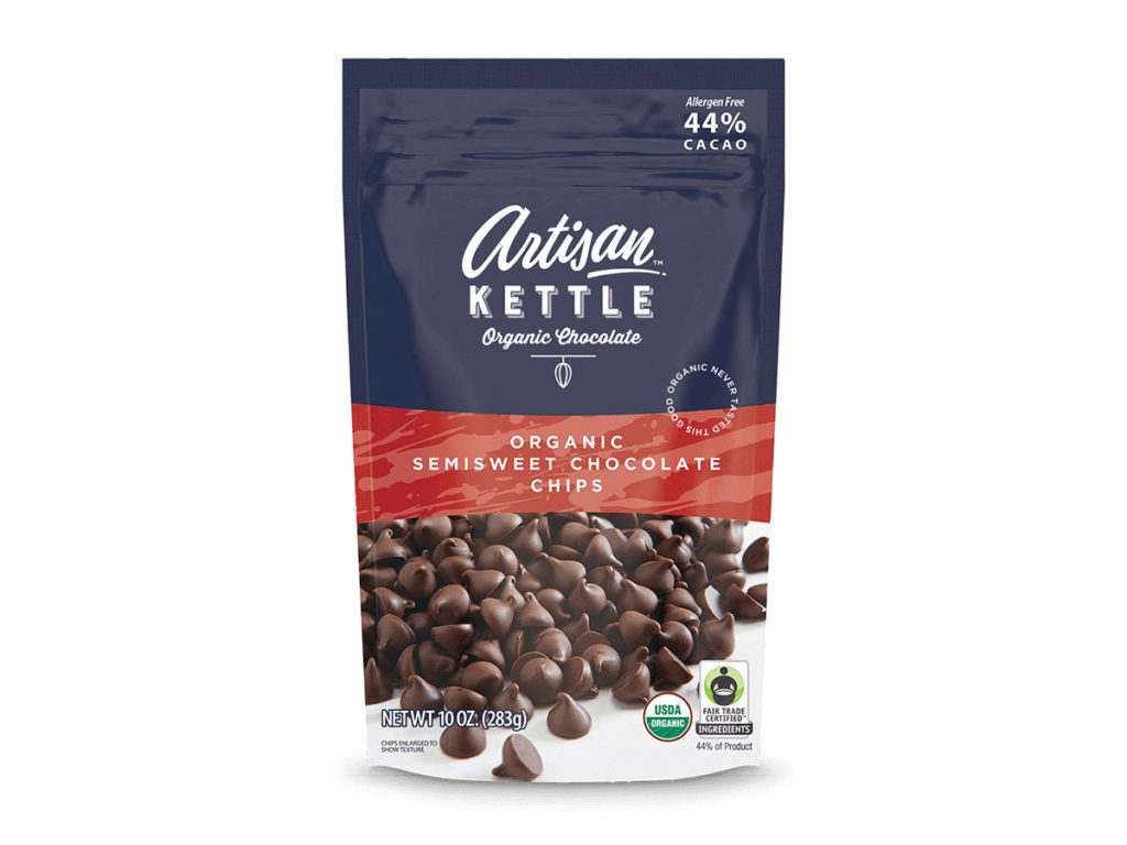
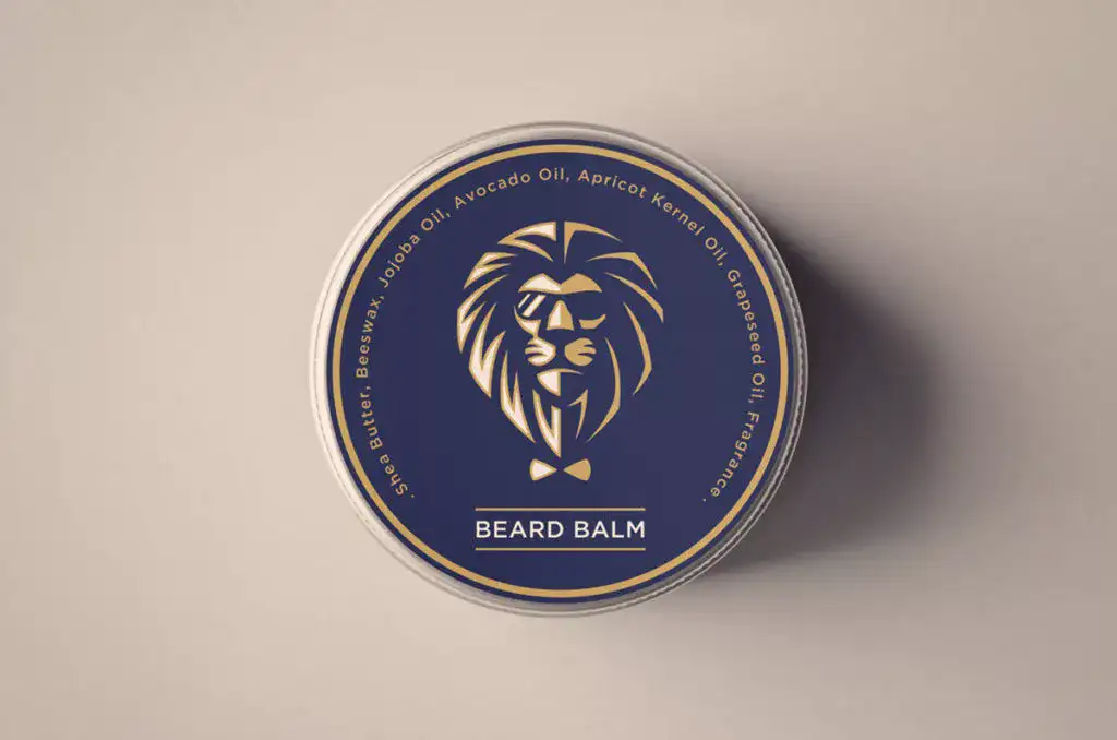
Crafted Elegance: The Artisan Kettle Brand Evolution
Crafted Elegance: The Artisan Kettle Brand Evolution
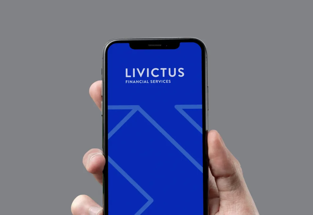
Financial Services Branding
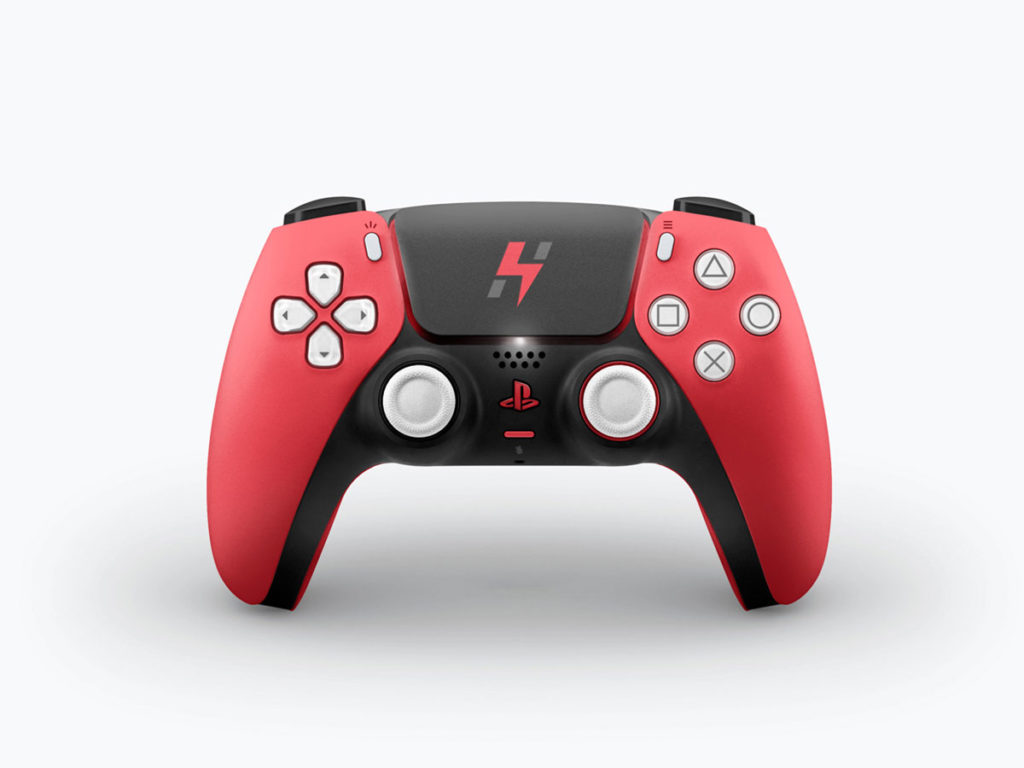
Multiplayer Mobile Games Branding
Multiplayer Mobile Games Branding
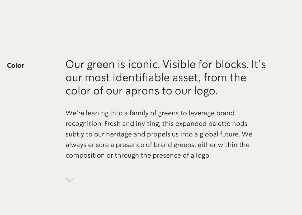
Brand Color Palette
During the development of the primary brand mark, the brand color palette is also developed. Sometimes this is developed simultaneously with the logo or it could be developed later on.
For some market segments and brands, I recommend creating the primary logo design in black and white and then coming up with the color palette that best communicates the brand image accurately and is not influenced by whether the colors suit the logo or not.
The reason for this is that although design and colors are interlinked, working on them separately will give you better insights into the brand message and how to convey that to the audience.
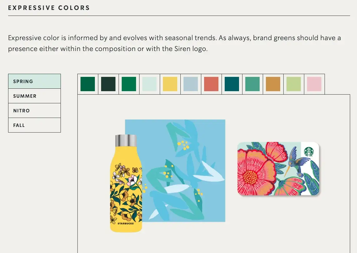
With Starbucks, their entire focus is on their iconic green color and a family of greens to leverage brand recognition. Starbucks green is universally recognizable. It is meant to evoke freshness and an inviting feel. This green permeates the entire visual language of the brand.
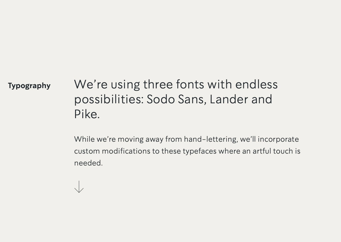
Typography and Fonts
Undoubtedly typography and font selection is crucial to how your brand identity looks and feels. If ever you looked at different type of logos and felt something was off even though the icon looked nice, nine times out of ten it could be the poor choice of fonts for the text part.
Choosing typography for your brand should not be arbitrary or based on cool trends. It should be based on the brand story and the message. It should add to and enhance the message being told in the logo and other visual elements of the identity.
In Starbuck’s case, they started out with hand lettering but are not moving towards more custom modifications to rigid fonts. They use three different fonts throughout their entire branding but very judiciously.
![]()
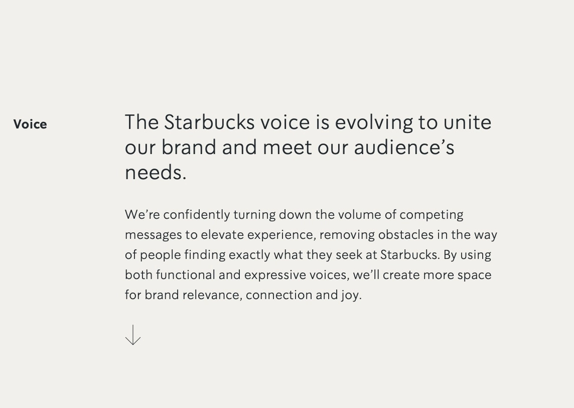
Brand Voice - Functional and expressive
There is a lot of confusion as to what a brand voice is and Starbucks clarifies this very well with its brand voice split into the functional and expressive.
Most often, it is hard to recognize the brand voice of brands because of competing messages within the brand that have different notes of function or expression. When competing messages are recognized and managed then your brand voice will become clear.
But what is a brand voice anyway?
Your brand voice can manifest in several different ways including your visual identity, the content on your website, the articles you post, the podcasts or videos you produce, how your social media channels look, how you sound on these platforms, how your products and services are and how your customers feel about the experience of dealing with your brand (Source)
Starbucks talks about paving the way for its audience to find what they are seeking through their brand voice. They talk about removing obstacles in this path. They use brand voice to create brand relevance, connection, and joy.
Functional brand voice is for being helpful and is all about clarity of information when the audience is dealing with the brand. This could be information about the products or services, stores, online ordering, usage of products, and more.
Expressive brand voice is for telling the brand story which in Starbucks ‘ case is a passionate coffee story. They want to make the audience smile and love the brand and the products.
Check out this case study of one of our clients, a luxury bikini wear brand, for whom we created an awesome brand voice.
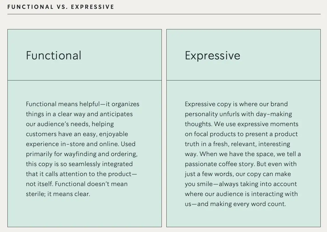
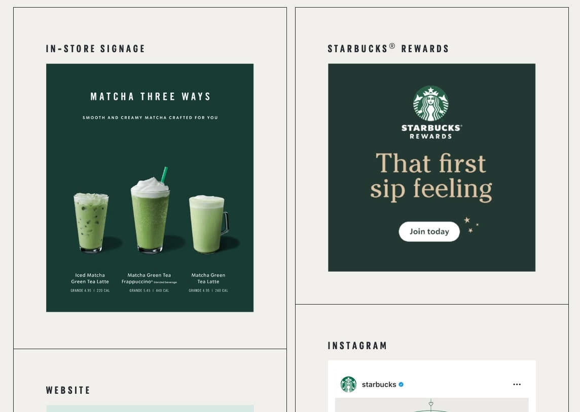
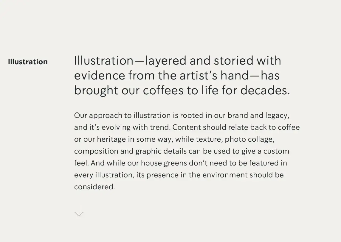
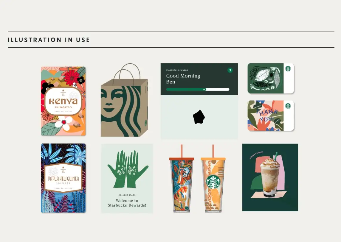
Illustration Style
If you are using illustrations, either as part of your core identity or as support visual elements, then great care must be taken to establish some guidelines as to how they should look and feel. This will give consistency to the use of illustration and will also make it easy for your design team (either internal or external) to stay close to your brand’s visual language.
For Starbucks, illustration has been a huge part of its identity right from the start. They used illustration to bring their brand story of coffee to life and is rooted in their brand legacy and heritage. They tie their brand colors to the illustration in subtle ways to add another layer of visual consistency.
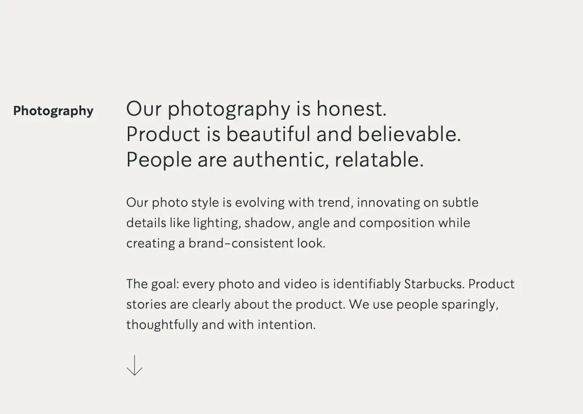
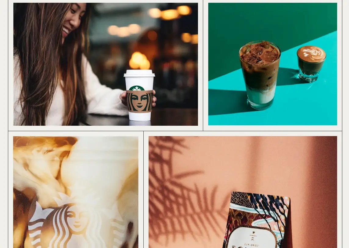
Photography Style
Most brands do not even think about consistency when using photos in their branding and marketing. Visit any brand website and social media channels and nine out of ten times you find there is a disconnect between the photos on the website and photos being posted on other platforms.
This happens because no guidelines are set for how photos should be aligned with their brand message.
For Starbucks photography is a tool they use to communicate the honesty and authenticity of their products and their brand as a whole. They use details like lighting, shadow, and composition to give a unique look and feel that is unmistakable.
I hope you found this brief analysis of brand visual language to be useful and insightful. When you build a visual or brand language, use brand language based on brand standards and brand personality.
Remember that a strong brand has consistent visual language.

Mash Bonigala
Creative Director & Brand Strategist
With 25+ years of building brands all around the world, Mash brings a keen insight and strategic thought process to the science of brand building. He has created brand strategies and competitive positioning stories that translate into powerful and stunning visual identities for all sizes of companies.
Featured Work
See Our Work in Action
Real brands, real results. Explore how we've helped businesses transform their identity.

Client Love
What Our Clients Say
Don't just take our word for it. Hear from the brands we've worked with.

Jenny Richard
Woods Of Fairfax
"Working with the team at Spellbrand has been fantastic! I spent time researching companies that would help me build brands for each asset that are all in different locations and more specifically build a brand that could help tell each of their unique stories. Spellbrand did just that. The process was easy. To provide them with my initial thoughts through a nicely-outlined input form they sent to me and they took that information and created a number of awesome designs. I was able to incorporate "the story" easily with a design we selected. I'm excited to get it into action and see what's in store for the next project. Also, each person I worked with has been super responsive, knowledgeable, and awesome to work with! Kudos to Mash, Mike, and Eva! I really enjoy working with you!"

Sue Politte
Success In Focus
"Love it! My brand identity and logo helps quickly communicate what I do. I coach very busy business leaders who want to take their organization to the next level and are tired of all the things that are slowing things down or blocking progress. My brand identity needed to grab visual attention and communicate quickly that I help my clients get focus so they gain and build success. My new brand will help my potential clients identify with me. Thank you!!!!"
Related Services You Might Love
Based on what you just read, here are services that can help you achieve similar results for your brand.
Free Download
Brand Consistency Checklist
A 27-point checklist to audit your brand across every touchpoint. Used by our team on real client projects.
Success! Check your email for the download link.
Instant PDF download. We'll also send branding tips -- unsubscribe anytime.
Keep Reading
Related Articles
Apr 17, 2026
Stop Naming Your Brand Like a Founder. Start Naming It Like a Buyer.
Founders name brands from the inside out: what the company does, what the technology is, what the vision means to them. Buyers do not care about any of that. After 250+ naming projects, here is how to name from the buyer's perspective.
Read MoreApr 16, 2026
The Brand Name Moat: How the Right Name Creates an Unfair Advantage Your Competitors Can Never Copy
Your product can be copied in six months. Your price can be undercut tomorrow. But your brand name, if you chose it right, is the one competitive asset that's permanently yours. Here's how naming creates a moat that widens every year.
Read MoreApr 15, 2026
The Final Three: How to Pick Between Your Last Brand Name Candidates Without Blowing the Decision
You've narrowed it to three names. You can't decide. Every name has a flaw, every name has a fan on your team, and the launch date is closing in. Here's the decision framework I've used for 250+ naming projects to cut through the deadlock and pick the right name with confidence.
Read More