Spellbrand Blog
How Illustrative Logos Can Boost Brand Look

What is an illustrative logo?
Illustrative logo design style is a very popular type of logo design that has been in fashion for quite some time. If done well, illustrated logos look awesome and create a tremendous amount of brand recall.
However, it is not all rosy with illustrative logos. While they are beautiful and attractive to look at, their complexity, as opposed to abstract logos, may not suit all brands or market segments. In this article, we look at what illustrative logos and analyse some examples to discuss the different type of logos based on illustration.
Pros and Cons of Illustrative Logos
Unlike most other logo design types, Illustrative logos can be quite volatile in terms of suitability for brands. The reason is simple – illustrated logos are complex and most often large in size.
Compared to abstract logo or iconic logos, illustrative logos have a lot of illustration and complexity of artwork. The brand story may be told with much more flair and layered. But illustrative may not be suitable for some brands precisely because of these strengths.
Let us look at some pros and cons of illustrative logos:
PROS
- Illustrative logos are beautiful and very attractive
- They can tell the brand story with much more flair and detail
- They make the brand appear larger than life and more appealing
- They will stand out amongst competition and create brand recall
CONS
- Illustrative logos can be expensive to create and market
- Due to the complexity and size of the logo, they may not be suitable for certain types of media
- They may not work well at smaller sizes
- If not aligned with the target audience archetypes, they may end up looking superficial and pompous
Let us look at some illustrative logo examples and try and work out the pros and cons of each with reference to their impact on the bottom line. How do they work for or against the brand and how do they align with the target audience.
We will take examples of our own clients for whom Spellbrand has created identities using this design style.
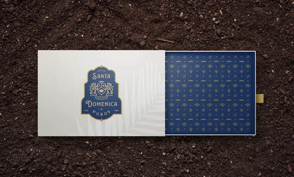
Cigar Brand Identity by Spellbrand
Illustrative logos with line art
Some of the simpler types of illustrative logos are ones that use elegant line art to create illustrations. Depending on the thickness of the line art, these logos can be very elegant and subtle while still retaining some of the characteristics that make illustration based logos so powerful.
In this example, we created a super elegant line art based logo for our client, Santa Dominica Puros, a new Dominican Republic cigar brand that is now taking the US by storm.
This elegant logo is an emblematic logo with a touch of heraldry about it. The brand crest which depicts two lions holding a shield is quiet modern looking while still connecting back to the medieval legacy of heralds. Inside the shield are some elements from the tobacco landscape and history of the Dominican Republic.
Recommended for: luxury food and beverage brands, lifestyle brands and more.
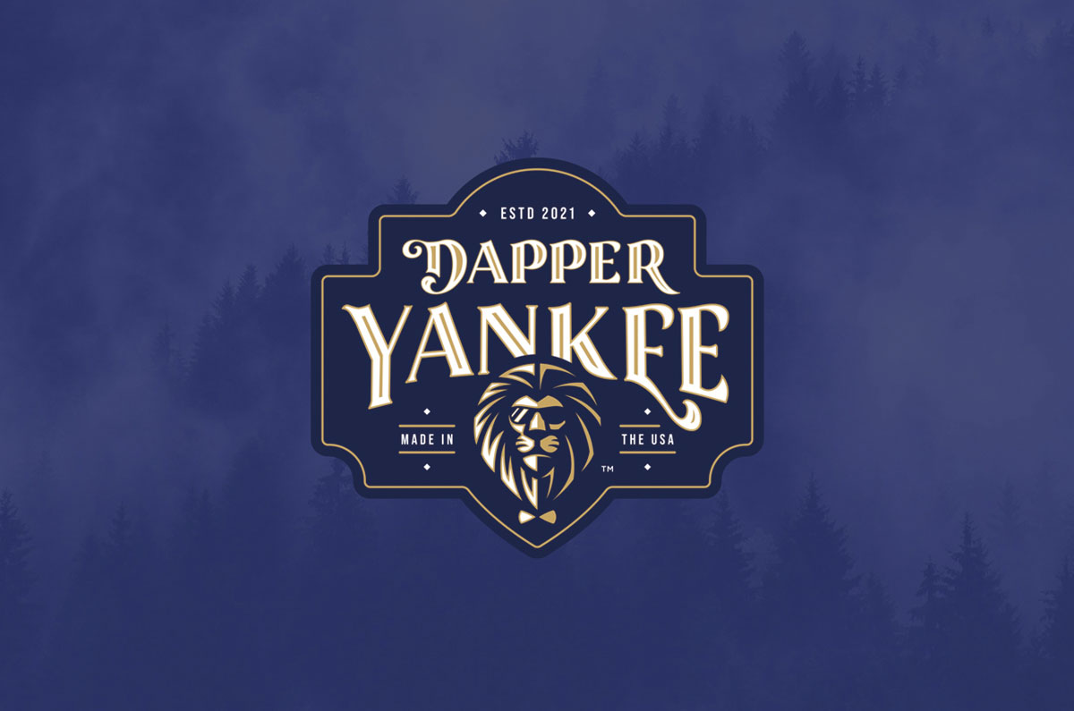
Premium Men Care Brand Identity by Spellbrand
Illustrative logos with iconic treatment
In the next example, we look at an iconic treatment as part of the illustration which takes the complexity a step above the line art illustration style seen in the example above.
With the iconic style, lines are thicker and a lot of design elements are added to give depth to the design as well as the illusion of shadows. This makes the iconic illustrative designs bolder and more in your face compared with the elegant line art designs.
For this premium mens grooming products brand we created a kick ass logo that blurs the kine between abstract, line art and icon design styles. The hero of the logo is an iconic lion image with shades and a bow tie. This beautiful icon connects so well with the customer persona of the [Ruler archetype](https://spellbrand.com/brand-archetypes/ruler). It shows strength, sophistication and leadership!
Recommended for: luxury brands, lifestyle products or services and more.
![]()
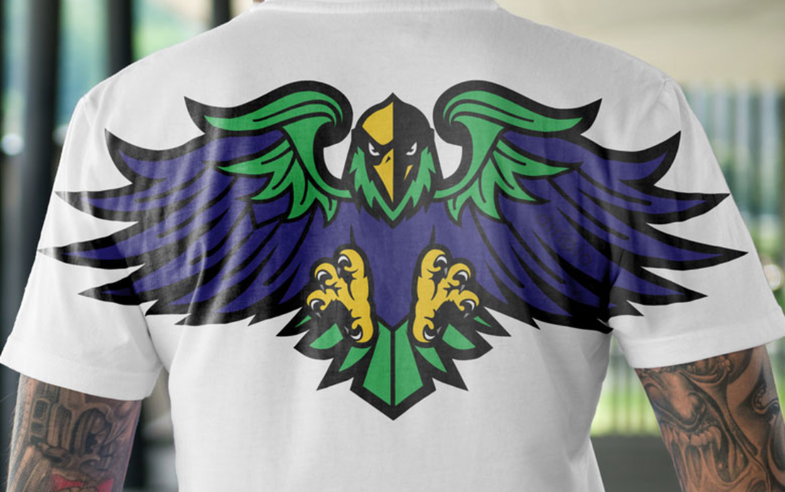
High School District Mascot Logo by Spellbrand
Illustrated logos with complex design
Next we look at a bit more complexity in term of the iconic element of the logo. As you can see in the example above of one of our high school district logo clients, we created a beautiful illustrated logo mascot that has depth, character and uniqueness.
Taking the familiar figure head that people may have seen a thousand times, we injected some uniqueness through the design style and the result is a school mascot logo that is just stunning!
Recommended for: Schools mascots, sports teams, software brands and more.
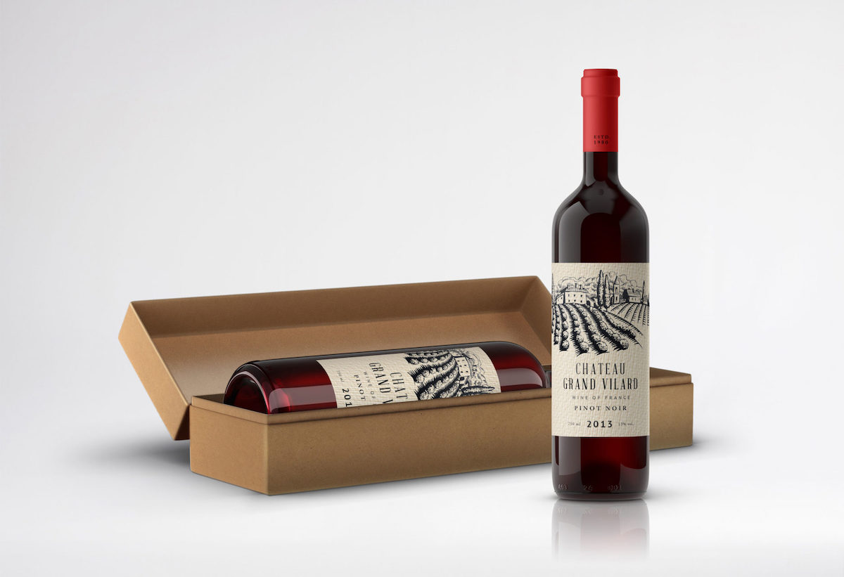
Luxury Wine Brand Identity by Spellbrand
Woodcut Illustration style logos
This next style is a very interesting illustration style and one that can really take your brand logo to the next level.
Wikipedia defines “Woodcut” as a relief printing technique in printmaking. An artist carves an image into the surface of a block of wood—typically with gouges—leaving the printing parts level with the surface while removing the non-printing parts. Areas that the artist cuts away carry no ink, while characters or images at surface level carry the ink to produce the print. The block is cut along the wood grain (unlike wood engraving, where the block is cut in the end-grain). (Source)
In the example above you can see a beautiful woodcut style logo that we created for a premium luxury wine brand client. We actually created a series of woodcut illustrations of their vineyards and form part of the different wine labels that we designed.
Recommended for: With style of design, you can create a feeling of heritage, vintage or nostalgia and is recommended for brands that want to convert the feeling of time, and quality such as luxury wine, cigar brands, some clothing lines and more.

Custom hand illustration by Spellbrand
Custom hand illustration style
In this final example, we look at a custom hand drawn illustration design style that can have a great range in terms of style, complexity and colors. It would be impossible to mention or show examples for all range of custom hand illustrations but we have picked an example that adequately reflects this style.
We created a series if Tiki illustrations for a client to use not only as their brand identity but also for a series of t-shirt designs that look stunning. These designs are hand drawn and unique in every way. The lines, colors and layouts are all based on various messaging that the client wanted to convey to their target audience.
Recommended for: any kinds of fun brands that want to appear friendly, loud, unique or fun. Great for t-shirt companies, children based products or services and more.
As we create more and more illustrative logo designs for our clients, we will update this page and add any new styles. Hope you found this post useful in terms of helping understand the different types of illustrated logo styles and how they can help your brand stand out.

Mash Bonigala
Creative Director & Brand Strategist
With 25+ years of building brands all around the world, Mash brings a keen insight and strategic thought process to the science of brand building. He has created brand strategies and competitive positioning stories that translate into powerful and stunning visual identities for all sizes of companies.
Featured Work
See Our Work in Action
Real brands, real results. Explore how we've helped businesses transform their identity.
Client Love
What Our Clients Say
Don't just take our word for it. Hear from the brands we've worked with.

Sue Politte
Success In Focus
"Love it! My brand identity and logo helps quickly communicate what I do. I coach very busy business leaders who want to take their organization to the next level and are tired of all the things that are slowing things down or blocking progress. My brand identity needed to grab visual attention and communicate quickly that I help my clients get focus so they gain and build success. My new brand will help my potential clients identify with me. Thank you!!!!"

Jenny Richard
Woods Of Fairfax
"Working with the team at Spellbrand has been fantastic! I spent time researching companies that would help me build brands for each asset that are all in different locations and more specifically build a brand that could help tell each of their unique stories. Spellbrand did just that. The process was easy. To provide them with my initial thoughts through a nicely-outlined input form they sent to me and they took that information and created a number of awesome designs. I was able to incorporate "the story" easily with a design we selected. I'm excited to get it into action and see what's in store for the next project. Also, each person I worked with has been super responsive, knowledgeable, and awesome to work with! Kudos to Mash, Mike, and Eva! I really enjoy working with you!"
Keep Reading
Related Articles
Nov 19, 2025
Why Crowdsourcing Your Brand's Logo is a Bad Idea
Discover why crowdsourcing your logo design is a costly mistake. Learn about quality issues, lack of collaboration, ethical concerns, and how it cheapens your brand.
Read MoreNov 19, 2025
What Do You Need To Start An Online Business
Discover the essential elements needed to start a successful online business. From branding and website design to capital and self-discipline, learn what it takes to launch and grow your digital venture.
Read MoreNov 19, 2025
What are paths and anchor points in Adobe Illustrator?
Master the fundamentals of paths and anchor points in Adobe Illustrator. Learn how these essential tools work together to create professional logo designs and vector graphics.
Read More