Dapper Yankee: Modern Masculinity Through Premium Grooming
Situation: Launching Premium Men’s Grooming Brand in Competitive Market
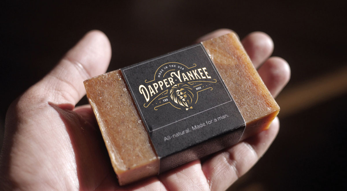
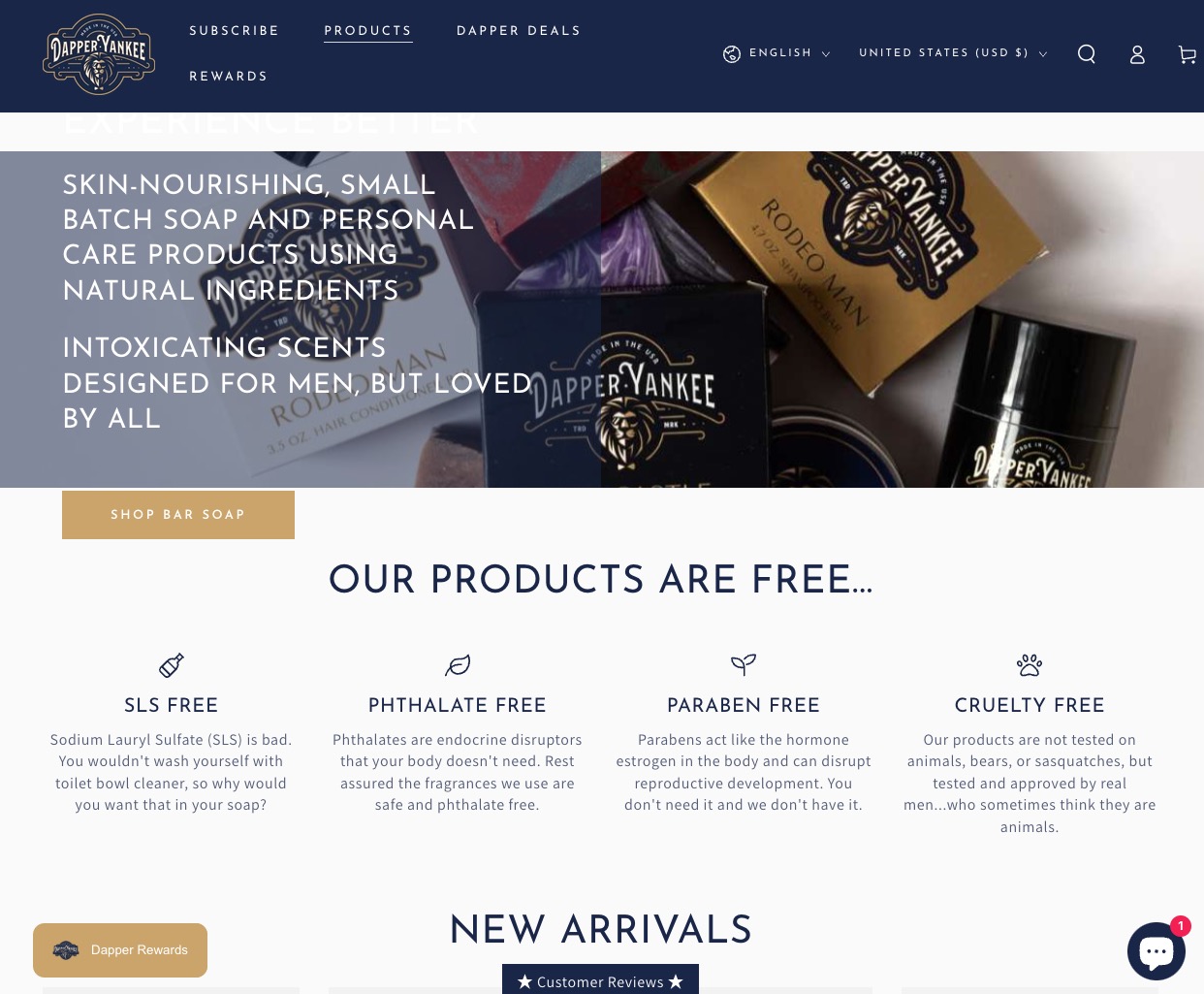
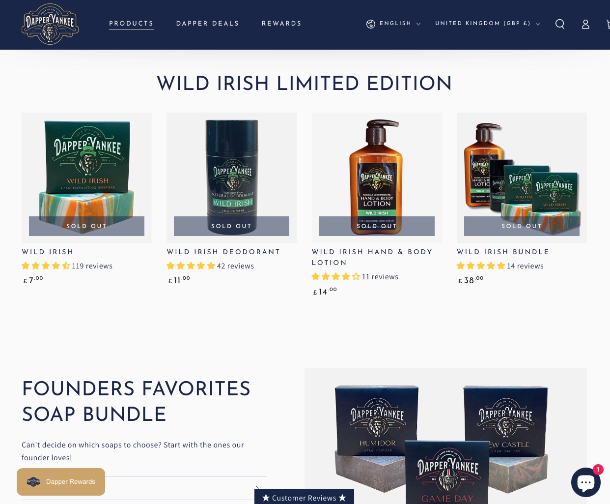
Dapper Yankee offers a premium line of men’s personal care products made in the USA, from natural ingredients with masculine scents. The initial offering includes soaps, beard oils, and beard balms, with more products released next year. The products are primarily sold online through their website.
The men’s grooming market is highly competitive, with numerous brands competing for attention. Most brands rely on cliché imagery of bearded men, making differentiation challenging. Dapper Yankee needed a brand identity that would transcend mere products to embody a lifestyle of elegance, strength, and refinement—resonating with the urbane man who values quality and style.
Task: Create Brand That Transcends Products
The challenge required:
- Lifestyle positioning: Brand that embodies lifestyle, not just products
- Market differentiation: Stand out from competitors using cliché imagery
- Premium appeal: Brand identity that appeals to style-conscious men
- American heritage: Communicate “Made in the USA” quality and heritage
”This review might sound a bit repetitive compared to the other positive reviews, but it is what it is. Mash and his crew at Spellbrand are fantastic at what they do! My branding looks amazing and I couldn’t be happier!
My store launches next week and I’ve already had tons of compliments on my logo from potential customers. However, Spellbrand created more than just a logo for me, they created a true brand identity that conveys a feeling to my customers with something they can relate to.
I can’t thank Mash and his team enough for creating something truly unique, inspiring, and exciting. I’m very proud of my branding. Thank you again!
Christian Nocera, Dapper Yankee
Action: Strategic Brand Development
Logo Design: The Majestic Lion Mascot
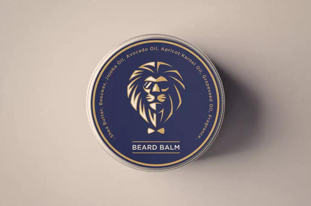
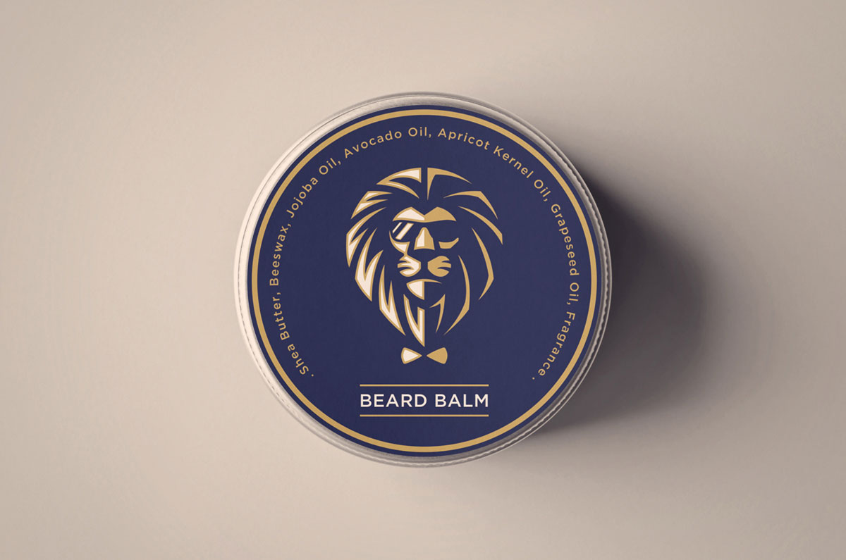
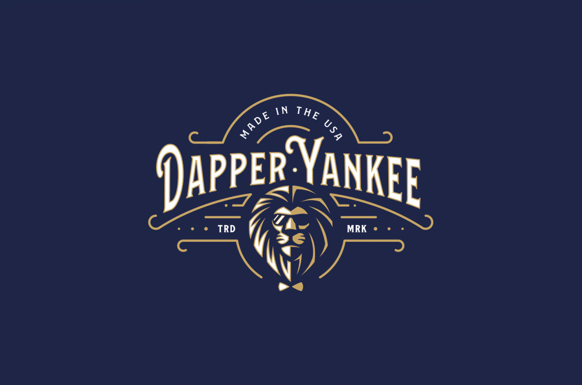
To bring home the essence of the brand and to stay away from the cliché imagery of a bearded man, the talented design team at Spellbrand came up with the idea of a lion mascot. The logo design is made up of a line art icon of a lion face with a majestic mane and sunglasses. This conveys the attitude and message of the brand.
The lion mascot approach:
- Represents strength and confidence: Symbolizes the modern man’s inner strength
- Connects naturally: Majestic mane connects to beard grooming products
- Adds contemporary edge: Sunglasses add stylish, modern element
- Avoids clichés: Moves beyond typical bearded man imagery
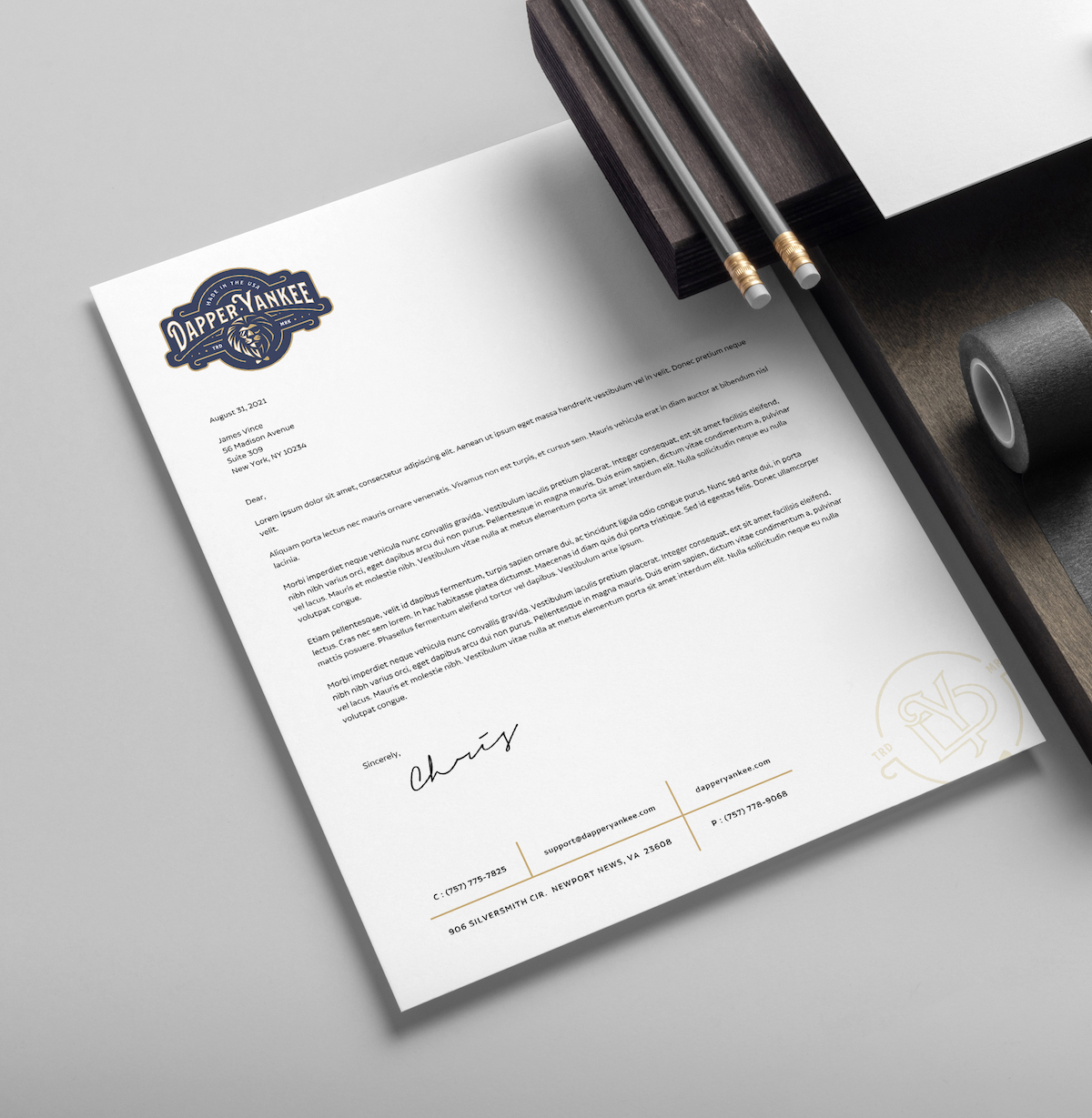
Brand Identity: Vintage Elegance Meets Modern Style
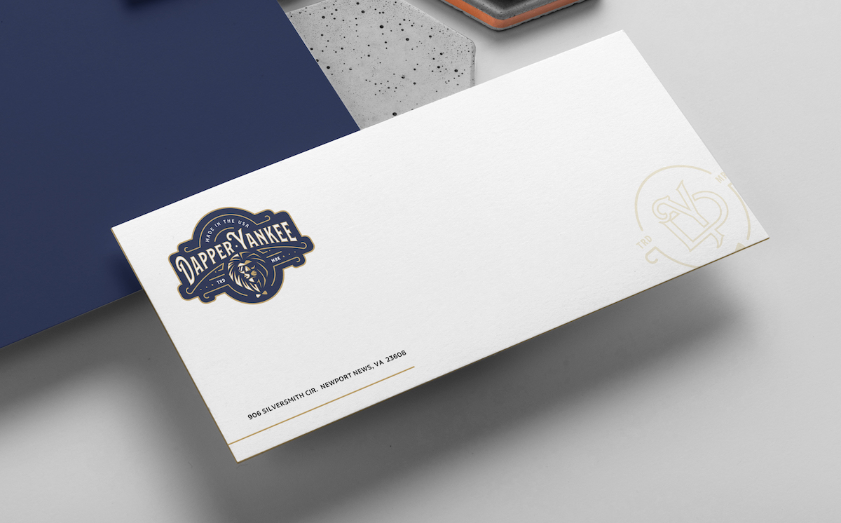
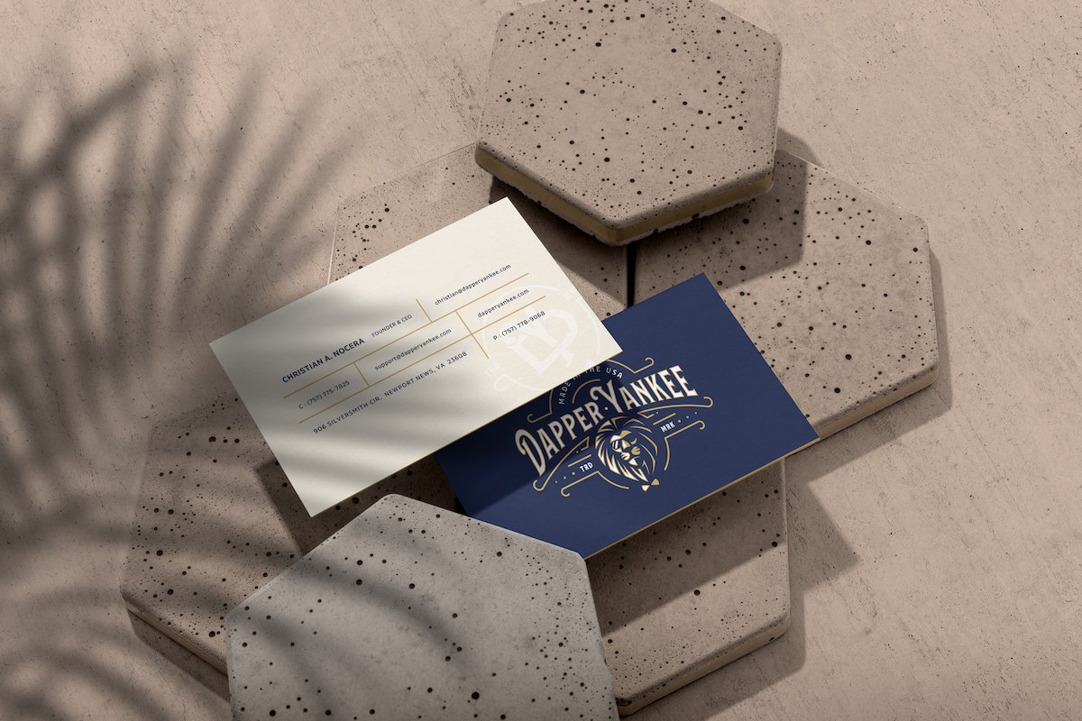
The full logo design is an emblematic design with a touch of vintage elegance and design elements to hint at the glory days of men’s grooming. The typography of the name—Dapper Yankee—was hand-created for this brand. The design also shows the words “Made in the USA,” emphasizing the quality and heritage of American-made products.
This approach creates a brand identity that:
- Honors tradition: Vintage elements connect to classic men’s grooming heritage
- Stays modern: Contemporary design appeals to today’s style-conscious men
- Communicates quality: “Made in the USA” reinforces premium positioning
- Creates uniqueness: Hand-crafted typography ensures brand distinctiveness
Brand Pattern: Extending the Visual Language
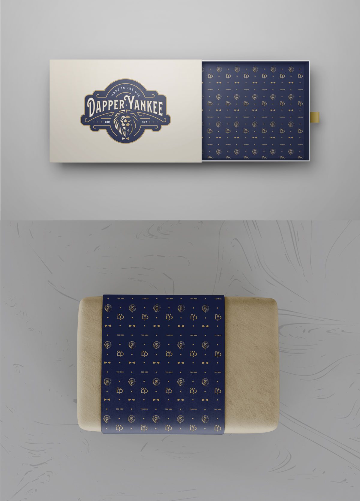
We also created a beautiful brand pattern that can be used effectively on the packaging of the soaps, oils, and more. The pattern is made up of the main lion icon, a secondary icon that we crafted for this client, and some design elements taken from the primary logo design. This creates a cohesive visual language that extends across all product packaging and marketing materials.
Custom Campaign Icons: Maintaining Brand Consistency
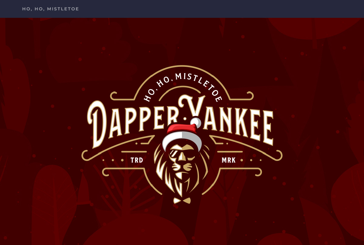
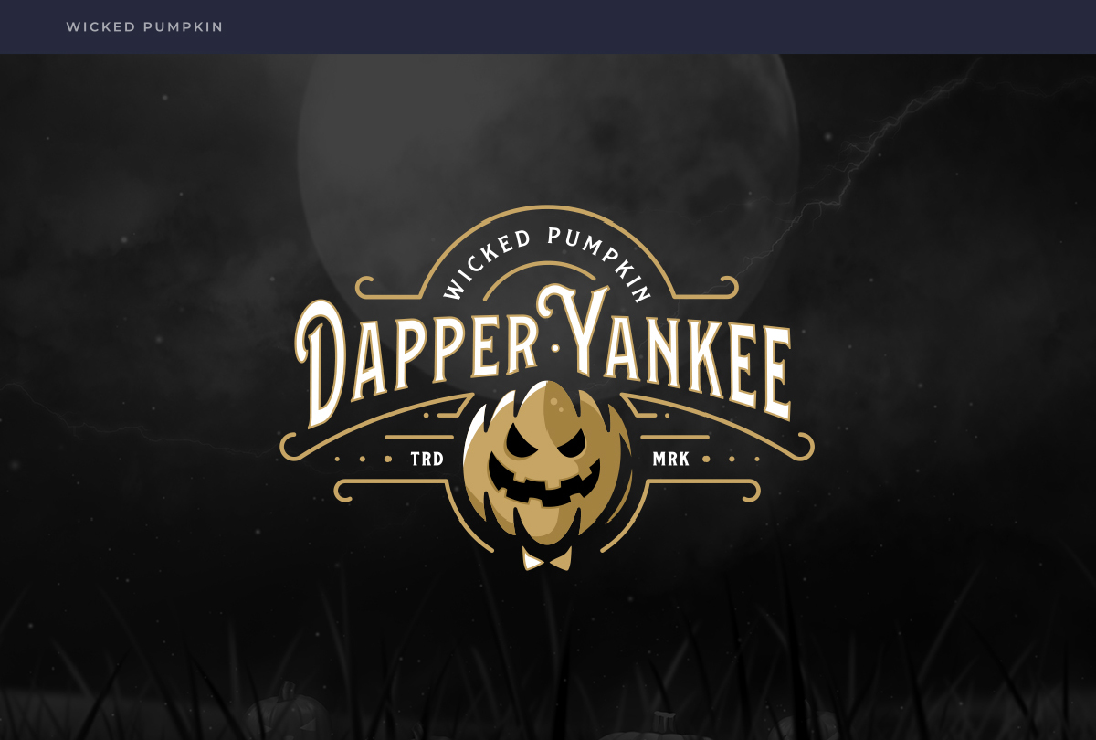
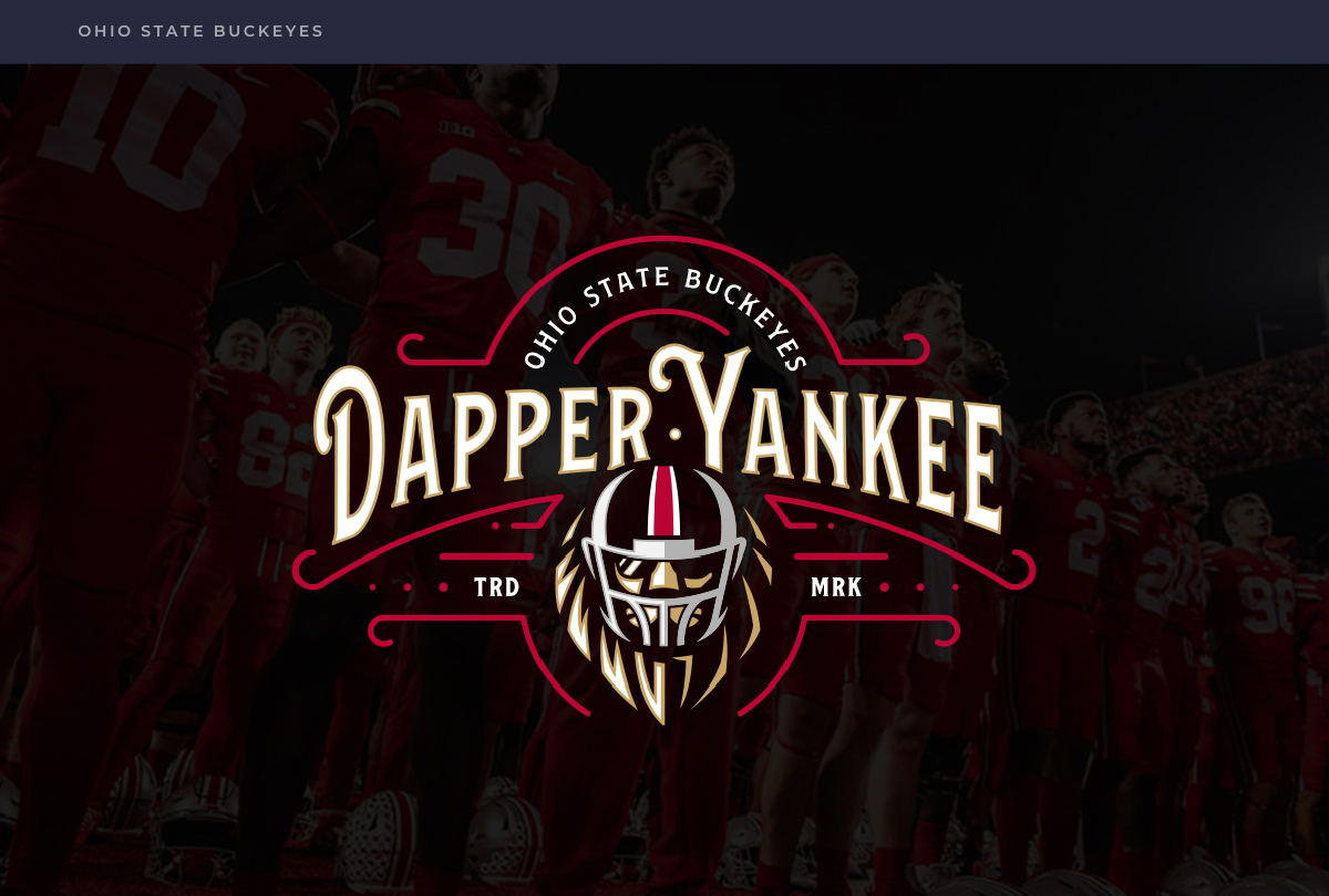
Above you can see how we created custom logo icons for special campaigns, holiday events such as Halloween, and more. We crafted subtle but powerful references to the special occasions while still keeping the overall identity consistent and beautiful! This approach allows Dapper Yankee to participate in seasonal marketing while maintaining brand recognition and visual consistency.
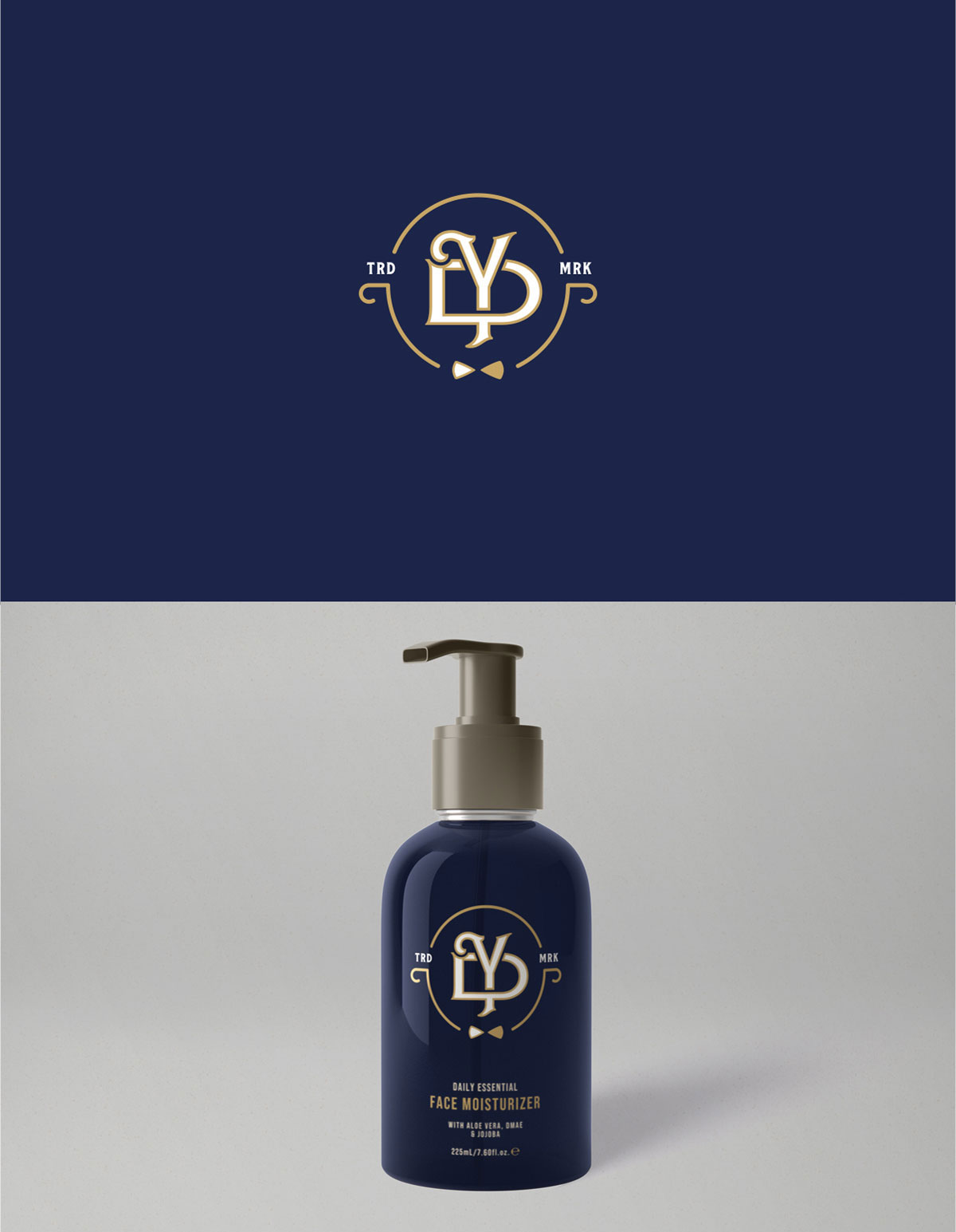
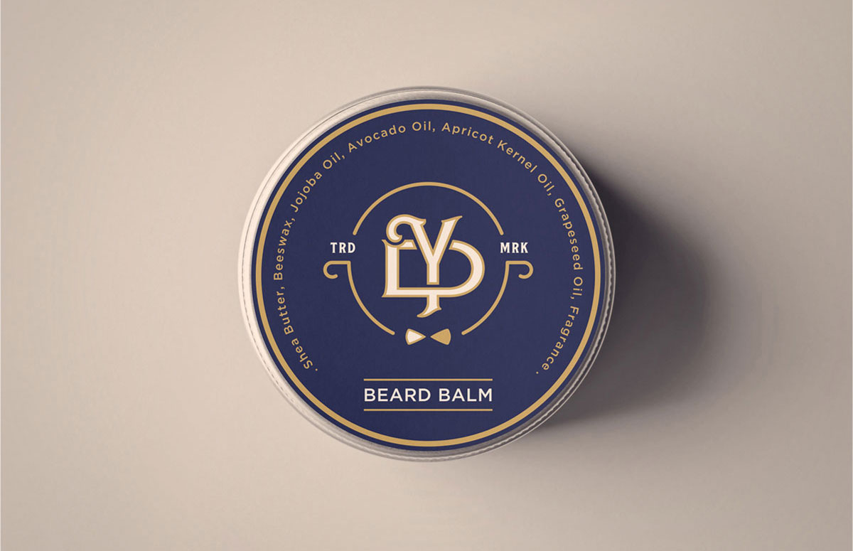
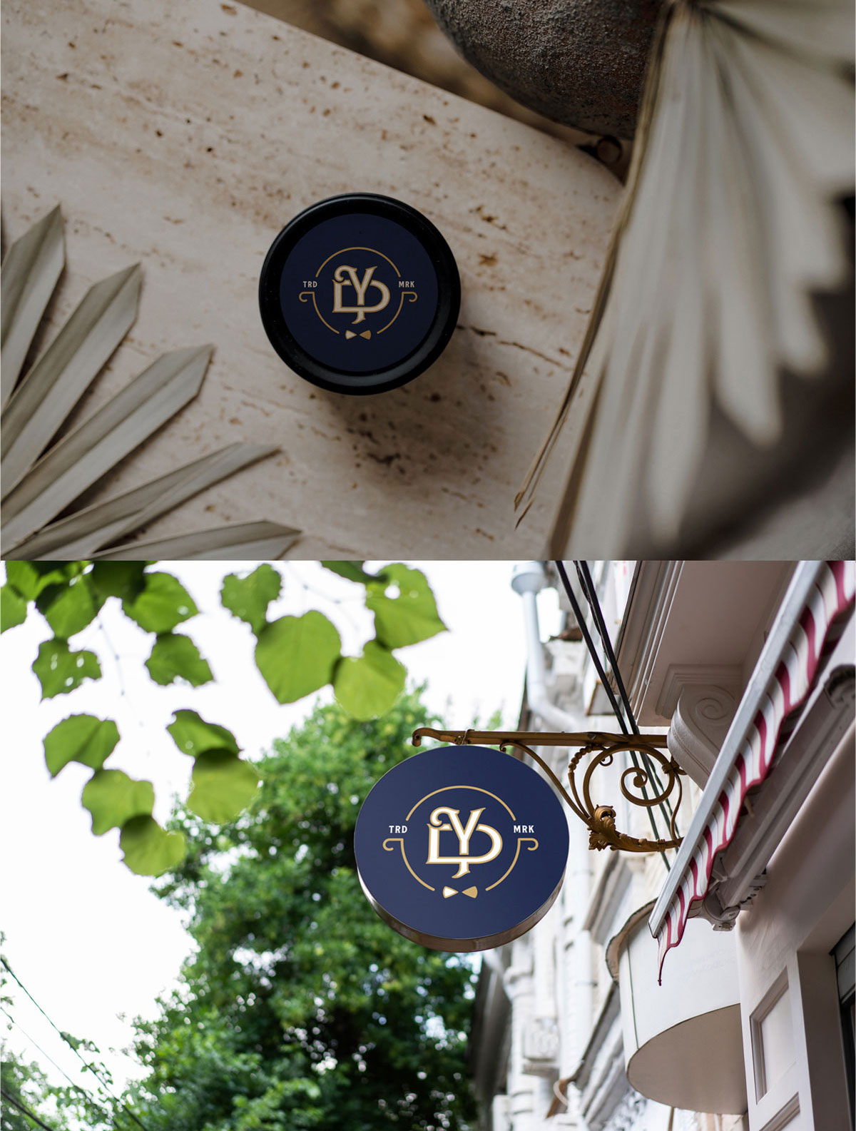
Secondary Icon: The DY Monogram
We crafted a stunning-looking secondary icon for Dapper Yankee that is made up of the letters D and Y, which were created by hand along with a mini emblematic enclosure and a bow tie at the bottom. The result is a secondary mark that is unique and still retains the visual language of the primary brand mark. This versatile icon can be used in smaller applications where the full logo might not fit, ensuring brand consistency across all touchpoints.
Result: Brand That Commands the Market
Dapper Yankee, with its lion-hearted essence and dashing demeanor, is more than a brand—it’s a beacon for the modern man who holds his grooming to a gold standard. The comprehensive brand transformation delivers:
Strategic Outcomes
- Lifestyle positioning achieved: Brand transcends products to embody lifestyle of elegance, strength, and refinement
- Market differentiation: Lion mascot avoids clichés and stands out from competitors
- Premium appeal: Vintage elegance meets modern style appeals to style-conscious men
- American heritage: “Made in the USA” messaging reinforces quality and heritage
- Cohesive brand system: Brand pattern, custom campaign icons, and secondary mark create unified experience
Implementation Success
Today, Dapper Yankee uses this comprehensive brand identity to attract style-conscious men who appreciate premium, American-made grooming products. The lion mascot logo, vintage-inspired design elements, and cohesive brand pattern create a memorable brand experience that resonates with customers who want more than just products—they want a lifestyle brand that reflects their values and style. Spellbrand has meticulously sculpted its identity to ensure that Dapper Yankee doesn’t just occupy a space in the market—it commands it, setting the standard for the new era of men’s grooming.
Brand Name Strategy: Creating “Dapper Yankee”
The name “Dapper Yankee” was developed through Spellbrand’s strategic brand naming process. Our team researched the competitive landscape, target audience, and brand positioning to create a name that would resonate in the market and support long-term brand growth.
The naming process included linguistic analysis, trademark screening, domain availability verification, and brand storytelling to ensure “Dapper Yankee” would be distinctive, memorable, and legally protectable. Learn more about our brand naming service or explore our full naming portfolio.