Spellbrand Blog
Power of Abstract Logos (With Examples)

What is an abstract logo?
In the past, logo designs tended to be quite literal and brands typically would showcase what they did or sold in a very illustrative way. But that design style of logo is slowly starting to die out although there are and always will be instances when an illustrative and literal logo would suit the brand perfectly.
The reason for that is the nature of branding itself. Creating a primary logo design for a brand is all about the message it needs to communicate to the target audience and create a connection. So, if the brand strategy dictates that a literal symbol, an elegant logo, or illustration would create that connection with the target audience then that is how the logo should be designed.
The polar opposite of a literal logo is an abstract logo.
An abstract logo is a logo design that communicates its message through an abstract design that takes effort to understand and decipher. It is a design style that takes a literal object or idea and then turns it into an abstract representation.
A simple example would be an icon of a hand. An illustrative logo may have a design that looks like a hand and can be recognized right away that it is a hand. An abstract representation of that hand could be a star-like design with five pointy appendages radiating from the center which represents the hand.
Why you may ask!
In this article, we look at the abstract style of logo design and why it is used in branding. We are going to look at the different styles of abstract logos by analyzing a few logos that we created for our clients.
Abstract logos with line art
Abstract logos with line art are the most common and also the most effective. Through simple line art, a designer can express qualities such as simplicity, friendliness, quality, and more.
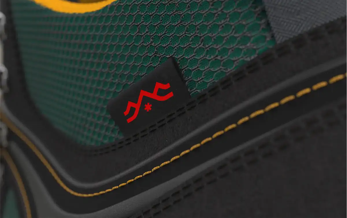
Chinese Footwear Brand Identity by Spellbrand
In the above logo design that we created for a client of ours – a Chinese footwear brand identity, the idea was to represent the outdoors as the client manufactured and sold kickass outdoor shoes and boots.
The target audience is people who love the outdoors and activities such as hiking, camping, trekking, mountain climbing, kayaking, and more. To communicate the outdoors, we would normally have opted for an emblematic logo that showed illustrations of the mountains, trees, a river, and other such design elements.
However, the biggest requirement of this client was that the logo had to go on their shoes and therefore had to be compact and simple. The solution is an abstract design style using lines to simply represent mountains. The star you see is the person wearing that shoe and looking up at the mountains ready to get started on their adventure!
Now that is a story being told by a couple of wavy lines and an asterisk!
Abstract logos with icons
Abstract logos with icons are found everywhere and are the most popular as they try and show a message or idea in a single and usually simple icon. Great examples are logo designs for Apple, and Twitter.
![]()
Music Company Brand Identity by Spellbrand
When Kinnison came to Spellbrand to help their music company rebrand and to transition them from small-time to global growth, we chose an iconic abstract logo to represent the true essence of the brand.
Launched by the husband and wife duo, the business started out by selling choral sheets locally to their community, friends, and associates. In a year, the business grew to an online store and hundreds of sales of their choral sheets around the United States.
Although the brand was growing, the core brand essence of the husband and wife and each of their skillset coming together to form their product and service and this what we focused on when we created this beautiful icon of two birds singing.
Abstract logos with Negative space
Negative space is a great design tool that, if executed properly, can create stunning logos and create that wow factor. But to create a negative space logo design takes a lot of creativity, experience, and boldness.
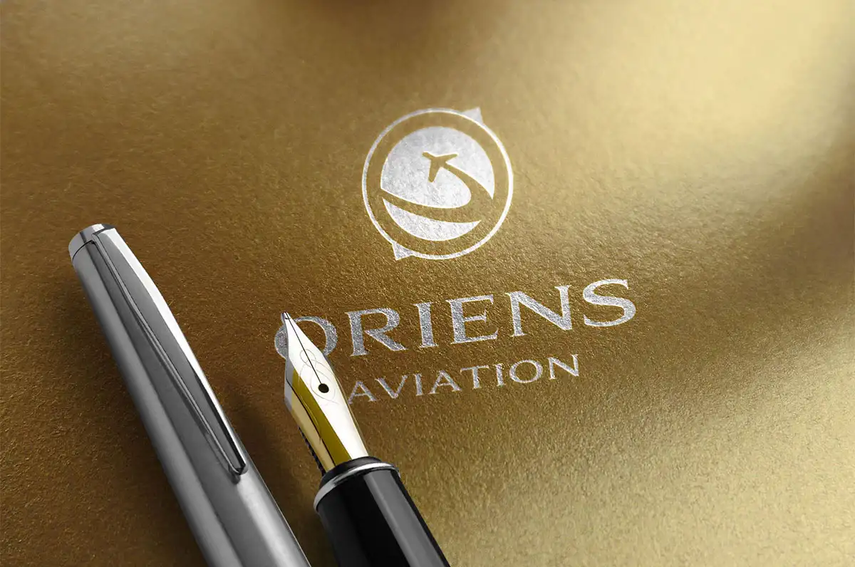
Aviation Company Brand Identity by Spellbrand
The negative space challenge goes to the next level when the abstract factor is introduced into the equation but can lead to a really elegant solution that is abstract as well as creative.
In the design above that, we created for one of our clients, a Germany based Aviation firm, we brought together three distinct elements of their service – the world, an aeroplane and the points of compass and created a dynamic logo using negative space to convert the message.
However, creating negative spaces in logos has to be thought out carefully and great care must be taken to ensure the logo symbol is legible at all sizes.
Abstract logos with abstract symbols
Using abstract symbols in logo designs is actually a time tested trope and was quite prevalent in the 80s and 90s but fell out of favour. However, it is making a comeback and for good reason.
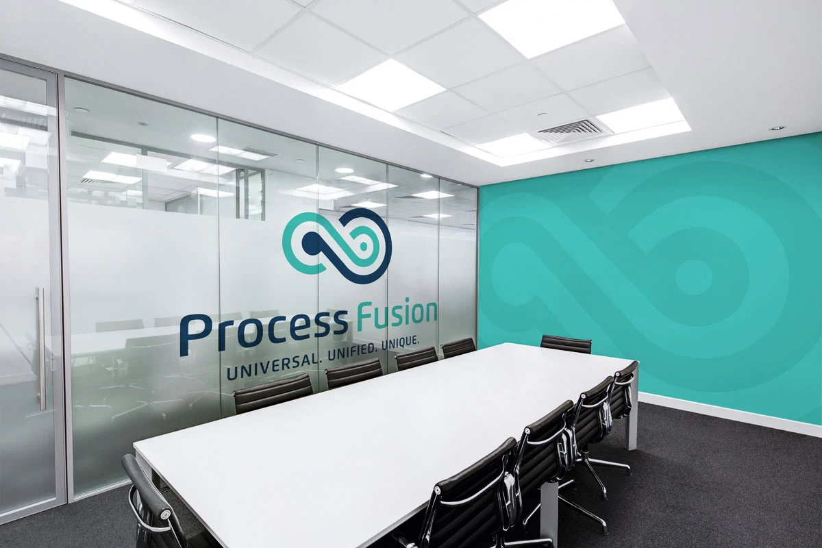
Software Company Brand Identity by Spellbrand
When Process Fusion, a software company wanted a kick-ass logo design, they came to Spellbrand. They wanted a logo design and brand identity that conveyed digital transformation and the limitless potential of their service.
We decided to go with an abstract symbol of the idea of infinity to convey exactly that. The result was a beautiful logo that has many layers of meaning and works elegantly to make the brand stand out while being simple and classy.
Abstract logos based on letters
Creating abstract logos using one or more letters as the base of the design is quite a rare design style and not many brands can pull it off. But when they do, the result is a beautiful logo that is tied to the brand name closely.

Jeddah Brand Identity by Spellbrand
For a Saudi Arabia, Jeddah based luxury apartment developer, we created an awesome abstract logo design based on the first letter of their brand name as well as created a shape that echoed the very structure of the building they constructed.
The L shaped icon we created reflects the brand name and the different lines echo the floors and shape of the building to create a sense of connection with the luxury apartment. When audience encounter this logo and then see the building there would be no question in their minds as to how they are related to each other!
There are tons of other abstract logo design styles and we will be updating this page frequently to reflect newer design strategies. If you have any questions about this design style simply reach out to us.

Mash Bonigala
Creative Director & Brand Strategist
With 25+ years of building brands all around the world, Mash brings a keen insight and strategic thought process to the science of brand building. He has created brand strategies and competitive positioning stories that translate into powerful and stunning visual identities for all sizes of companies.
Featured Work
See Our Work in Action
Real brands, real results. Explore how we've helped businesses transform their identity.
Client Love
What Our Clients Say
Don't just take our word for it. Hear from the brands we've worked with.
Liana Alexander Raye
Harlequin Starr International Styles
"Working with the Spellbrand team has been incredibly easy. Mash has a team of experts who are extremely visionary and pioneering, pulling together ideas and initial thoughts into an actual brand giving you options that you feel best align with your thought process. I have no idea how they created my brand based on the vague brief I gave them, but they have worked wonders and magic. Their design, attention to detail, willingness to ensure the final product is exceptional all counts towards a company who has the client at the forefront of mind at every step of the way. Spellbrand is my Number 1 go to for all branding, website and design concepts moving forward. I look at them as an extension to our marketing arm. Just brilliant."
Raymond Chen
RLC Global Archicom, Singapore
"SpellBrand was very accommodating from the beginning of the design process even when we had distinct design ideas, being architect designers ourselves. Jeff responded with many preliminary style options based on our initial sketchy ideas, enabling us to zoom in on the specific feel we were looking for. From that point on, it was just refinement and the final logo was in our hands in a matter of days. We have used SpellBrand on other logos for my clients projects."
Related Services You Might Love
Based on what you just read, here are services that can help you achieve similar results for your brand.
Free Download
Brand Consistency Checklist
A 27-point checklist to audit your brand across every touchpoint. Used by our team on real client projects.
Success! Check your email for the download link.
Instant PDF download. We'll also send branding tips -- unsubscribe anytime.
Keep Reading
Related Articles
Apr 17, 2026
Stop Naming Your Brand Like a Founder. Start Naming It Like a Buyer.
Founders name brands from the inside out: what the company does, what the technology is, what the vision means to them. Buyers don't care about any of that. After 250+ naming projects, here's how to name from the buyer's perspective and why it changes everything.
Read MoreApr 16, 2026
The Brand Name Moat: How the Right Name Creates an Unfair Advantage Your Competitors Can Never Copy
Your product can be copied in six months. Your price can be undercut tomorrow. But your brand name, if you chose it right, is the one competitive asset that's permanently yours. Here's how naming creates a moat that widens every year.
Read MoreApr 15, 2026
The Final Three: How to Pick Between Your Last Brand Name Candidates Without Blowing the Decision
You've narrowed it to three names. You can't decide. Every name has a flaw, every name has a fan on your team, and the launch date is closing in. Here's the decision framework I've used for 250+ naming projects to cut through the deadlock and pick the right name with confidence.
Read More
