Spellbrand Blog
How to Preserve Your Brand’s Visual Identity When Using

Branding is what people say about you when you are not in the room.
This famous quote by Amazon’s Jeff Bezos reflects perfectly the way human memory works – we don’t store carbon copies of previous experiences in our brain, we only recreate them instead, essentially making a series of educated guesses based on the most salient (for us) characteristics of an item or event.
That means your brand’s visual identity in consumers’ minds is nothing like the detailed image library your brand book features. This doesn’t necessarily mean you wasted a sizeable piece of your marketing budget on something your audience will not even pay much attention to – every startup is familiar with the challenges of keeping their marketing consistent with the brand’s set visual identity.
Let’s see how you can fine-tune image post templates for social media, web, and ads to fit your brand’s identity.
Stick to the essence
When picking a template to use, don’t try to fit in too many of your brand’s signature design elements. Think of it like creating a sketch – to recreate the resemblance between the image on the page and real-life object, an artist strives to use the bare minimum of lines necessary for the audience to still be able to identify the object correctly.
Use this approach to pick the bare minimum of the design characteristics of your brand’s visual identity that ensures your audience can still create a link between the cluster of elements within the marketing imagery you are using and your brand.
The key elements of a brand’s visual identity are usually listed as follows: logo design, signature, fonts and colors, imagery, iconography, layouts, image post templates, and composition. Below we look at how brands can use them to maintain a consistent visual identity when using predesigned templates.
Add a logo design
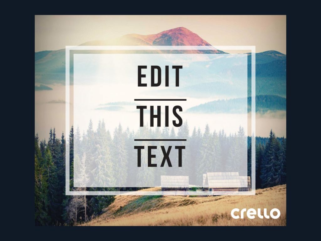
One of the simplest ways to make a premade template your own is including your logo design. Have a file with the logo design on a transparent background handy to add instant brand flavor to any template of your choosing. In this example, you can see the default logo of Crello shown on the image template. You should replace this with your own brand logo.
Pick a template with brand colors
Another simple way to reflect your brand identity using ready-made templates is sticking to using ones that feature your brand color in some capacity. Here we’ve selected a few example templates that may fit our brand colors – light sky blue and white:
Change template colors to fit your brand
Another way to maintain your brand’s visual integrity when using templates is changing the colors of template elements – fonts, backgrounds, frames, etc. See how we changed this original template (on the left) into one that’s consistent with a visual identity on the right:
Add own photos as template backgrounds
Adding photos of your product, service, offices or production facilities as template backgrounds can be another effective way to adjust any template to your brand visual identity. Here’s a template with custom preset background versus a template with replaced background:
Use signature font
Adding your brand’s signature font to your template can help your marketing imagery fit seamlessly with your brand’s visual identity. Most graphics editors allow changing the fonts of their template texts and some, including Crello, allow uploading your own fonts. A subtle font change can go a long way in adjusting a template to your brand visual identity:
Use similarly styled image post templates
One more way to broadcast your visual identity that’s somewhat less obvious is consistently using templates that aren’t all in one style but have a signature common piece. They can all contain a square, a triangle frame, be left-aligned, etc.:
Adjust the fonts, object colors or a background image and your collection of seemingly random images will come together swimmingly.
At a glance
So what are people saying when you are not in the room? Or rather – what’s the first visual appearing in their mind when they hear the name of your brand? Is it a large curvy yellow M? Is it a circle with red and blue colors united in a yin-yang styled harmony or is it the familiar red on white handwriting with extra showy tails on top and bottom?
Use the most prominent elements of your brand visual identity to customize graphics templates and image post templates – and be consistent with that – and your audience will be able to make the connection in a split second.

Mash Bonigala
Creative Director & Brand Strategist
With 25+ years of building brands all around the world, Mash brings a keen insight and strategic thought process to the science of brand building. He has created brand strategies and competitive positioning stories that translate into powerful and stunning visual identities for all sizes of companies.
Featured Work
See Our Work in Action
Real brands, real results. Explore how we've helped businesses transform their identity.
Client Love
What Our Clients Say
Don't just take our word for it. Hear from the brands we've worked with.
Jenny Richard
Woods Of Fairfax
"Working with the team at Spellbrand has been fantastic! I spent time researching companies that would help me build brands for each asset that are all in different locations and more specifically build a brand that could help tell each of their unique stories. Spellbrand did just that. The process was easy. To provide them with my initial thoughts through a nicely-outlined input form they sent to me and they took that information and created a number of awesome designs. I was able to incorporate "the story" easily with a design we selected. I'm excited to get it into action and see what's in store for the next project. Also, each person I worked with has been super responsive, knowledgeable, and awesome to work with! Kudos to Mash, Mike, and Eva! I really enjoy working with you!"
Ernest Bannister
M.O.R.E
"My experience with the Spell brand team has been nothing short of excellent. From the beginning Mash and team made me feel very comfortable with the design process. I am extremely happy with the results of my design and look forward to working with Spellbrand; exclusively! I have told many family, friends and peers about the great work the Spellbrand team has done in creating my design. Thanks again for all your patience and professionalism; I look forward to working with you in the future."
Related Services You Might Love
Based on what you just read, here are services that can help you achieve similar results for your brand.
Free Download
Brand Consistency Checklist
A 27-point checklist to audit your brand across every touchpoint. Used by our team on real client projects.
Success! Check your email for the download link.
Instant PDF download. We'll also send branding tips -- unsubscribe anytime.
Keep Reading
Related Articles

Mar 26, 2026
Brand Culture: How to Build an Internal Culture That Amplifies Your External Brand
Your brand is only as strong as the people who deliver it. Learn how to align internal culture with your external brand promise so that every employee interaction reinforces what your marketing communicates.
Read MoreMar 26, 2026
Brand Name Ideas: 50 Examples by Industry with Expert Analysis
Explore 50 real brand name examples across 10 industries with expert analysis on why they work. Get naming inspiration and learn what makes a brand name memorable.
Read MoreMar 26, 2026
Brand Naming Agency vs DIY vs AI: Which Approach Is Right for You?
Compare the three main approaches to brand naming: hiring a professional agency, doing it yourself, or using AI tools. Honest breakdown of costs, quality, risks, and ideal use cases.
Read More


