Pro Salon Studios: The Professionals’ Choice
Situation: Differentiating B2B Salon Rental Service in Competitive Market
Pro Salon Studios is “the professionals’ choice” in independent studio rental where they offer modern, fully equipped, studio-sized salons ready for business. Pro Salon Studios came to Spellbrand to help them create a stunning new logo design and brand identity for their new concept salon. Their studios are designed for Salon and Spa professionals who are willing to make an investment in their own success.
In a B2B market where salon professionals need to trust their studio rental provider, Pro Salon Studios needed a brand identity that would communicate professionalism, quality, and partnership—not just another rental service. The salon rental market is competitive, with many providers offering tired-looking, dated brands.
Task: Create Brand Identity That Differentiates in B2B Market
The challenge required:
- B2B positioning: Brand identity that communicates professionalism and partnership
- Market differentiation: Brand that moves away from tired, dated competitor logos
- Professional appeal: Brand that appeals to salon and spa professionals
- Quality communication: Visual identity that communicates quality and enables success
Action: Strategic Brand Development
Brand Strategy: B2B Professionalism
Because Pro Salon Studios was in the B2B space, we decided to create a predominantly text-based logo. So we started researching the “mini-salon” industry and realized most of the competition had tired-looking, blocky, and quite dated-looking logos and brands. So to help differentiate the client, we opted to go for a stylized and elegant icon that was made out of the initials “PS”. We also chose a beautiful and regal font for the name.
The result is a beautiful logo that communicates the message that Pro Salon Studios cares about its business partners and enables them to become successful. Creating an icon that is not clichéd and still retains freshness in a saturated market segment is quite a challenge. But at Spellbrand we relish such challenges.
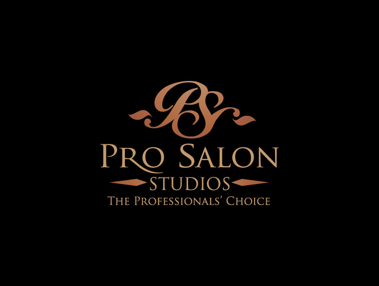
Logo Design: Elegant PS Monogram
The stylized PS monogram icon:
- Communicates professionalism: Clean, elegant design communicates quality
- Suggests partnership: The monogram suggests collaboration and support
- Differentiates: Moves away from tired, dated competitor logos
- Enables versatility: Works across all B2B applications and marketing materials
Result: Brand Identity That Enables Success
The brand identity we created for Pro Salon Studios successfully differentiates them in the competitive salon rental market. The comprehensive brand transformation delivers:
Strategic Outcomes
- B2B positioning: Brand identity successfully communicates professionalism and partnership
- Market differentiation: Brand moves away from tired, dated competitor logos
- Professional appeal: Brand appeals to salon and spa professionals
- Quality communication: Visual identity communicates quality and enables success
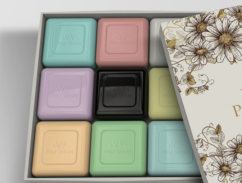
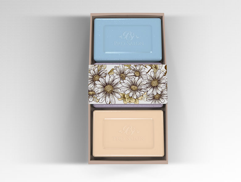
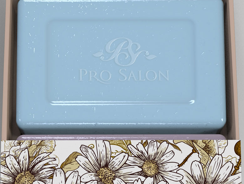
- Complete brand system: Elegant PS monogram, regal typography, and product package renderings create unified experience
Implementation Success
Today, Pro Salon Studios uses this comprehensive brand identity to attract salon and spa professionals who need modern, fully equipped studio spaces. The elegant PS monogram and regal typography communicate professionalism and partnership, positioning them as the professionals’ choice for salon and spa professionals who want to invest in their own success. The brand successfully positions Pro Salon Studios as a partner in their success rather than just a rental service, with a brand identity that enables success for salon and spa professionals.
Brand Name Strategy: Creating “Pro Salon Studios”
The name “Pro Salon Studios” was developed through Spellbrand’s strategic brand naming process. Our team researched the competitive landscape, target audience, and brand positioning to create a name that would resonate in the market and support long-term brand growth.
The naming process included linguistic analysis, trademark screening, domain availability verification, and brand storytelling to ensure “Pro Salon Studios” would be distinctive, memorable, and legally protectable. Learn more about our brand naming service or explore our full naming portfolio.