Highlands Brewers: A Hollywood Tale of Perseverance
Situation: Rebranding 120-Year-Old Brewery with Rich Heritage
Opened in 1908, Highlands Brewers located in St. Louis, Missouri, has tons of history, fortune, and misfortune in a gripping story that reads like a Hollywood tale.
Within a few years of opening the brewery, the original partners died one after another which led to the shutting down of the brewery for over 5 years after which it was bought by an immigrant Italian family that persevered through prohibition, declining sales, and personal misfortune. In 1986, the Highlands was once again boarded up and left silent for another 15 years. It was then that the current owners bought the old brewery and mills and started making craft beer.
The craft beer market requires brands that communicate heritage, quality, and authenticity. Highlands Brewers needed a brand identity that would honor their rich heritage while bringing the brand into modern times.
Task: Create Fresh Logo Retaining Aspects of Bygone Era
With a new brand strategy, the clients want to create a fresh new logo. The challenge required:
- Heritage honor: Brand identity that honors rich heritage and history
- Modern times: Visual identity that brings brand into modern times
- Heritage retention: Logo design that retains aspects of bygone era
- Craft beer positioning: Brand that positions as craft beer maker
- Quality communication: Brand that communicates quality and authenticity

Action: Strategic Brand Development
Logo Design: Seal-Like Design Honoring Heritage
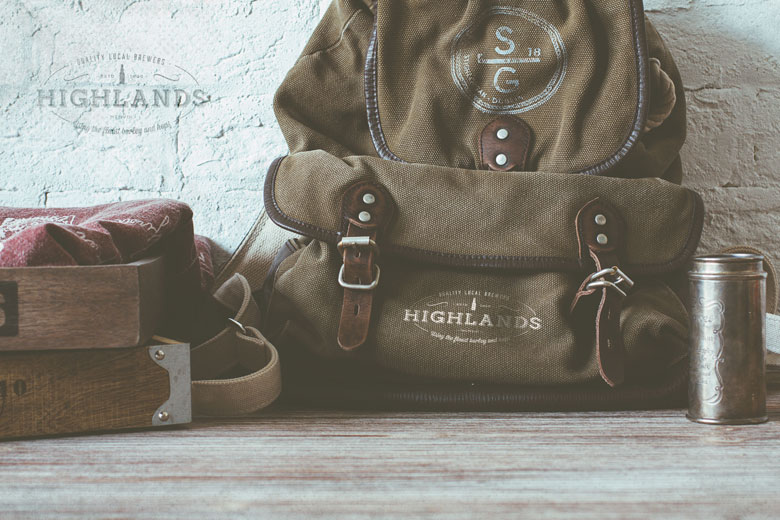
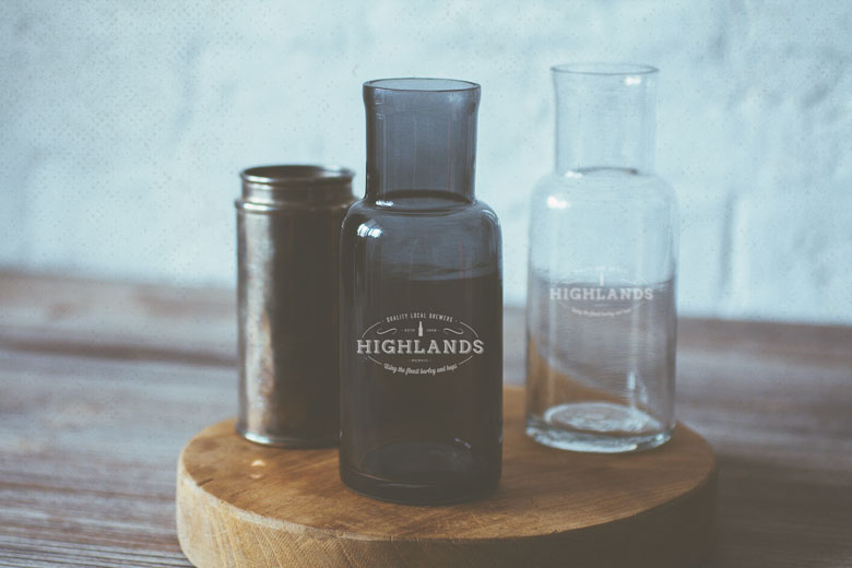
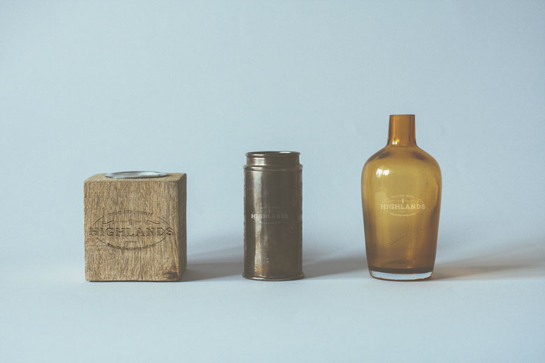
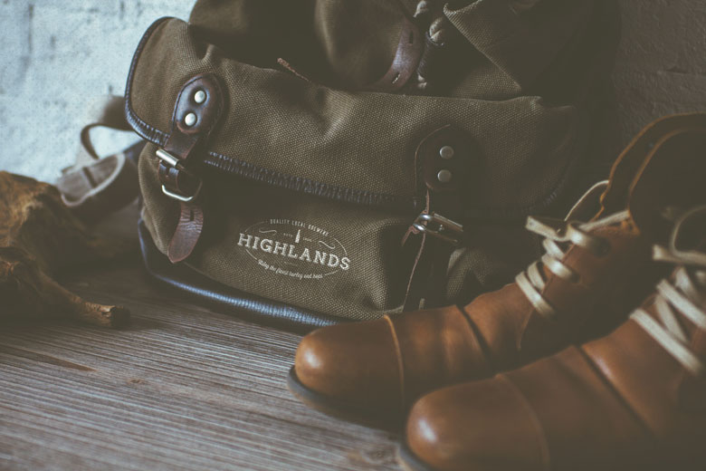
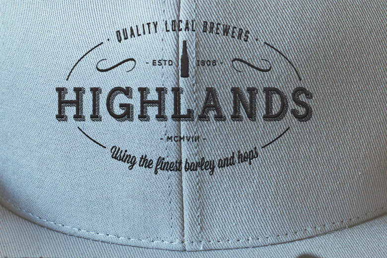
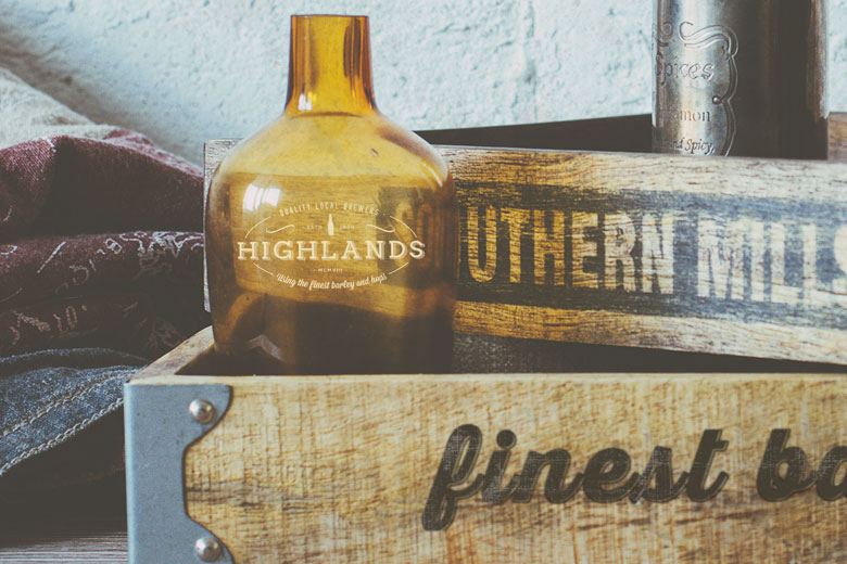
Because of the rich heritage and history of the brewery, we decided to implement the brief by creating a simple and unassuming design that would relate directly to the history and bring the brand into modern times. A symbolic seal-like design was the preferred way to take since that would lend itself well to branding on bottles, packaging, and other bit and pieces.
Final Design: Turn of the Century Nostalgia
The final design that the client selected emphasizes the name “Highlands” which is the focus of the logo with a very simple and rustic-looking icon of an old beer bottle on top, flanked on both sides by the words “Estd 1908” on top. The whole design is encased in a broken ellipse with the words “Quality Local Brewers” on top and “Using the finest barley and hops” at the bottom.
This design brings back the nostalgia of the turn of the century design, typefaces and ornaments and gives the brand a quiet dignity and confidence.
This logo design:
- Focuses on Highlands: Name “Highlands” is the focus of the logo
- Features beer bottle: Simple and rustic-looking icon of old beer bottle
- Includes Estd 1908: Flanked on both sides by “Estd 1908”
- Uses broken ellipse: Whole design encased in broken ellipse
- Communicates quality: “Quality Local Brewers” and “Using the finest barley and hops”
- Creates nostalgia: Brings back nostalgia of turn of century design
- Gives dignity: Gives brand quiet dignity and confidence
Result: Brand Identity That Honors Heritage
The brand identity we created for Highlands Brewers successfully honors the rich heritage while bringing the brand into modern times. The comprehensive brand transformation delivers:
Strategic Outcomes
- Heritage honor: Brand identity successfully honors rich heritage and history
- Modern times: Visual identity successfully brings brand into modern times
- Heritage retention: Logo design successfully retains aspects of bygone era
- Craft beer positioning: Brand successfully positions as craft beer maker
- Quality communication: Brand successfully communicates quality and authenticity
- Complete brand system: Seal-like logo, brand identity system, and visual language create unified experience
Implementation Success
Today, Highlands Brewers uses this comprehensive brand identity to attract craft beer enthusiasts. The seal-like logo design with “Highlands” as the focus, old beer bottle icon, “Estd 1908” flanking, and broken ellipse encasing creates a design that brings back the nostalgia of the turn of the century design, typefaces and ornaments, giving the brand a quiet dignity and confidence. The brand successfully positions Highlands Brewers as a 120-year-old St. Louis brewery that persevered through prohibition, declining sales, and personal misfortune, now making craft beer with a fresh logo that retains aspects of the bygone era while bringing the brand into modern times, honoring the rich heritage and history of the brewery through symbolic seal-like design that lends itself well to branding on bottles, packaging, and other pieces.
Brand Name Strategy: Creating “Highlands Brewers”
The name “Highlands Brewers” was developed through Spellbrand’s strategic brand naming process. Our team researched the competitive landscape, target audience, and brand positioning to create a name that would resonate in the market and support long-term brand growth.
The naming process included linguistic analysis, trademark screening, domain availability verification, and brand storytelling to ensure “Highlands Brewers” would be distinctive, memorable, and legally protectable. Learn more about our brand naming service or explore our full naming portfolio.

