Portfolio Case Studies
Selected branding and identity projects.
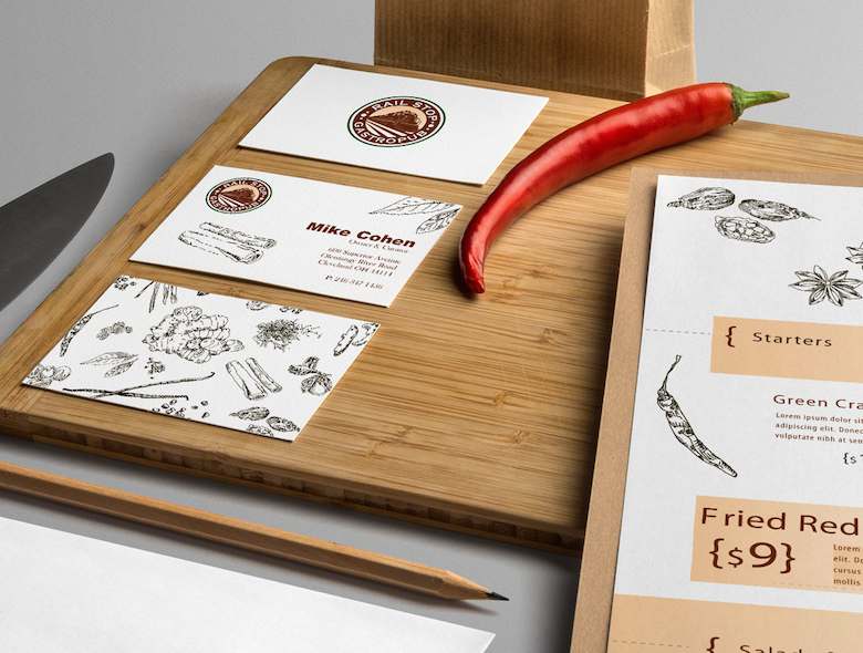
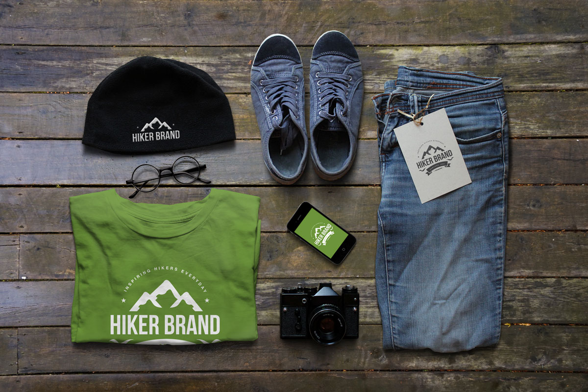
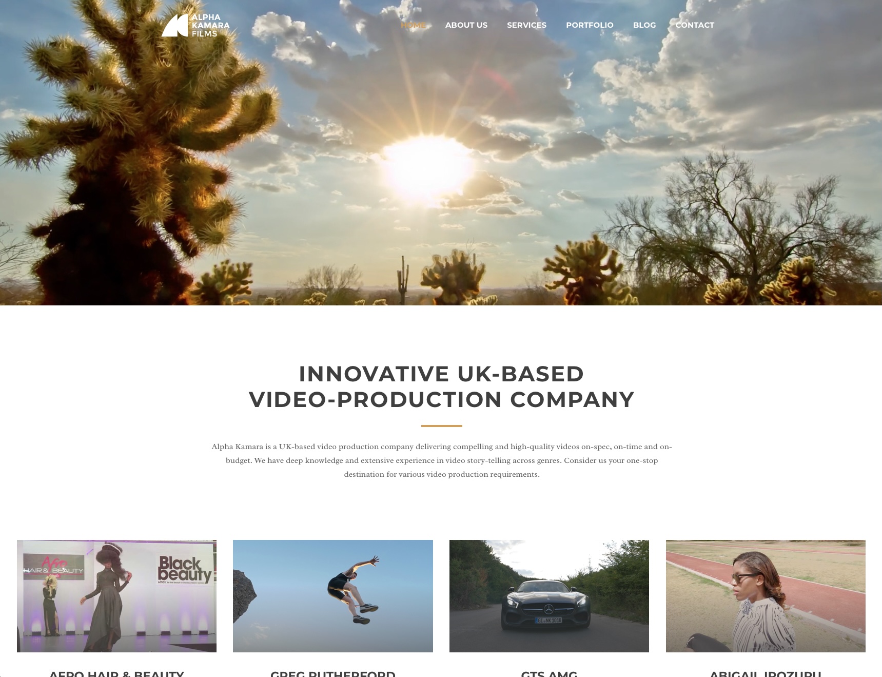
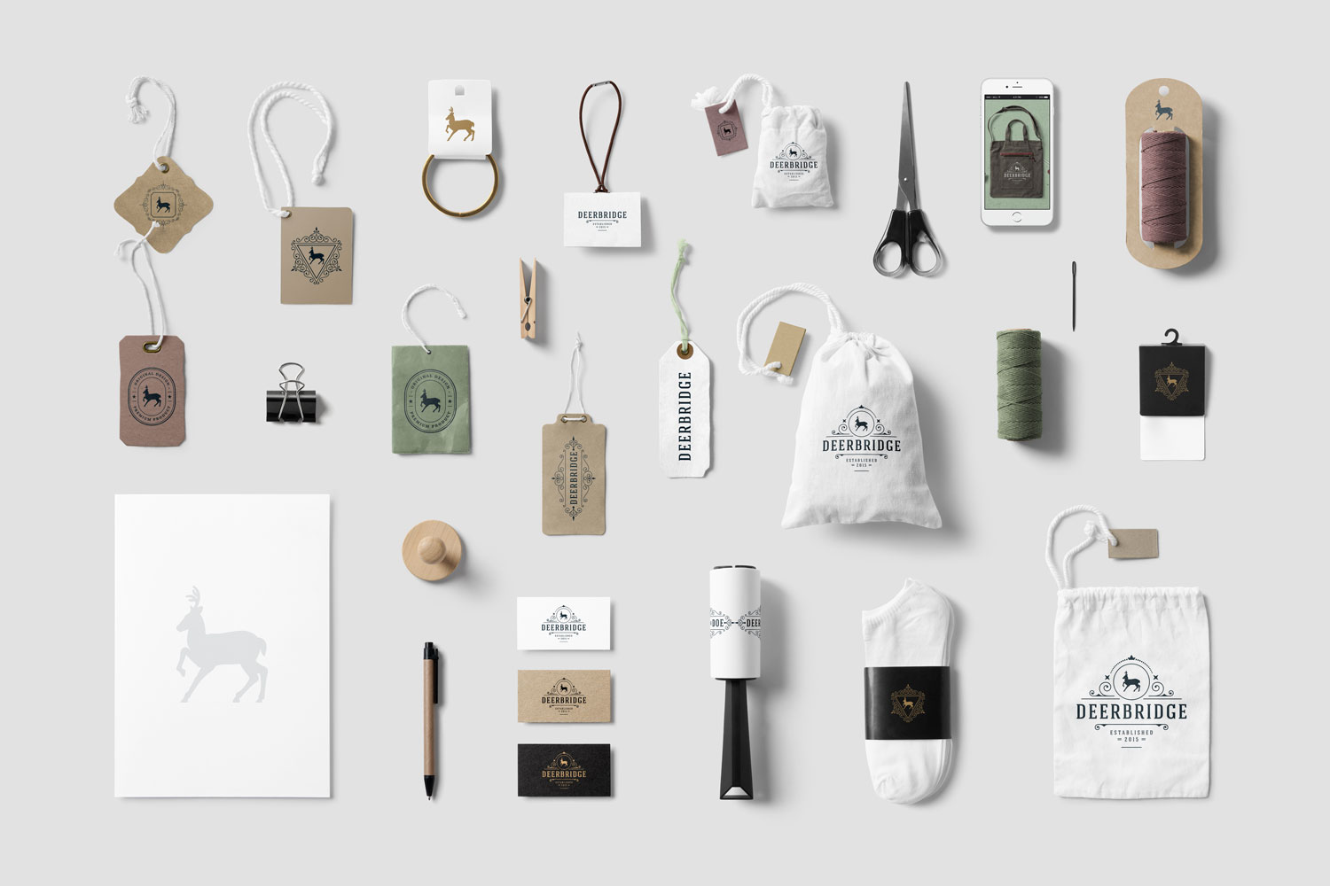
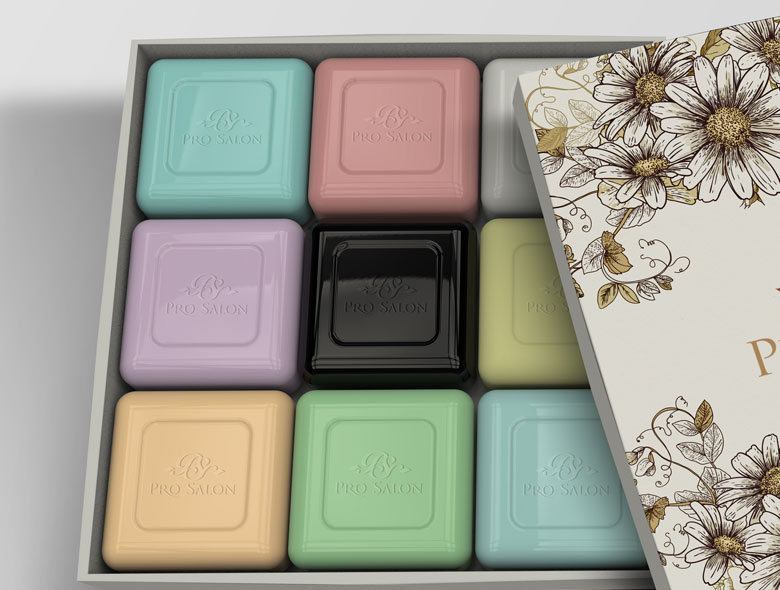
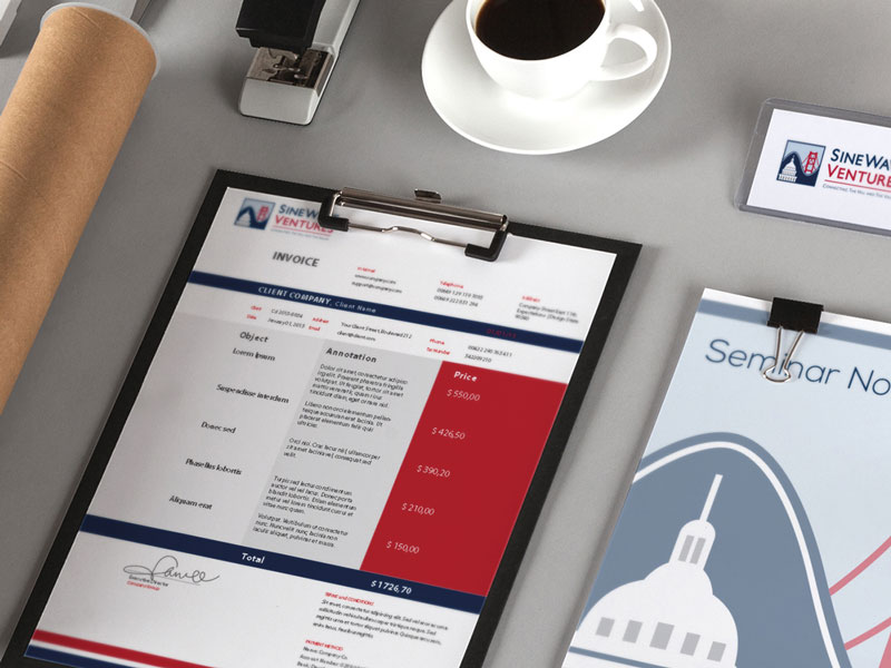
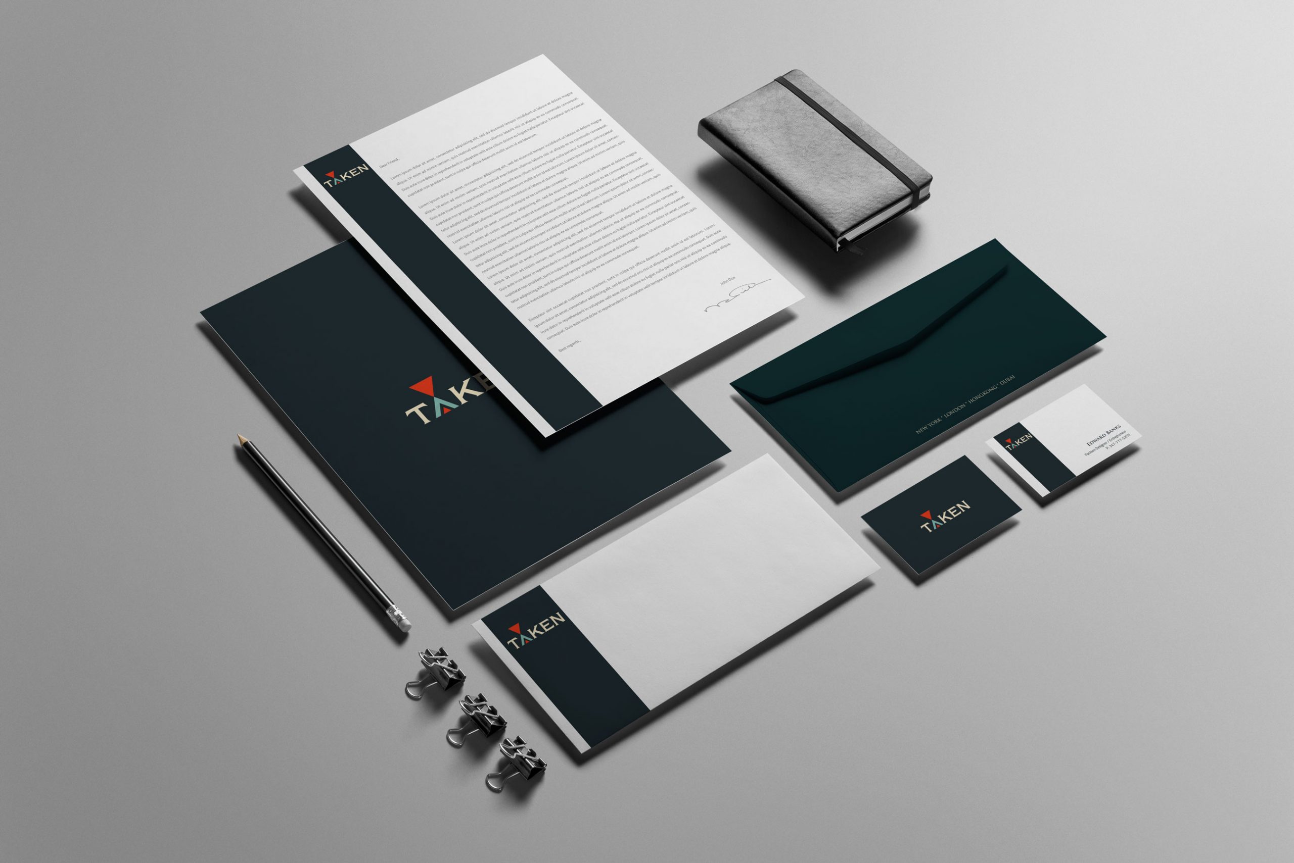
Brand Strategy & Design Projects


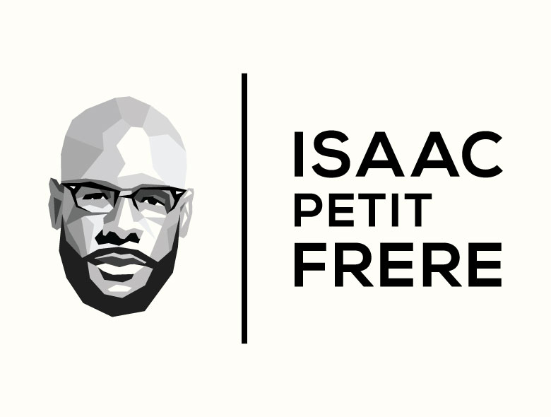
Logo Design & Brand Identity Projects


No projects found
Try adjusting your search terms
Ready to Build Your Brand?
Join 2000+ businesses that have transformed their brands with Spellbrand
Let's Create Something Magical Together
Ready to create a brand that stands out and drives real business results? Browse our service packages and choose the perfect fit for your business. Transparent pricing, instant purchase, and immediate project start.