Arena Construction: Honoring Heritage While Building the Future
Situation: Rebranding 20-Year Legacy Construction Company
Arena Construction is a leading construction and architecture company based in Barcelona, Spain. With over 20 years of brand heritage, they had built a strong reputation in the Spanish market. However, as the construction industry in Spain faced challenges in recent years, they recognized the need to refresh their brand identity while honoring their legacy.
The Spanish construction market has faced challenges, requiring companies to refresh their brands while maintaining trust and heritage. When they approached Spellbrand to help them create a visually stunning brand identity, the challenge was clear: breathe new life into a brand that had served them well, without losing the heritage and trust they had built over two decades.
Task: Rebrand While Honoring Heritage
The challenge required:
- Heritage preservation: Honor 20-year legacy and trust built over decades
- Brand refresh: Breathe new life into brand without losing heritage
- Market positioning: Refresh brand identity for challenging construction market
- Cultural connection: Brand that honors Spanish heritage and pride
Action: Strategic Brand Development
Brand Strategy: Connecting Past and Present
The client’s brief was straightforward: create a stunning logo design and matching stationery design and identity items. But we knew that great branding goes deeper than aesthetics—it needs to tell a story that resonates with both existing clients and new opportunities.
After extensive brainstorming, we explored several directions including architectural landmarks of Spain such as La Sagrada Família, Església de Santa Maria del Mar, Torre Agbar, Palau de la Música Catalana, and Mercat de Santa Caterina. However, we ultimately chose a direction that honored something deeper: Spanish medieval history and the client’s pride in their heritage.
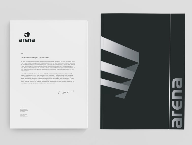
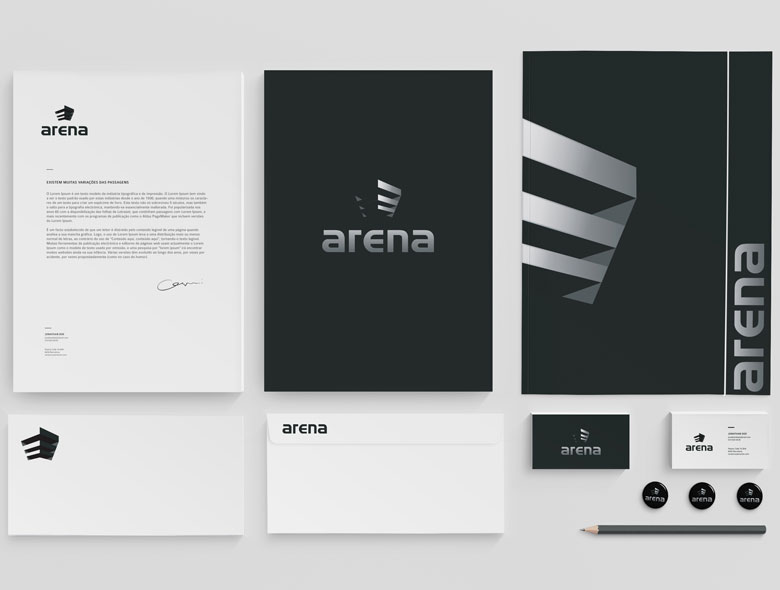
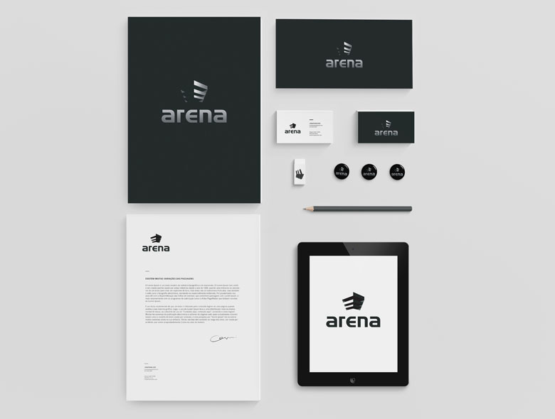
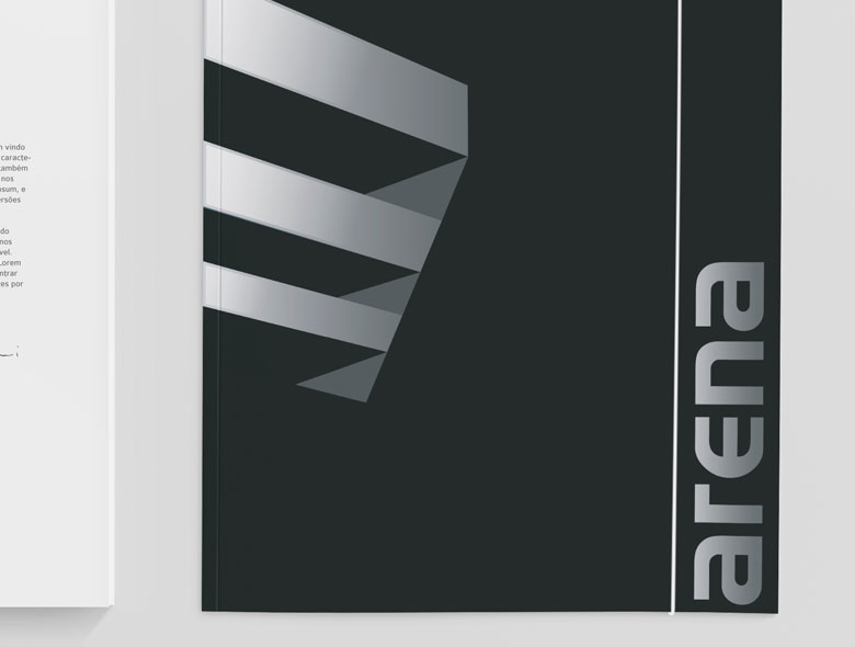
Logo Design: The Abstract Helmet
The final logo design depicts an abstract building that simultaneously resembles a medieval knight’s armor helmet. This dual interpretation works on multiple levels:
- Architectural connection: The building form connects directly to their construction business
- Heritage honor: The medieval helmet references Spanish history and the client’s pride in their cultural roots
- Power and strength: Both buildings and armor suggest durability, protection, and reliability
- Abstract sophistication: The design feels modern while honoring tradition
The icon we created is powerful, abstract, and has depth and dimension—all attributes that describe Arena Construction as a company. It communicates strength, heritage, and forward-thinking design in a single mark.

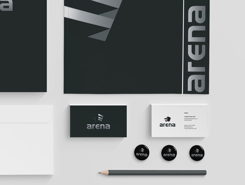
Complete Brand Identity System
Beyond the logo, we created a comprehensive brand identity system including:
- Matching stationery design that extends the brand across all business communications
- Folder design for presentations and proposals
- Print materials that maintain brand consistency
- Visual language that works across digital and physical touchpoints
The cohesive system ensures that Arena Construction presents a unified brand experience whether clients encounter them through proposals, on-site signage, or digital marketing.
Result: Brand Identity That Honors Heritage and Builds Trust
The rebrand successfully balances honoring Arena Construction’s 20-year heritage with creating a fresh, modern identity that positions them for future growth. The comprehensive brand transformation delivers:
Strategic Outcomes
- Heritage preserved: Brand successfully honors 20-year legacy and trust built over decades
- Brand refreshed: Fresh, modern identity breathes new life into brand
- Cultural connection: Abstract helmet-building logo honors Spanish medieval history
- Market positioning: Brand positions for future growth in challenging construction market
- Comprehensive system: Complete brand identity system creates unified experience
Implementation Success
Today, Arena Construction uses this comprehensive brand identity to maintain their strong position in the Barcelona market while appealing to new clients who value both heritage and innovation in their construction partners. The abstract helmet-building logo communicates strength and reliability while the connection to Spanish medieval history adds depth and cultural resonance, successfully balancing honoring Arena Construction’s 20-year heritage with creating a fresh, modern identity that positions them for future growth.