Situation: The Invisible Luxury Real Estate Firm
Braden International Realty had quietly operated for two decades, handling premium properties across five global markets—Hong Kong, London, Dubai, Tokyo, and Mumbai. Despite their impressive track record, including brokering properties worth up to $28 million, they faced a critical challenge: they were invisible in a market dominated by household names.
In the ultra-luxury real estate market, brand perception is everything. High-net-worth individuals don’t just buy properties—they buy into brands that reflect their status and aspirations. Braden was losing million-dollar deals not because of their service quality, but because their brand didn’t command the respect their expertise deserved.
The company had built a strong reputation through word-of-mouth and personal relationships, but lacked the visual identity and strategic positioning needed to compete with established luxury brands. Their existing brand materials looked generic and failed to communicate the sophistication and exclusivity their clients expected.
Task: Reposition as the Premium Choice for Ultra-High-Net-Worth Clients
The challenge was clear: transform Braden International Realty from a capable but overlooked player into a recognized leader in the ultra-luxury real estate market. This required:
- Strategic repositioning that differentiated them from competitors
- Premium visual identity that communicated luxury, sophistication, and exclusivity
- Brand system that worked seamlessly across five global markets
- Implementation across all touchpoints—from digital to physical materials
Action: Strategic Brand Transformation
01. Market Intelligence & Research
We conducted deep-dive research across all five markets—Hong Kong, London, Dubai, Tokyo, and Mumbai—analyzing not just the competitive landscape, but the psychological drivers of ultra-high-net-worth property purchases.
Key Insights: Luxury buyers prioritize discretion and exclusivity over flashy marketing. Cultural nuances vary dramatically across markets. Personal relationships and trust trump transaction speed. Brand heritage matters, but innovation signals expertise.
02. Strategic Positioning
We positioned Braden not as another real estate agency, but as “The Private Office for Property Acquisition”—positioning them as trusted advisors to the ultra-wealthy, not just brokers. This positioning emphasized their role as strategic partners rather than transactional service providers.
03. Visual Identity Development
The Visual Language of Luxury
We created a brand identity that speaks the visual language of wealth without being ostentatious. Every element was designed to convey power, sophistication, and exclusivity.
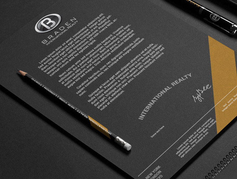
04. The Iconic Brandmark
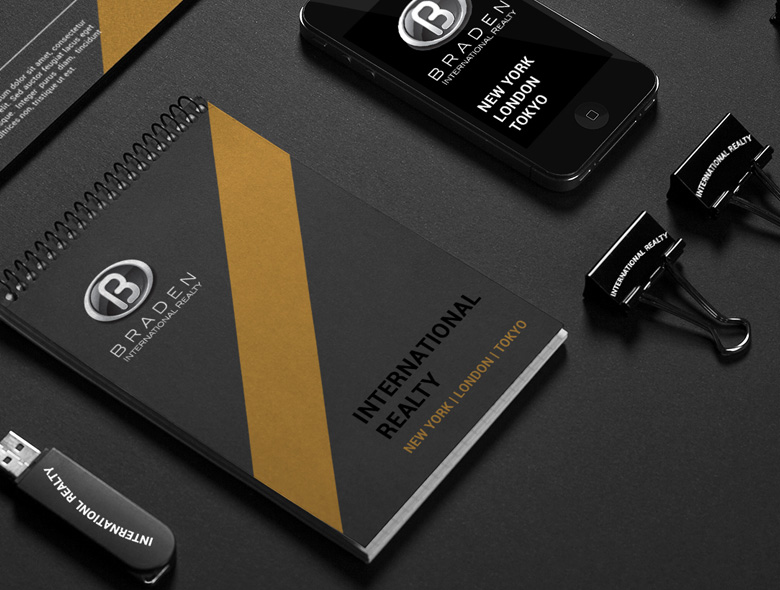
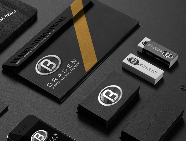
A bold, architectural “B” that suggests strength, structure, and sophistication. The mark works equally well on a business card or a 40-foot building facade.
Comprehensive Brand System
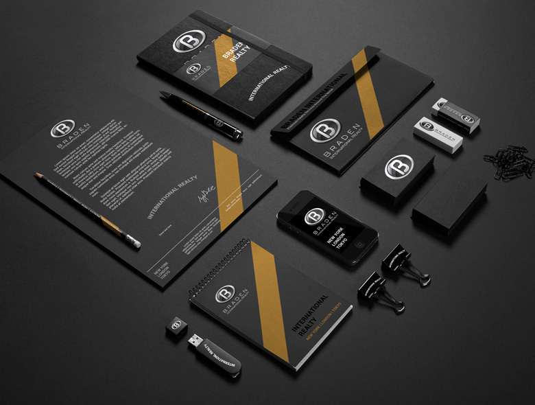
We developed comprehensive brand guidelines ensuring perfect execution across all global markets and touchpoints—from website to office signage to property brochures. The system included typography specifications, color palettes, spacing rules, and application guidelines for digital and physical materials.
Every detail was meticulously crafted to communicate luxury, sophistication, and trustworthiness at every touchpoint.
05. Premium Implementation
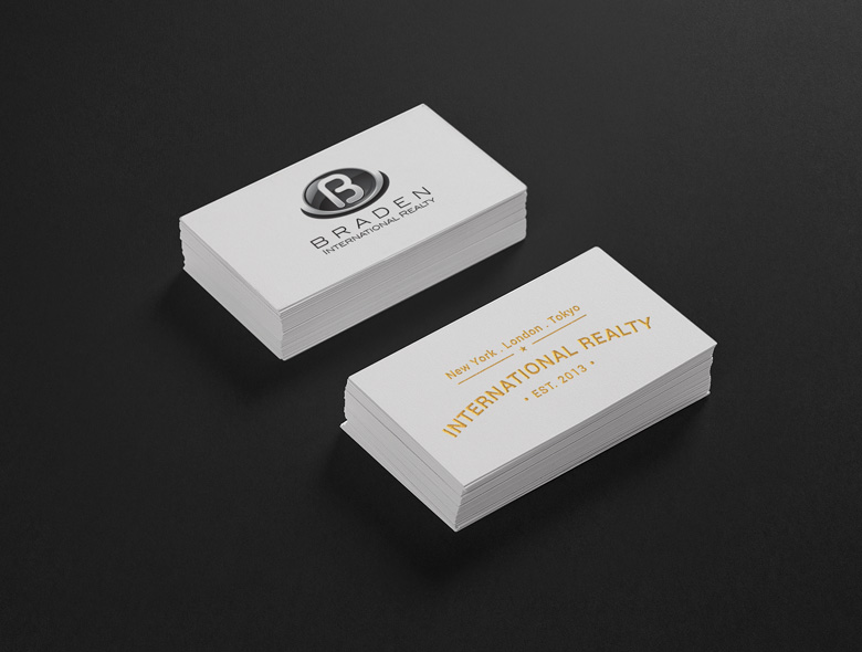
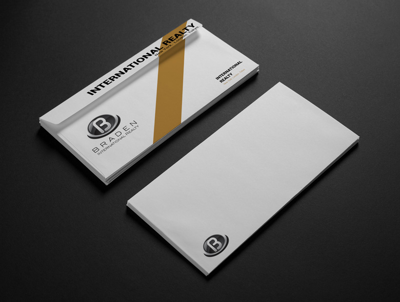
Every brand touchpoint—from business cards to property presentations—executed with premium materials and meticulous attention to detail.
Comprehensive Collateral System
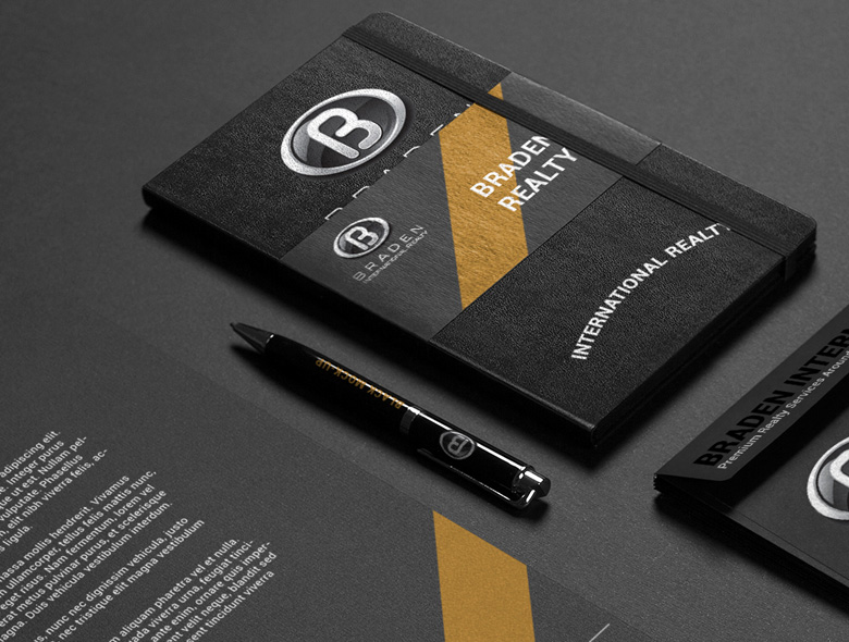
The brand identity extended across all customer touchpoints, creating a cohesive and memorable brand experience. From property brochures printed on premium stock to digital presentations, every detail reinforced the brand’s luxury positioning.
We implemented the brand system across:
- Digital platforms (website, email signatures, social media)
- Physical materials (business cards, letterhead, property brochures)
- Environmental branding (office signage, building facades)
- Marketing materials (advertising, presentations, proposals)
The result: a complete brand system that works seamlessly across five global markets and dozens of touchpoints.
Result: Transformation into a Recognized Luxury Real Estate Leader
Within 12 months of the rebrand, Braden International Realty transformed from a capable but overlooked player into the go-to choice for ultra-luxury property acquisitions.
Measurable Business Impact
The strategic brand transformation delivered significant results:
Strategic Outcomes
- Premium positioning achieved: Braden now competes with—and beats—established luxury brands they previously couldn’t access
- Client base transformed: Attracted ultra-high-net-worth individuals and celebrity clients who value discretion and exclusivity
- Pricing power increased: Commanding fees that reflect their true expertise and premium positioning
- Global consistency: Brand identity works seamlessly across all five markets, maintaining luxury positioning while respecting cultural nuances
- Team confidence: Staff now represent a brand that matches their expertise and professionalism
Spellbrand didn’t just redesign our logo—they repositioned our entire business. We’re now competing with—and beating—brands we never thought we could touch. Our client base has completely transformed, and we’re commanding fees that reflect our true expertise.
The Strategic Difference
This wasn’t a design project—it was a business transformation. By leading with strategy and supporting it with world-class execution, we helped Braden International Realty claim their rightful position in the ultra-luxury market.
Strategic Foundation
Deep market research and positioning strategy
Premium Execution
World-class design and materials
Implementation Support
Training and ongoing brand stewardship
Results Focus
Every decision tied to business outcomes
Ready to Transform Your Brand?
Stop competing on price. Build a brand that commands premium positioning and attracts your ideal clients.
Start Your Brand Strategy
