#Alkaline: Pure Water, Pure Design
Situation: Creating Brand Identity in Crowded Bottled Water Market
#Alkaline is a bottled alkaline water brand taking over the nation with crystal clear and 100% pure water available primarily in gas stations and supermarkets. In a crowded bottled water market dominated by established brands, they needed a brand identity that would stand out while communicating purity and quality.
The bottled water market is highly competitive, with numerous brands competing for shelf space in gas stations and supermarkets. #Alkaline needed a brand identity that would create immediate recognition while communicating their unique value proposition of crystal clear, 100% pure alkaline water.
Task: Create Striking Yet Simple Brand Mark
When #Alkaline needed a simple, elegant, and yet striking brand mark and logo design, they came to Spellbrand. The challenge required:
- Retail visibility: Design that works in retail environments (gas stations, supermarkets)
- Brand recognition: Brand mark that builds recognition through marketing campaigns
- Purity communication: Visual identity that communicates purity and quality
- Simplicity: Simple, elegant design that stands out

Action: Strategic Brand Development
Logo Design: The Hashtag Anchor
The #Alkaline bottled water logo design was based on one simple concept: using the hashtag to create an anchor that would then be used in marketing and branding campaigns. This strategic approach:
- Integrates social media: Hashtag naturally connects to social media marketing
- Creates memorable symbol: The # creates a distinctive, recognizable mark
- Enables versatility: Works as both a logo element and marketing tool
- Appeals to modern consumers: Appeals to contemporary consumers who understand hashtag culture
Bottle Label Design: Simplicity and Clarity
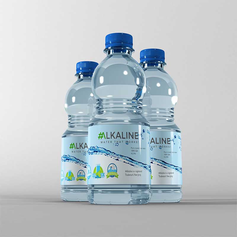
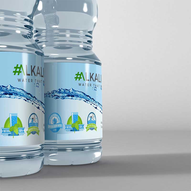
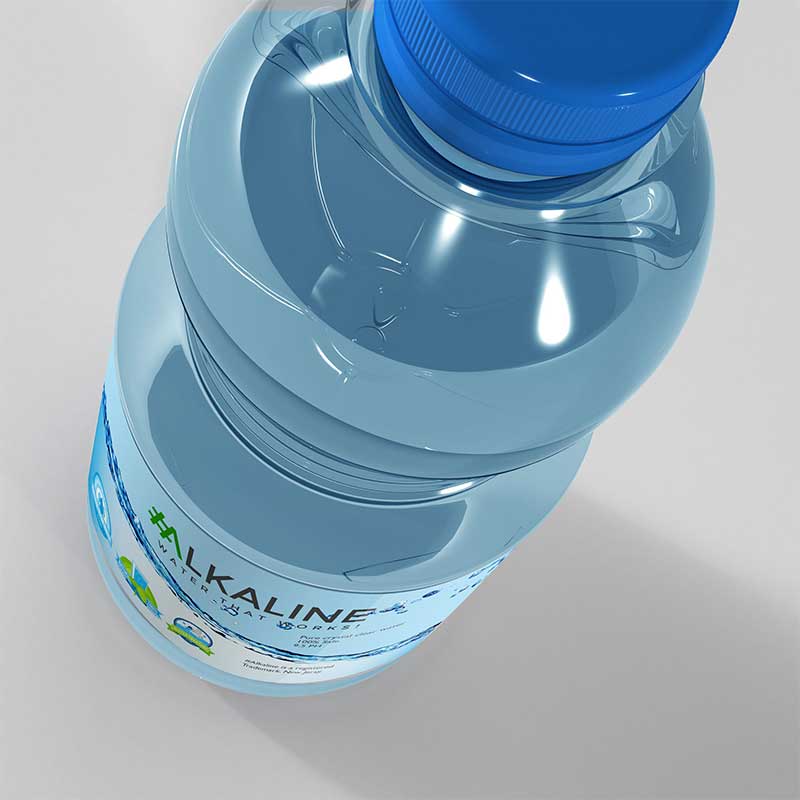
The bottle label design also reflects the simplicity of the logo design, along with secondary icons that can be used for various messages that the client would be sending out. This approach ensures:
- Clear communication: Simple design makes product information easy to read
- Brand consistency: Secondary icons extend the brand language
- Retail visibility: Clean design stands out on crowded shelves
- Message flexibility: Icons can be adapted for different marketing messages
Brand Identity: Eco-Friendly and Modern
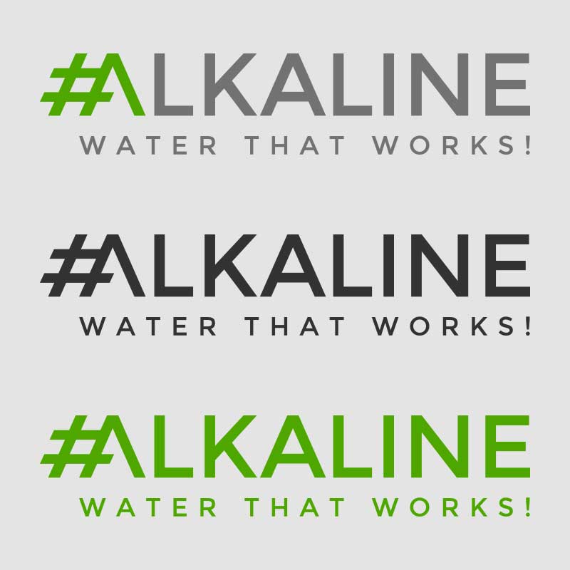
Coupled with clean and sharp modern typography, the logo looks stunning. The choice of modern green was intended to create an eco-friendly brand outlook that reflects the brand’s core vision of purity and environmental responsibility.
The logo looks awesome in any kind of color combination, including monotone variations. This versatility enables the client to use the logo across all kinds of media and print campaigns without losing legibility—essential for a brand that needs to work in gas stations, supermarkets, and digital marketing.
Result: Brand Identity That Stands Out
The brand identity we created for #Alkaline successfully differentiates them in the competitive bottled water market. The comprehensive brand transformation delivers:
Strategic Outcomes
- Retail visibility: Design successfully works in retail environments (gas stations, supermarkets)
- Brand recognition: Brand mark builds recognition through marketing campaigns
- Purity communication: Visual identity communicates purity and quality
- Simplicity: Simple, elegant design stands out in crowded market
- Complete brand system: Hashtag anchor logo, eco-friendly green palette, and bottle label design create unified experience
Implementation Success
Today, #Alkaline uses this comprehensive brand identity to build recognition in gas stations and supermarkets nationwide. The hashtag anchor logo creates a memorable mark that works both as a brand identifier and a marketing tool, while the eco-friendly green color palette communicates their commitment to purity and environmental responsibility. The brand successfully creates a distinctive presence that helps consumers choose their crystal clear, 100% pure alkaline water over competitors.

