Brennia Kottefaru: A Sanctuary for Sovereign Spirits
Situation: Launching a Super Resort in a Saturated Market
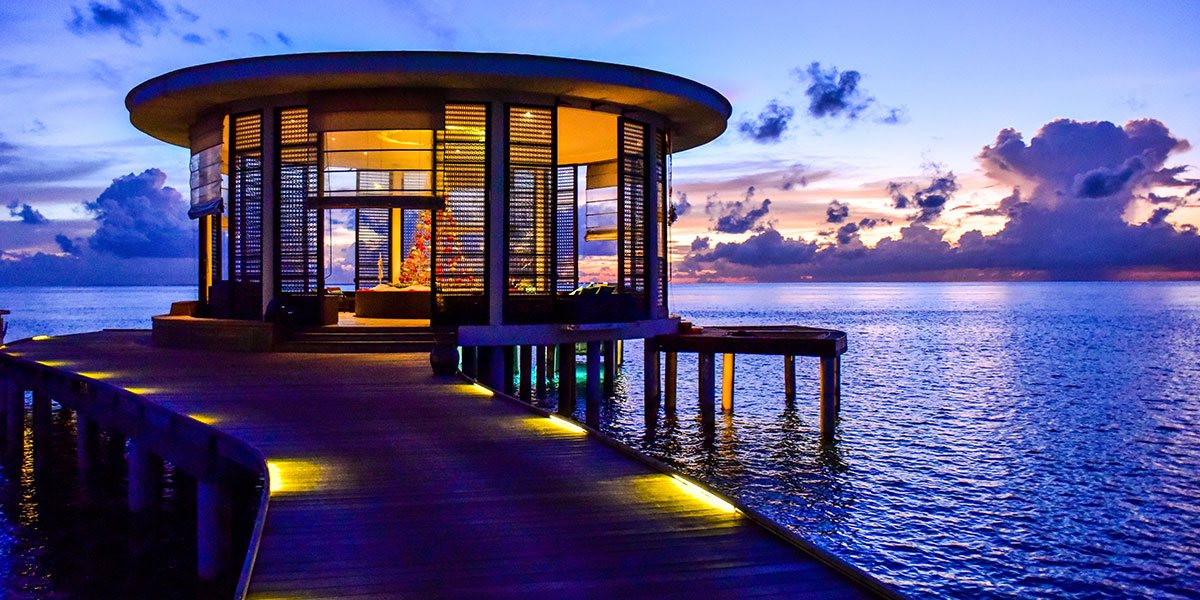
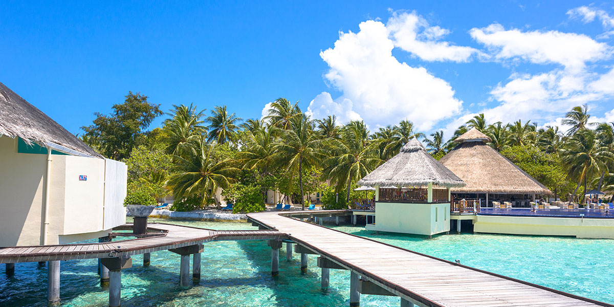
Nestled in the embrace of Raa Atoll’s cerulean waves, Brennia Kottefaru was envisioned as a sanctuary for the sovereign spirits—a place where each guest is royalty. In a world where the ordinary is ubiquitous, there exists an oasis so pristine that it seems otherworldly. Brennia Kottefaru is that jewel in the Maldives, a super resort conceived not just to stand apart from the profusion of overwater bungalows but to redefine the very essence of island luxury.
The challenge was significant: the Maldives resort market is highly competitive, with over 90+ resorts vying for attention. Most resorts rely on similar imagery—palm trees, turquoise waters, overwater bungalows—creating a sea of sameness that makes differentiation nearly impossible.
Task: Create Distinctive Brand Strategy That Stands Out
The client wanted a positioning and brand strategy that would set their new resort apart and stand out amongst the noise of the other 90+ resorts. The challenge required:
- Distinctive positioning: Brand strategy that differentiates from 90+ competitors
- Regal brand identity: Visual identity that echoes regality and splendor
- Effective marketing story: Brand narrative that enables effective resort marketing
- Luxury redefinition: Brand that redefines island luxury beyond typical imagery
Action: Strategic Brand Development
Brand Strategy for Sovereignty
In a sea of sameness where over ninety resorts vie for attention, Brennia needed a brand strategy as distinctive as its vision. Spellbrand set sail on a strategic voyage, steering clear of clichés and charting a course toward a haven of uniqueness.
A Name for Nobility: ‘Brennia,’ inspired by a word of regal origins, was chosen as the moniker that would carry the weight of the brand’s promise—every guest’s regal journey begins here.
A Story of Sovereignty: The brand narrative was woven into every element, instilling a sense of majesty in the guests. Every moment on the island is a testament to their personal quest for discovery and indulgence.
This strategic approach:
- Creates regal positioning: Every guest is treated as royalty
- Develops unique narrative: Story of sovereignty sets brand apart from competitors
- Avoids clichés: Distinctive vision that steers clear of typical resort branding
- Builds emotional connection: Creates personal quest for discovery and indulgence
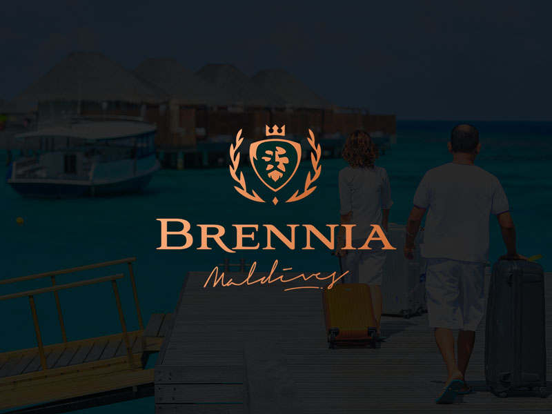
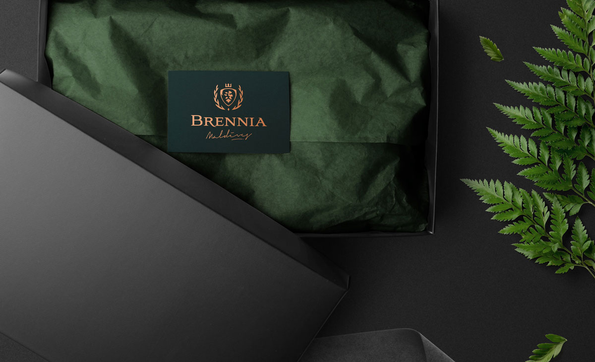
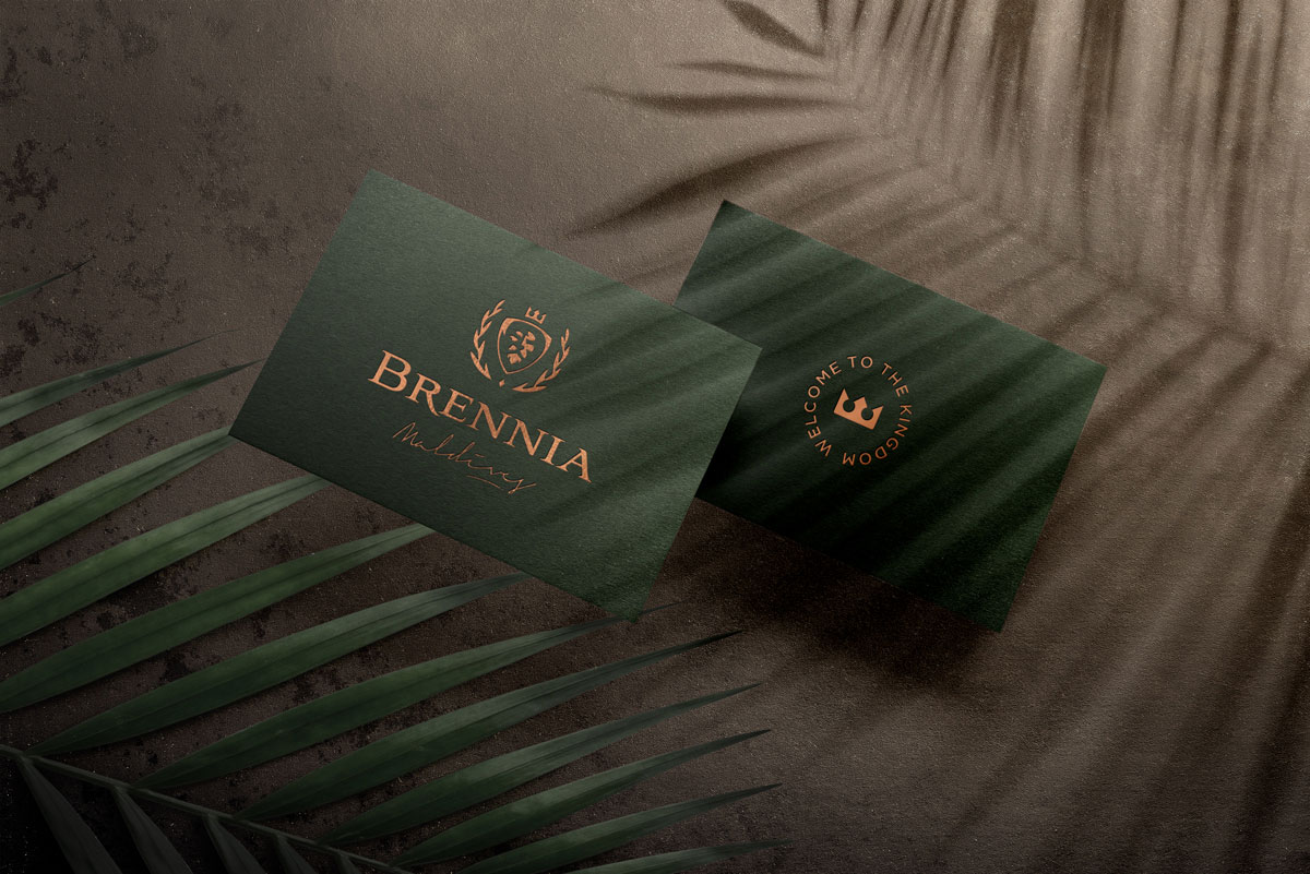
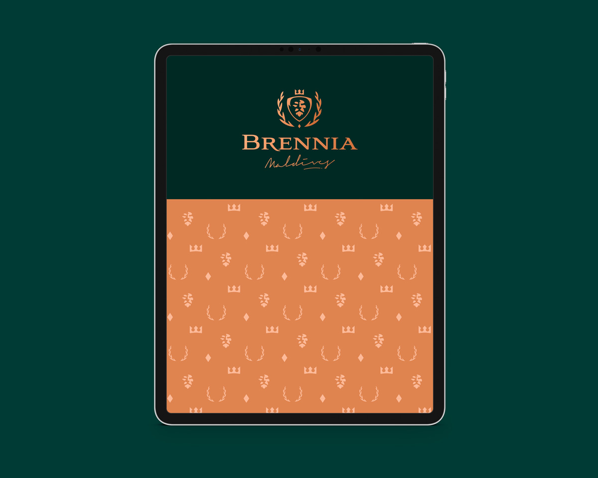
The Royal Emblem
Spellbrand’s artisans, in their quest for visual excellence, crafted a logo that reflects Brennia’s ethos. The emblem, an intricate interplay of tradition and luxury, invites one into a realm where regality meets relaxation.
Symbol of Supremacy: The logo, a sophisticated and elegant emblem, encapsulates the resort’s luxury while subtly nodding to the Welsh origins of the name.
Regal Raiment: The color palette is drawn from the environs—the azure of the sky, the gold of the sun’s kiss on the water, and the lush greens of tropical bliss.
This design approach creates:
- Sophisticated emblem: Reflects luxury and tradition
- Cultural heritage: Nods to Welsh name origins
- Natural color palette: Azure, gold, and green from Maldivian environment
- Regal aesthetic: Communicates sovereignty and luxury
The Scepter of Services
From the infinity of the pools to the infinity of the ocean, every amenity at Brennia Kottefaru pledges a premium experience, reflecting the brand’s commitment to excellence in service and setting.
- Amenities of Ascendancy: Each service at Brennia, whether the spa that beckons with rejuvenating promises or the culinary ventures that promise a feast for the senses, is branded to befit kings and queens.
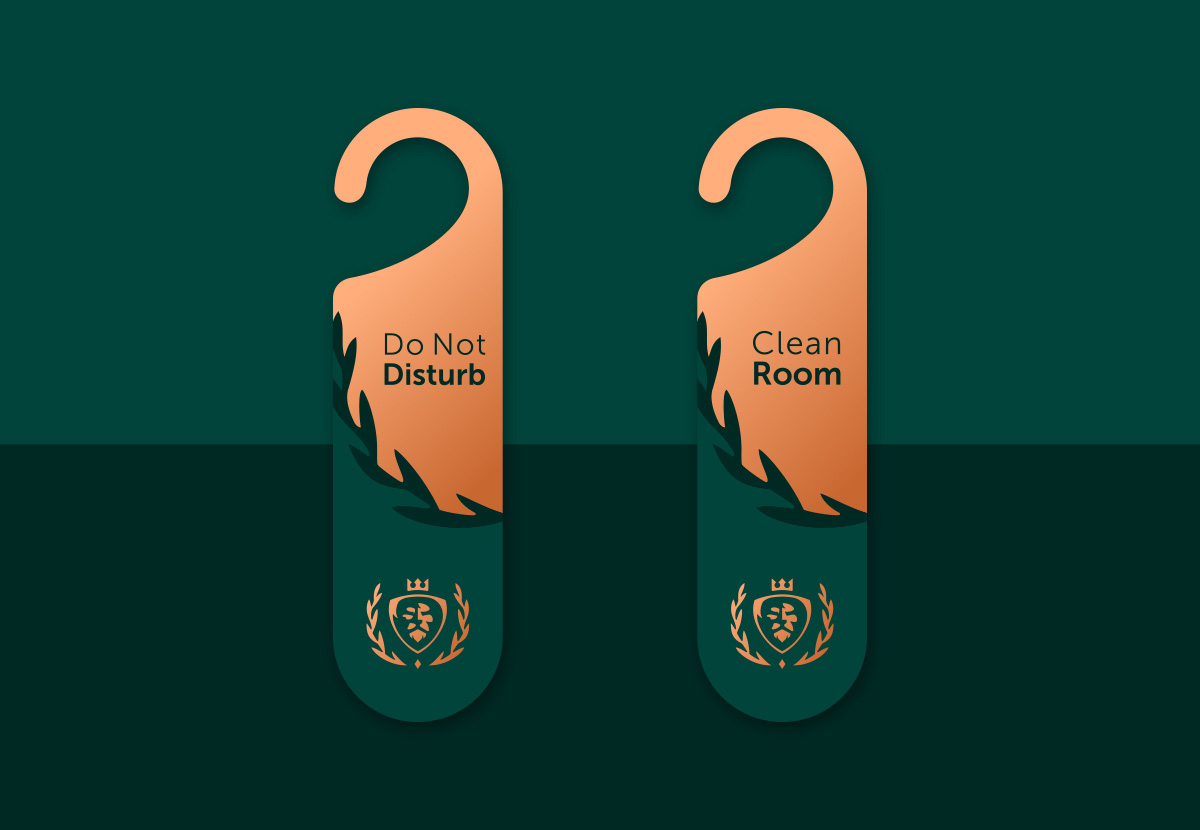
- The Iconography of Elegance: A custom set of icons designed to simplify luxury—each symbol a story, each line a legacy, guiding guests through the Brennia experience with clarity and beauty.
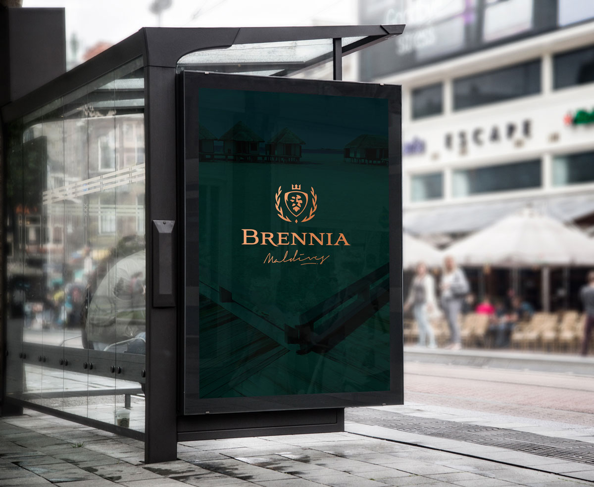
The Throne of Digital Dominion
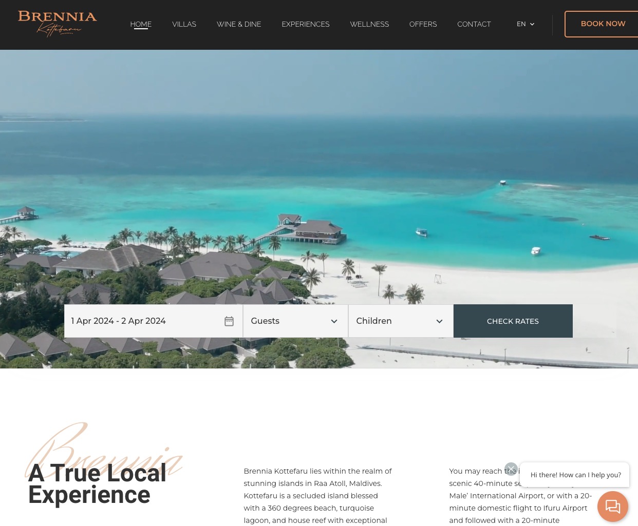
In the digital realm, the Brennia brand needed to shine as brightly as it does under the Maldivian sun. The website, a digital doorway to paradise, was crafted to enrapture and inform.
- A Portal of Prestige: The website mirrors the resort’s promise, a collage of stunning visuals and immersive content, inviting the world to witness the Brennia Kottefaru phenomenon.
- The Sovereign’s Scroll: Online narratives tell of the island’s allure, the unique experiences awaiting, and the seamless journey from arrival to ascension into luxury.

Comprehensive Brand Applications
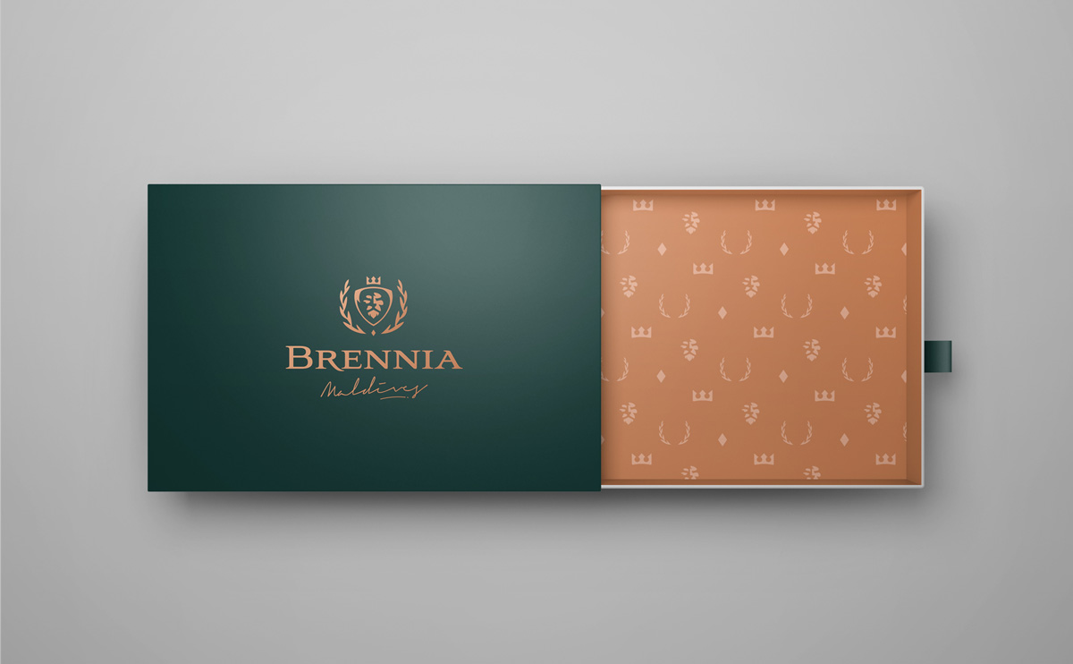
As the resort took shape, each touchpoint, from the brand pattern that graced the materials to the typography that danced across communications, was a coronation of the brand’s identity.
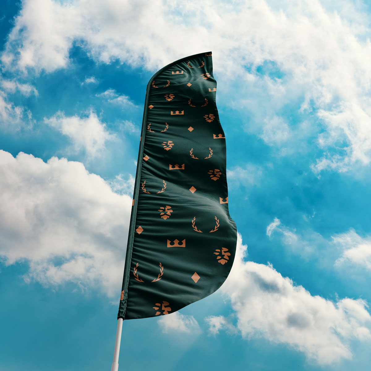
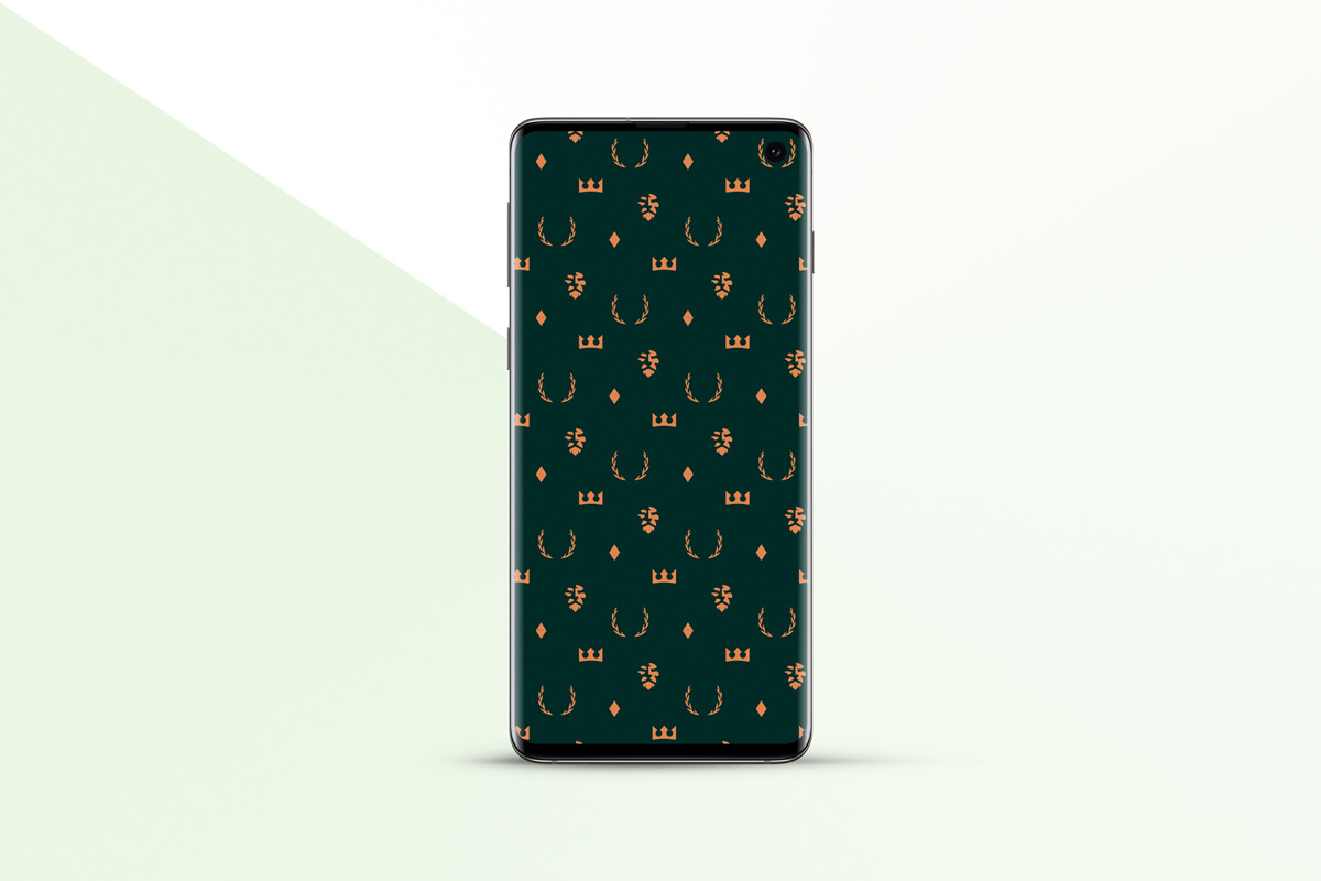
Patterns of Power: The brand pattern, found on everything from pillowcases to poolside umbrellas, is a tapestry that ties the physical experience to the brand’s story.
Typography of Tradition: The chosen typefaces exude elegance and fluidity, mirroring the seamless experience that Brennia promises its noble guests.
Digital Presence: The website mirrors the resort’s promise, a collage of stunning visuals and immersive content, inviting the world to witness the Brennia Kottefaru phenomenon.
Result: Distinctive Brand Identity That Stands Out
The brand identity we created for Brennia Kottefaru successfully sets the resort apart from 90+ competitors in the Maldives market. The comprehensive brand transformation delivers:
Strategic Outcomes
- Distinctive positioning achieved: Regal brand strategy that differentiates from competitors
- Unique brand narrative: Story of sovereignty enables effective marketing and positioning
- Sophisticated visual identity: Royal emblem and brand system that avoids clichés
- Comprehensive brand system: Brand pattern, typography, and applications create cohesive experience
- Effective marketing story: Brand narrative that enables client to market resort effectively
Implementation Success
Today, Brennia Kottefaru uses this brand identity to attract guests seeking a sanctuary for sovereign spirits—a place where each guest is royalty. The brand successfully positions the resort as a super resort that redefines the very essence of island luxury, with a brand identity as enchanting as the isle itself, standing out in a sea of sameness where over ninety resorts vie for attention.
![]()
The Regalia of Recognition
Brennia Kottefaru, now a bastion of splendor in the seascape of Maldives resorts, stands unmatched in its grandeur. Spellbrand’s magnum opus in branding has rendered a resort that doesn’t just invite guests—it beguiles them, entwines them in its enchanting narrative, and crowns them monarchs of their tropical domain.
A Legacy Unleashed
Today, Brennia Kottefaru is not merely a destination; it’s a dynasty in the making. It’s where the legacy of a 135-year-old company was reborn through Spellbrand’s branding wizardry. A testament to the transformative power of storytelling, brand strategy, and visual identity, Brennia Kottefaru stands as a sanctuary for sovereign spirits—a place where each guest is royalty, set apart from the noise of 90+ other Maldives resorts through a distinctive brand identity that echoes the regality and splendor of this untouched paradise.
Brand Name Strategy: Creating “Brennia”
The name “Brennia” was developed through Spellbrand’s strategic brand naming process. Our team researched the competitive landscape, target audience, and brand positioning to create a name that would resonate in the market and support long-term brand growth.
The naming process included linguistic analysis, trademark screening, domain availability verification, and brand storytelling to ensure “Brennia” would be distinctive, memorable, and legally protectable. Learn more about our brand naming service or explore our full naming portfolio.