Spellbrand Blog
Optimize Your Funnel Today with a Laser Targeted Call

In your study of sales funnels up to this point, you have probably encountered the term ‘call to action’ more than once. Doubtless, you have woven some into your own content or landing pages. But if you are like most marketers, you wonder whether your CTAs are optimized. In this post, we will explore the concept in depth.
Along the way, we will reveal how the call to action relates to the sales funnel and its assets, and we will tell you how to write them for every stage and optimize your funnel. You will learn how to write optimized CTAs and survey funnels that spur your readers into action. By utilizing targeted CTAs, you can nurture leads, turning curious visitors into repeat customers.

What is a CTA?
A call to action is a crucial element of any sales funnel. In fact, its use is rooted in evolutionary psychology. It is a bit of copy employed by marketers to provoke an immediate response from a prospect. You can use a CTA to prompt the prospect to buy immediately. But you can also use a CTA to get the potential customer to perform an action that will take them to the next step in your funnel. As such, the call to action is a powerful tool that offers a lot of flexibility.
CTAs are often used at the end of a sales letter, or sales pitch. But as we will see, you can use them all over your site in many different ways. Overall, the idea is to tell potential customers know what to do if they are interested in your offer.
It may seem counterintuitive that you would need to tell the reader what to do next. But keep in mind that, depending on where the prospect is in your funnel, they may not be thinking about converting. They may, in fact, simply be on your site for the free information on offer. Consequently, you can use a call to action to focus the prospect’s attention.
Many new marketers ignore the power of CTAs, to their detriment. Two common reasons for under-utilization of CTAs are:
- Concerns that CTAs are annoying and/or obnoxious
- A belief that the prospect already knows what to do/how to proceed if they want more information or want to convert
We will tackle the first concern later in this post, where we tell you how to use CTAs depending on which stage of the funnel the prospect is in. For now, let us address concern number two.
It is common for the novice marketer to underestimate just how busy, distracted or plain ol’ scatter brained most readers are. That is not to say that your readers are simple-minded. Far from it. But they are busy. Often, your readers are juggling two or three pressing issues in their mental space at once. Therefore, a well-placed CTA can give your reader the nudge they need to take that all-important next step.
For instance, without a CTA at the end of your blog post, the reader is likely to simply close the tab, switch to a YouTube video or check their Facebook page.
How CTAs Are Used
The most obvious use is the sales CTA, such as “Buy now!” But, as we will see, more subtle CTAs are extremely useful at the top and middle sections of the funnel. Indeed, the more expensive your item or service, the more you will need to use CTAs at the top and middle of the funnel. You will need to use CTAs to guide your visitor to other pieces of content so you can build a relationship with them. Along the way, you will build trust, and trust can lead to conversions.
Additionally, you can—and should—use CTAs to build your email list. A typical call to action for that purpose might be, “Sign up for our exclusive report now!”
You can also use CTAs to increase your social media following. That might look like, “Get more tips and tricks by following us on Facebook!”
Naturally, you can use CTAs to keep a reader on your site, and that might look like this: “Click here to read more about…”
Typical CTA Phrases
As you learn more about CTAs, you will become familiar with commonly used trigger words. These are verbs that cue the reader to take a specific action. Here are a few:
- Sign up
- Call
- Register
- Donate
- Order
- Buy
- Share
- Follow
- Download
- Click here for
From this list, we can uncover the first clue on how to write an effective CTA: use short, specific trigger words that clearly convey to the reader what you want them to do.
Urgency
The most effective CTAs combine trigger words with urgency. Scarcity has been part of the human condition since the beginning of time, as outlined in the paper, The Psychological Effects of Perceived Scarcity on Consumer’s Buying Behavior. It is only natural, then, that people respond to urgency. Think about it: how many times have you been compelled to action by the fear that you would miss out on an opportunity?
Below are a few examples of CTAs with urgency:
- This offer expires on Christmas Eve!
- This is a limited time offer!
- Act now before time runs out!
- Enroll before the 30th to qualify for the special rate!
All of these CTAs carry the implication that if the reader does not take action, they stand to lose something. Even if the loss would be trivial—such as missing out on a sale—many people respond to such CTAs. For the most part, this works on the subconscious level.
Now, let us move beyond the basics and turn our attention to three CTAs used in the wild.
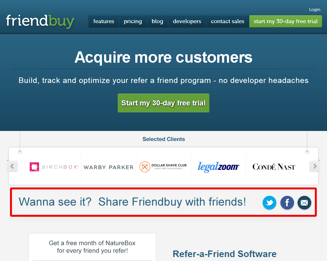
Case Study: Friendbuy
Friendbuy helps marketers drive referrals via customized widgets. They have worked with brands such as Allure, Disney, LootCrate and Spanx. But before they could help Mickey Mouse sell more merch, they had to build a reputation. To do that, they set about optimizing their CTAs.
One of their original CTAs was, ‘Wanna see it? Share Friendbuy with friends!’
Sounds good, right? This may seem like a strong CTA on the surface, but it is not, really. In fact, according to Friendbuy, it was under performing. To solve the issue, Friendbuy’s marketers tested out two simpler variants:
Test it out
See demo
Results
The second variation—see demo—increased click-through rate by 211 percent, according to Hubspot.
Takeaways
So why was the second variation so much more effective? Well, let us break their old CTA down.
On the left, you will see an element of the CTA. On the right, you will see how the typical customer might have reacted to that element when reading it:
- Wanna see it—See what? The widget?
- Share—Why would I do that?
- Friendbuy with friends—Huh? Why would I want to help you by sharing your widget with my friends?
The problem with this CTA, then, is that it is vague and overly complex. Worse, it is not clear to the reader what they stand to gain from taking action. If anything, it is pretty clear that only Friendbuy benefits.
The first variation—test it out—is much better because it is simpler, and it is quite clear what the reader stands to gain from doing so. But the second—see demo—performed best because it conveys the benefit in a non-confrontational way. The word ‘test’ implies work in a way that ‘demo’ does not.
The second variation, then, is the perfect balance of simplicity and relevancy. The reader knows right away what they are supposed to do, and they know what they stand to gain by doing so.
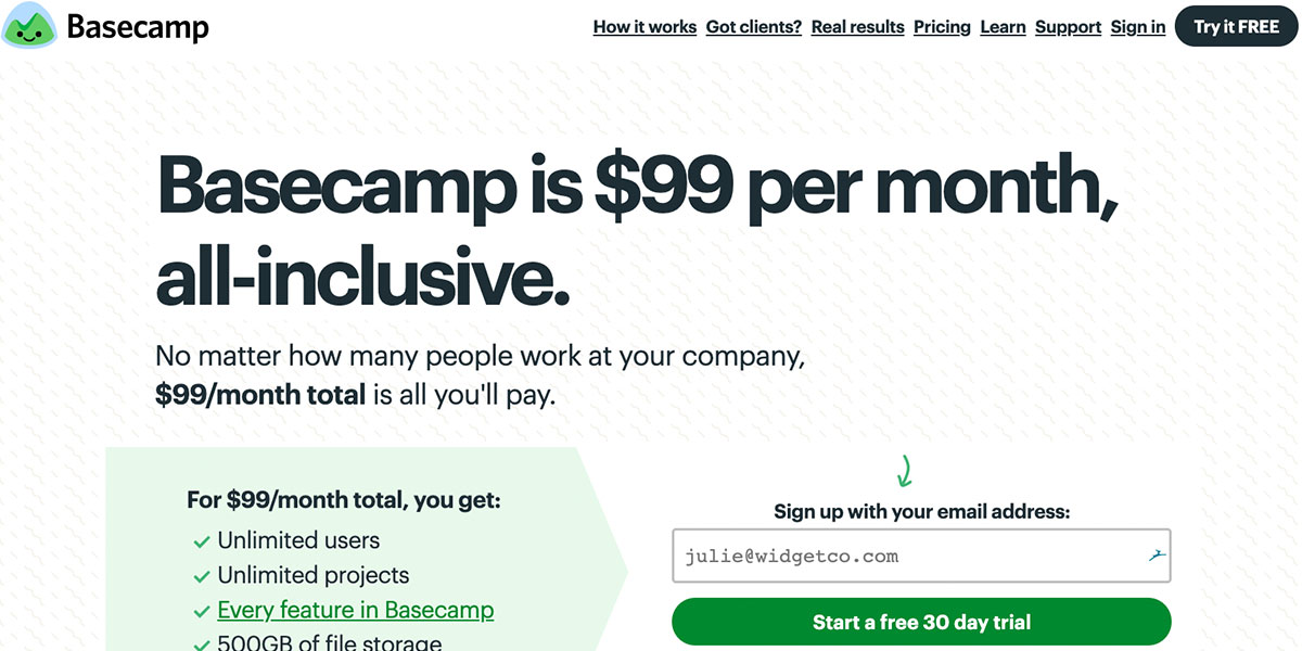
Case Study: 37signals
Basecamp, formally known as 37signals, provides project management and collaboration tools to both large and small businesses. Back when the company was still known as 37signals, the co-founder, Jason Fried, wanted to optimize conversions. To accomplish this, he sought to tweak the site’s CTAs.
For several years, the company has relied on variations of ‘free trial’ and ‘sign up for a free trial.’ But these CTAs were lackluster. One reason for this may be that Basecamp is primarily B2B, and the person viewing their site may not necessarily be the decision maker.
To address this, they began testing variations of, “See plans and pricing.”
Results
The new CTA increased sign ups by a whopping 200 percent.
Takeaways
Do not rely on the word ‘free’ to prompt prospects to action, particularly if you are B2B. Remember, businesses expect to invest in solutions to increase their bottom line. If you offer a valuable product or service, consider using a CTA that conveys that value.
For B2C, the word ‘free’ in a CTA tends to perform well. But even so, do not be afraid to experiment. After all, just because something is free does not mean there are not other costs associated with trying it.
When a customer is considering several possible solutions, they are more aware of opportunity cost than usual. For instance, consider the working professional who is considering several different project management SaaS solutions. To properly judge each, they will have to sign up for free trials and then learn the ins and outs of each software environment. This will take time. So even though each SaaS offers a free trial, trying each solution is not exactly free.
By taking the focus off of how free your trial is, and instead focusing on why you offer more value, you may just win the day.
In the case of 37signals, there is another reason the switch paid off so well for them.
By switching to, ‘See plans and pricing,’ 37signals signaled to the reader that their landing page was meant for the decision maker, not the low-level employee. The reader was then subtly cued that if they thought 37signals would be a boon to their business, they should kick it up to someone who could pull the trigger. In other words, the change substantially increased conversion because it put the offer in front of the person who could make the purchase decision.
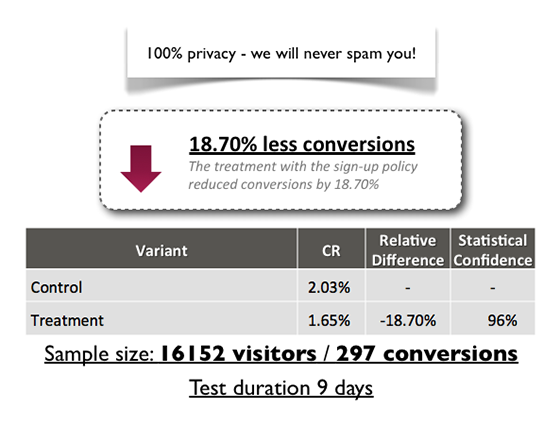
Case Study: A Client’s Payment Page
In this post, Michael Aagaard highlights how changing a single word can have a huge impact. Aagaard changed just one word on a client’s payment page.
Michael says:
“Getting a negative test result is the worst thing that can happen when you perform an A/B test — right?”
While many marketers probably would subscribe to the logic behind this statement, experience from almost 400 split tests tells me otherwise. A negative test result will often give you as much insight and learning as a test that generated a major lift.
Sounds weird? Read the rest of the post, look at some real world examples and find out what the deal is.
Let us see what happened.
Results
The hypothesis was that changing the indirect wording on the page to something more direct—which largely meant using ‘you’ more often—would lead to higher conversion. To his surprise—and dismay—conversions actually fell 25 percent over the trial period.
Takeaways
A/B testing is important, and you should not be afraid to experiment. Indeed, failures can often point you in the right direction if you take the time to conduct an autopsy. Failure can lead to success if you can pinpoint what went wrong.
For the budding entrepreneur or marketer, being forced out of their comfort zone can be a blessing in disguise as it forces them to question their assumptions. The best marketers are like good scientists: they are always asking questions, and they always have a hypothesis to test.
Remember: a test is a success if it gives you insights into how you can optimize your overall funnel.
Free Download
Brand Consistency Checklist
A 27-point checklist to audit your brand across every touchpoint. Used by our team on real client projects.
Success! Check your email for the download link.
Instant PDF download. We'll also send branding tips -- unsubscribe anytime.

CTA Boot Camp
In this section, we will examine how to write a compelling call to action that will spur your prospect to take that all-important next step. When designing a page or creating other marketing materials, never assume that the reader knows what you want them to do. You will always get better results by being clear and succinct.
Below are a few other concepts for your consideration.
Use Them
As mentioned, many novice marketers are afraid to use CTAs. They are afraid they will alienate or annoy the prospect. But consider this: most consumers have been exposed to thousands of CTAs since the early 2000s. If you sell a product, they are expecting to see your CTAs, even on your blog. Your goal is not to minimize the number of CTAs on your site. Your goal is to write effective CTAs.
So, is it okay to have a call to action in every piece of marketing material? Yes. In fact, you want to make sure that your CTA stands out on the page and is highly visible. To get an idea of what a CTA should look like, scan the marketing materials of any established business.
KISS
Keep it simple.
A call to action will work best for you when you keep it simple. A formula for the perfect CTA might look something like this: verb + benefit = CTA. It consists of:
- The verb, or action phrase. This is a word, or group of words, that tells your reader, clearly and in no uncertain terms, what you want them to do. This is not the place to be coy or shy.
- The benefit. This is, of course, what they stand to gain by clicking.
Your CTA does not need to be any more complex than this. If you try to get fancy with it, your conversions will take a hit. Remember Friendbuy and their convoluted CTA?
Wanna see it? Share Friendbuy with friends!
It is kind of…complex, is not it? Worse, it is a bit of a head scratcher. When consumers are reviewing your marketing materials, the last thing you want them to have to do is think.
Write an Appropriate CTA
You should go into every piece of marketing material you create—including blog posts—with a clear idea of what you want the reader to do. For a sales letter, that is fairly obvious. But what about a blog? Well, you can use your blog to build your readership. To do that, you might include a CTA at the end of your post—or in the middle—asking them to sign up for your newsletter. That way, they can stay up to date on your latest content. Note that in blog content you can be a bit wordy, or more conversational, with your CTA. It might look like this:
Hey there, enjoying this post? Did you know that if you sign up for our newsletter, you_‘ll get periodic updates about content like this? Sign up now and never miss a post!_
But if you are writing a CTA for a sales letter, you would want to make it much shorter than this. The length and complexity of your call to action, therefore, depends on context.
Do not Be Coy about the Benefit
Let us take another look at the above CTA, shall we?
Hey there, enjoying this post? Did you know that if you sign up for our newsletter, you_‘ll get periodic updates about content like this? Sign up now and never miss a post!_
Let us remove any verbiage that references the benefits of taking action.
Hey there, enjoying this post? Sign up for our newsletter. Sing up now!
Tonally, it is a bit different, is not it?
Even removing the redundant sign up now, it is a bit…aggressive.
That is not to say that this would not be an effective CTA. It might work for some. But it would turn others off. Consequently, you should always include the benefit—what they stand to gain—in a CTA. Consider the CTA itself a bit of copy. You must persuade the reader to take action. Typically, people will not take action just because we tell them to.
Consider the following:
Click to download this free report on how to save $100 a week on groceries
Call now for a free 15 minute consultation
Reserve your spot in our How to Save Money Webinar
Note the clear delineation between verb and benefit. We might break it down like this:
[Click to download] this (free report on how to save $100 a week on groceries)
[Call now] for a (free 15 minute consultation)
[Reserve your spot] in our (How to Save Money Webinar)
Put another way, you are saying:
[I want you to do this] so you can (get this)
If you follow this formula, using as few words as possible, you cannot go far wrong.
Now let us look at a few CTA types. Note the use of urgency.
- Free gift. The first 100 people to order will receive a free gift! Order now before they_‘re all gone!_
- Free Trial. Sign up by August 30th to qualify for our special extended 90-day free trial!
- Price increase. Our prices are going up March 1st! Come in today to take advantage of our lower prices while they last!
- Discount deadline. Order by this weekend to receive 10% off your order!

Where to Place Them
In general, you should add CTAs in as many places as you can, without being obnoxious. You can use a heatmap tool like Crazyegg to test your CTAs. If users are avoiding those areas of the page, you may be using too many.
Here is the secret, though: the more value you provide your visitors, the more marketing they will tolerate from you. Therefore, if your blog content is genuinely helpful, you should feel fine about using CTAs.
Blogs
Blog posts are amazing CTA real estate. The person reading your blog has already indicated—just by being there—that they are interested in your industry or niche. Placing a relevant CTA in your post that promotes a content offer, such as an eBook or white paper, only makes sense. It is important, of course, that the supplement be relevant to your blog. The more targeted the offer is to that exact blog post, in fact, the better your CTA will perform.
CTAs you place at the bottom of a post are especially effective because, presumably, the prospect read the entire blog post and is therefore likely receptive. But, as mentioned, you can also place a call to action in the middle of a post.
The Sidebar
The sidebar is an excellent place to put your more generic CTAs. These CTAs should promote your business as a whole, or a specific product or service. That way, you can display these CTAs site-wide, and if someone looks, and is interested, you have just used your blog to create a lead.
The Homepage
Your homepage is another good place to place CTAs promoting generic content offers, such as white papers or eBooks.
So, if you had a business selling garden gnomes, you might have a generic eBook about gardening tips that you promote on your homepage. Then you might have several blog posts on, say, the history of garden gnomes. On those pages, you would promote your free garden gnome eBook—and of course, in that eBook, you would go into much more depth about the history of garden gnomes than you do in the posts. In exchange for learning more about garden gnomes, you get their email.
This is how you use your site to build trust. Trust leads to conversions.

CTAs and the Funnel
You have learned what CTAs are, why they are effective and how to write them. Now you will find out which CTAs to use in every state of the funnel. In general, you_‘ll want to ensure that the action you are asking the prospect to take is aligned with where they are in the buyer’s journey._ For instance, let us assume your visitor is on a page that showcases your various case studies. You can make a few assumptions:
- Someone who visits this page is likely interested in how your product compares to others
- They are probably interested in more information about your product
You can assume that visitors to this page are likely in the middle of your funnel. Therefore, you should use a CTA that is focused on getting them to engage with your product in some way. You might offer them a free trial or a demo, for instance.
Many, many new marketers get this wrong by offering a generic CTA or a CTA that is inappropriate. For instance, you would not give this middle-of-the-funnel prospect a CTA that leads them back to your blog content. Nor would you give a top-of-the-funnel a CTA that asks them to buy.
Always ensure that your CTA is relevant to the stage of the sales funnel its applied to. This way, your CTA always aligns with the user’s intent.
What is more, you should carefully consider where you are directing the reader to. For instance, a CTA that leads to a Contact Us page will not be very effective in generating new leads. But if you send that traffic to a dedicated landing page that offers content for download, such as an eBook, you will see a better result. Why? Because the former is just a static page, but the latter is a resource with which you can demonstrate your expertise. Naturally, you would want to include a CTA at the end of the eBook prompting the prospect to contact you for a consultation.
Similarly, you would never place a CTA for a product demo at the bottom of a blog post if that blog post is providing general, top-of-funnel content. Instead, you would place the CTA for the product demo on your bottom-of-funnel content only.
Let us look at each stage one-by-one.
The Top of the Funnel
Remember that the top of the funnel is the awareness stage. Prospects at the top of the funnel are not looking into your solution yet. They are merely aware that they need a solution. At this stage, they are looking for general information. They have come to your blog because you provide that in a quality they find acceptable. You are not there to push or promote your product. You are there to build trust.
Your job is to capture their attention and to build authority. Your CTAs at this stage should be centered around getting them to consume even more of your content. You can use CTAs here to gain referral and organic traffic by cross-pollinating your posts. For instance, you might include a CTA at the bottom of a post that links to a related post.
You can also promote your eBooks, white papers, reports and infographics in top-of-funnel CTAs. Such CTAs might look something like this:
- Click to get your free eBook!
- Download our handy dandy checklist!
Remember, do not jump the gun. The idea at this stage is to build trust by demonstrating authority. The prospect at this stage will not be receptive to a hard sell.
You can also include CTAs that promote interaction, such as:
- What do you think? Let us know in the comments section below!
- Did we miss anything? Let us know!
The Middle of the Funnel
At this stage, the prospect is aware of your offering, but they are evaluating multiple solutions. They are committed to finding a solution, but they do not feel any particular loyalty to you, even if they recognize that you are an authority. Your goal here is to continue to educate while at the same time positioning your product in the best possible light. To that end, your CTAs should lead to things like:
- White papers that compare your products to similar products in a favorable light
- Expert guides
- Webinars
To get the most out of middle-of-the-funnel CTAs, you will want to create dedicated landing pages for them. This serves as a filter. The people who are not truly ready to learn more about your product will bounce. Yet those who are will stay, and they are more likely to be receptive to your landing page content. This content would be, of course, a bit of copy that highlights the benefits of the guide, webinar or white paper on offer.
This is your chance to give the prospect a reason to forget about your competitors.
The Bottom of the Funnel
Prospects at the bottom of the funnel are ready to buy, and they are seriously considering your solution—or, at least, that is the hope. The benefit of moving prospects through the funnel in this way, and in aligning your CTAs to reflect this progression, is that nurtured leads outperform non-nurtured leads.
So, if your prospect consumed your top-of-funnel content and followed CTAs that led them to the middle of the funnel, they will be much more likely to convert than someone who did not go through this process. Most of the hard work is done at this point. Now, you want to link to content and resources that will prompt your prospect to make a purchase. This can be:
- A download of a free trial
- A live demo
- Product literature
- Buyer guides
- Case studies
- Infographics
Here, especially, you want to personalize your CTAs. You have spent time developing a relationship with the prospect, so do not shy away from a CTA like, Get your membership access now!
Or, Start your free trial today!
Or, Request your live demo now!
A bit of personalization here allows you to draw on the trust and authority you have built up to this point.
Review
Top-of-the-funnel CTAs should lead to resources that build credibility and demonstrate authority.
Middle-of-the-funnel CTAs should lead to dedicated landing pages that get your prospect to interact with your product and/or focus on you instead of the competition
Bottom-of-the-funnel CTAs should ask for the sale.
Summary
You now understand how the concept of the CTA relates to the funnel, and you should have a stronger understanding of how to use CTAs in each section of the funnel itself. In addition, you have learned a few best practices for writing effective CTAs. Finally, you know the importance of using succinct language and of highlighting benefits.
Stay tuned for the next post, where you will learn how to build an effective landing page for each stage of the funnel!

Mash Bonigala
Creative Director & Brand Strategist
With 25+ years of building brands all around the world, Mash brings a keen insight and strategic thought process to the science of brand building. He has created brand strategies and competitive positioning stories that translate into powerful and stunning visual identities for all sizes of companies.
Featured Work
See Our Work in Action
Real brands, real results. Explore how we've helped businesses transform their identity.
Client Love
What Our Clients Say
Don't just take our word for it. Hear from the brands we've worked with.

Christian Nocera
Dapper Yankee
"Delighted to have used Spellbrand for our last project. The work was thorough and results excellent. For me it was such a pleasure to work with Mash who was able to keep up with all my last minute requests for small changes. Nothing was too much of a problem and I would have to say that its great to work with people who do actually put the customer needs first! One thing saying it, its another thing doing it – Thanks Mash!"

Jenny Richard
Woods Of Fairfax
"Working with the team at Spellbrand has been fantastic! I spent time researching companies that would help me build brands for each asset that are all in different locations and more specifically build a brand that could help tell each of their unique stories. Spellbrand did just that. The process was easy. To provide them with my initial thoughts through a nicely-outlined input form they sent to me and they took that information and created a number of awesome designs. I was able to incorporate "the story" easily with a design we selected. I'm excited to get it into action and see what's in store for the next project. Also, each person I worked with has been super responsive, knowledgeable, and awesome to work with! Kudos to Mash, Mike, and Eva! I really enjoy working with you!"
Related Services You Might Love
Based on what you just read, here are services that can help you achieve similar results for your brand.
Free Download
Brand Strategy Canvas
Map your brand positioning, audience, messaging, and competitive advantage on a single page. Fillable template.
Success! Check your email for the download link.
Instant PDF download. We'll also send branding tips -- unsubscribe anytime.
Keep Reading
Related Articles

Mar 15, 2023
Brand Immersion Marketing: How to Create Sticky Brands...
Learn how brand immersion marketing creates non-interruptive customer experiences. Expert strategies and insights to help your business succeed.
Read More
Oct 24, 2022
How To Market Your Beauty Salon on Social Media
Marketing a beauty salon is quite challenging. In this post I write about strategies that help to not only market your salon but take it to the next level.
Read More
Sep 23, 2022
How To Stand Out From The Competition
How do you, as an emerging brand, differentiate yourself? The advent of the Internet and social media means it’s no longer enough to have the best.
Read More