Spellbrand Blog
Powerful Visual Branding Tactics

In our latest series, we’re diving deep into the world of visual branding. Our first post in this series looks at some of the psychological aspects of visual branding and how you can use human neurology to your advantage. While everyone is different in how they perceive the world, it’s true that we all tend to have similar preferences on design elements. The good news: it’s easy to understand these innate preferences. Then you can create stunning messaging that will consistently net you more views, shares, and sales.
In this post, we cover:
• The key elements of effective, appealing visual branding—skimp on any of these at your own peril
• The psychology of color
• How math impacts design preferences
• How to use fonts to naturally appeal to a wide audience
Ready to learn more? Let’s get started.
Why Visual Branding is Vital to the Success of Your Business
Visual branding consists of many design elements, such as:
• Media or format
• Shapes
• Fonts
• Functionality
• Color
Used together, and with intention, these elements can help you forge an emotional connection with your audience. This is extremely useful when you want to establish a new brand, rebrand or strengthen an existing brand. Understanding how these elements work together can take you to the next level. Disharmony between these elements, on the other hand, can leave your visitors and customers with a bad impression.
Remember: visual branding is what conveys your values and personality to your target audience.
To stand out from your competitors, you should be:
• Consistent. Your visual branding should be present and evident in everything you do, from your website design to your logo design. You should strive for consistency in these elements at all times and across all media. Starbucks is a good example of a company that has consistent messaging.
• Attractive. Sleek or functional design makes people want to interact with your content to learn more. Look no further than Apple for a good example of attractive visual branding.
• Unique. Your messaging should speak to who you are. As such, it shouldn’t be hard to make it unique. Nike is adept at creating messaging that stands out and demands attention.
• Memorable. One way to think of a brand is as the mental real estate that you take up in your customer’s head. Therefore, good messaging is memorable. Amazon is a great example of a company with memorable messaging.

Read the case study of Kinnison Choral Music – our client for whom we created stunning visual branding.
The Psychology of Effective Visual Branding
As you’ll see in the next section, there are many aspects of visual branding that affect us on a subconscious level. From symmetry to color choice, you can and should make conscious design decisions during the brand creation process. These decisions will, over time, steer you toward your visual branding goals.
When you master these branding techniques, your customer won’t know quite why they’re being so trusting. Heck, they may not even realize they’ve decided to trust you. But trust you they will. This is because you’ve taken advantage of how the human mind operates. If you color within the lines, so to speak, you can be confident of your success.
Here are some quick tips:
• Focus on faces. If in doubt, including a face in your marketing materials is a good idea. Many studies indicate that a human being is more likely to be drawn to material that displays another person’s face. A face is familiar, and another person’s eyes draw the reader in.
• Use screenshots. Screenshots convey to the reader that you’re serious about helping them. In all materials where you’re trying to demonstrate a process, such as a how-to, always include screenshots. A screenshot that demonstrates a process is more user-friendly than written instructions.
• Focus on the foreground. When creating images, favor the foreground over the background. Blur the background when it makes sense to do so. Or use bokeh to focus attention. Make sure that whatever is in the foreground is something that the viewer will relate to or find interesting.
• Leverage illustration. The cartoon is a non-intimidating way to convey information or provide humor. Never be afraid to employ cartoons in your messaging, but don’t overdo this medium, either.
Here’s a Brand Story to Study….
Airbnb ditched its older, fluffy blue logo for a more mature red one. The change signaled to consumers that the concept had legs and that the company wasn’t going anywhere. Also, the new logo made the company appear more serious. This was important at the time since they were facing legal issues.
Now, let’s turn our attention to specific strategies you can use to better draw in your potential customers.
#1 Embrace Math
Our hunter-gatherer ancestors had one overriding goal: live for as long as possible. Aiding them in that goal was a powerful and complex brain the likes of which the world had never seen before. One thing that brain does especially well is to scan its environment.
What, pray tell, is the brain looking for?
Well, much of that processing power goes into scanning the environment for threats. But some of it goes into unconscious analysis of people and the objects around us. You see, everything from what we find beautiful to who we find attractive comes down to math. What’s more, our brain does this math behind the scenes all day.
The brain finds certain patterns attractive. At the most basic level, the brain looks for symmetry. Researchers have long known that the most attractive people have high facial symmetry, for instance. Presumably, people gravitate toward more symmetrical partners because this symmetry conveys genetic fitness.
In the world around us, we also prefer symmetry. This is evident in our architecture. But we tend to take symmetry in architecture for granted. Often, the front entrance to a public building is a grand affair, featuring double doors. But if you think about it, a single, small door would suffice, would it not?
This desire for order is inherent in all of us, and it comes down to pattern recognition. We seek patterns in nature because patterns often mean safety, food or shelter. Once you understand this bias for patterns, you can use it to your advantage. These patterns are known as math sequences.
Baking symmetry into your visual branding comes down to providing balance and proportionality. Using symmetry in your ads, case studies, blog posts and other communications can give you an easy way to increase your appeal. If your messages are more symmetrical—aka, better balanced—than those of your competitors’, users will gravitate toward your website.
There are two types of symmetry you want to focus on.

You can see bilateral symmetry in the above Wine label branding that we created for one of our clients.
Bilateral Symmetry
This is the simplest type of symmetry. With this type of symmetry, the blog post, ad or another type of media is divided, providing two equal halves. Advertisers also refer to this as mirroring or reflection. With bilateral symmetry, you give yourself a nice, clean canvas onto which you can place information. As you might imagine, many memes and infographics take advantage of this type of symmetry.
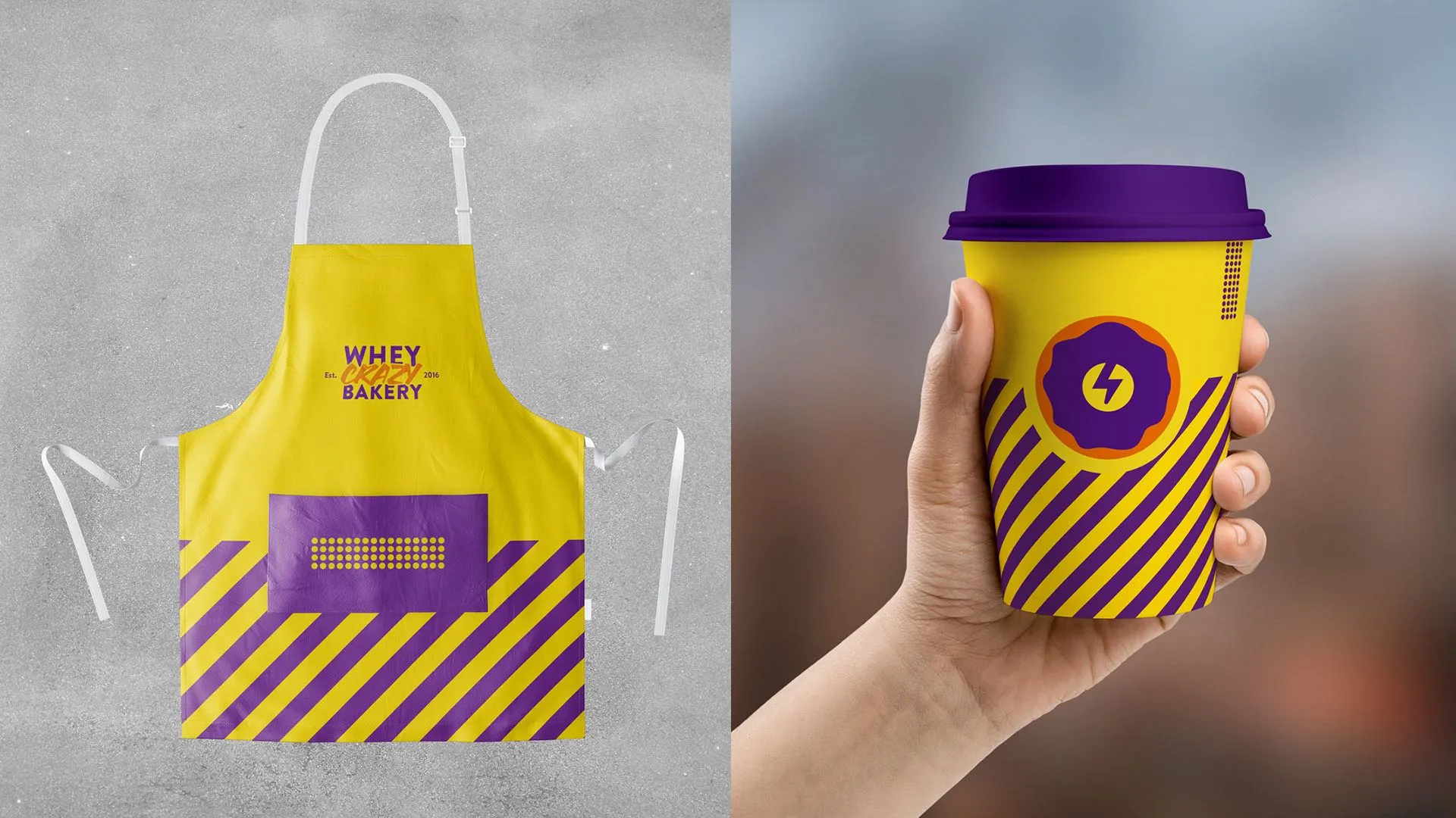
You can see how we created rotational symmetry for our protein bakery client during the brand identity development.
Rotational Symmetry
Rotational symmetry is a bit trickier to get right. But it can provide a calming psychological effect. Materials that utilize rotational symmetry contain objects like stars, dart boards, and other symmetrical objects. These draw the eye and focus the reader’s attention. But don’t overdo it.
There are two other types of math sequences you should know about.

The Fibonacci Sequence
Consider the following sequence:
0, 1, 1, 2, 3, 5, 8, 13….
The above set of numbers is an example of a Fibonacci sequence. The defining characteristic of such a sequence is that the next number in the series is the sum of the previous two. So after 13, we’d have 21. When expressed graphically, the Fibonacci sequence is very, very pleasing to the eye. It tends to create smooth arches and lines often found in nature.
For instance, the following all exhibit the Fibonacci sequence:
• The number of petals on flowers. Some flowers have three, some have five and others have eight. These are all Fibonacci numbers.
• Seashells. The segmenting of many seashells follows a Fibonacci sequence.
• Pine cones. The spacing of seed pods in pine cones follows a Fibonacci sequence.
So, to get a better idea of how to incorporate Fibonacci into your design elements, check out these sources of inspiration from nature.

The Golden Ratio
Eight divided by five is 1.6.
Five divided by three is 1.67.
Three divided by two is 1.5.
Dividing any two sequential Fibonacci numbers gives you what’s known as the golden number, or ratio.
The golden ratio has long been a staple of architecture and design. A quick, devastatingly effective way you can use the golden ratio right now is to make sure all of your images fit it.
To find out if a given image is golden, divide your images’ width by its height. The answer should be 1.618. If not, it should be very, very close to that. If it’s far off, the image is unbalanced. AKA, ugly. Use this trick right now to instantly improve your memes, infographics, and images.
Say you know the height of your image is 355 pixels. To instantly find out what the width should be, divide this by 1.618. This gives you 566 pixels. This is a ‘golden’ image, and it will appeal to your visitor on a fundamental, subconscious level.
Remember: people naturally prefer images that follow the golden ratio.

The Rule of Thirds
There’s one more way you can use math to your advantage here. In an image manipulation program, divide your image into thirds. Now, look at your design elements. If anything is off-kilter, that will be off-putting to your viewers.
For instance, if your visual element contains a face, don’t have the face hanging out in dead space. It should fall on one of the third lines. This provides a natural balance that is pleasing to the eye.

#2 Use Color to your Advantage
Many marketers underestimate how much color influences our emotions. And guess what? Anything that impacts our feelings influences our actions, too.
Color is powerful.
You can use color in one of two ways:
• Intentionally. Use color to your advantage by using it consciously. Trigger users to take the action you want them to take.
• Unconsciously. Use colors that ‘feel good’ to you regardless of their psychological impact. This introduces an element of chaos and will render your results unpredictable.
Clearly, it’s usually better to use color intentionally.
The Importance of Color Balance
Orange is the opposite of blue.
Red is the opposite of green.
Purple is the opposite of yellow.
When creating marketing materials or settling on your color palette keep these opposites in mind. In general, using a color’s opposite is a good idea. But balance is essential.
So if your logo contains the colors blue and orange as its primaries, you’d want your image to be around 70% blue and 30% orange.
Keeping the secondary color to around 30% gives your eye a nice visual break from all that blue. This creates a calming effect that your customers will love. They’ll find something very pleasing about your color balance, even if they can’t articulate why.
Of course, you need not use this trick only on your logo. Use it in all aspects of your visual branding. You can use it on or in:
• Case studies
• Blog posts
• Ads
• General website design
• Memes
• Infographics
• Images on blog posts
Color Palette
It’s best to nail down your color palette early on and then be consistent with it. When the color palette is well calibrated to a given business, the chosen colors are doing double duty. They are:
• Providing certain emotional cues. Many banks use the color blue in their branding. This is not a coincidence. Blue promotes feelings of calm, serenity, and confidence. By choosing your primary color intentionally, you can tell customers how they should feel about your business.
• Building brand recognition. Over time, your logo and other brand elements anchor your brand in the customer’s mind. If change your logo often you throw this brand recognition away.
Filters
When using filters on images, take care. Image editors like Photoshop and Gimp provide a bevy of filters and effects like blur and bokeh. But just because those tools are there doesn’t mean you have to use them. In fact, they’re often best avoided unless you have a specific use case in mind.
If you do use them, use them consistently.
This will provide your entire site with a sense of style. Over time, this will contribute to your brand visual identity.

Check out the power of fonts and how they can be utilized to create an impact as we did for our organic chocolate client when we created their branding. You can see a completely different visual branding of another chocolate company logo that we created for another client.
#3 Leverage the Power of Fonts
Steve Jobs was a big fan of neat fonts. This isn’t too surprising given that he studied them in college. Jobs was in love with calligraphy, and much of his calligraphy knowledge went into the Apple OS. What did Jobs know that everyone else was missing?
He understood that fonts convey emotion too.
Don’t believe us? Open a word processor and type the following:
I am an expert.
Now change the font to Comic Sans.
When you view the above sentence in Comic Sans, do you feel more or less confident?
Your font, whether you like it or not, says a lot about your brand. What is your font saying about you? Comic Sans might not be a disaster font for, say, an online gag gift shop. But for a bank? Yikes. You see, everything is contextual.
Do a font audit on all your customer-facing materials and make sure that your fonts are conveying the right message about you. While you’re at it, find out how many fonts you’re using site-wide. A good rule of thumb is to limit yourself to three. Any more than that and you risk distracting your reader.
Remember: the fonts you use should reflect your brand’s personality.
Keep Shape & Size in Mind
As we’ve seen, the mind reacts to many things on a subconscious level—shape and size included. A stellar logo designer knows this, and she’ll use edges, lines, circles, and curves intentionally. Her design will imply certain values to the viewer based on the shapes she chooses to use.
Combined with color, this can be powerful.
Unfortunately, there’s no magic pill you can take that will allow you to instantly understand these shape dynamics. This is why professional logos cost big bucks —sometimes millions.
In general, try to be harmonious. For instance, it’s rare to see a well-designed logo that uses both sharp edges and curves in equal measure. This is unpleasing to the eye. Worse, it can induce a feeling of unease in viewers.
Above, we cautioned against using more than three font types. Here, we’ll caution against using more than three font sizes. The brain finds it difficult to parse more than three font sizes at once.
So if you use many font sizes in your blog posts, memes, images, or infographics and have been bleeding visitors, this is probably why. Discipline yourself to stick to no more than three. Two is better.
Of course, you can apply the same logic to logo design elements. Keep elements similar in size. If you do need to vary things up, try to maintain a ratio. For instance, an element should be half as big as another or twice as large. But don’t make them different sizes arbitrarily. All of your design choices should be deliberate.
#4 Don’t Rely on One Type of Content
Your visual branding is a many-splendored thing. Don’t paint yourself into a corner. Don’t use one type of content as a crutch. A common trait of the stagnant brand is that they rely on one type of content in particular to carry their message.
Some brands are great at blogging. Others do infographics well. But the best brands master all these media types. Don’t take that to mean you have to master them yourself, though. Budget permitting, take on experts who can help you express yourself in new ways. Your audience will thank you for it.
There are a few image types you want to create consistently and at a high level. These are:
• Images. Posts with images generate almost twice the engagement as posts without images. Remember to include faces, too. If you don’t like using dedicated image editors, there are several light-weight browser image editors for both Firefox and Chrome. With these plugins, you can do everything from change color balance to make collages.
• Infographics. Infographics, when done properly, convey a fair amount of information without causing information overload. If you’re inexperienced, it’s best to hire someone to create these for you. If you’re good at converting visitors into revenue, you can easily recoup the cost. Infographics lead to visitors. Period.
• Memes. A meme is an image that’s accompanied by a humorous or witty caption. Memes are a reliable way to help your content go viral. But there’s a trick to using them: They need to make sense within the context of the post. Don’t create a meme if it doesn’t somehow relate to the post you’re using it in. An out of place meme will stand out, and not in a good way.
• Video. Videos are expensive, but they’re deadly effective. People love to share quality, informative video. And there’s a reason that YouTube is the second largest search engine in the world. You can generate ongoing, organic traffic with video. Posts that embed relevant videos get around 300 percent more backlinks than posts that don’t.
• Presentations. Embedded PDFs and interactive presentations can also be very powerful. These aren’t as gripping as video, but you can use them to convey essential information quickly and easily. Note that this doesn’t mean that you can use them to promote your own products. At least, this shouldn’t be your primary goal. Always strive to provide value when creating content for your site.
A Note on Branding & Images
As mentioned, you want to use all these content types if possible. But it’s important that you brand them consistently. At a minimum, all your content should feature your URL and logo. The exception, of course, is embedded images. But anything that might get picked up by others and shared, such as infographics, should contain your branding.
Here’s a Brand Story to Study….
The online newspaper The Huffington Post saw stellar success in the 2000s. It was so successful, in fact, that it was scooped up by media company AOL in a truly staggering deal. When the founder, Arianna Huffington, left the organization, AOL felt it was time for a visual upgrade. The logo was simplified and given more focus. The name, too, was simplified, changing to Huff Post.
There you have it…several powerful visual branding tactics. In the next post in this series, we’ll look at the psychological impact of color in more detail. Stay tuned!
Featured Work
See Our Work in Action
Real brands, real results. Explore how we've helped businesses transform their identity.
Client Love
What Our Clients Say
Don't just take our word for it. Hear from the brands we've worked with.

Steve Turner
Turn2Coaching
"Delighted to have used Spellbrand for our last project. The work was thorough and results excellent. For me it was such a pleasure to work with Mash who was able to keep up with all my last minute requests for small changes. Nothing was too much of a problem and I would have to say that its great to work with people who do actually put the customer needs first! One thing saying it, its another thing doing it – Thanks Mash!"

Ernest Bannister
M.O.R.E
"My experience with the Spell brand team has been nothing short of excellent. From the beginning Mash and team made me feel very comfortable with the design process. I am extremely happy with the results of my design and look forward to working with Spellbrand; exclusively! I have told many family, friends and peers about the great work the Spellbrand team has done in creating my design. Thanks again for all your patience and professionalism; I look forward to working with you in the future."
Keep Reading
Related Articles

Apr 6, 2025
Expert Brand Building Tactics For 2025
Branding building is defined as what defines a business in the minds of consumers. It’s what sets a brand apart from all others in its space. But how do.
Read More
Apr 2, 2025
Social Media Marketing – The Ultimate Guide
An ultimate guide to creating your social media marketing and includes an explanation of how to use social media as well as how to implement campaigns.
Read More
Jan 2, 2025
How to Align Brand Identity with Customer Perception
How to Align Brand Identity with Customer Perception for Long-term Success
Read More