Sinewave Ventures: Bridging Private and Public Sectors
Situation: Creating Brand Identity for Venture Capital Company Bridging Sectors
SineWave Ventures is a venture capital company that invests alongside the industry’s top venture capital firms in startups where the firm can add value in bridging the private-public sector divide.
They help companies that are looking to provide a service or technology to public sector clients OR need to navigate the public sector for key strategic reasons (seeking non-dilutive financing, managing political and regulatory risk, etc.).
The venture capital market requires brands that communicate expertise, trust, and unique value proposition. Sinewave Ventures needed a brand identity that would visually represent their unique positioning of bridging the private-public sector divide.

Task: Create Iconic Brand Mark Representing Bridge Concept
To help them with their vision and marketing strategy, the client came to Spellbrand. The challenge required:
- Bridge concept: Brand identity that visually represents private-public sector bridge
- Iconic design: Logo design that is clean symbol for smaller, standardized image sizes
- DC and Silicon Valley: Visual identity that represents both markets visually
- Professional appeal: Brand that is modern, professional, subliminally patriotic
Action: Strategic Brand Development
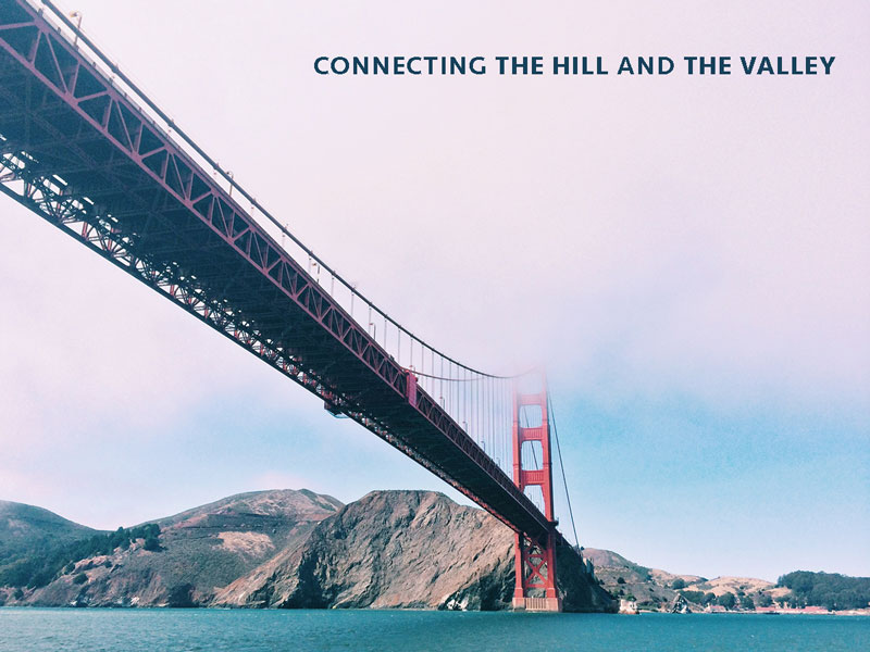
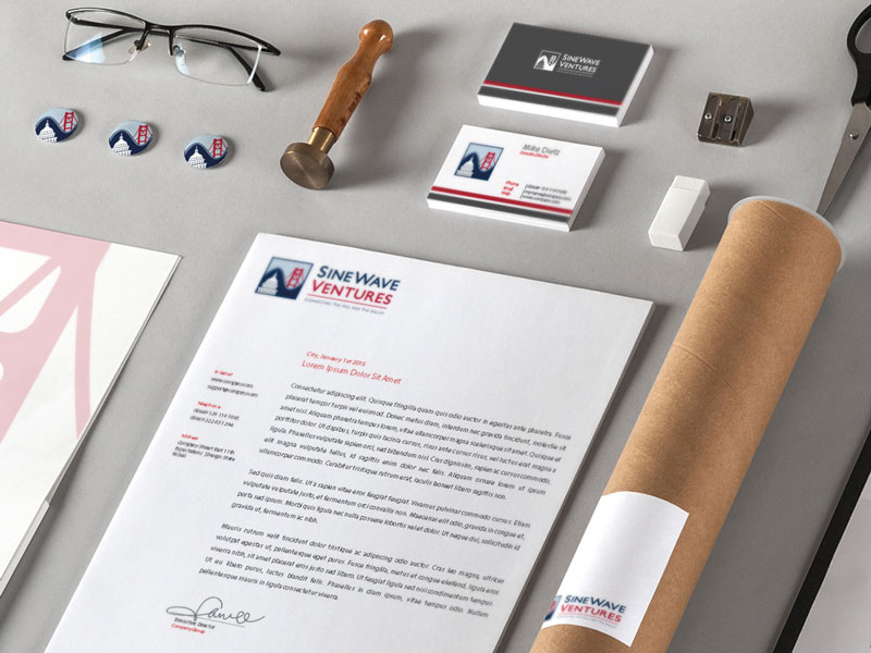
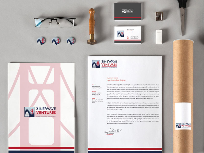
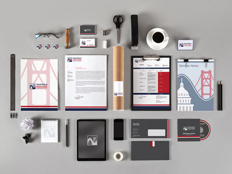
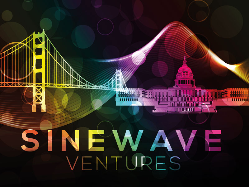
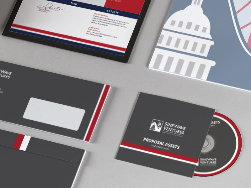
Brand Identity: Golden Gate Bridge and Capitol Hill
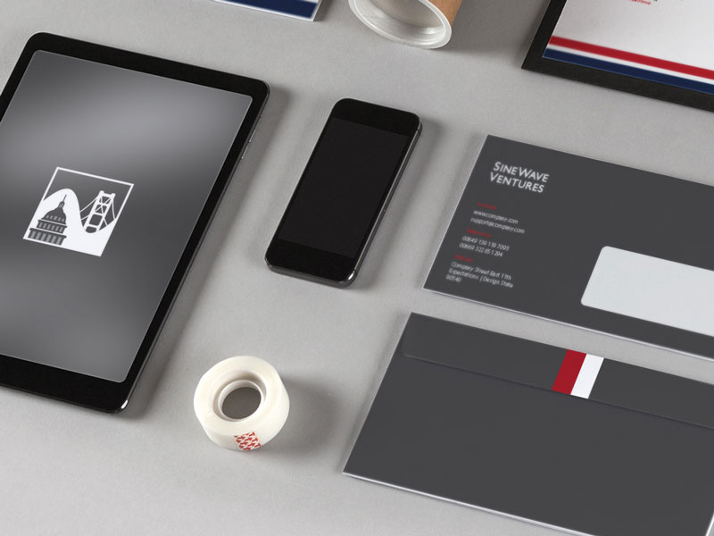
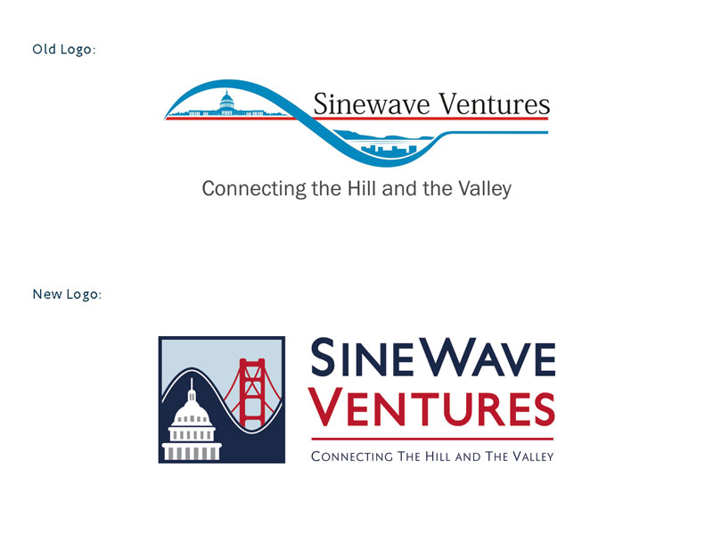
Brand Identity: The client’s previous logo, which is a SineWave curve with pictures of DC and Silicon Valley under each arc respectively. The client wanted to stick with that idea, and for a number of the concepts to be in a similar red, white and blue pattern (without overly patriotic tones). They were looking for a clean symbol that can be displayed where smaller, standardized image size icons are preferable to the long-form as well.
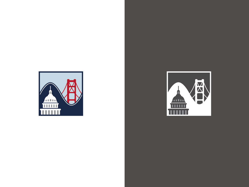
For imagery representing DC and Silicon Valley, the Capitol Building and Golden Gate Bridge were identified to be ideal.
The current logo was too long horizontally and did not have an iconic look and feel to it. Furthermore, the Hill and the Valley concept is not clear. We created a series of iconic designs based on the Golden Gate Bridge and the Capitol Hill building. With refinement and tweaking, we finally arrived at a design that showed the two landmark icons in a simple and contrasting way separated by the Sinewave.
The result is a brand mark that looks modern, professional, and subliminally patriotic.
This design approach:
- Uses iconic landmarks: Golden Gate Bridge and Capitol Hill represent both markets
- Creates visual bridge: Sinewave separation creates visual bridge between private and public sectors
- Shows simple contrast: Two landmarks shown in contrasting way
- Ensures modern professional: Clean, iconic design
- Adds subliminal patriotism: Red, white, blue without being overly patriotic
- Enables versatility: Works in smaller, standardized image sizes
Brand Strategy: Strong and Confident
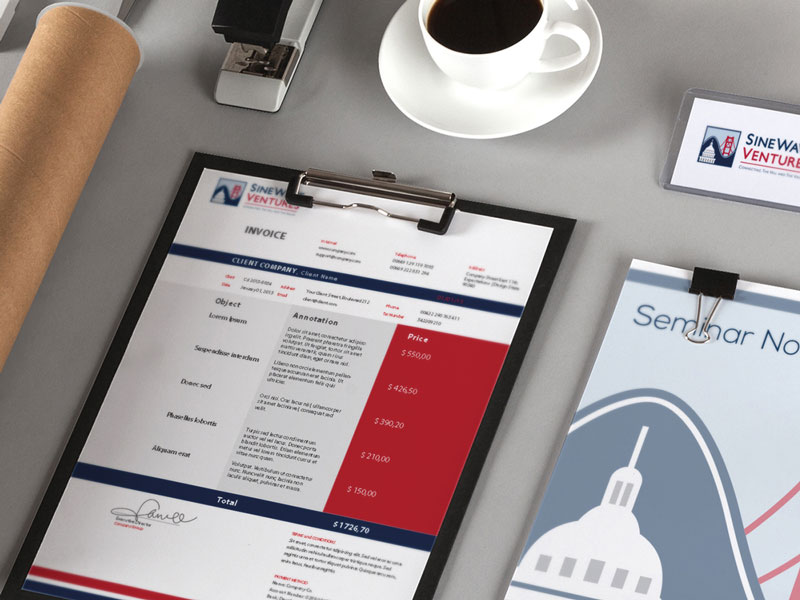
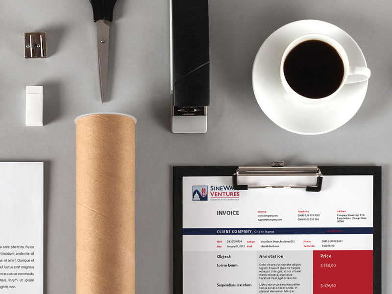
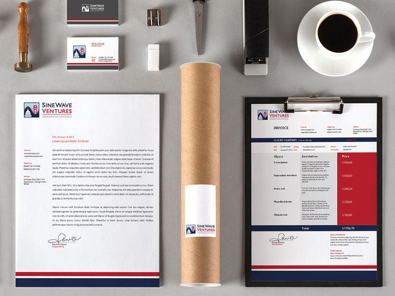
As you can see in the branding shown on this page, this design and the colors are used effectively to establish a consistent look and feel while making sure the brand looks strong and confident. When creating brand identities, it is important to consider layout and composition that use contrast to appear strong.
This strategy:
- Establishes consistent look: Design and colors establish cohesive identity
- Creates strong appearance: Brand looks strong and confident
- Uses contrast: Layout and composition use contrast effectively
- Ensures professional positioning: Modern, professional brand mark
Result: Brand Identity That Bridges Sectors
The brand identity we created for Sinewave Ventures successfully communicates their unique value proposition of bridging the private-public sector divide. The comprehensive brand transformation delivers:
Strategic Outcomes
- Bridge concept: Brand identity successfully visually represents private-public sector bridge
- Iconic design: Logo design successfully creates clean symbol for smaller, standardized image sizes
- DC and Silicon Valley: Visual identity successfully represents both markets visually
- Professional appeal: Brand successfully achieves modern, professional, subliminally patriotic
- Complete brand system: Iconic logo, brand identity system, and visual language create unified experience
Implementation Success
Today, Sinewave Ventures uses this comprehensive brand identity to attract startups that need help navigating the public sector. The iconic logo design with Golden Gate Bridge and Capitol Hill separated by a Sinewave creates a modern, professional, and subliminally patriotic brand mark that works across all applications, from small standardized icons to full brand identity systems. The brand successfully positions Sinewave Ventures as a venture capital company that invests alongside top VC firms in startups where they can add value in bridging the private-public sector divide, helping companies build scalable, successful businesses with the greatest impact possible.
Brand Name Strategy: Creating “Sinewave Ventures”
The name “Sinewave Ventures” was developed through Spellbrand’s strategic brand naming process. Our team researched the competitive landscape, target audience, and brand positioning to create a name that would resonate in the market and support long-term brand growth.
The naming process included linguistic analysis, trademark screening, domain availability verification, and brand storytelling to ensure “Sinewave Ventures” would be distinctive, memorable, and legally protectable. Learn more about our brand naming service or explore our full naming portfolio.