

Fruit5: Disruptive Smoothie Brand for UK Market Launch
Situation: Creating Brand Identity for Disruptive Smoothie Brand
Fruit5 is a company that makes smoothies sold in supermarkets, coffee shops and various other outlets.
Challenge: Create and launch a disruptive smoothie into the UK market initially and then roll it out internationally. This included coming up with a brand strategy and visual branding.
The smoothie market requires brands that communicate health, natural ingredients, and unique positioning. Fruit5 needed a brand identity that would launch a disruptive smoothie into the UK market with plans for international rollout.
Task: Create Brand Strategy and Visual Branding
The challenge required:
- UK market launch: Brand strategy that launches disruptive smoothie in UK market
- International rollout: Brand that enables international rollout after UK launch
- Brand strategy: Complete brand strategy development based on “5 A Day” concept
- Visual branding: Visual branding that stands out with bold, simple, iconic language

Action: Strategic Brand Development
Brand Solution: “5 A Day” Concept
Brand Solution: Fruit5 is a company that makes smoothies sold in supermarkets, coffee shops, and various other outlets. Based on the concept of “5 A Day” which is any of various national campaigns in countries such as the USA, the United Kingdom, and Germany, to encourage the consumption of at least five portions of fruit and vegetables each day.
The Fruit5 smoothies are made of 100% natural and organic ingredients that are grown and sourced locally. With no artificial flavors, preservatives, or additives, the Fruit5 smoothies are healthy alternatives to most smoothies found in the market.
Brand Strategy: Bold, Simple, and Iconic
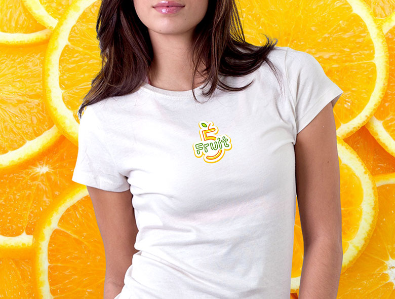
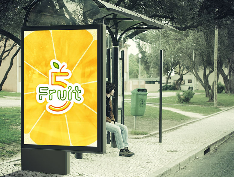
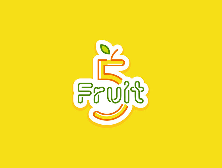
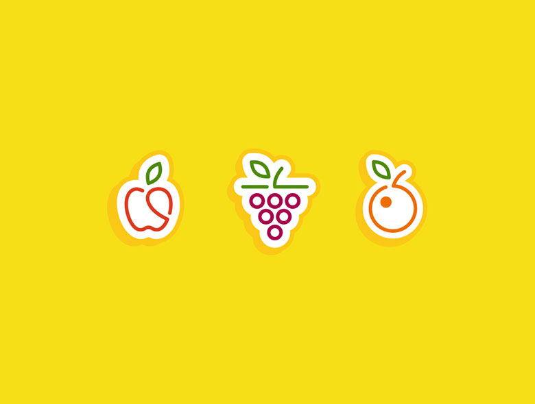
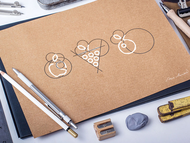
The brand strategy involved creating awareness of the 100% natural and locally sourced ingredients that form the core of the brand. To support that strategy, the visual language had to be bold, simple, and iconic. To facilitate this, we created an iconic logo that looks like it is made from the peels of the fruit. This gives it a very fresh and natural look and feel. We also created a series of secondary icons that would be used on the various flavors of smoothies with simple iconic fruit symbols and color codes.
Result: Disruptive Brand That Stands Out
The brand identity we created for Fruit5 successfully launches a disruptive smoothie brand into the UK market. The comprehensive brand transformation delivers:
Strategic Outcomes
- UK market launch: Brand strategy successfully launches disruptive smoothie in UK market
- International rollout: Brand successfully enables international rollout after UK launch
- Brand strategy: Brand strategy successfully based on “5 A Day” concept
- Visual branding: Visual branding successfully stands out with bold, simple, iconic language
- Complete brand system: Fruit peel logo, secondary icons, and visual language create unified experience
Implementation Success
Today, Fruit5 uses this comprehensive brand identity to attract consumers who want healthy smoothie alternatives. The brand strategy based on “5 A Day” concept, combined with the iconic fruit peel logo design and secondary icons with fruit symbols and color codes, creates a bold, simple, and iconic visual language that creates awareness of 100% natural and locally sourced ingredients. The brand successfully positions Fruit5 as a company that makes smoothies sold in supermarkets, coffee shops, and various other outlets, made of 100% natural and organic ingredients that are grown and sourced locally, with no artificial flavors, preservatives, or additives, creating healthy alternatives to most smoothies found in the market, with plans for international rollout after UK market launch.
Brand Name Strategy: Creating “Fruit5”
The name “Fruit5” was developed through Spellbrand’s strategic brand naming process. Our team researched the competitive landscape, target audience, and brand positioning to create a name that would resonate in the market and support long-term brand growth.
The naming process included linguistic analysis, trademark screening, domain availability verification, and brand storytelling to ensure “Fruit5” would be distinctive, memorable, and legally protectable. Learn more about our brand naming service or explore our full naming portfolio.