Spellbrand Blog
5 Creative UI/UX Design Styles For Brand Success

What is creative UI/UX design?
Creative UI is the art of designing user interfaces in software, applications, websites, and other user touchpoints to give users a great experience. UI is the design of user interfaces to give a great UX, which is user experience design.
Although these acronyms are used interchangeably, great UI enables an awesome UX. For instance, the design of a button on a landing page to prompt the user to take action can be considered user interface design. When a user comes across this button on the landing, the way it is perceived, the impact it had on making the user take action, the way the user feels when they click the button, and then what happens after – essentially the user journey, is considered the user experience or UX.
Designing great UI should take into account interactivity, readability, graphics, and clarity.
Here is a brief list of items to consider when designing UI for a great UX:
- Formatting content – your content should be formatted based on user intent and requirement
- User navigation – clean, simple, and intuitive navigation is the name of the game
- Content organization – organize your content into logical and semantic patterns
- Brand design consistency – make sure your visual branding is consistent
- Underlying technology – choose the right kind of platform for the right kind of website or app
- Page load times – for websites, page load times are one of the biggest issues to contend with
- Number of steps – try and reduce the number of steps required for any action or goal
Here are a few creative UI/UX design and interaction design strategies with examples.
Using Custom Illustrations
To communicate the brand message visually in a fun and friendly way, custom illustrations can be a great UI/UX strategy. Depending on how the illustrations are, they can bring a sense of openness, friendliness, warmth, and trust to the brand message.
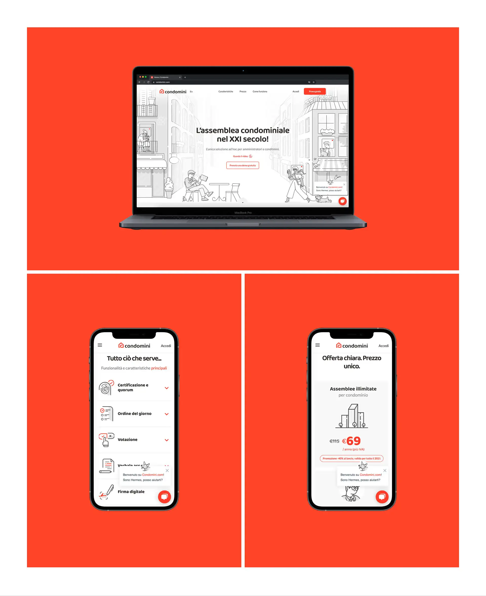
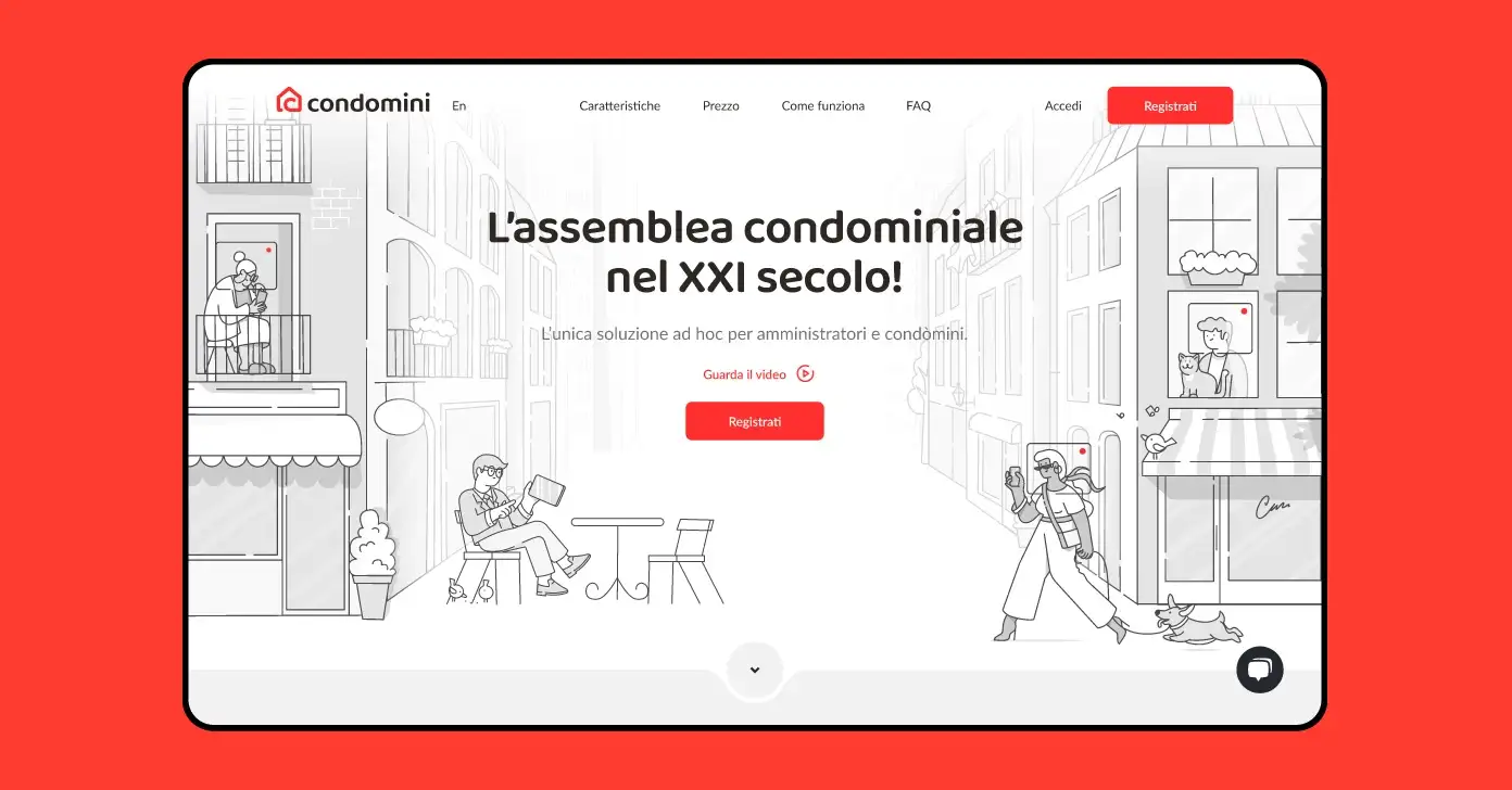
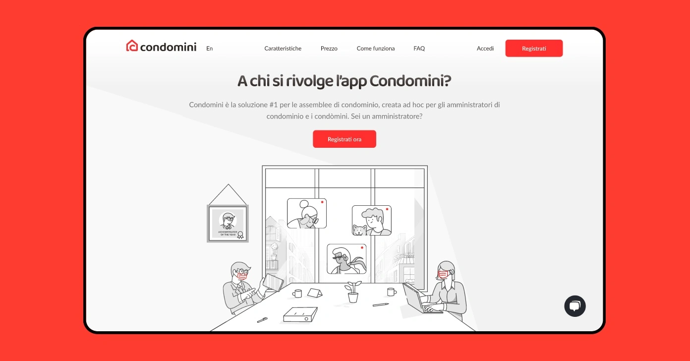
Take the case of a SAS brand called Condomini. Based out of Italy the brand created a platform for managers and tenets of condominiums to communicate with each other and remove the friction that usually exists in such interactions. The platform allows users to create remote meetings, an agenda for the meeting, voting, assisted minutes, digital signatures, videoconferencing, and certification.
To lessen the friction of using a new platform, Condomini used a clean layout and custom illustrations to make the brand and the service seems fun. The visuals look fresh, modern, and very friendly.
Check out their website to see how all this was executed to perfection.
3D Design Elements
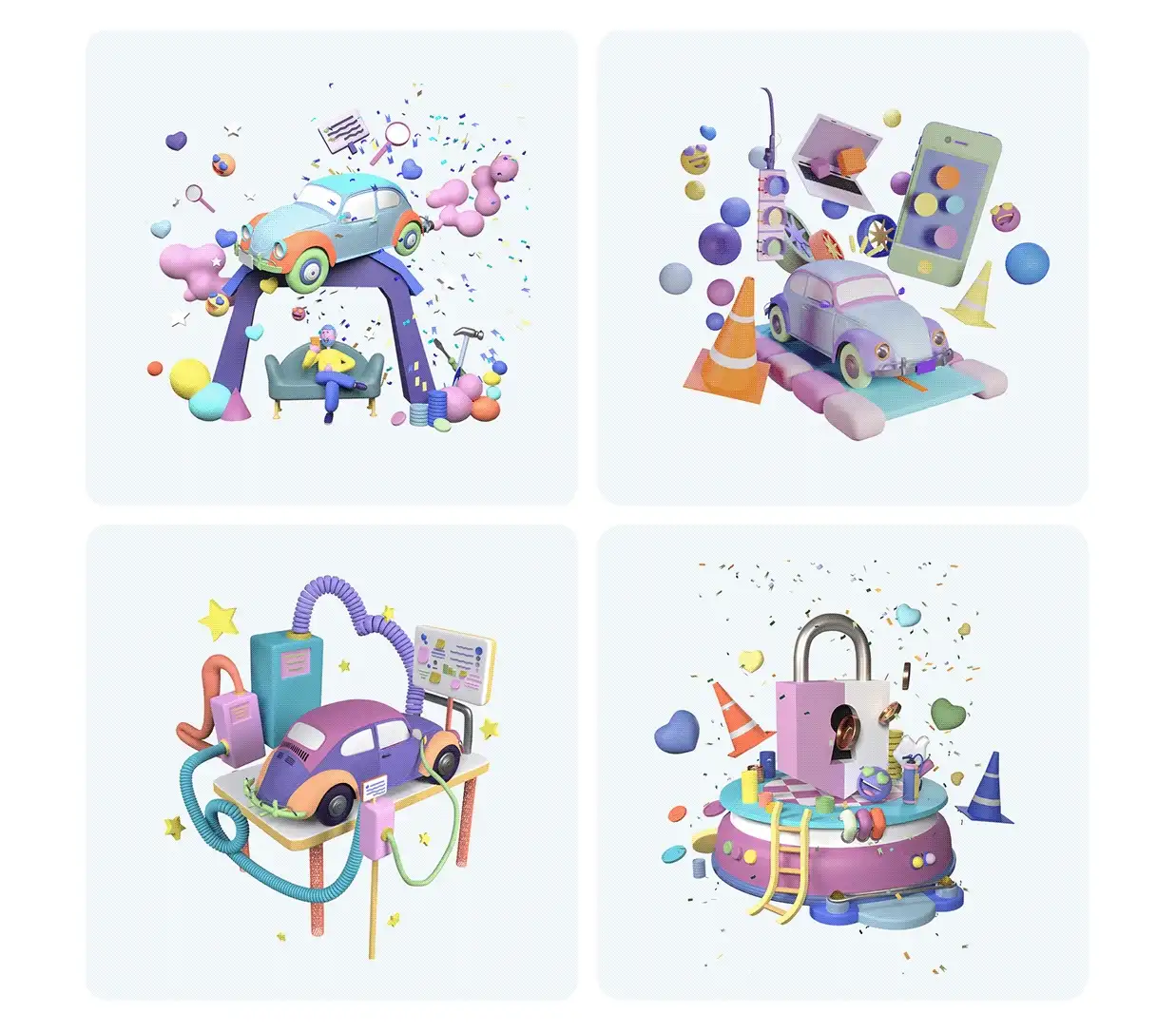
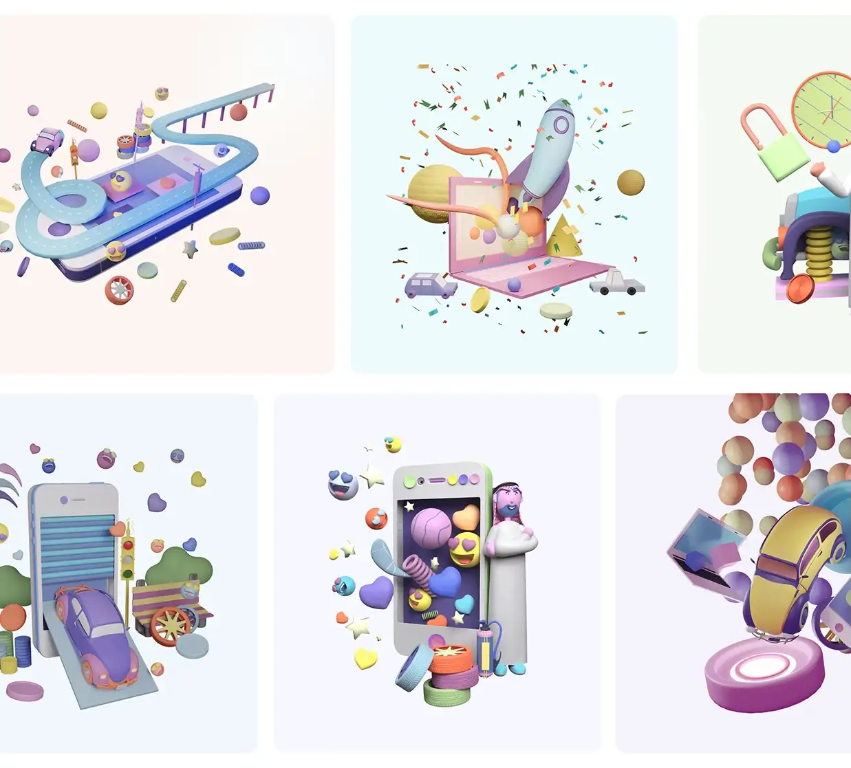
One of the newer trends is the use of 3D models and visuals to communicate fun and pleasing UI. Using fun and friendly-looking 3D models and visuals starts the storytelling on the right foot. Of course, this strategy is not right for every brand or audience.
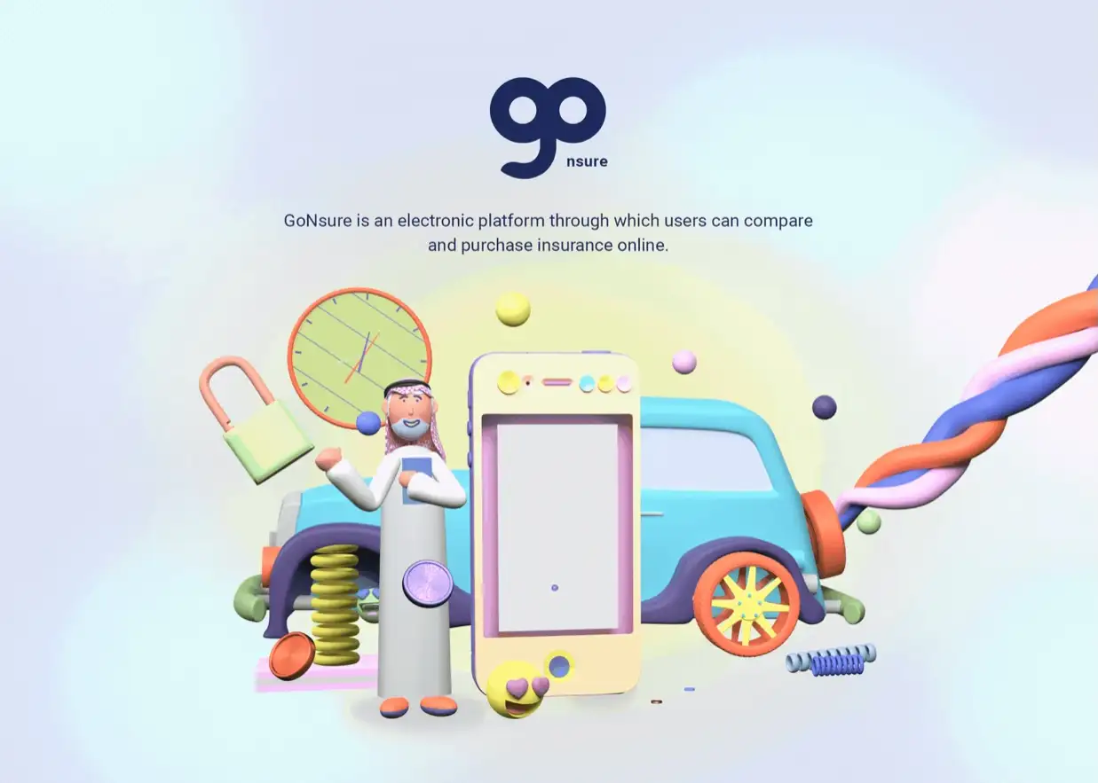
If your market segment or your target audience can relate to the human touch and can find humor in visuals as part of your UI then you can go ahead and create custom 3D characters and other design elements that can then be used judiciously to make the interface of the website or app user friendly and fun. Here are a few more inspiring character design examples.
In the example below, GoNsure is an insurance SAS where users can compare and purchase insurance. In the noisy and highly competitive insurance comparison websites, GoNsure wanted to set themselves apart from the competition while giving their users a great UX. They went with a series of custom 3D characters and design elements.
Dark Themes and Motifs
Clean, minimalistic, and dark UI themes and motifs can be very effective for organizing content and intuitive navigation if done properly. Having great photos or art is essential to making dark theme UI appealing.
Of course, as with all other UI strategies, dark theme design UI style may not be ideal for all brands and all market segments. For instance, schools and educational institutions may struggle with their UX if they implement a dark theme. Of course, there are exceptions to any rule.
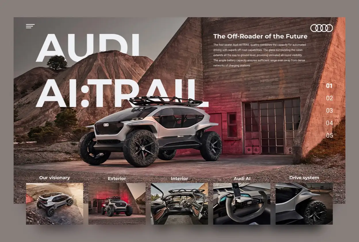
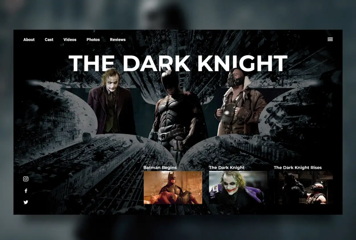
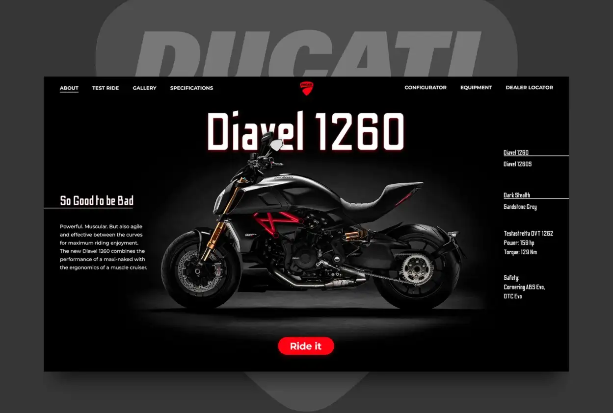
Below we have an example of 3 different dark motif UI designs that really showcase the power of visual appeal as well as ease of use.
The first website for Audi shows a beautiful header with a clean and minimalist header and navigation. On the top right, you see the logo and a description. In the center, you see a beautiful photo slide with some category navigation below that. All this creates a beautiful experience.
Next is the website for the file Dark Knight which again shows minimalistic navigation and header along with stunning photos of the film scenes.
The third example is for the Ducati Diavel 1260 bike with a beautiful center image, clean navigation and powerful branding.
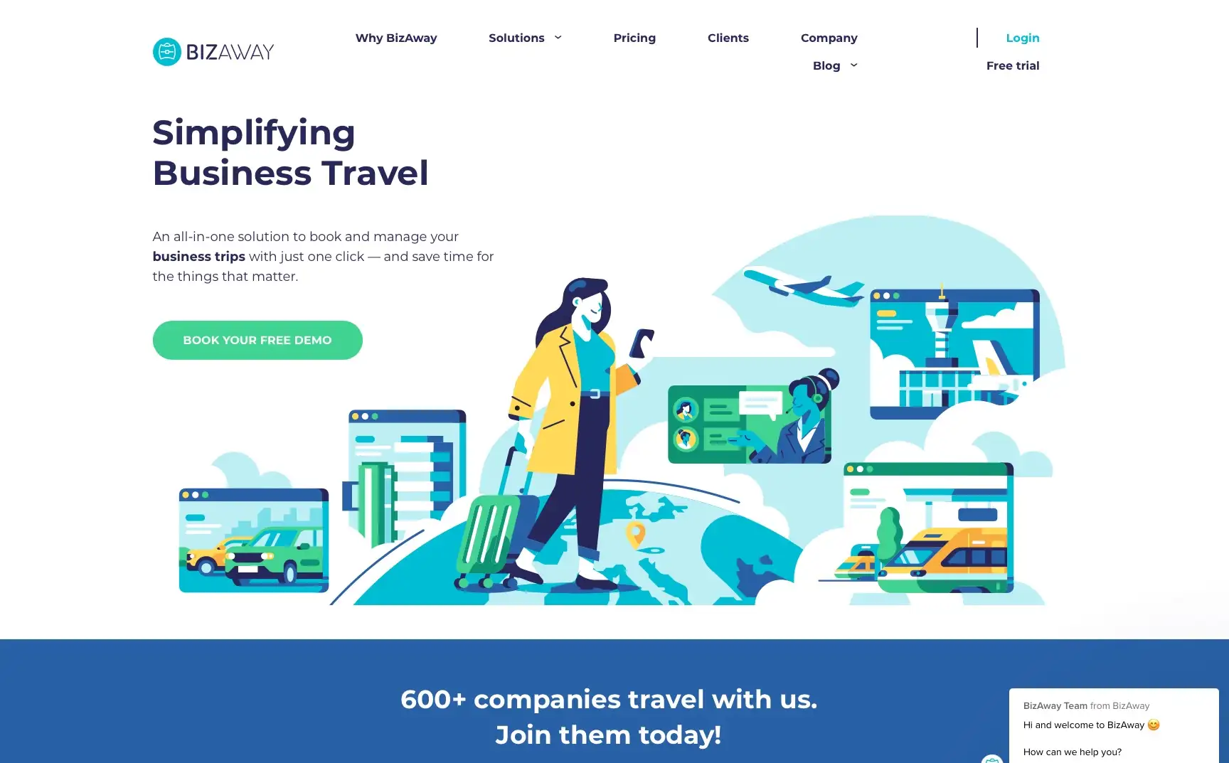
Flat Illustration Design Strategy
One can argue that perhaps the flat illustration is being overused on websites and apps. However, if used properly in UI design, a flat illustration style can enhance the user experience and make the user journey through the website or app a treat.
A very good example is BiZAway, a corporate travel platform that utilizes custom flat illustrations to not only tell the brand story and messaging but also to present the information and content clearly. The design elements lead the user down the funnel in a simple yet effective way. Check out their website to see it in action.
![]()

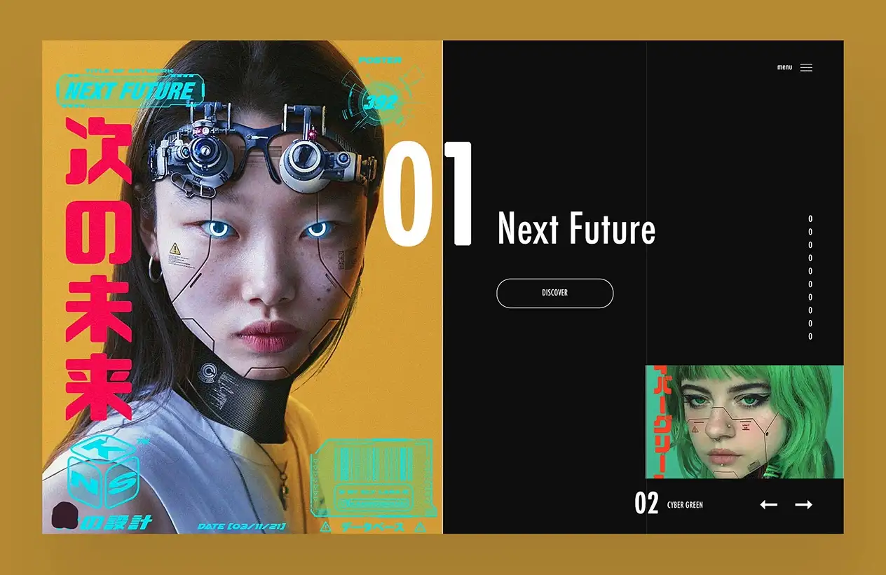
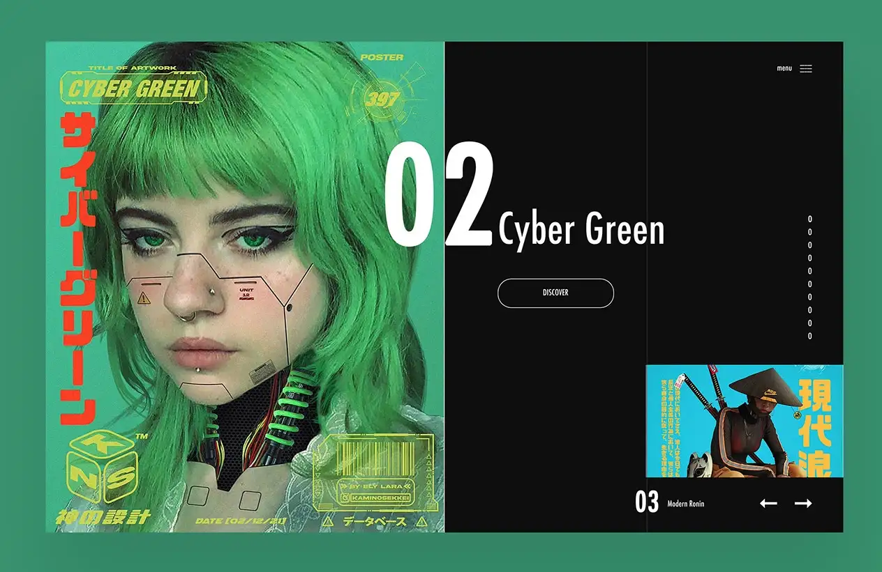
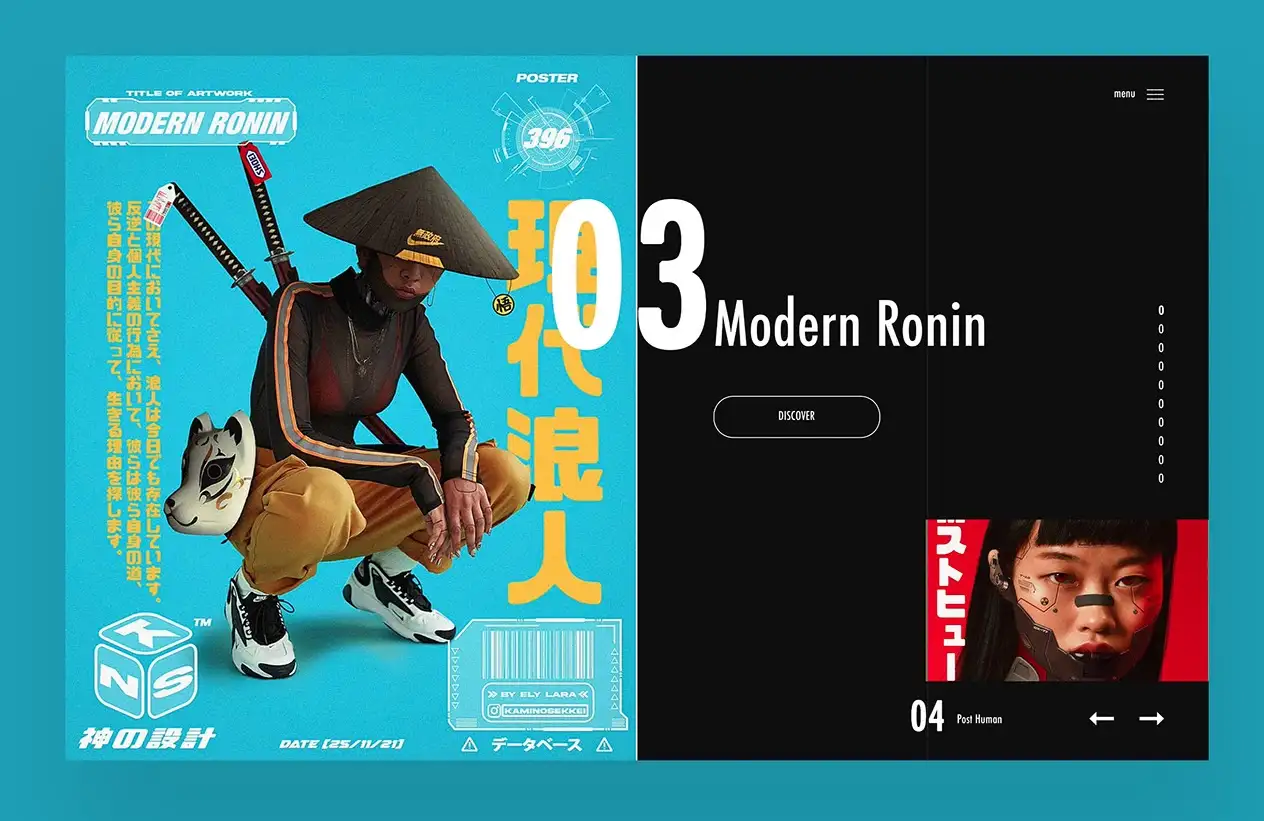
Magazine Style UI
I really like this kind of layout and UI for websites whose audiences are tech-savvy and appreciate futuristic interfaces. Laid out like a magazine and utilizing a similar kind of navigation, this style capitalizes on stunning photos or graphics to form the narrative while keeping the content organized and the audience’s journey flowing.
The example we have here is a beautiful layout and UI for the NextFuture website that utilizes stunning photos of models in cyberpunk themes. The navigation on the side is intuitive and hints at full-screen pages scrolling up just as if you were paging through a magazine.
However, care should be taken in creating such layouts since not everyone would have the latest browser on their computers and some of the older browsers may not render such Javascript-heavy websites properly and in fact, create a terrible UX.
Designing award-winning UI can be daunting and with more people using mobile devices to visit websites than desktops, UI elements such as swipe gestures can play an important part in the creative process and push the skill of the creative teams. It is critical that your agency comes up with a creative direction that serves the audience as a priority. Invest in usability testing or simple user testing to make sure your user interface UI design is up to mark and there is excellent user flow. Pay more if you need to, to hire people with a UX design certificate to audit and develop your UI.
Creative UI design and creative UX design are disciplines that require a lot of learning and experience.
References & Credits
Photo Credit: Condomini — Illustration / Website by Fourmeta Digital
Photo Credit: GoNsure UI/UX Design
Photo Credit: UI Concepts by Sergey Kipcharskiy
Photo Credit: Next Future + More Website Ui Design

Mash Bonigala
Creative Director & Brand Strategist
With 25+ years of building brands all around the world, Mash brings a keen insight and strategic thought process to the science of brand building. He has created brand strategies and competitive positioning stories that translate into powerful and stunning visual identities for all sizes of companies.
Featured Work
See Our Work in Action
Real brands, real results. Explore how we've helped businesses transform their identity.
Client Love
What Our Clients Say
Don't just take our word for it. Hear from the brands we've worked with.

Steve Turner
Turn2Coaching
"Delighted to have used Spellbrand for our last project. The work was thorough and results excellent. For me it was such a pleasure to work with Mash who was able to keep up with all my last minute requests for small changes. Nothing was too much of a problem and I would have to say that its great to work with people who do actually put the customer needs first! One thing saying it, its another thing doing it – Thanks Mash!"

Liana Alexander Raye
Harlequin Starr International Styles
"Working with the Spellbrand team has been incredibly easy. Mash has a team of experts who are extremely visionary and pioneering, pulling together ideas and initial thoughts into an actual brand giving you options that you feel best align with your thought process. I have no idea how they created my brand based on the vague brief I gave them, but they have worked wonders and magic. Their design, attention to detail, willingness to ensure the final product is exceptional all counts towards a company who has the client at the forefront of mind at every step of the way. Spellbrand is my Number 1 go to for all branding, website and design concepts moving forward. I look at them as an extension to our marketing arm. Just brilliant."
Related Services You Might Love
Based on what you just read, here are services that can help you achieve similar results for your brand.
Free Download
Brand Consistency Checklist
A 27-point checklist to audit your brand across every touchpoint. Used by our team on real client projects.
Success! Check your email for the download link.
Instant PDF download. We'll also send branding tips -- unsubscribe anytime.
Keep Reading
Related Articles
Apr 17, 2026
Stop Naming Your Brand Like a Founder. Start Naming It Like a Buyer.
Founders name brands from the inside out: what the company does, what the technology is, what the vision means to them. Buyers do not care about any of that. After 250+ naming projects, here is how to name from the buyer's perspective.
Read MoreApr 16, 2026
The Brand Name Moat: How the Right Name Creates an Unfair Advantage Your Competitors Can Never Copy
Your product can be copied in six months. Your price can be undercut tomorrow. But your brand name, if you chose it right, is the one competitive asset that's permanently yours. Here's how naming creates a moat that widens every year.
Read MoreApr 15, 2026
The Final Three: How to Pick Between Your Last Brand Name Candidates Without Blowing the Decision
You've narrowed it to three names. You can't decide. Every name has a flaw, every name has a fan on your team, and the launch date is closing in. Here's the decision framework I've used for 250+ naming projects to cut through the deadlock and pick the right name with confidence.
Read More