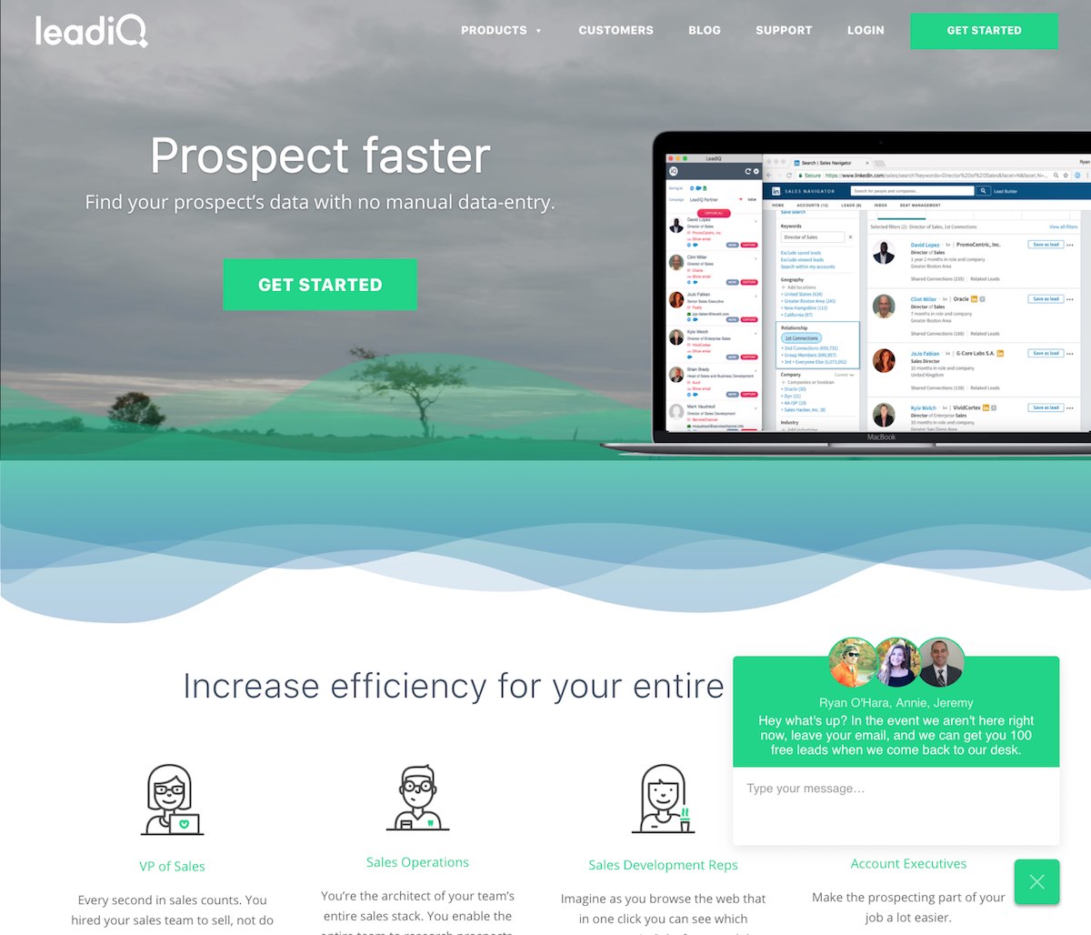
1. LEADIQ BLOCKCHAIN BRAND IDENTITY
LeadIQ is on a mission to revolutionize Sales industry using data science. Their product helps their customers to collect and enrich their target prospects. Their internal data processing combines human intelligence and data science to enable their customers to find perfect contact information and save to their existing platforms like Salesforce, etc.
Visit the website
The logo design of LeadIQ is not too bad. It is simple and hints at the data part of their offering through a small magnifying glass search icon in place of the letter Q. But I feel that it may be a little confusing since it comes off as a search engine/portal of some sort.
The website is quite nice with a neat layout and the top header has a nice transparent flowy separator.
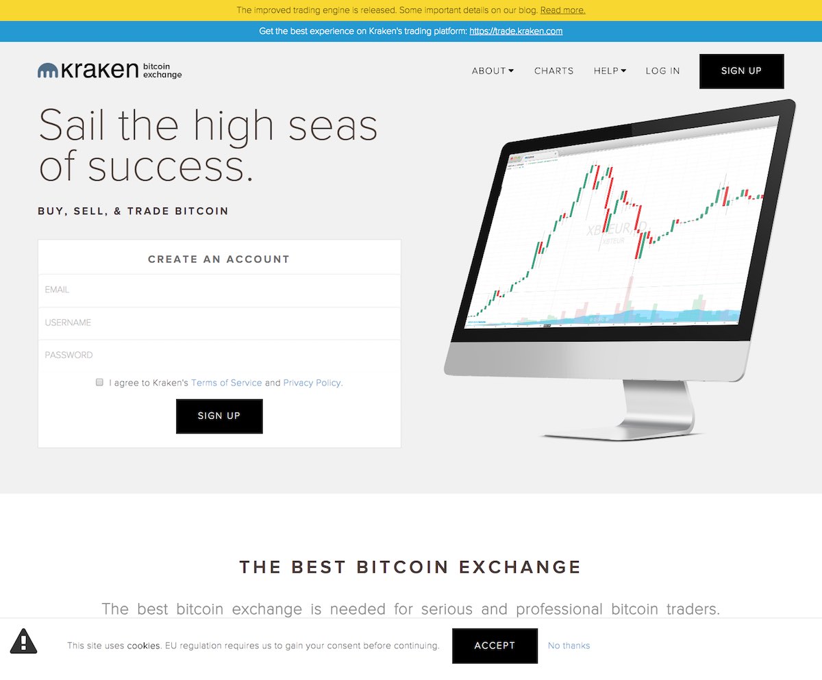
2. KRAKEN BLOCKCHAIN STARTUP BRAND IDENTITY
Kraken.com is a global digital asset exchange with support for multiple digital assets including: Bitcoin, Ethereum, Ripple, Litecoin, Monero, Zcash, and several more. Founded in 2011 and profitable with a growing team of over 75 people.
Visit the website
The Kraken logo design is simple and interesting. I would assume it is made up of monster arms because the name is Kraken from the Clash Of The Titans movie franchise and based on the ancient Greek mythological creature of the sea Kraken which is controlled by the sea god Neptune.
However, you can also perhaps interpret it as an upside down comb, children’s fork or columns of pillars. The website is not bad but I feel it lacks character. Perhaps a bolder visual language is required.
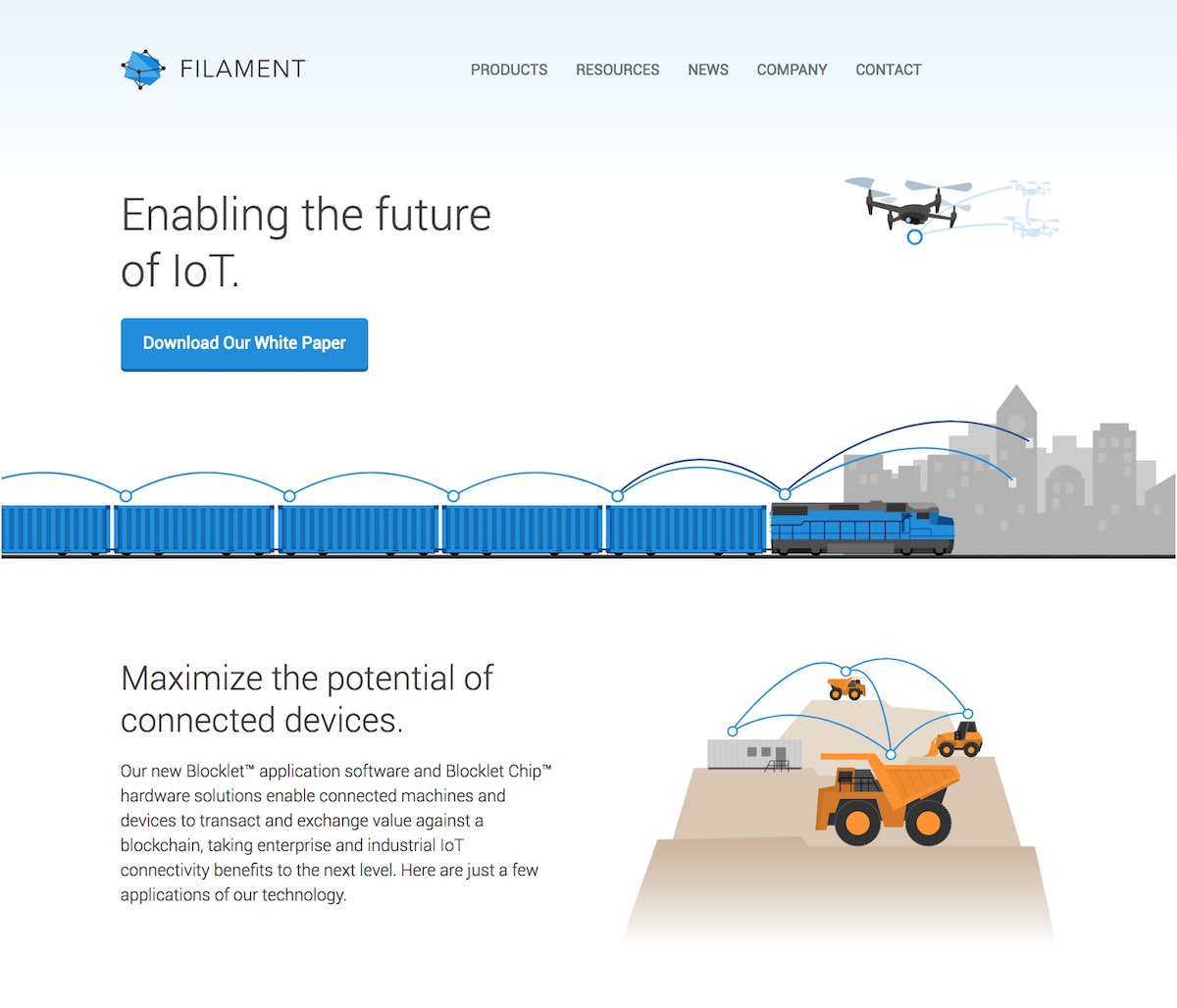
3. FILAMENT BLOCKCHAIN BRAND IDENTITY
Filament (previously known as Pinoccio) builds blockchain hardware and software solutions for the enterprise and Industrial Internet of Things (IIoT), allowing companies to securely connect devices and machines that interact and transact value independent of a central authority.
Vist the website
The Filament logo design is interesting with a 3d depth to it. It looks like a crystal inside a mesh. I do however thing that the notion of interconnected dots to represent a distributed network or blockchain would become a tiring design trend as we move forward and more and more blockchain startups are launched.
The Filament website design looks decent with their little custom illustrations but I think more can be done in terms of the layout and design elements.
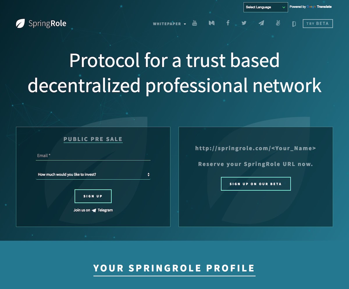
4. SPRINGROLE BLOCKCHAIN COMPANY BRAND IDENTITY
SpringRole is the first professional reputation network powered by artificial intelligence and blockchain to eliminate fraud from user profiles. Because SpringRole is built on blockchain and uses smart contracts, it’s able to verify work experience and reputation, give real meaning to endorsements, reward endorsers, and get users endorsements outside of their network. SpringRole is the first portfolio company from Science Blockchain, the blockchain-focused incubator from Science Inc.
The SpringRole logo is very simple and in my opinion does not really align with how well the rest of the brand is communicated on the website. I understand that the leaf is related to spring and hints at some thing that is refreshing and life giving. But the leaf icon is confusing and makes the brand look like a food or beverage brand.
The website on the other hand is quite robust with a lot of information and really draws the reader into their world. The conversion path is really well put together and makes one want to sign up to whatever they are offering right off the bat. The information architecture is also quite robust.
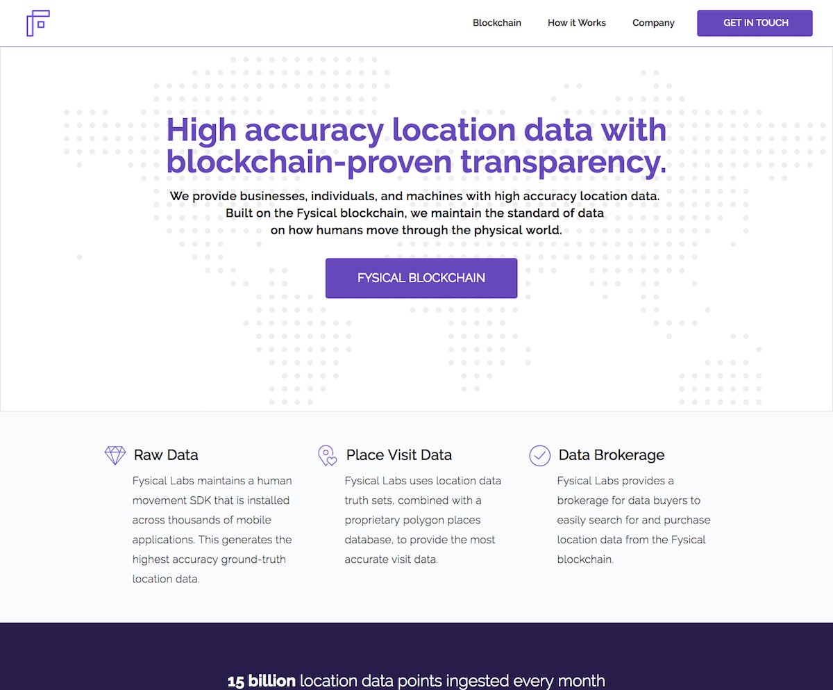
5. FYSICAL BLOCKCHAIN TECHNOLOGY BRAND IDENTITY
Fysical Labs helps marketers, investors, AI, and smart cities make better decisions by providing them with high quality location data on where people go. Built on the Fysical blockchain, an open-source, decentralized location data market, we maintain the standard of data on how humans move through the physical world. Fysical Labs was founded in 2014 and is headquartered in San Francisco, CA.
The Fysical logo is quite simple and somehow reminds me of the Flipboard logo with out the color. It is a wireframe icon of the letter F and I must admit does not really remind of any thing. No hint whatsoever as what it represents.
The website is equally bland and I am beginning to wonder why all these blockchain starts up are not investing in their branding and websites. Perhaps they are trying to follow the minimalist design path but as this space starts to get crowded, all simplistic brands would end up looking the same and remove differentiation.
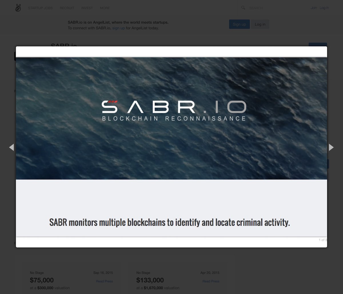
6. SABR.IO BLOCKCHAIN BRAND IDENTITY
SABR.io is a software to monitor, investigate and locate users of bitcoin and other blockchain-based digital currencies.
I like this logo although it is a simple text based logo. The little red blocks on the S hint at blockchain and that makes sense. The font selection is not really unique and may have to be changed down the line.
I noticed that SABR does not have a live website which was surprising – not even a landing page or a coming soon page!
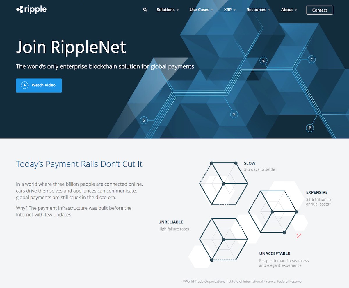
7. RIPPLE BLOCKCHAIN BRAND IDENTITY & WEBSITE DESIGN
Ripple provides one frictionless experience to send money globally using the power of blockchain. By joining Ripple’s growing, global network, financial institutions can process their customers’ payments anywhere in the world instantly, reliably and cost-effectively. Banks and payment providers can use the digital asset XRP to further reduce their costs and access new markets.
With offices in San Francisco, New York, London, Sydney, India, Singapore and Luxembourg, Ripple has more than 100 customers around the world.
Ripple is one the few blockchain brans that I like in terms of the logo design, website design and other branding elements. The logo is fun and icon and hints at blockchain – although the blocks are represented by circles or orbs. The font is is also quite tech friendly and suits the logo.
The website is also quite slick with a nice lean layout, bold headers and relevant photos and good information architecture.
I love the animated GIFs on the home of page Ripple.
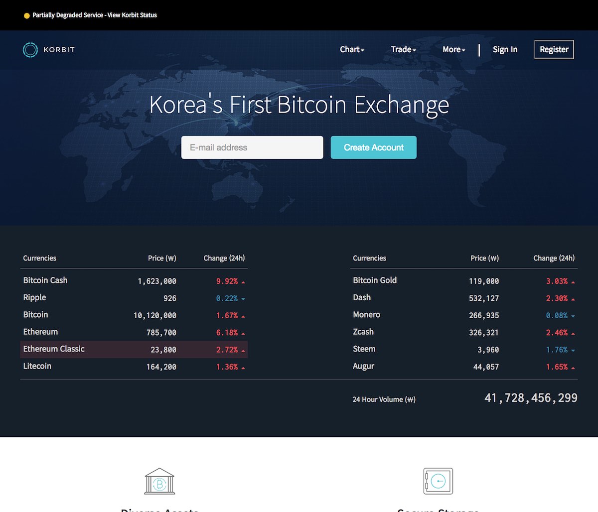
8. KORBIT BLOCKCHAIN STARTUP BRAND IDENTITY
Korbit is South Korea’s first and largest bitcoin exchange, wallet and merchant processor.
Their mission statement reads: “Korbit’s mission is to enable the free flow of value by utilizing new technologies such as Bitcoin and the Blockchain. Starting with financial services, we are creating a world where individuals can transact with each other freely, without sacrificing security or convenience.”
Korbit’s brand name is awesome and hits all the criteria of a perfect brand name. It is Korea’s first Bitcoin exchange and hence it is Korbit! The logo design is also quite nice with a central circle representing the Bitcoin surrounded by a dashed line circle representing an exchange.
The website is also quite elegant with a nifty currency value grid that updates in realtime. The inner pages perhaps need a little more attention but the overall look and feel is better than most.
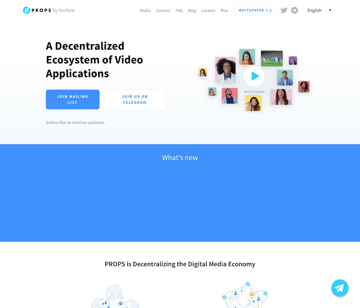
9. PROPS BLOCKCHAIN BRAND IDENTITY
Props is passionate about building innovative and immersive products that empower creative people to express themselves and engage directly with their audience. With the PROPS project, they are committing to the future of digital content creation by launching a decentralized interactive video platform built specifically to better align the interests of creators, developers, and other users than today’s highly centralized solutions.
Visit the website
While the Props project sounds awesome – giving back to video contributors through a distributed blockchain platform, the logo looks very dated. I can see the letters P and B in the logo but the icon itself looks out of place.
The website on the other hand is quite nice and fits into the video social media brands group. I would have preferred to see a bit more structure to the landing page though. Right now, it looks a little loose due to the white space and the small font.
The videos and graphics are all nice and the white paper is also designed well.
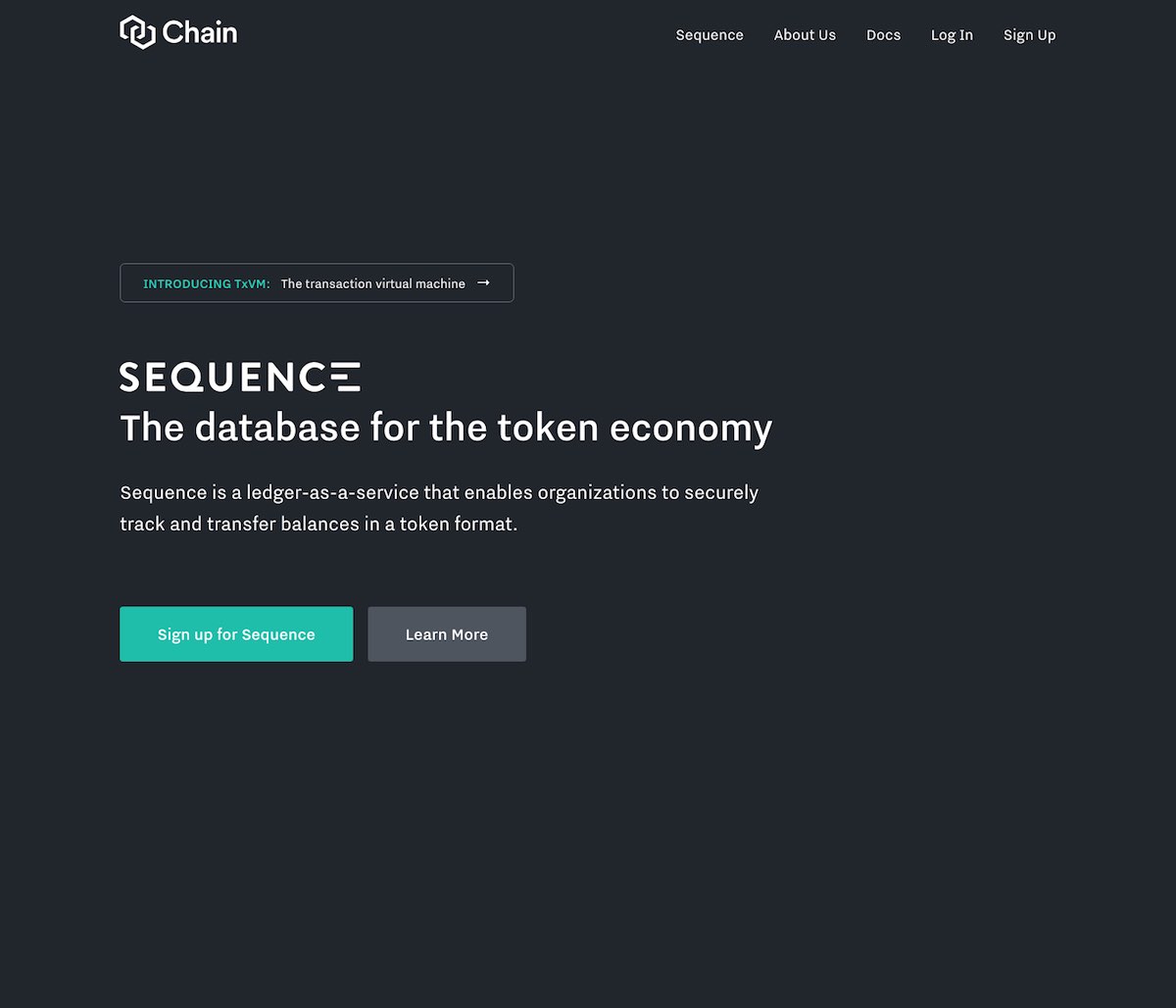
10. CHAIN BLOCKCHAIN APPLICATION BRAND IDENTITY
Chain is the leading blockchain platform for enterprises. They partner with leading financial institutions to build blockchain networks that transform markets. Their solutions enable institutions to design, deploy, and operate blockchain networks that can power any type of asset in any market. They envision a more connected financial industry that reaches every person and device on earth.
Visit the website
The Chain logo design is simple and to the point – two interlocking links of a chain. The links are more angular and have hexagonal shapes and do look unique and elegant.
The website home page is a little dull though. With no images or graphics or any sort, the background is one solid color with a little bit of text and one single splash of color. The product page on the other hand is the opposite with a white background and nothing much else.
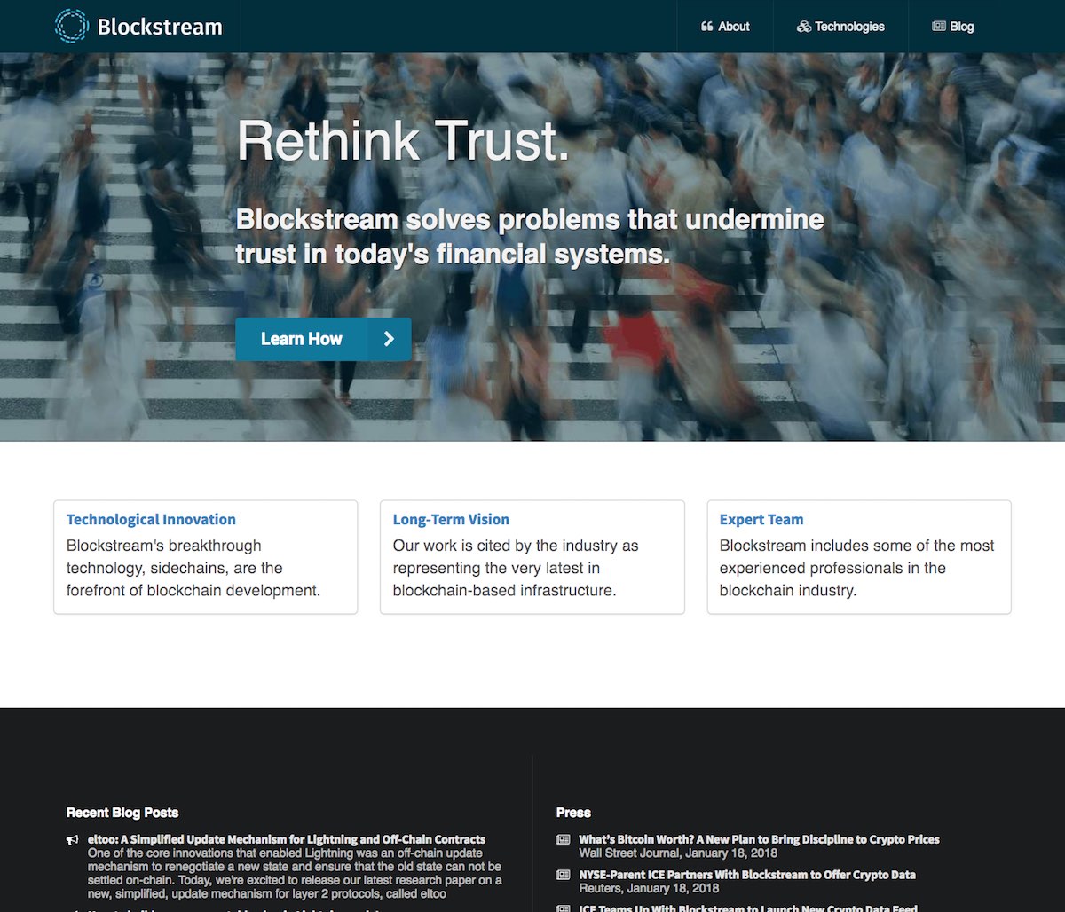
11. BLOCKSTREAM BLOCKCHAIN BRAND IDENTITY
Blockstream’s breakthrough technology, sidechains, are at the forefront of blockchain development. Blockstream includes some of the most experienced professionals in the blockchain industry.
I am not too thrilled with the Blockstream logo design. It does hint at the concept of the blockchain and shows a series of bits trying to come together and align as two concentric circles. But I felt that it is too generic and not strong enough in terms of communicating the message.
The website looks dated and very plain. Simple is good but plain is bad – at least in my opinion. I did not find it interesting or compelling.