Whey Crazy Bakery: Bite Into the Revolution
Situation: Creating Revolutionary Protein Foods Brand
Whey Crazy Bakery sells protein-based snacks, powders, and drinks with sub-brands like Whey Crazy Cookie, Whey Crazy Donuts, and so on. With the beautiful tagline “Bite into the revolution”, the messaging of this brand is clear.
The protein foods market is growing, with consumers seeking innovative alternatives to traditional snacks. Whey Crazy Bakery needed a brand identity system that would communicate their revolutionary approach while allowing each sub-brand to have its own identity.
Task: Create Morphing Brand System for Multiple Sub-Brands
To empower the tagline and the mission statement of the brand, the talented brand identity team at Spellbrand embarked on a mission to create a strategy and identity system for the client that would:
- Morphing logo system: Series of logos that morph for each sub-brand
- Consistent shape: Keep iconic shape consistent across all sub-brands
- Revolutionary positioning: Communicate revolutionary approach to protein foods
- Sub-brand flexibility: Allow each sub-brand to have unique identity while maintaining consistency
Action: Strategic Brand Development
Logo Design: Morphing Icon System
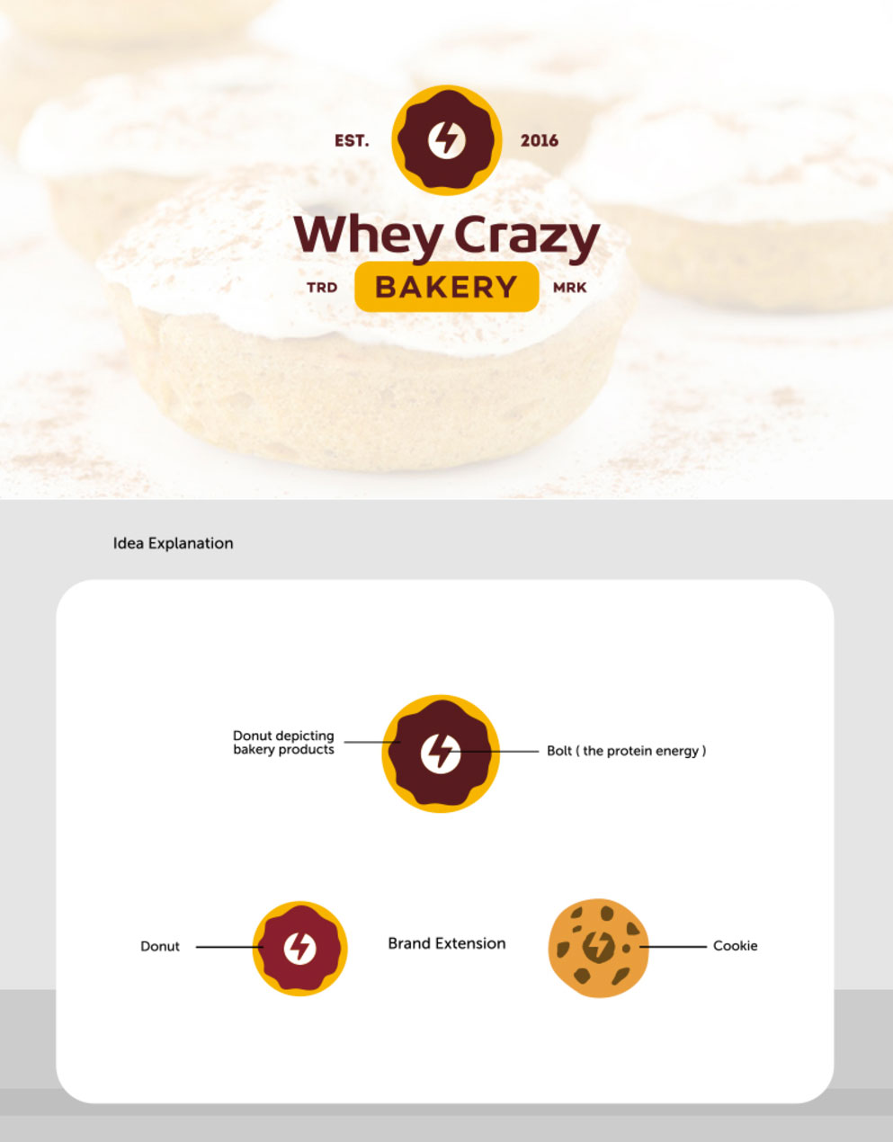
So we started by creating a shell for the iconic logo design which encapsulates varying designs of donuts or cookies etc. shapes. You can see the brand extension below which brings into play a cookie shape variation. The solid bold colors also add to the empowerment of the mission statement to bring about a revolution in the protein foods industry.
This morphing logo system:
- Maintains consistency: Iconic shape remains consistent across sub-brands
- Enables flexibility: Each sub-brand gets its own unique shape (cookie, donut, etc.)
- Ensures recognition: Consistent shell ensures brand recognition
- Communicates revolution: Bold colors and dynamic shapes communicate innovation
Brand Pattern: Dynamic Visual Language
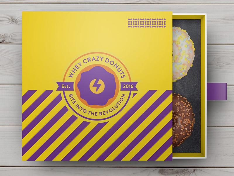
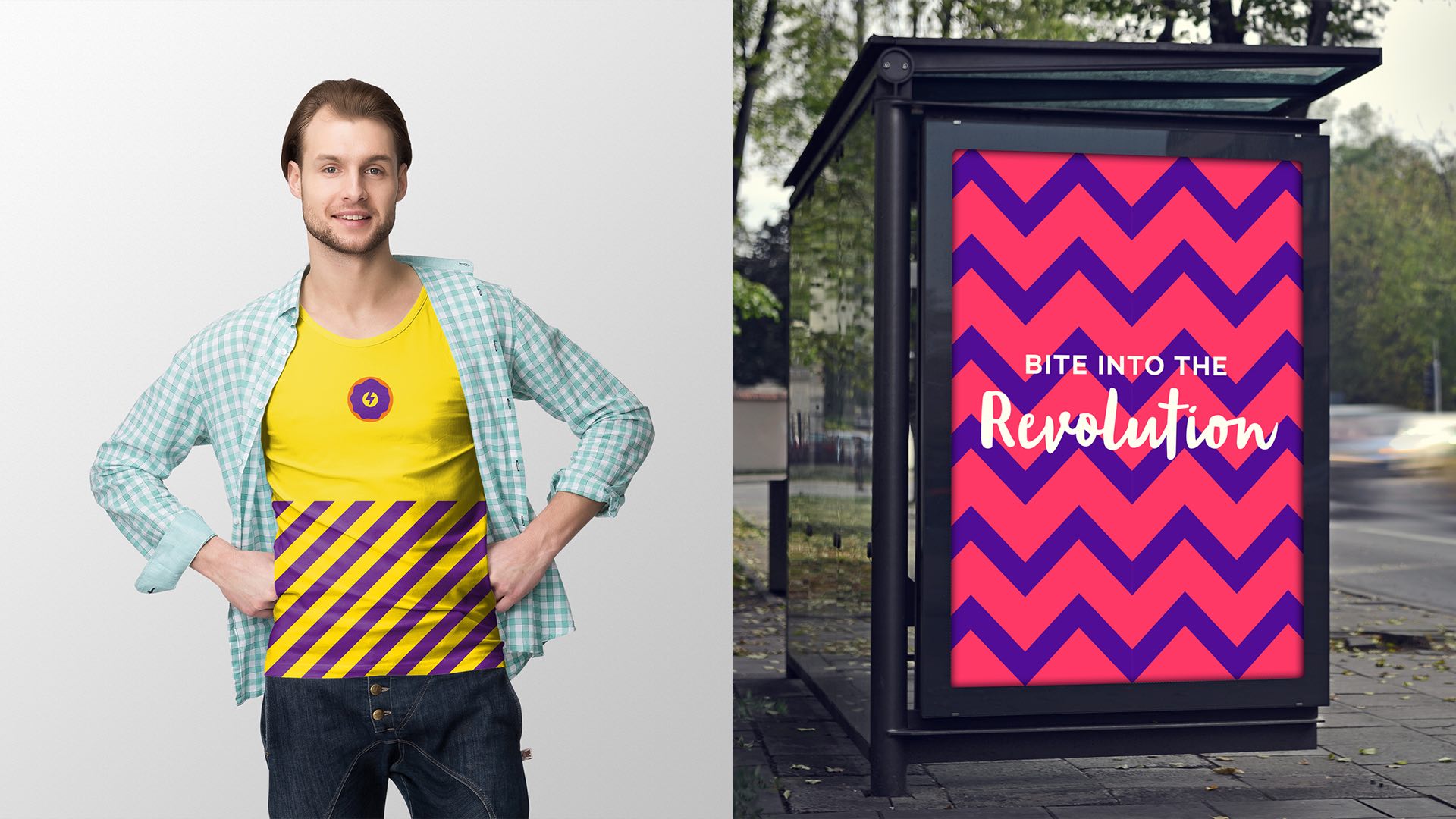
Next in the brand identity system was the official brand pattern which adds an additional level of depth to the brand visual language. The brand pattern is two-pronged with straight lines and angled wavy lines on different background colors.
As you can see on two different brand treatments below, the pattern works like magic on the yellow and magenta backgrounds. The wavy pattern creates a lot of dynamic movement to brand posters and can be used effectively in advertisements. This pattern system:
- Adds depth: Creates visual interest beyond the logo
- Dynamic movement: Wavy lines suggest energy and revolution
- Versatile: Works across different background colors
- Memorable: Unique pattern creates strong brand recall
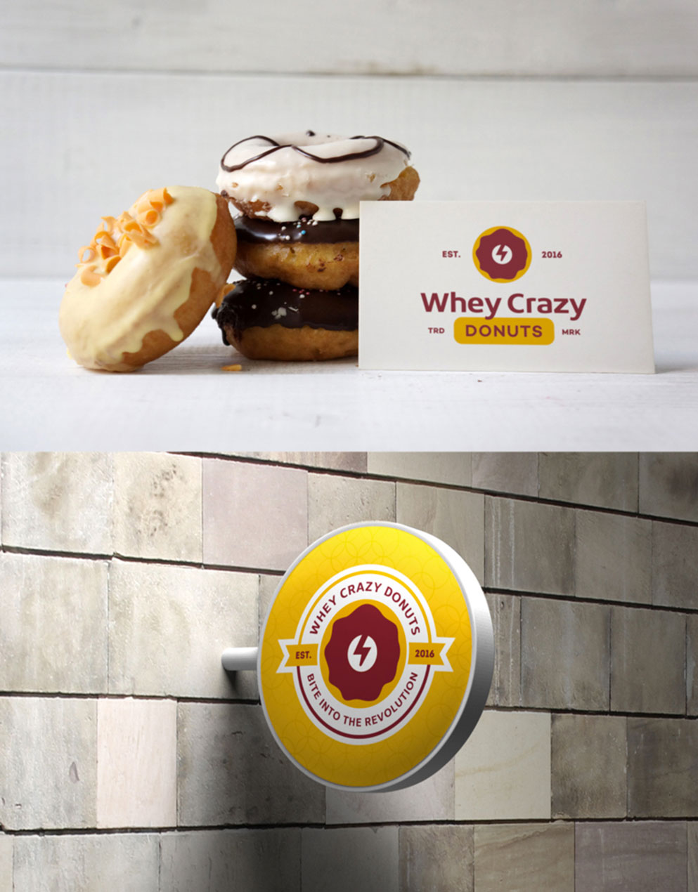
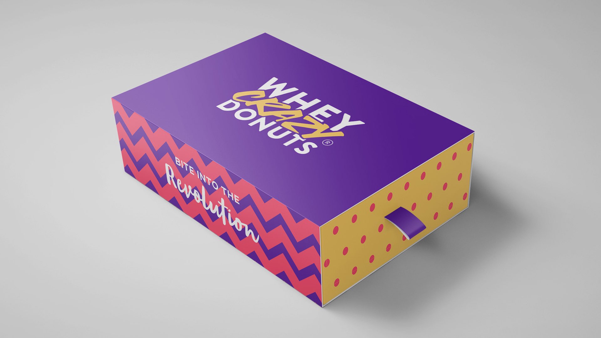
Package Design: Fun and Friendly
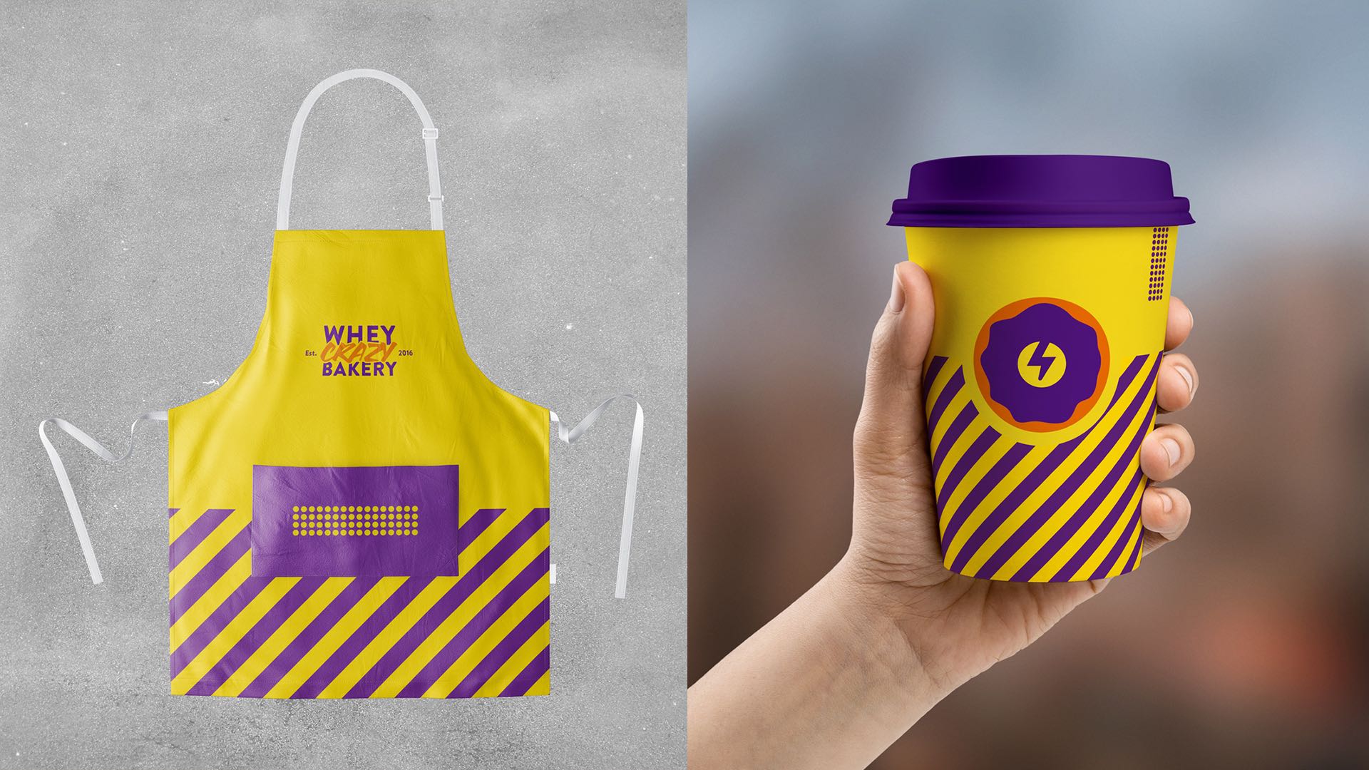
Package design for this brand again capitalizes on the beautiful brand pattern that we created and is supported by a secondary pattern element of polka dots. This makes the packaging more fun and friendly. The usage of the corporate colors, as well as the complementary secondary brand color palette, makes for some visually stunning package designs that stand out on shelves while maintaining brand consistency.
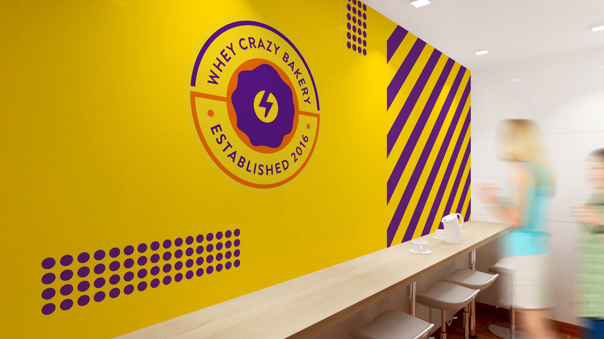
Interior Design: Cohesive Brand Experience
The interior design of the bakery uses the secondary brand mark, the official brand pattern, and supporting polka dot pattern to create a visually powerful backdrop. Sufficient care has to be taken to ensure that the colors are complementary to other design elements of the interior including the menu cards, menu signs, window stickers, uniforms, etc. This creates a cohesive brand experience that reinforces the revolutionary positioning while maintaining visual harmony.
Result: Brand Identity That Revolutionizes Protein Foods
The brand identity we created for Whey Crazy Bakery successfully communicates their revolutionary approach to protein foods. The comprehensive brand transformation delivers:
Strategic Outcomes
- Morphing system achieved: Logo system successfully morphs for each sub-brand while maintaining consistency
- Revolutionary positioning: Brand identity communicates revolutionary approach to protein foods
- Sub-brand flexibility: Each sub-brand has unique identity while maintaining brand recognition
- Dynamic visual language: Bold brand pattern creates dynamic visual interest
- Appealing packaging: Fun packaging design appeals to customers seeking protein-based products
Implementation Success
Today, Whey Crazy Bakery uses this comprehensive brand identity to attract customers who want to “bite into the revolution” of protein foods. The morphing logo system allows each sub-brand to have its own identity while maintaining consistency, the bold brand pattern creates dynamic visual interest, and the fun packaging design appeals to customers seeking protein-based snacks, powders, and drinks. The brand successfully positions Whey Crazy Bakery as Las Vegas’s premier destination for innovative protein-based bakery products with sub-brands like Whey Crazy Cookie and Whey Crazy Donuts.