Spellbrand Blog
10 Inspiring Package Designs

The design of product packaging is a fascinating art form. Package designs determine the success or failure of products on shelves and in the minds of consumers. Yes, the quality or suitability of the products is important but how they are packaged seems to be quite a significant factor in what people choose to buy when presented with a myriad of options in supermarkets or retail stores.
In this article, I have curated 25 of the most inspiring package designs with notes on design elements as well as why I think they work. Please remember this is a personal preference list. There may be much more awesome package designs out there which are way better than the ones I have listed below.
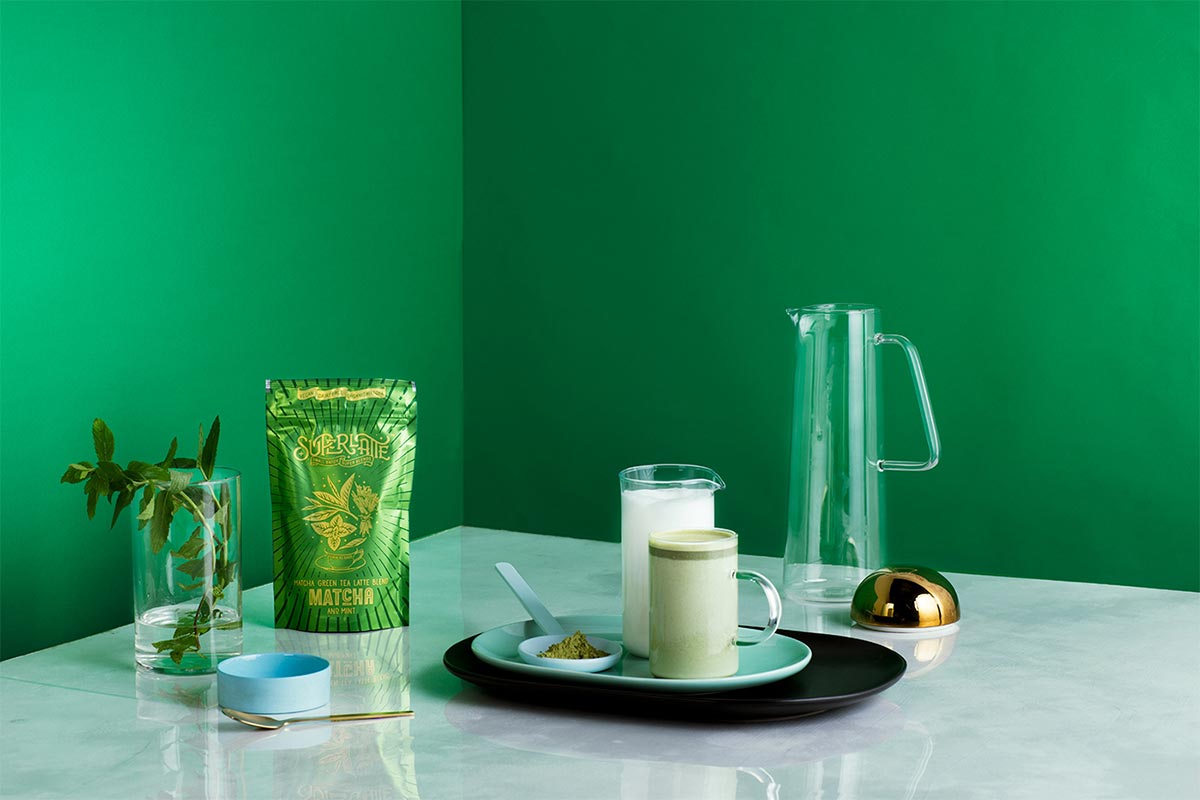
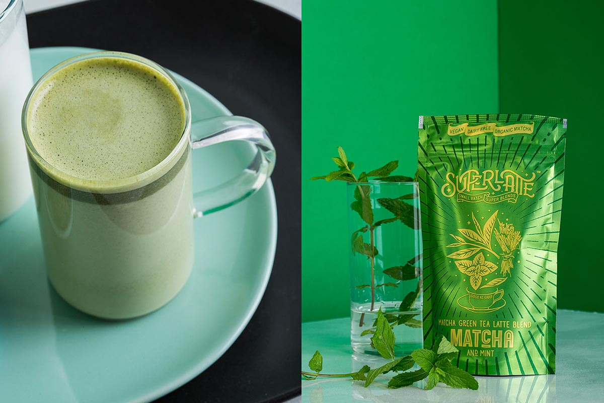
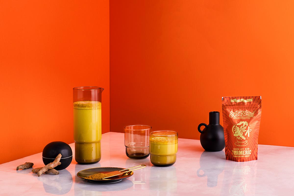
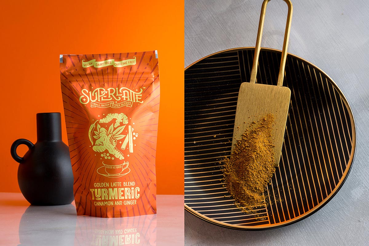
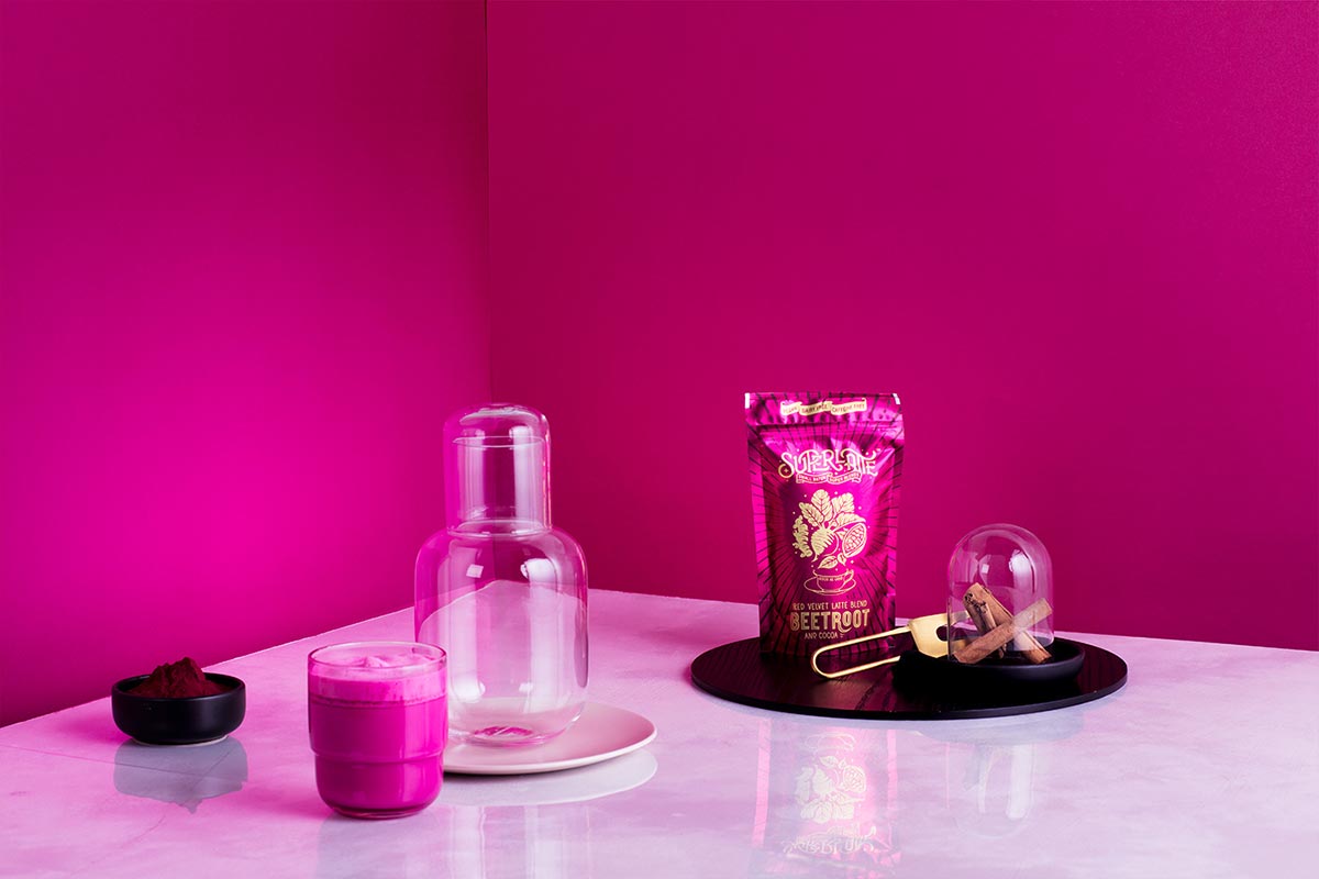
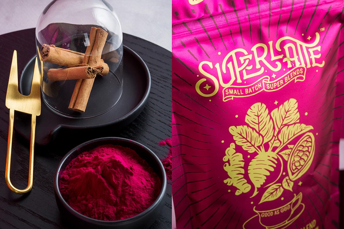
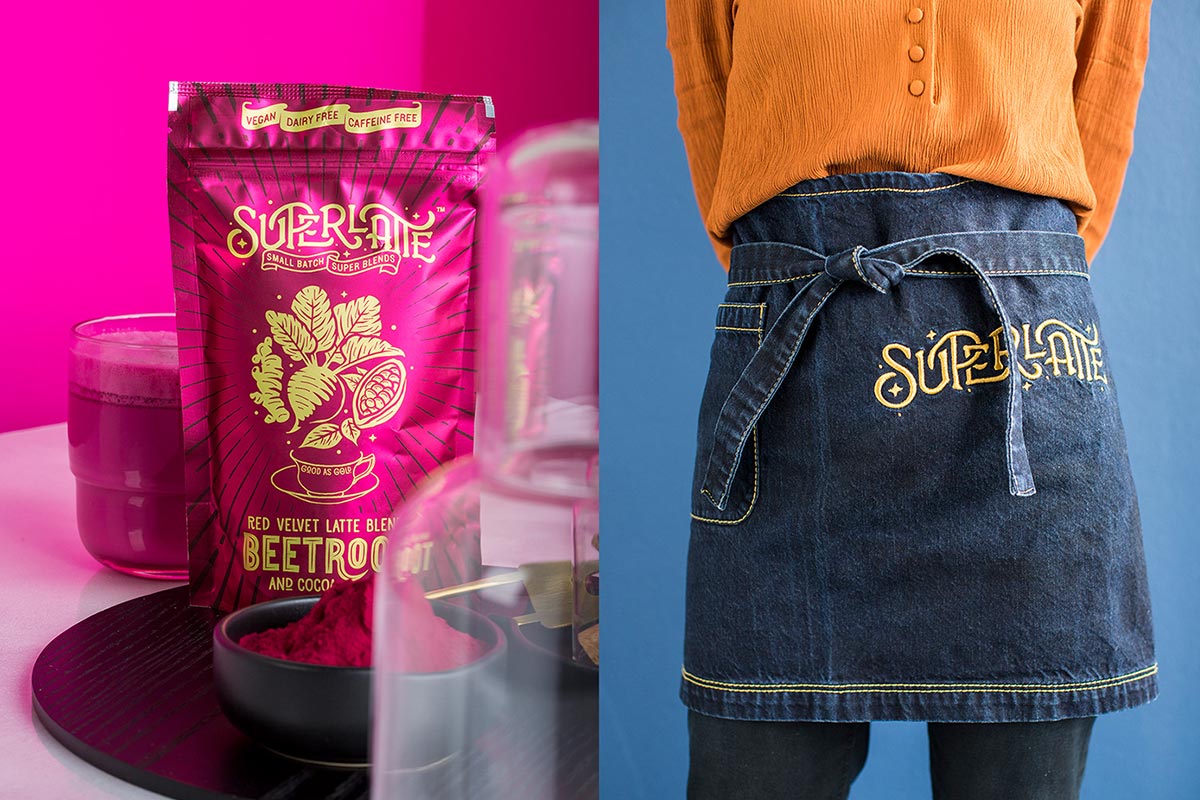
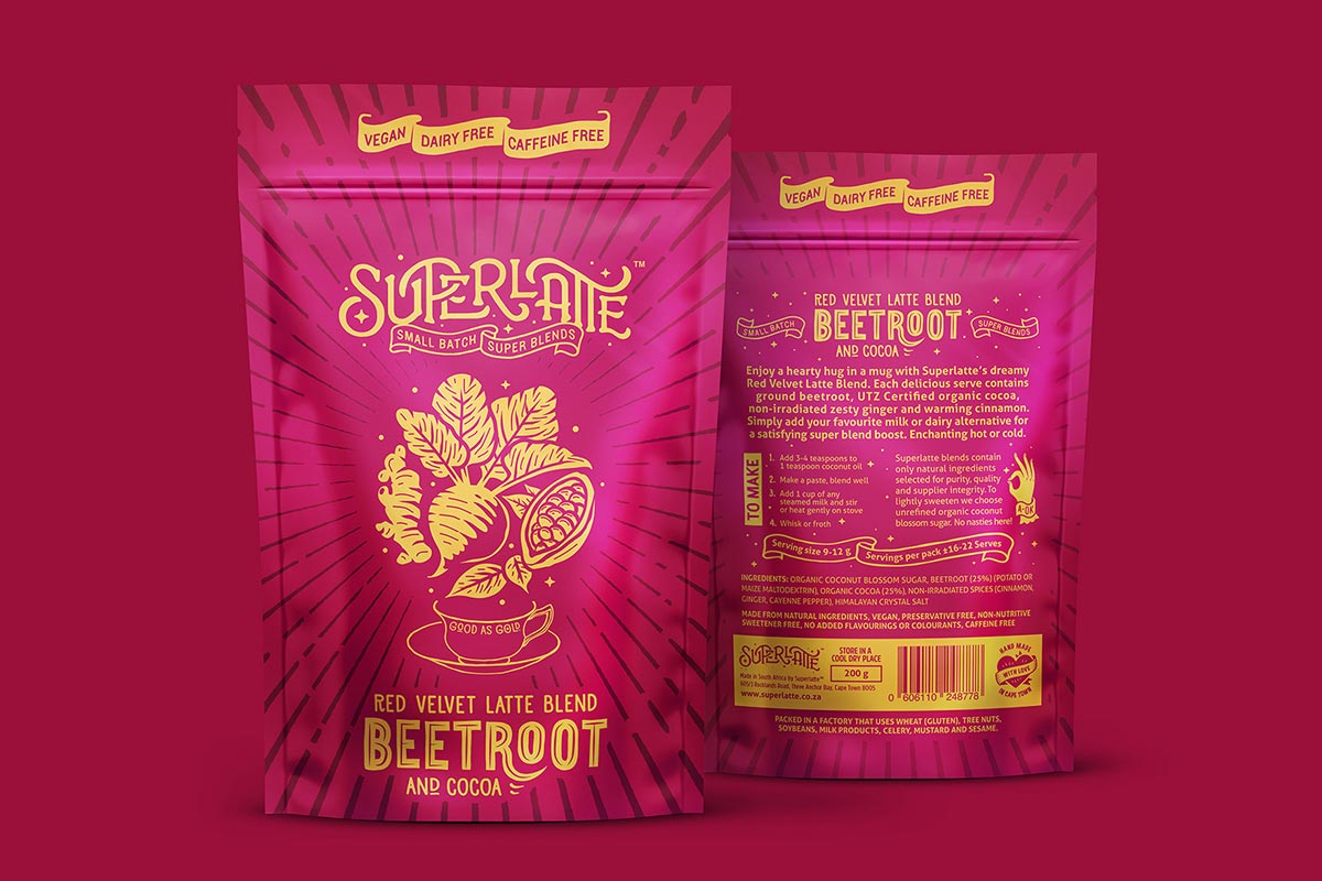
1. SUPERLATTE TEA PACKAGE
Superlatte is a premium super blend of exotic and healthy natural ingredients which include variants like Turmeric Latte, Beetroot Latte, and Matcha Latte. They’re made in small batches in Cape Town South Africa and are vegan-friendly and dairy-free. The package design is by MARK Studio who have done a wonderful job of showcasing the USP (unique value proposition) of the product in a vibrant, colorful and exciting design that would surely capture consumers attention. The design may look a little cluttered but the contrast of the color and the typography does make it pleasing to the eye. Each blend has a different illustration of the core ingredients on the front.
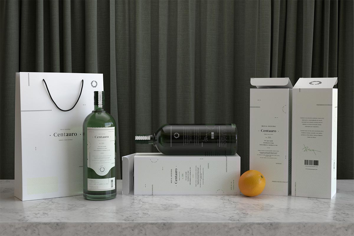
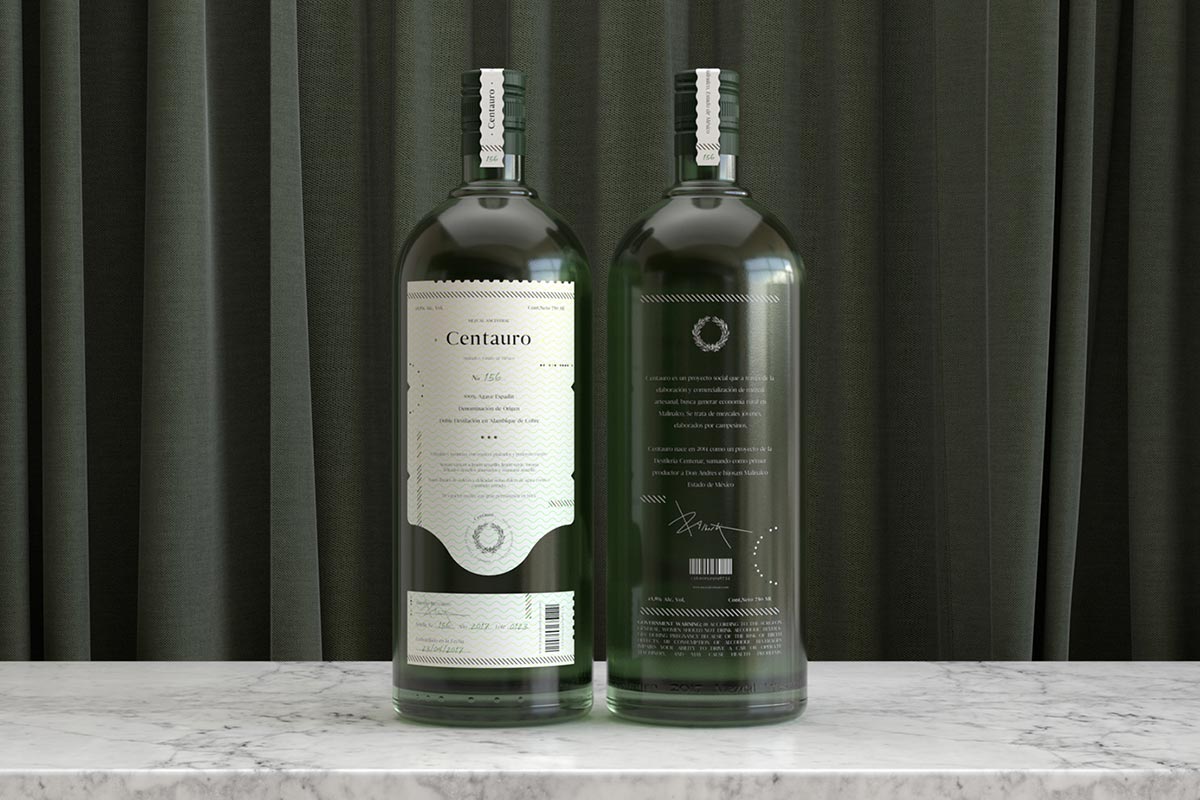
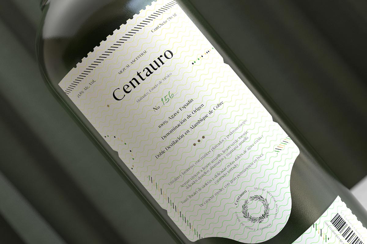
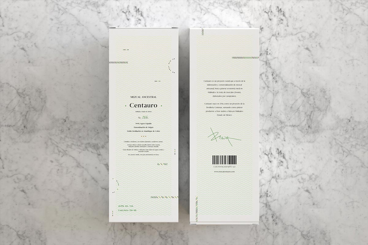
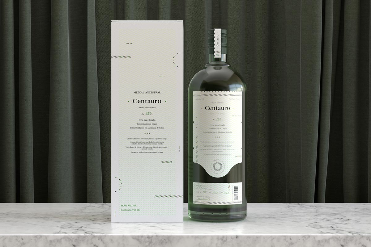
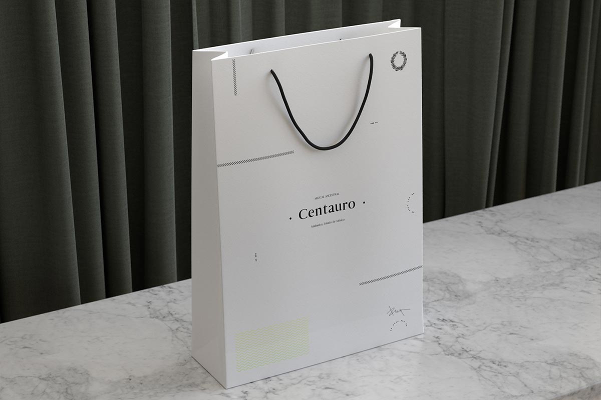
2. MEZCAL CENTAURO
Mezcal Centauro, is a 100% Agave Espadín mezcal of Ancestral – Premium category, made in the municipality of Malinalco in the State of Mexico. Mezcal is a distilled alcoholic beverage made from any type of agave. The word mezcal comes from Nahuatl mexcalli, metl, and ixcalli which means “oven-cooked agave”.[source]
Moises Baca developed an elegant, simple brand that has a certain freshness and character that represents the product while making the packaging look premium and timeless. The color palette is derived from the tones and notes of flavor found in mezcal. The bottle looks like it comes from the century gone and has a somewhat colonial kind of look. The box has been designed to be simple and fresh without any typical Mexican motifs that you would normally see on other Mezcal products.
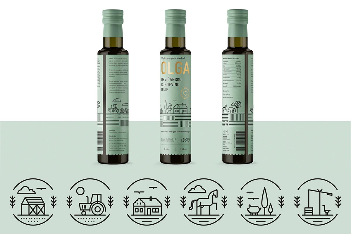
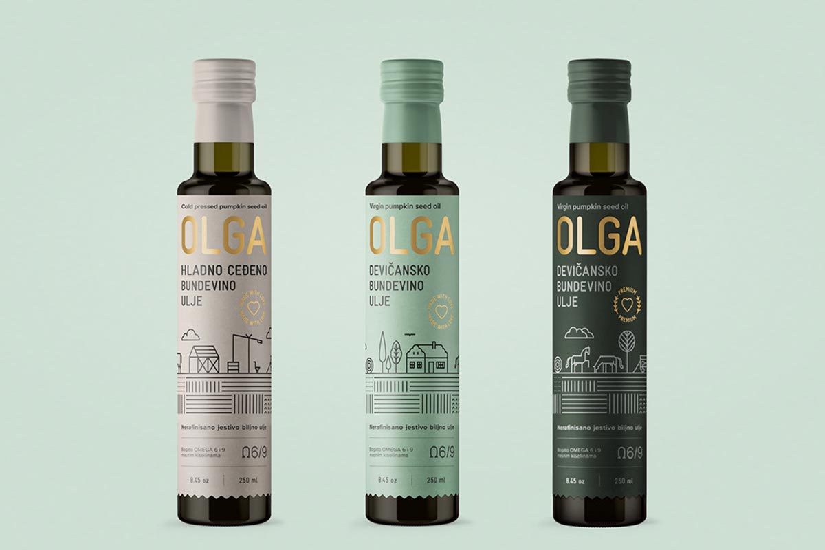
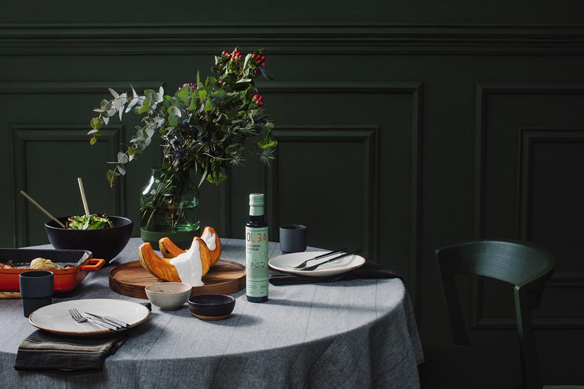
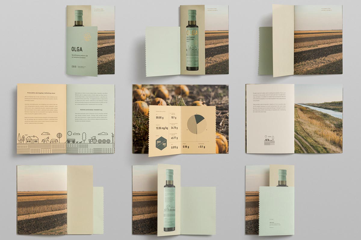
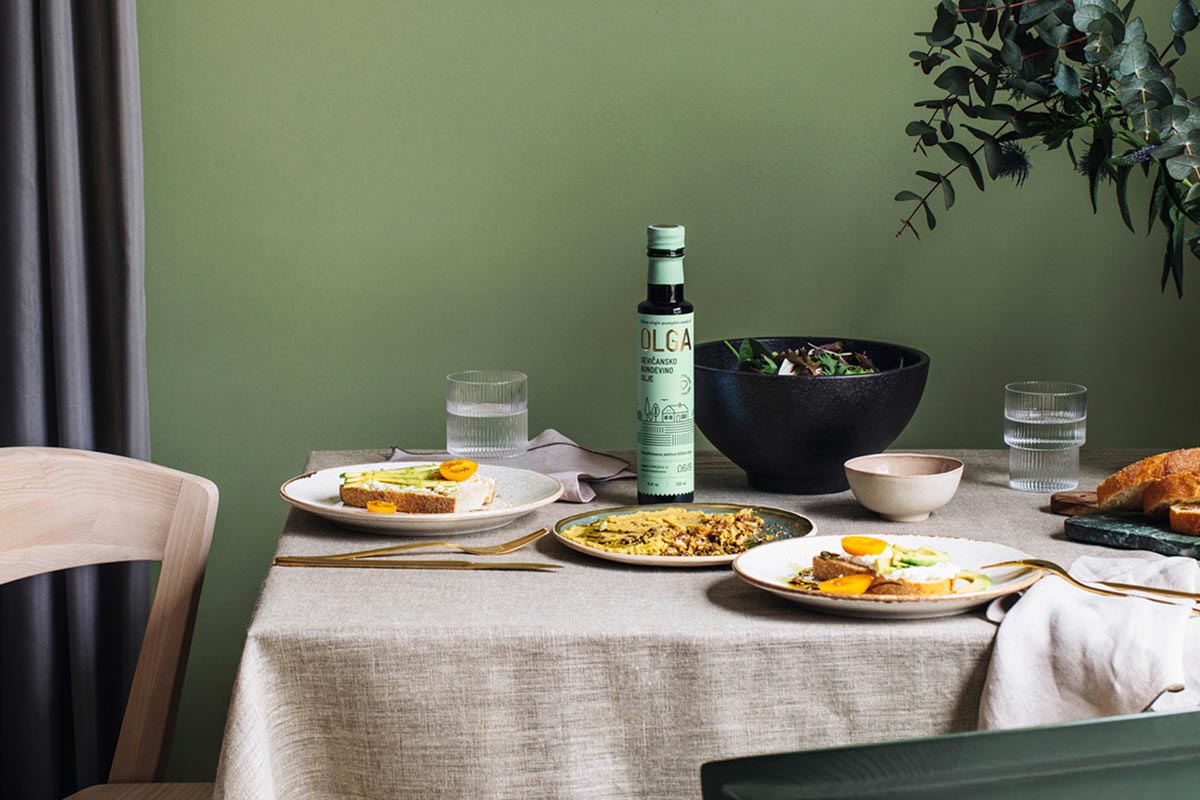
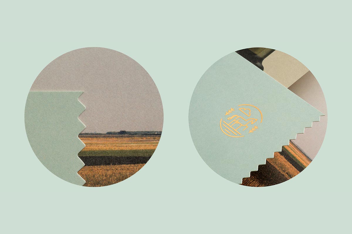
3. OLGA PUMPKIN SEED OIL
Olga pumpkin seed oil is a high-quality oil produced by JS&O from Novo Miloševo. Metaklinika Design Studio designed the packaging for this product which gives off a premium quality look-and-feel and hints at the fact that the product is produced as a mix of traditional and modern technology, in strictly controlled conditions.
The inspiration for the package design comes from the fields of Vojvodina plain and the rich cultural and historical heritage of the region. The main iconography based design on the labels is the iconic Vojvodina landscape which includes arable land, farms, horses, carriages, and animals. The icons provide a vivid narrative which essentially evokes association to the typical Vojvodina landscape.
The name of the oil, the choice of paper and its texture, along with the gold print indicate the luxury nature of the product. The simple color palette brings the illustrations to the forefront while the simple typography enhances the overall brand identity of the product.
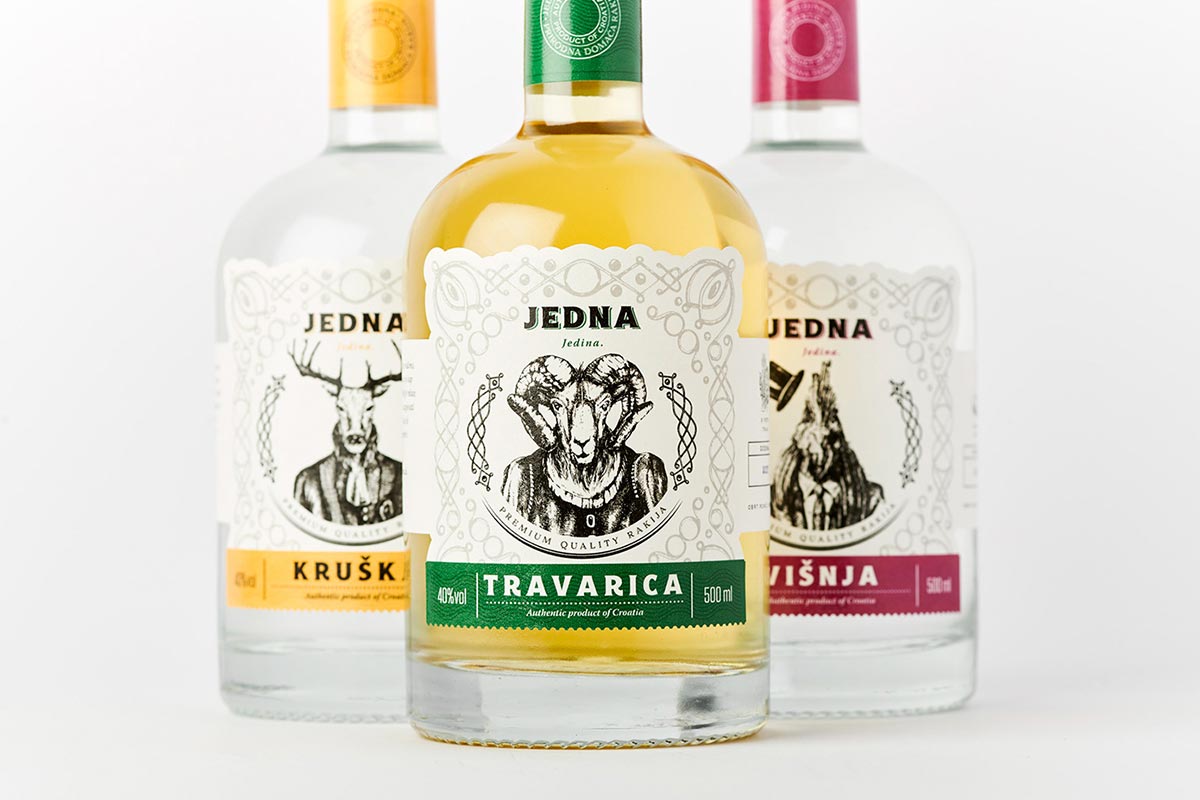
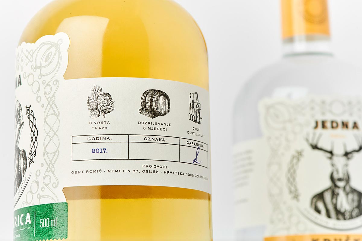
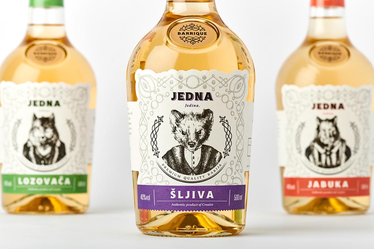
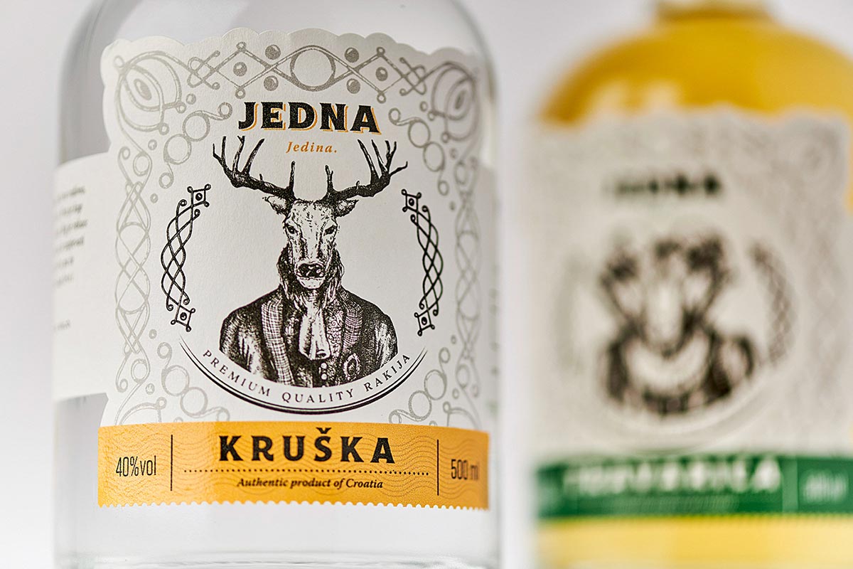
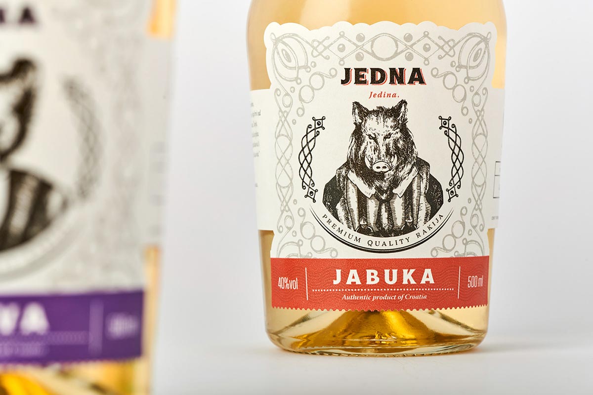
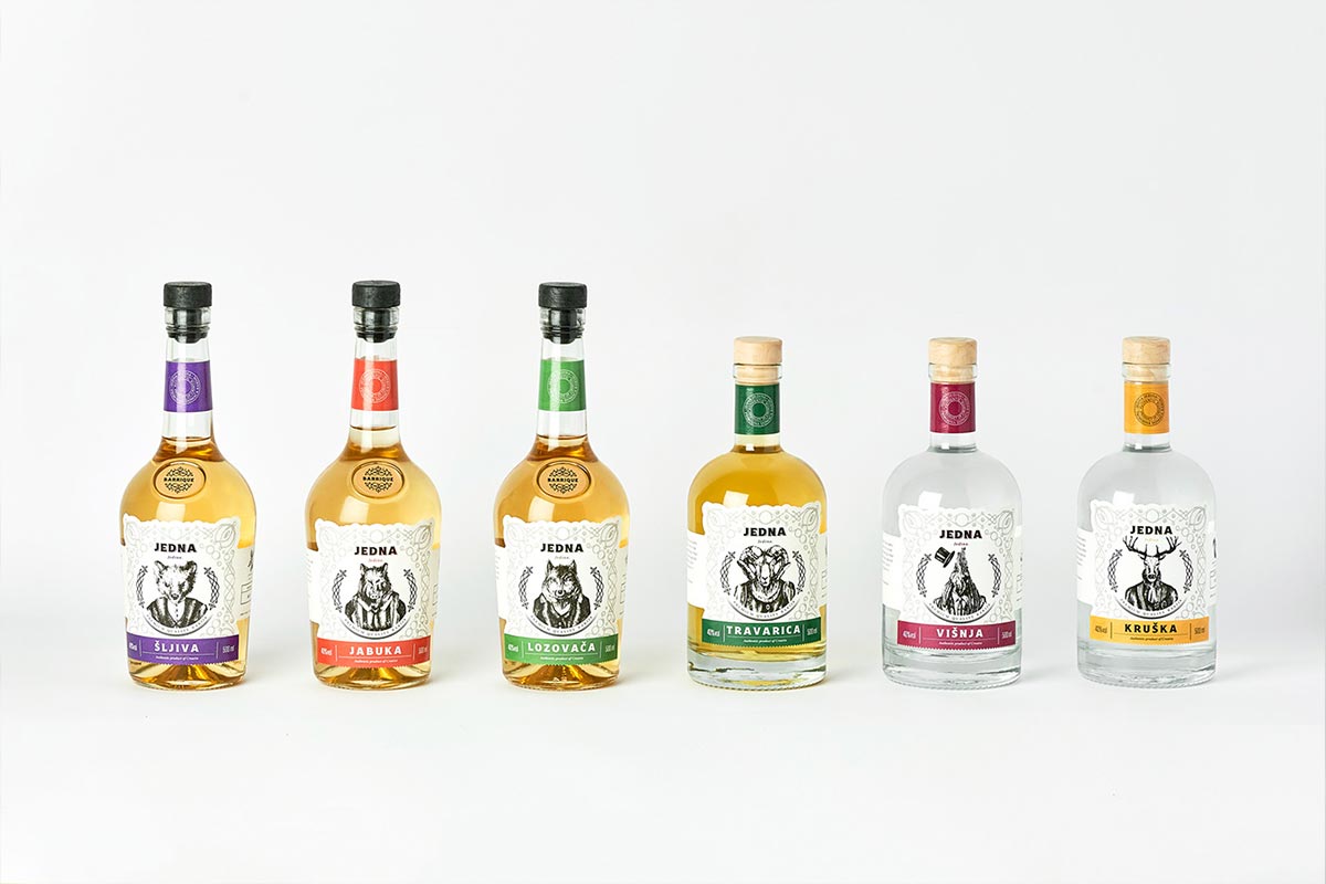
4. JEDNA CROATIAN BRANDY
Jedna is a Croatian brandy – called rakija, which is the collective term for fruit brandy popular in the Balkans. The alcohol content of rakia is normally 40% ABV, but home-produced rakia can be stronger (typically 50%). (source)
Although strictly speaking, this could be classified as label design, I decided to include it in this package design list because I simply love the design. The bottles themselves are quite interesting to look at. The design was created by Studio 33 is quite unique in the sense that to differentiate the different types of rakija, the designers chose to use illustrations of animals found in Slavonia and Baranja rather than the traditional design trend of showing illustrations or motifs of fruit used to make the drink. The illustrations show animal heads on human bodies in various elegant clothes such as suits, jackets, and traditional Baroque suits. The labels also show additional illustrations of the production process to hint at the quality of the process.
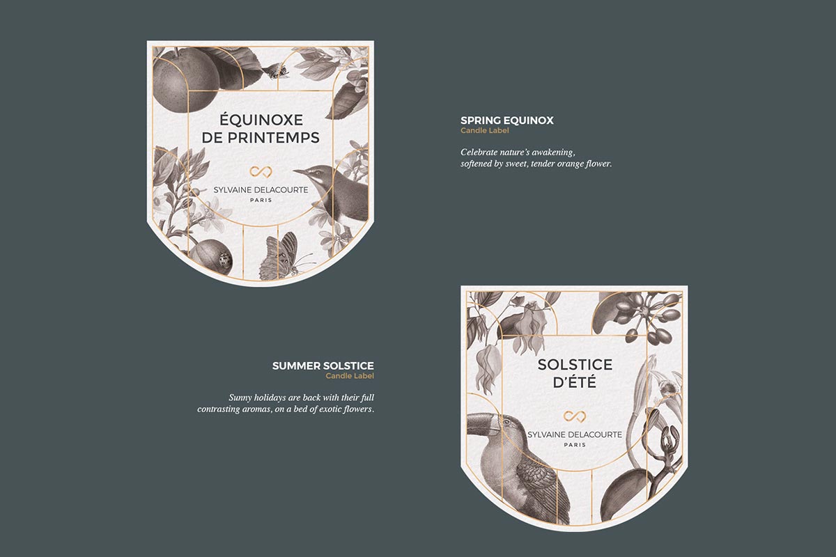
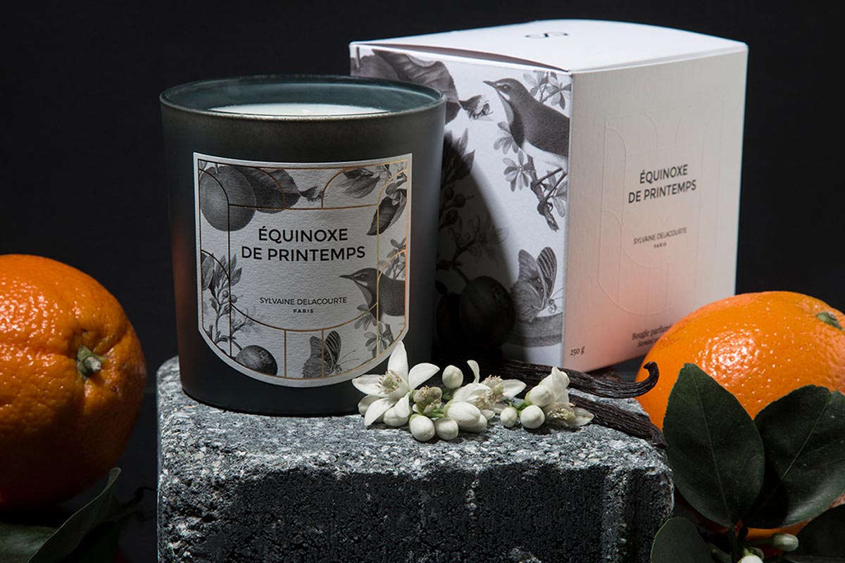
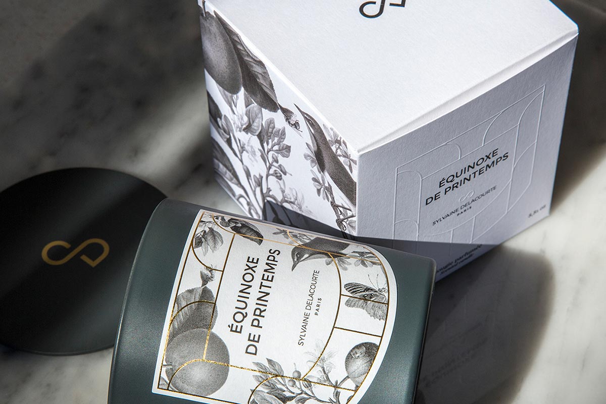
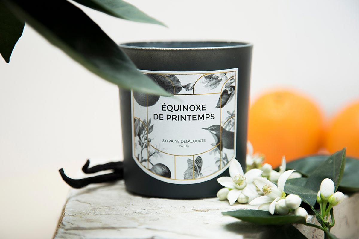
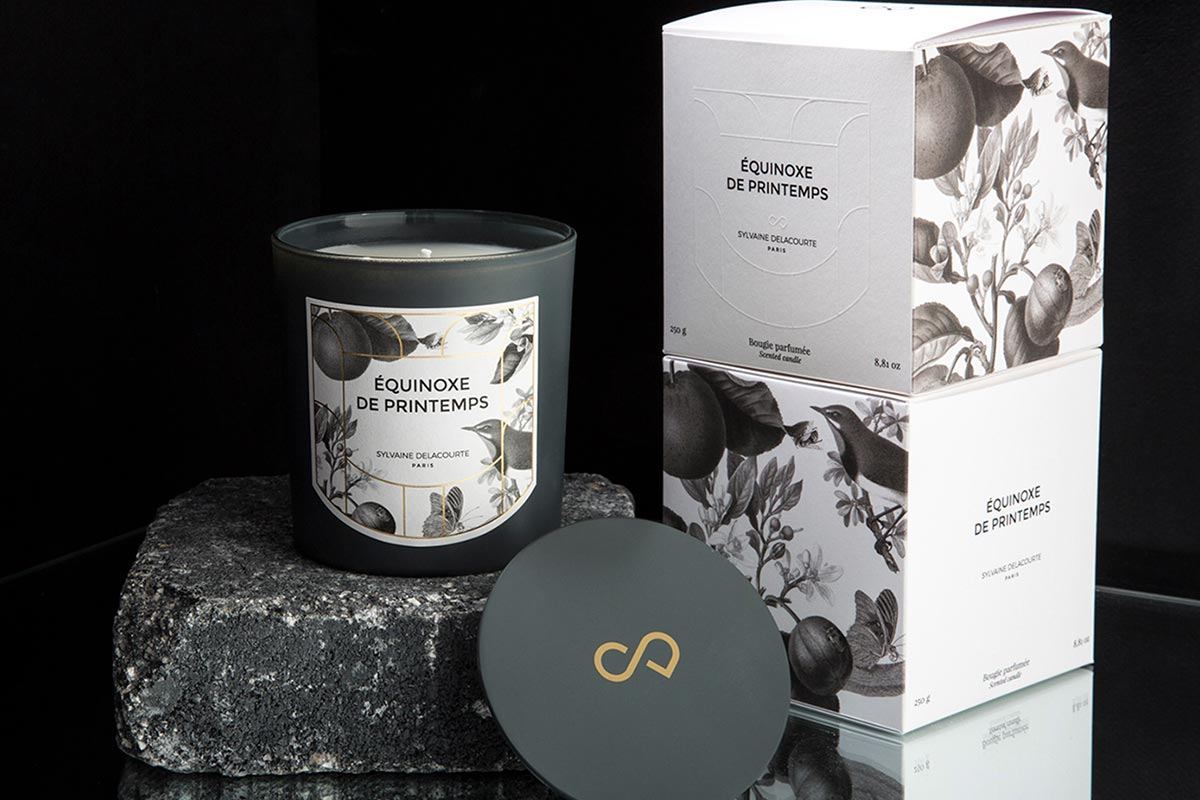
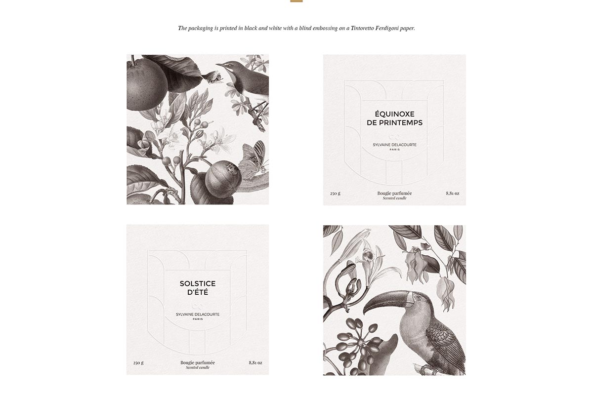
5. SYLVAINE DELACOURTE PERFUMED CANDLES
This design was created by Mathieu Delestre for Sylvaine Delacourte who was the Perfume Creative Director at Guerlain for 15 years and worked on the creation of over 70 perfumes, including L’Instant, Insolence or even in the Exclusive Collections, the very first Petite Robe Noire and Cuir Beluga. She decided to launch her own brand in 2017 around a unique concept: to present the most iconic raw materials in perfumery in 5 original facets in order to give them a new, unique, and unexpected personality. Sylvaine asked Mathieu to create the design of her new collection of perfumed candles, around the concept of the four seasons.
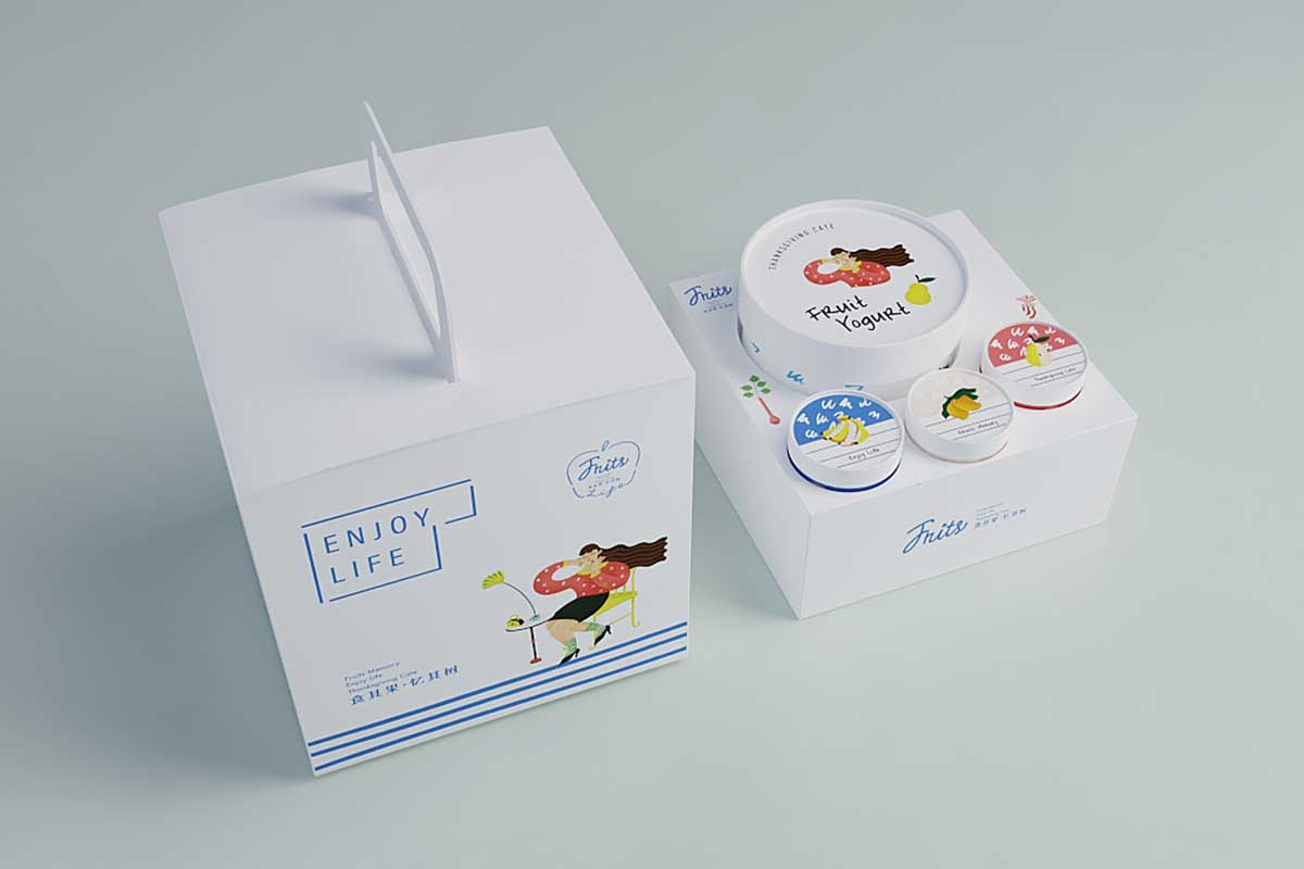
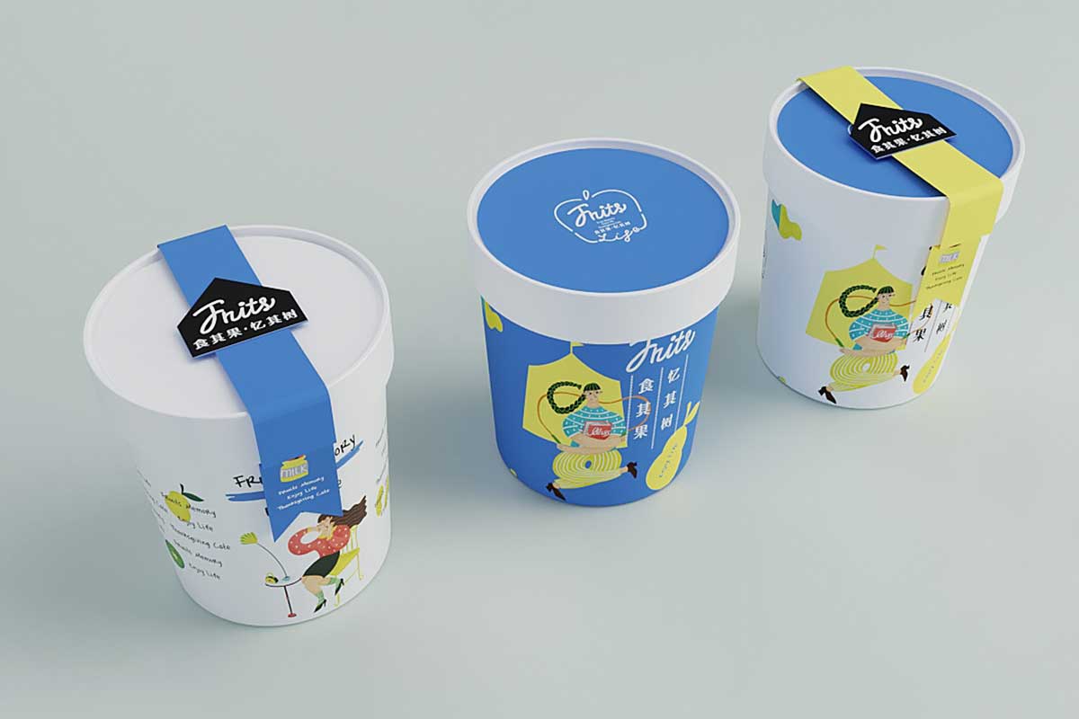
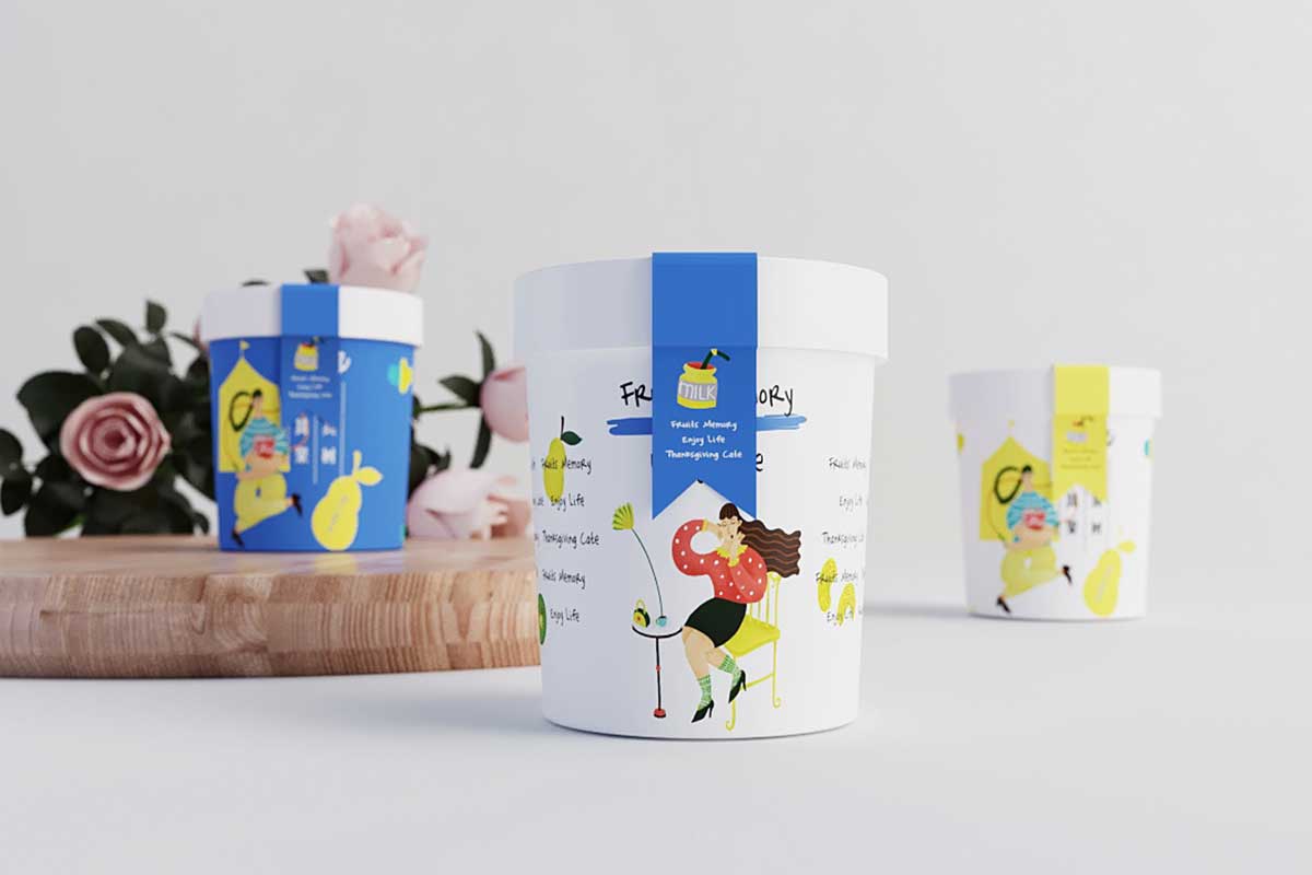
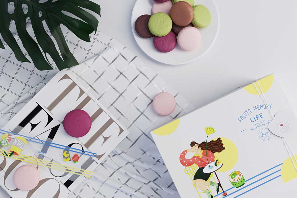
6. SOHO YOGURT PACKAGE DESIGN
This package design is simply awesome – it is simple, clean and very fun. Designed by Hellocean the package design has a vibrance and flair to it that you would not find in most yogurt packaging. The design utilizes a lot of white space with fun and retro looking quirky illustrations to create a flow and theme that would make this line of products stand out on the supermarket shelves. Notice how base colors are used effectively to create fun patterns that create an overall fun theme for the product as well as for marketing purposes.
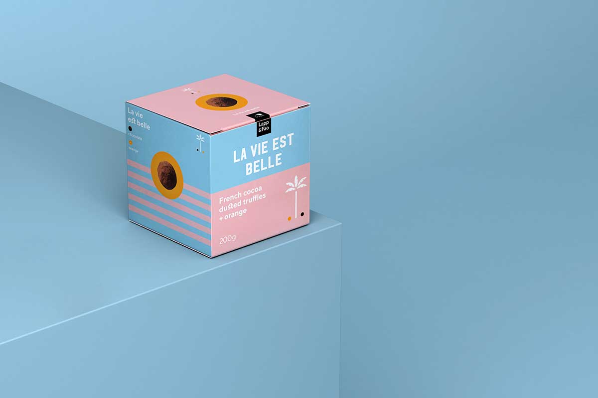
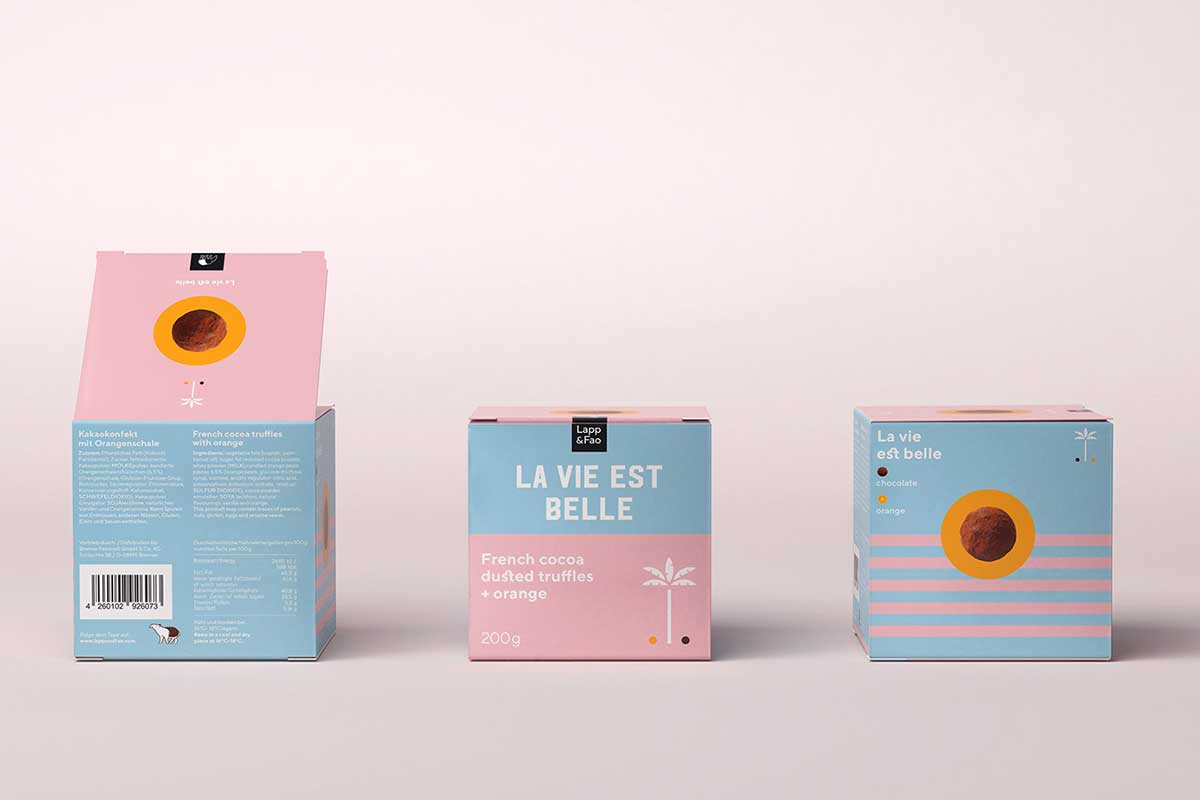
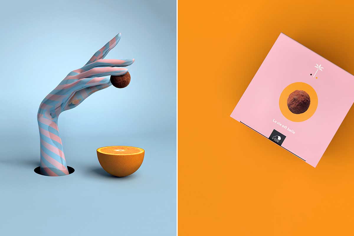
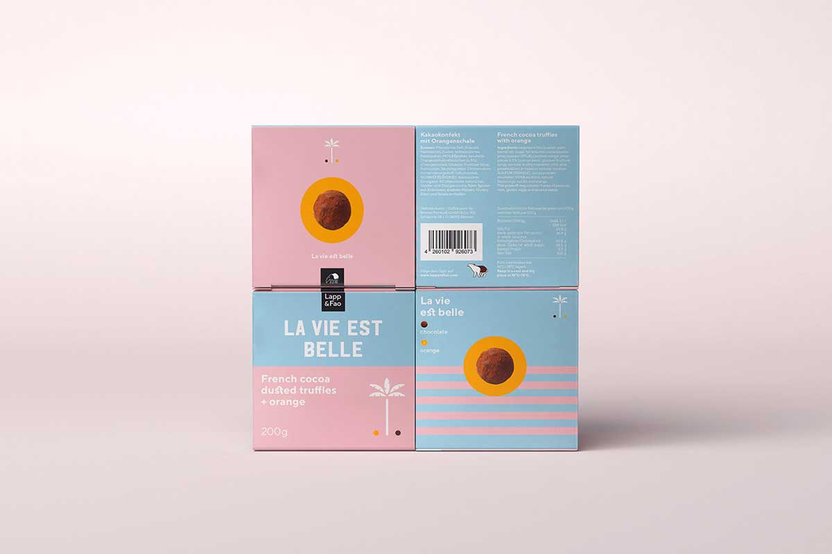
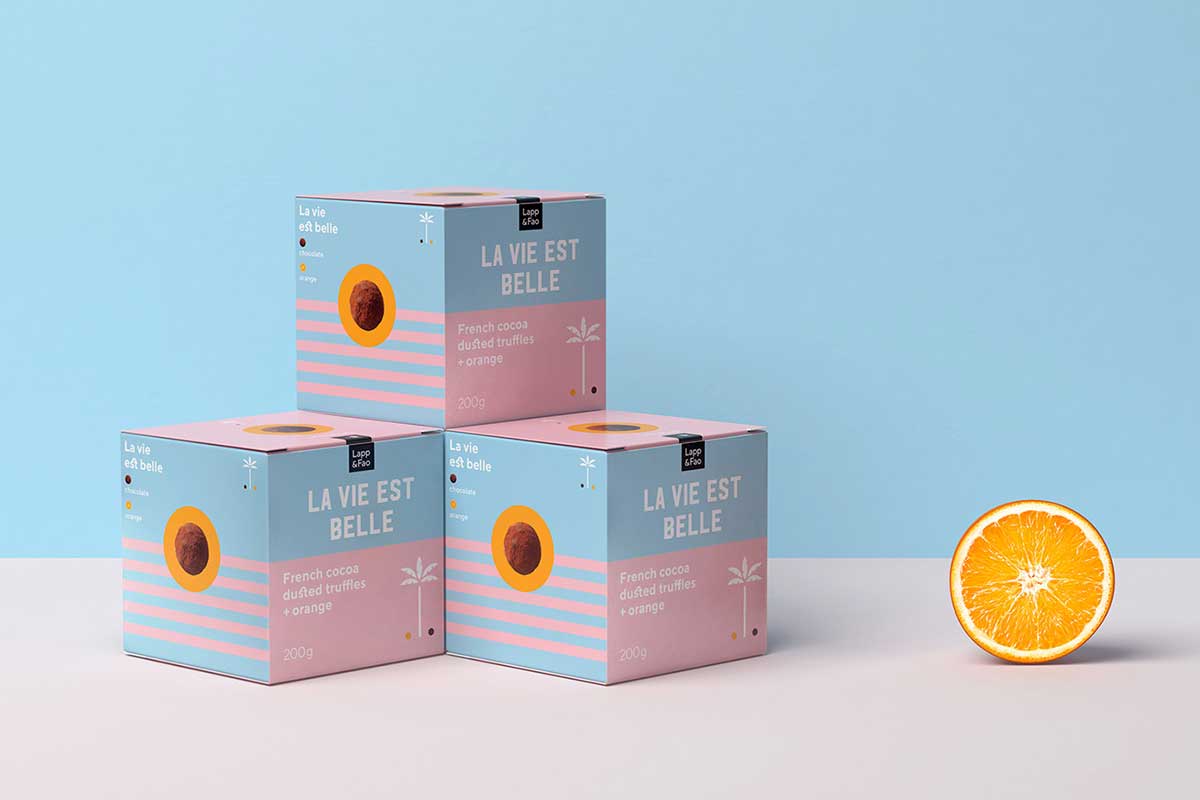
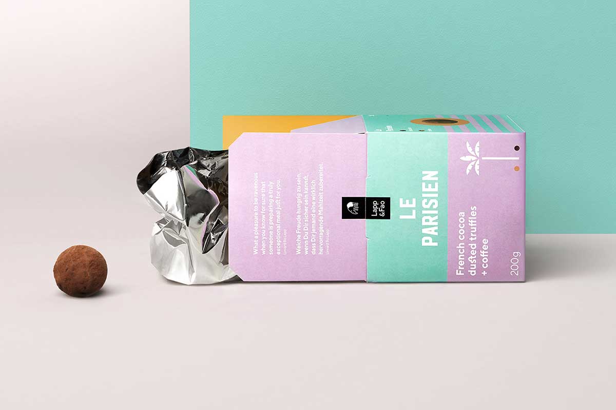
7. LAPP & FAO CHOCOLATE TRUFFLES
Lapp & Fao’s new truffle series is the finest French chocolatier art paired with dangerously tasty fillings, amuse your stomach and mind in eight different creations. The packaging design of the Lapp & Fao chocolate truffle is a tribute to the sweet life and has been designed by Studio Chapeaux. The package design is simple, bright and breaks with the tradition of premium confectionery design trends that you would normally find on the high street. The product image is kept to a minimum – perhaps a little too sparse, since I believe one would find it hard to identify what the product is. But the bright color and start contrasts would certainly draw the eye.
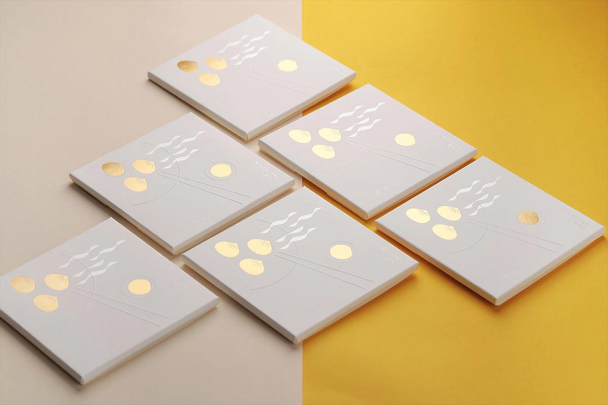
8. LAI HAO FACIAL BLOTTING TISSUES
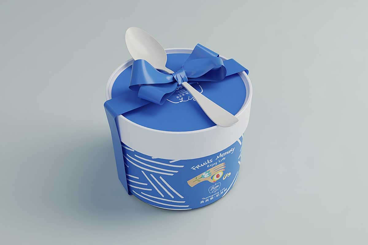
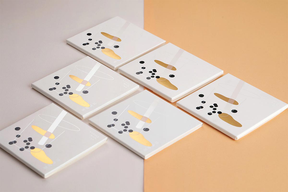
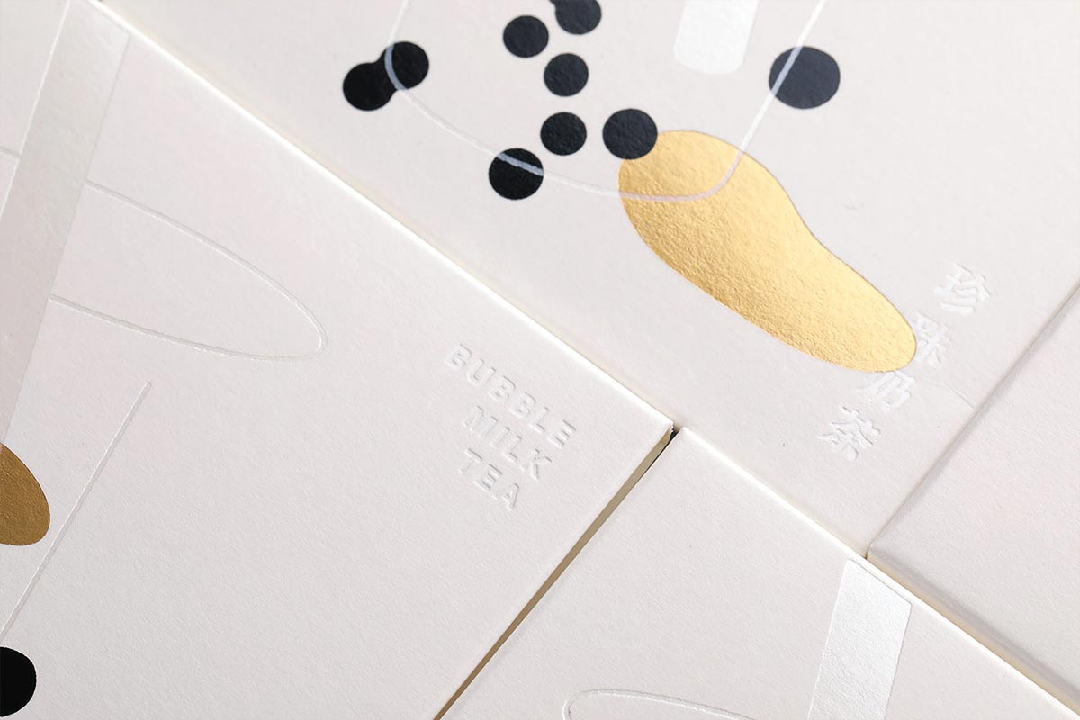
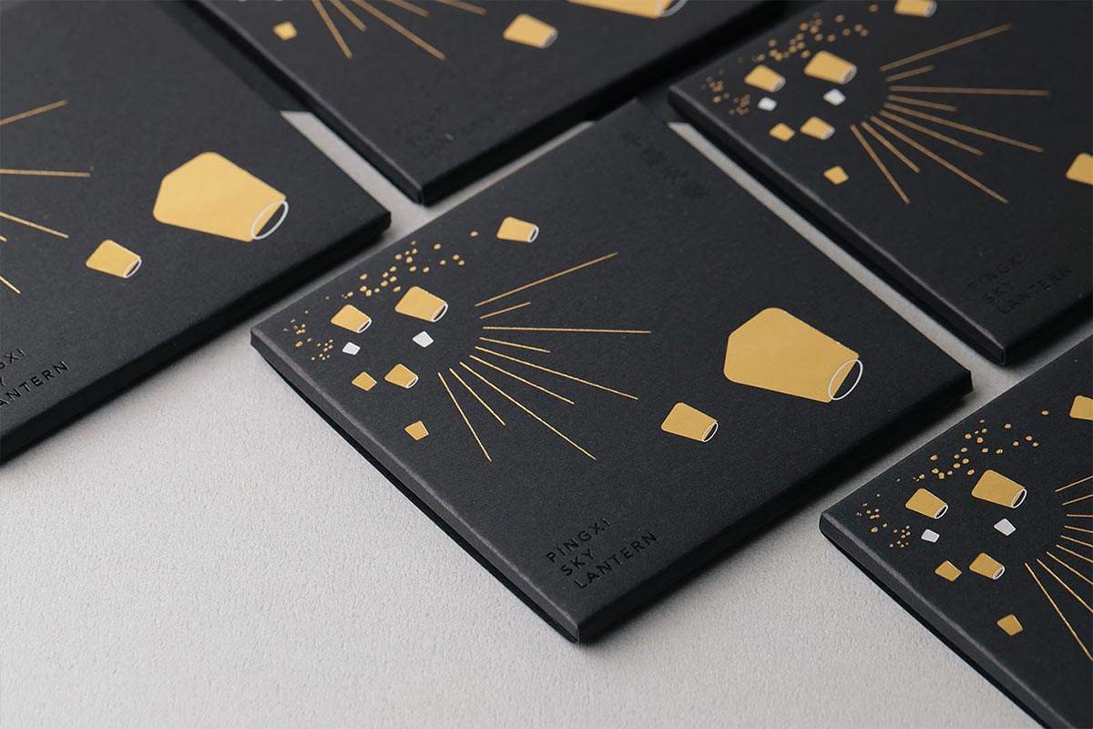
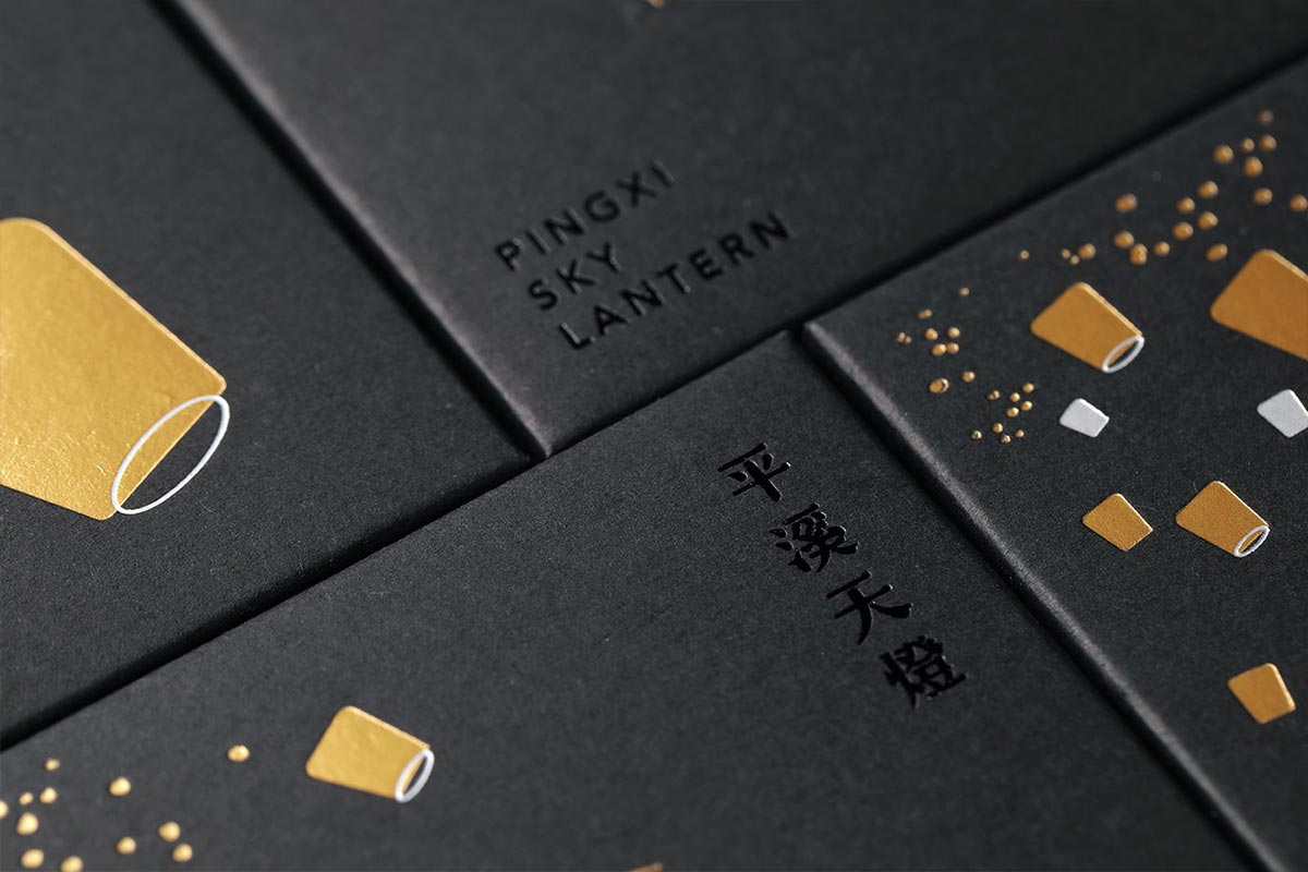
Designed by W/H Design this beautiful series of package designs are for a company that sells snacks, facial tissues and other tourist merchandise in Yongkang Street, Dongmen. It sells many Taiwanese specialties and is also committed to developing its own products. The designer has selected a few of the most popular Taiwanese features that are familiar to tourists from Taiwan, and have used the trends and patterns of the past sightseeing and handicrafts to abstract the various attractions and snacks and simplify the visual elements. After deconstruction and recombination, and through the processing and processing of composite makeup, the oil-absorbing paper presents a more unique appearance, and it is also expected that the gift can have more visual vocabulary performance.
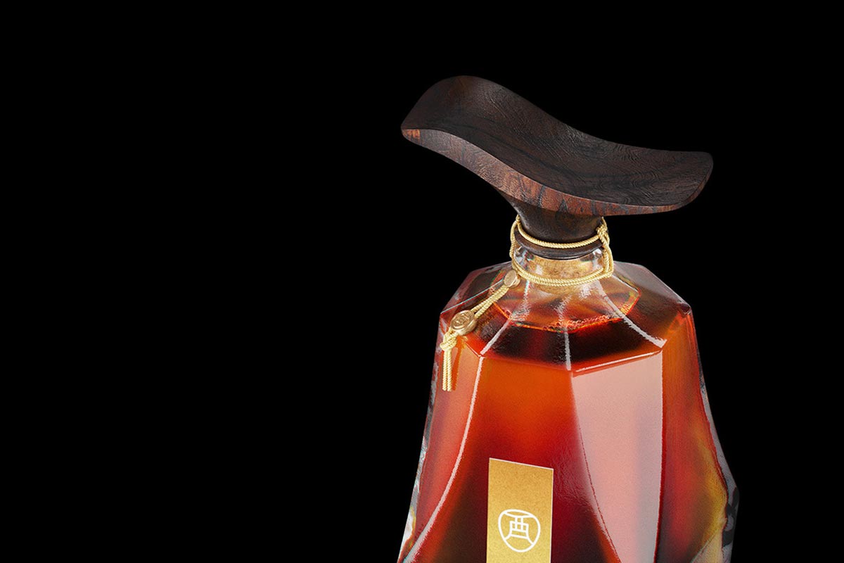
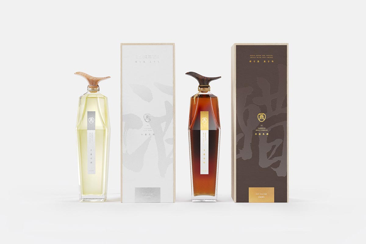
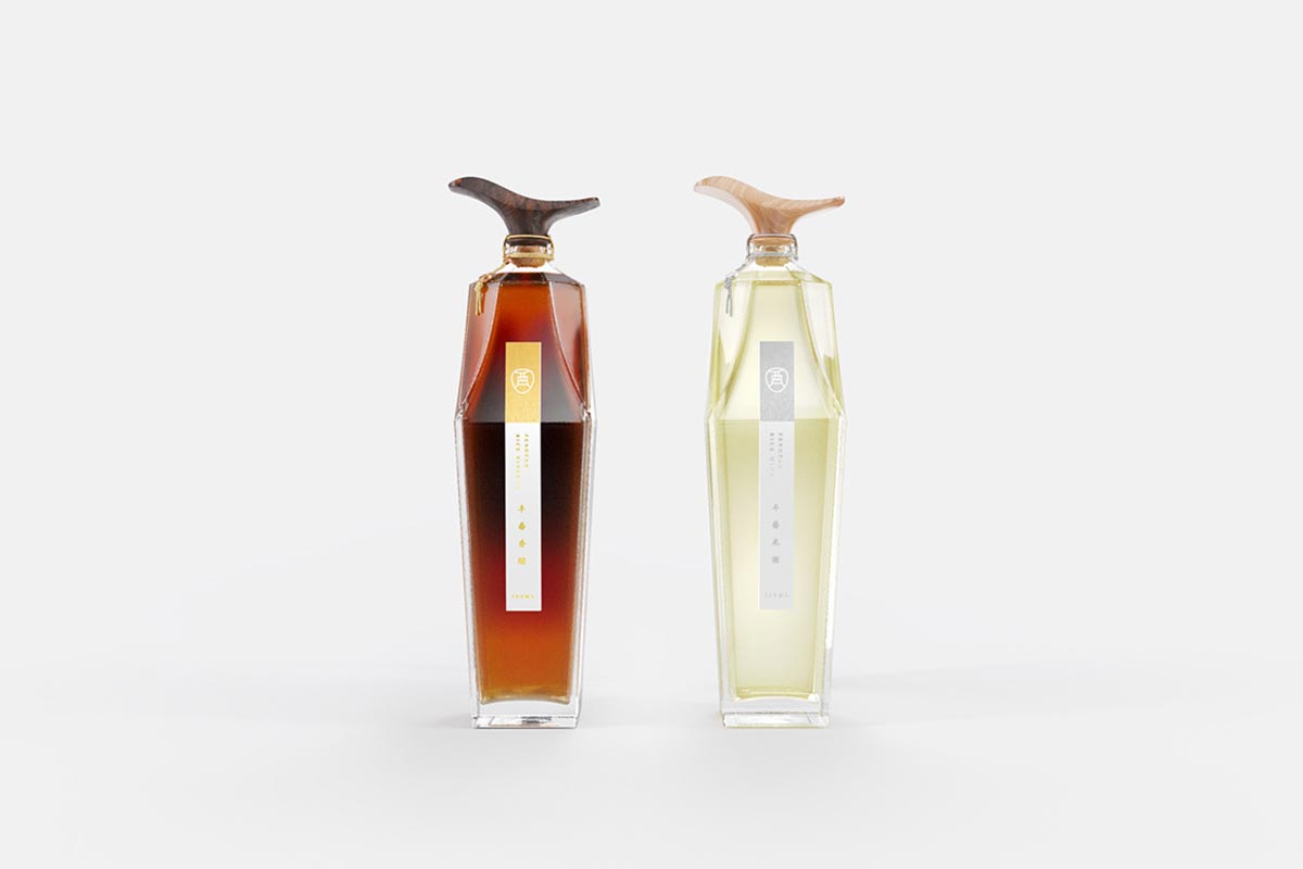
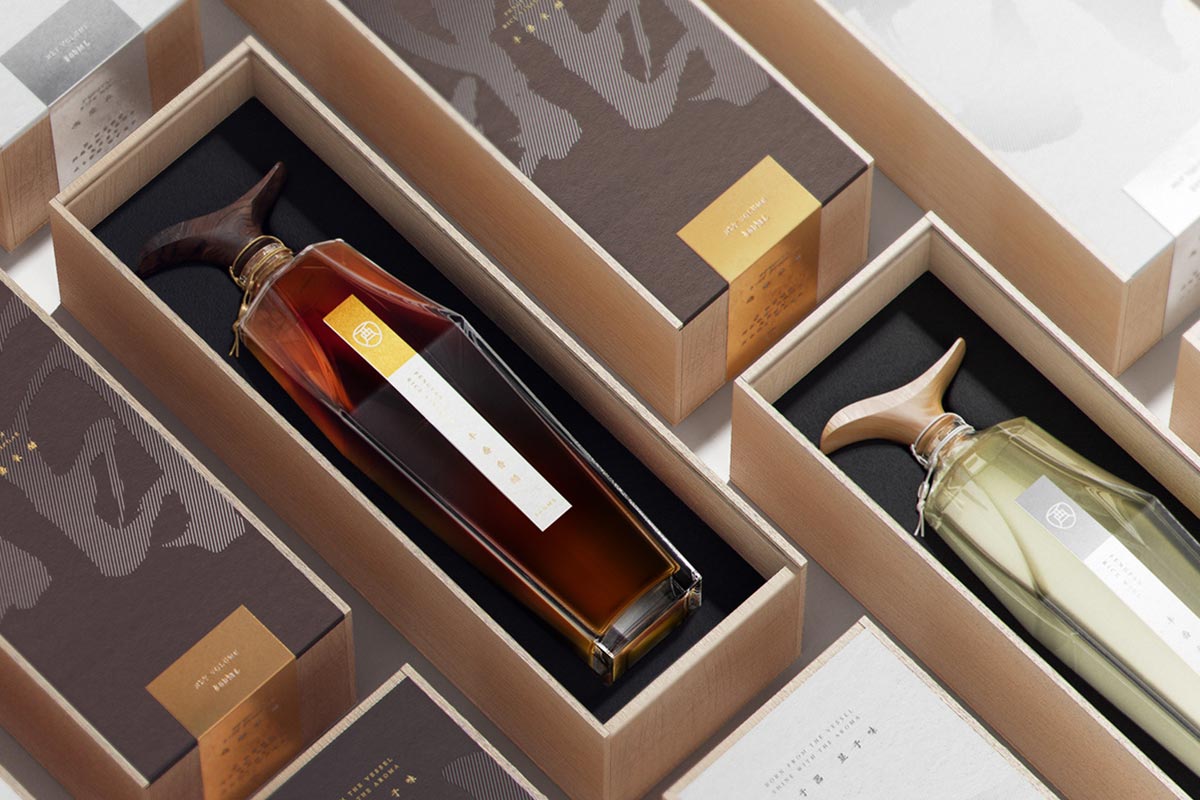
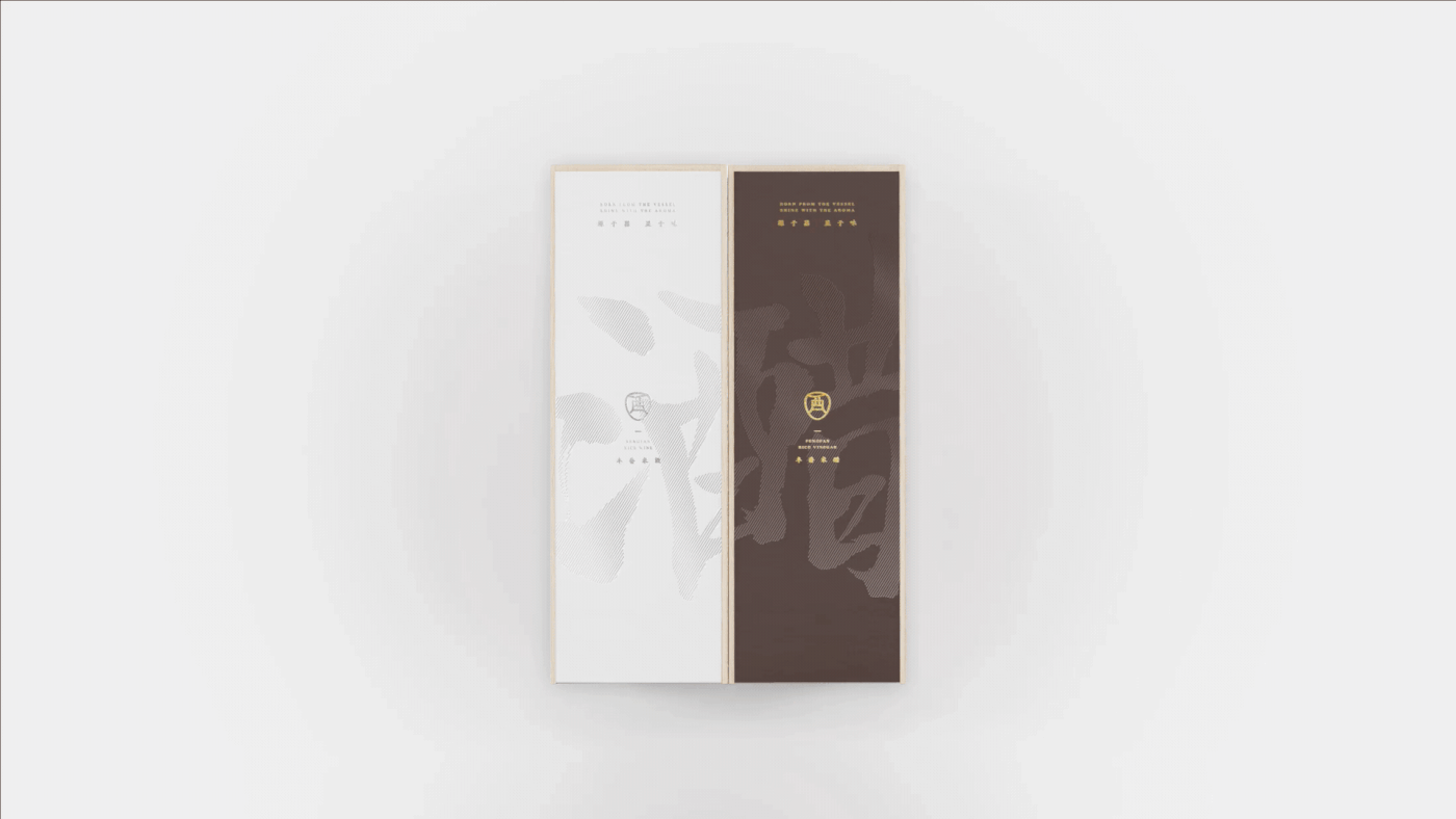
9. YOU CHINESE RICE WINE PACKAGE BRANDING
YOU is a unique type of Chinese rice wine brewed from polished rice. The branding and package design created by Sun Li takes the Chinese characters “醋” (vinegar) and “酒” (wine) which share the common radical “酉” (YOU) which means the vessel of wine in ancient meaning and integrate that into the branding, package design as well the bottle itself. The design, through contemporary artistic language, combines the character form of “酉” (YOU) with the overall bottle shape. The first stroke of “酉” (YOU) is designed as the cap of the bottle and looks very stylish and unique. The character “酉” (YOU) is printed on two boxes as a common composition, and the complete characters “酒” (wine) and “醋” (vinegar) will be formed when the two boxes are put together. I love the way the boxes, the bottles and the color of the liquids are in harmony and created an integrated package that makes the product so desirable. The angular bottles with their stylish caps look amazing and take the product into the luxury domain.
10. COMTESSE DU BARRY
Specialist of fine gastronomy, Comtesse du Barry is renowned for offering a wide choice of local products and foie gras specialties. Christmas is the time when they offer cards, letters, and gifts in their packaging. Comtesse du Barry wanted to develop an unforgettable range of Christmas boxes. For 2017, Comtesse du Barry appropriates the wonderful world of origami, a theme that corresponds to their artisanal heritage and their two fundamental values: gastronomy and aristocracy. 2S Global Design designed the range of Christmas boxes by working a refined, chic and gourmet origami, like a present that we unpack. In perfect synergy with the institutional boxes of the brand, they created a mix of colors and light effects in the spirit of Christmas. This concept is shown on the sleeves, the ribbons, the press box and in particular the calendar of the advent Comtesse du Barry. The latter is a first for the brand: they chose to work a striking form in connection with the main theme, origami.
The calendar unfolds to reveal all its graphics and surprises in the manner of a chic and gourmet origami. Behind each box, a sweet sweetness wisely waiting to be enjoyed every day.
I hope you have enjoyed this inspiration which is based purely on my personal opinion at this point in time. Remeber that package design can make or break a product so take your time and make sure your package design is creative and effective. In the meanwhile, if you have any favorite package designs you would like to share, please leave a comment below with a link to the design.

Mash Bonigala
Creative Director & Brand Strategist
With 25+ years of building brands all around the world, Mash brings a keen insight and strategic thought process to the science of brand building. He has created brand strategies and competitive positioning stories that translate into powerful and stunning visual identities for all sizes of companies.
Featured Work
See Our Work in Action
Real brands, real results. Explore how we've helped businesses transform their identity.

Client Love
What Our Clients Say
Don't just take our word for it. Hear from the brands we've worked with.

Josh Amburn
Lakefront Docks and Lifts
"I came into this project expecting to get the best logo for our brand. That’s exactly what I received. The team at SpellBrand used the descriptions of what we do along with a color palette of our site to design three amazing concepts. Once we decided on what worked best for our needs, they worked diligently to perfect the design. Their use of their project management software makes the collaboration painless. Great work team! We’ll see you on the next project! Josh"

Christian Nocera
Dapper Yankee
"Delighted to have used Spellbrand for our last project. The work was thorough and results excellent. For me it was such a pleasure to work with Mash who was able to keep up with all my last minute requests for small changes. Nothing was too much of a problem and I would have to say that its great to work with people who do actually put the customer needs first! One thing saying it, its another thing doing it – Thanks Mash!"
Keep Reading
Related Articles
Nov 19, 2025
What are paths and anchor points in Adobe Illustrator?
Master the fundamentals of paths and anchor points in Adobe Illustrator. Learn how these essential tools work together to create professional logo designs and vector graphics.
Read MoreNov 17, 2025
Use Of Color In Creating Logo Designs
Master the psychology of color in logo design. Learn how colors influence perception, build brand recognition, and create emotional connections with your audience.
Read MoreNov 17, 2025
Developing a Jewelry Logo
Learn how to create a jewelry logo that captures elegance and sophistication. Discover design strategies, typography choices, and color palettes that work for jewelry brands.
Read More