WizzKids Clothing: Rebranding a 1982 Children’s Clothing Brand
Situation: Rebranding Children’s Clothing Brand After Ups and Downs
WizzKids Clothing Co. is an online retailer of children’s clothing. Started in 1982 in New York, the brand went through ups and downs from being a successful children’s clothing brand to almost closing down and then again rebounding.
The children’s clothing market requires brands that appeal to both children and parents, making brand identity challenging. WizzKids needed a brand identity that would honor their 1982 heritage while positioning them for successful relaunch.
Task: Create Brand Identity Appealing to Both Children and Parents
For their relaunch and rebranding logo design and brand identity they had a simple brief – to create a logo design for their children’s clothing brand that would not only appeal to the children but also sit well with the parents. The challenge required:
- Dual appeal: Logo design that appeals to both children and parents
- Relaunch positioning: Brand identity that positions for successful relaunch
- 1982 heritage: Visual identity that honors brand heritage since 1982
- Simple execution: Design that achieves simple brief through complex execution

Action: Strategic Brand Development
Brand Strategy: Cute Animal Icon with “Wizz” Connection
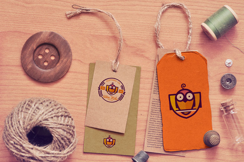
Although the brief was simple, creating a logo that works well with such a diverse target audience is quite a difficult task. But at Spellbrand difficult tasks are eaten for breakfast! From our research and brainstorming, we decided that we would have a cute animal as the iconic focus. Furthermore, we wanted to relate to the “wizz” part of the brand name. We narrowed down the choice of animals to a penguin (penguins are famous for being intelligent even when they are young etc) and an owl (an owl standing for wisdom and intelligence and always represented so). We created several designs based on these motifs and the client chose the owl icon as the final design.
This brand strategy:
- Focuses on cute animal: Cute animal as iconic focus
- Connects to wizz: Relates to “wizz” part of brand name
- Considers options: Penguin and owl options considered
- Chooses owl: Client chose owl icon as final design
This brand strategy works because:
- Cute animal: Cute animal as iconic focus
- Wizz connection: Relates to “wizz” part of brand name
- Penguin option: Penguins famous for being intelligent when young
- Owl option: Owl stands for wisdom and intelligence
- Client choice: Client chose owl icon as final design
Logo Design: Multiple Layers with Simple Elegance
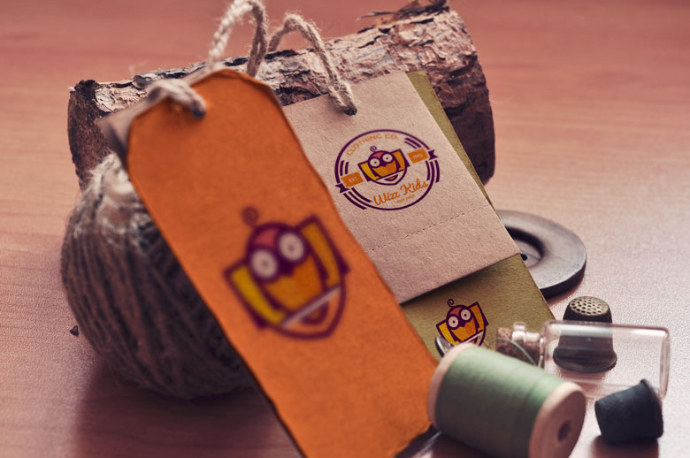
The design has multiple layers and meanings attached to each layer. The challenge was to present so many design elements while still keeping the design simple and elegant. So, we used thin lines and white space to create a roomy-looking logo. The logo itself is an emblem-like design with a circular stamp on the outside with a broken circle with two halves immediately after that. Inside the circle, on the top is the name “Clothing Co”. Below that is a cute owl icon with a ribbon to work as an abstract crest. Flanking the owl icon are the words “Est. 1982”. Below the owl icon is the brand name and below that is “New York”.
The overall design is one of cuteness, elegance, and meaning and works well with both the children and the parents equally!
This logo design:
- Creates multiple layers: Multiple layers and meanings
- Ensures simplicity: Simple and elegant despite many elements
- Uses thin lines: Thin lines and white space create roomy look
- Forms emblem: Emblem-like design with circular stamp
- Includes broken circle: Broken circle with two halves
- Features owl icon: Cute owl icon with ribbon as abstract crest
- Shows heritage: “Est. 1982” shows brand heritage
- Shows location: “New York” shows location
- Appeals to both: Works well with both children and parents
Result: Brand Identity That Appeals to Both Audiences
The brand identity we created for WizzKids Clothing Co. successfully relaunches and rebrands the 1982 children’s clothing brand. The comprehensive brand transformation delivers:
Strategic Outcomes
- Dual appeal: Logo design successfully appeals to both children and parents
- Relaunch positioning: Brand identity successfully positions for successful relaunch
- 1982 heritage: Visual identity successfully honors brand heritage since 1982
- Simple execution: Design successfully achieves simple brief through complex execution
- Complete brand system: Cute owl icon, multiple layers, and emblem structure create unified experience
Implementation Success
Today, WizzKids Clothing Co. uses this comprehensive brand identity to attract both children and parents. The cute owl icon design with multiple layers and meanings, combined with thin lines, white space, and emblem-like structure, creates a design of cuteness, elegance, and meaning that works equally well with both audiences. The brand successfully positions WizzKids Clothing Co. as an online retailer of children’s clothing that has rebounded from near closure, with a logo design that appeals to children through cute owl icon and to parents through elegance and meaning, successfully relaunching the brand after ups and downs since 1982.
Brand Name Strategy: Creating “WizzKids Clothing Co.”
The name “WizzKids Clothing Co.” was developed through Spellbrand’s strategic brand naming process. Our team researched the competitive landscape, target audience, and brand positioning to create a name that would resonate in the market and support long-term brand growth.
The naming process included linguistic analysis, trademark screening, domain availability verification, and brand storytelling to ensure “WizzKids Clothing Co.” would be distinctive, memorable, and legally protectable. Learn more about our brand naming service or explore our full naming portfolio.

