Hyderabad Italian Bistro Logo Design & Branding
Linden, CIBO House
Location
Hyderabad, India
Services Rendered
- Logo Design
- Branding
- Brand Identity Design
- Brand Strategy
- Menu Design
Deliverables
- Final Source Files
- Brand Style Guide
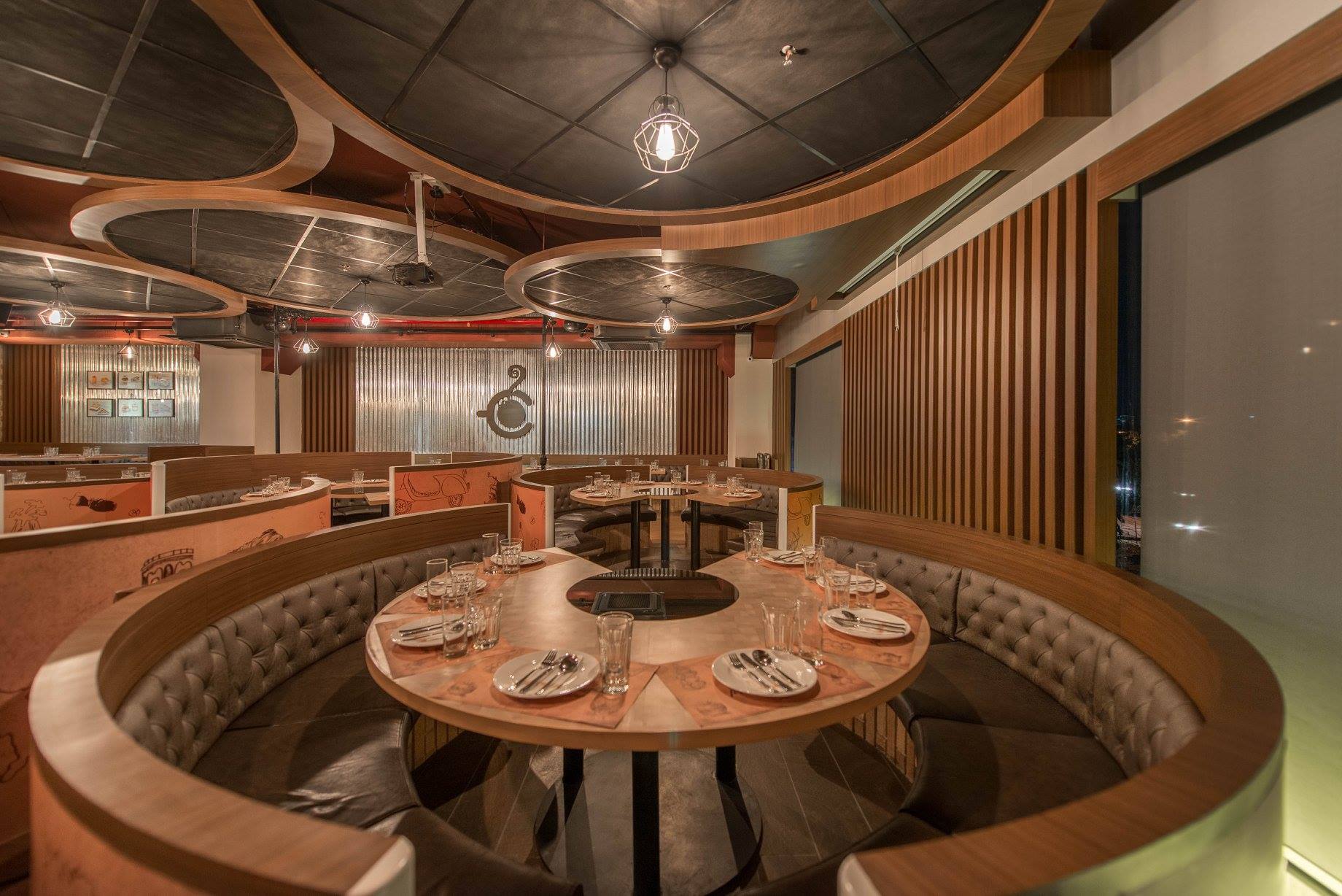
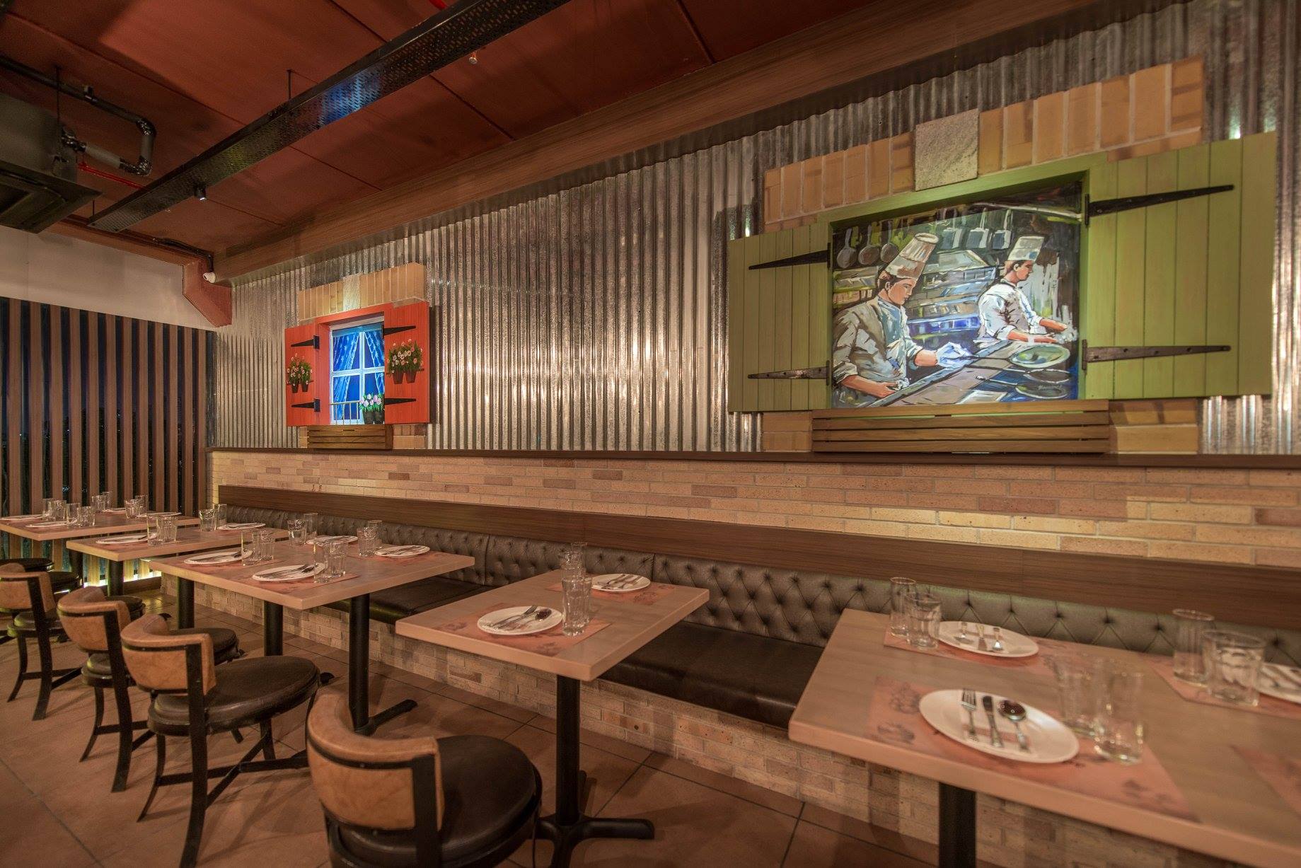
Linden, a company located in Hyderabad, India‘s first sub-brand is an Italian Bistro – actually the first Italian Cafe in Hyderabad.
The client wanted a brand name for the new venture that really tied in with their concept of heart warming Italian food served to the local Indian population. After much research and brainstorming, we came up with a series of brand names from which the client chose the final one – CIBO House. “Cibo” in Italian means food and we wanted to hint at an “eating house” or “eatery”. We also made sure that the name was not trademarked and that the website domain name was free to register.
Creating the right kind of brand name for chain of bistros is quite a tough challenge. More importantly creating a brand name for the Indian target market is even tougher. We carefully analysed the local language specifics of Andhra Pradesh in India to ensure that we were not committing any faux paux. This really takes up a lot of time when dealing with international brand naming exercises. Once we have a short list of names we put a lot of effort into making sure there are no trademarks registered and a domain is available. These days finding a domain name is near to impossible!
The client has experience running five successful subway restaurants (franchises) the last three years. Now they are trying to create their own successful model of Italian bistros.
Initially we explored Italian imagery related to various landmarks such as San Gimignano, Leaning Tower of Pisa, Piazza del Campo in Venice, Santa Maria del Fiore, Colosseum and more. We also explored images of Italian food drawn in line art. But increasingly we realised that such complex visuals would make it difficult for the client to brand their bistro logo effectively and also would end up costing a lot.So we went back to the drawing board and started stripping away everything right down to the core essence of the brand and were left with a few simple iconic images which resulted in highly effective designs that would serve a growing chain of bistros quite well.