Scandinavian University Press Brand Identity
Scandinavian University Press
Location
Norway
Services Rendered
- Brand Strategy
- Visual Identity System
- Modular Brand Grid & Guidelines
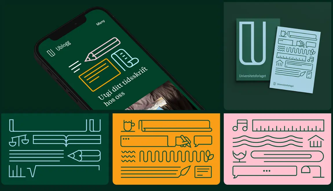
- Illustration Style & Icon System
- Typography & Color Strategy
- Print & Digital Applications (Books, Web, Posters)
As one of Norway’s oldest and most respected academic publishers, Universitetsforlaget needed a new identity that reflected their continued leadership in scholarly publishing – while expressing the evolving role of knowledge in a digital, dynamic world. The task was to create a visual system that could serve both as a symbol of legacy and a tool for modern communication across platforms and disciplines.

Master Identity System
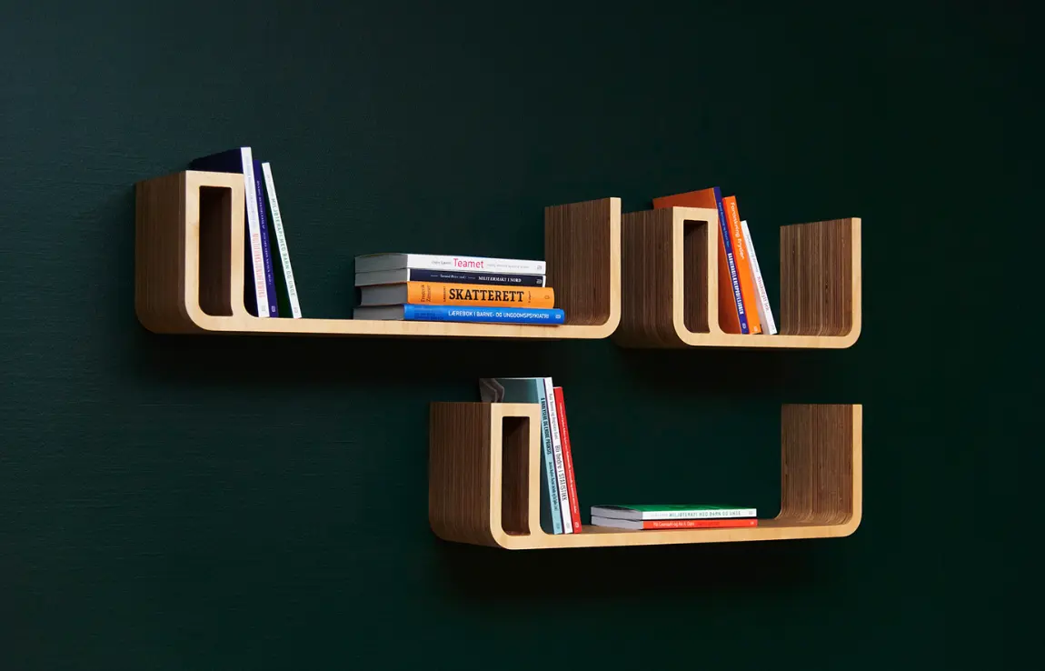
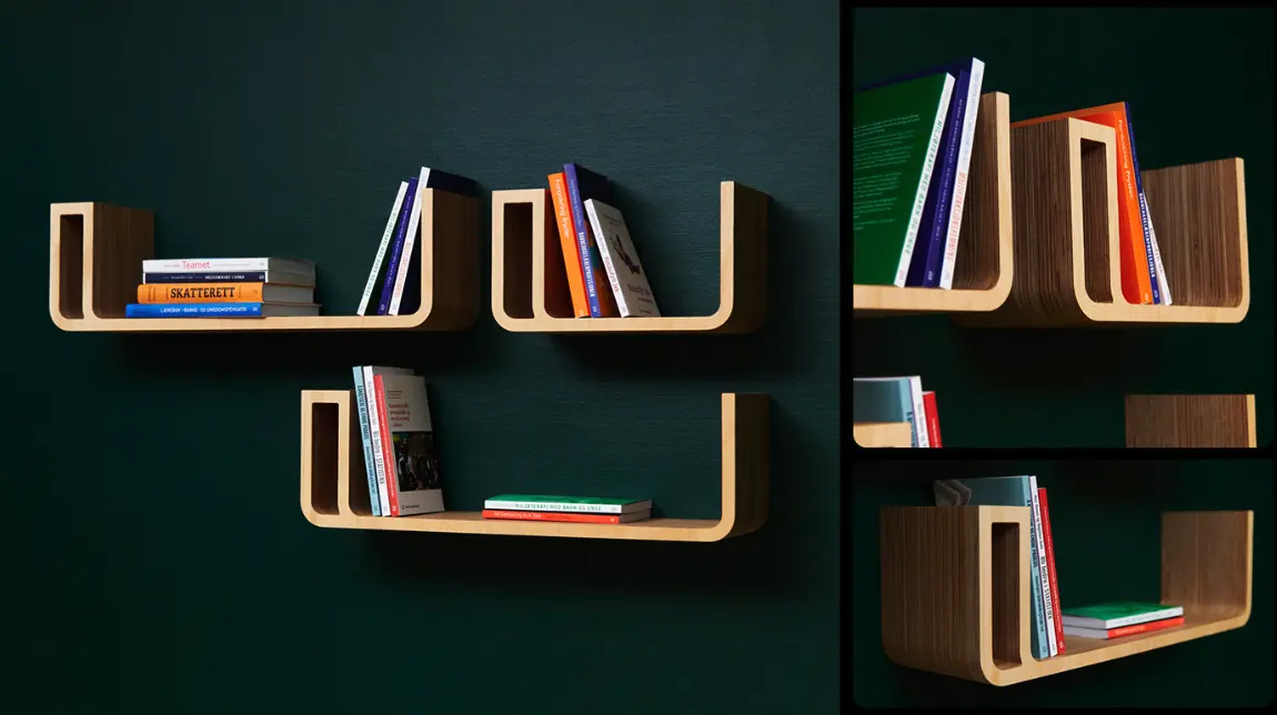
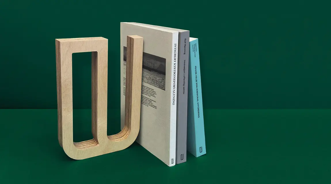
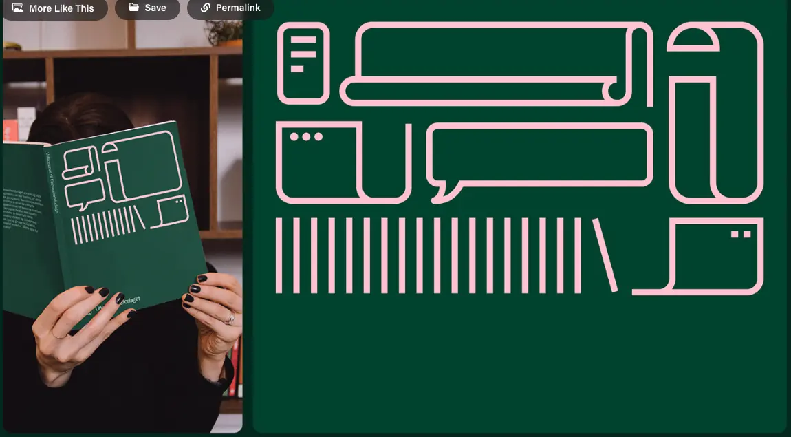
The redesigned “U” functions as the cornerstone of the identity. It’s both highly recognizable and versatile—serving as a container for content, a framing device in layouts, and a symbolic book spine. The mark embodies knowledge expansion and creates cohesion across all branded materials.
The Strategy
We anchored the new identity around the idea of knowledge as a building block of society—with the book as its universal symbol. The redesigned “U” becomes a modular, expandable form: a shelf, a spine, a window into insight. The visual language adapts seamlessly across categories and applications—from textbooks to journals to digital platforms.
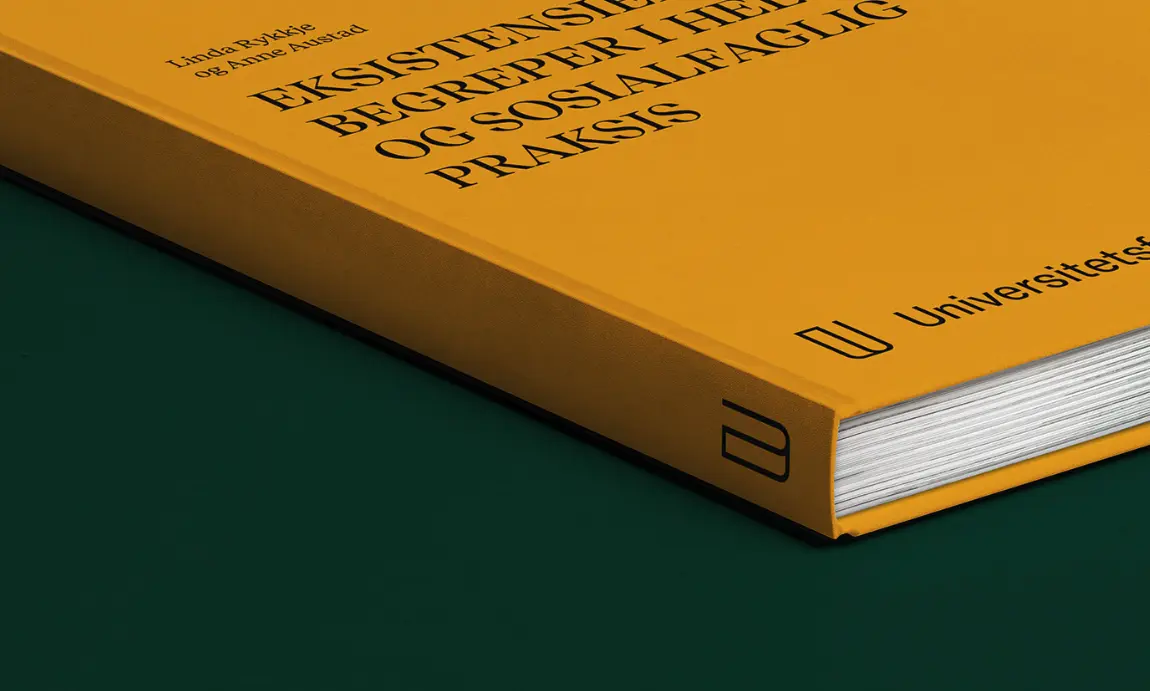
The new identity is bold, structured, and meaningful. It’s driven by a limited, distinct color palette, a custom illustration language, and a modern typographic system that balances tradition with clarity.
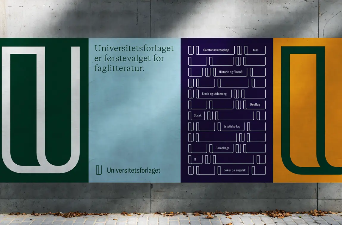
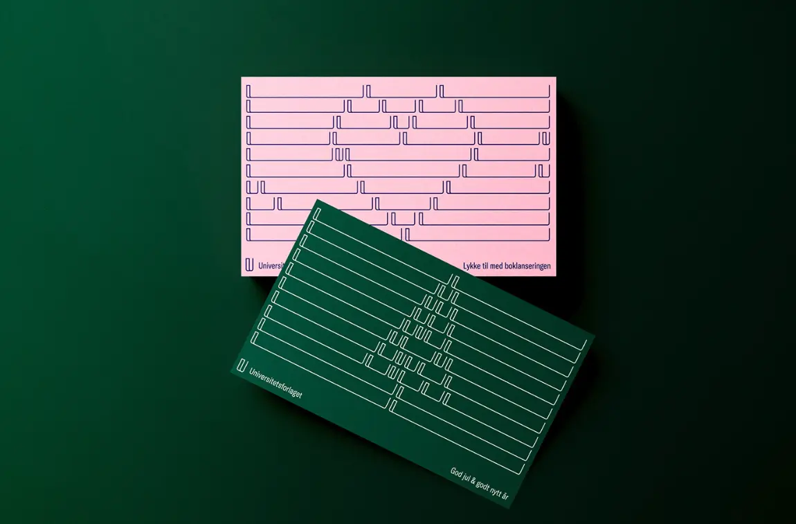
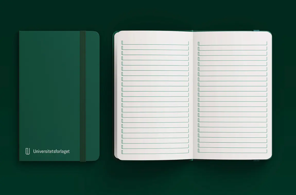
Pattern System
By repeating the “U” in structured grids, we created flexible visual textures that feel both academic and dynamic. These patterns reinforce brand recognition without requiring overt branding, working especially well across editorial layouts, packaging, and environmental design.
Color Palette & Type Hierarchy
A bold yet elegant color system – anchored in deep green, gold, and soft pastels—supports hierarchy and thematic segmentation across subject areas. The custom typographic hierarchy ensures every surface, from book covers to website footers, is legible, structured, and distinct.