MP2E Solutions Visual Language
MP2E Solutions
Location
Fontenay-aux-Roses, France
Services Rendered
- Brand Strategy & Positioning
- Visual Identity System
- Custom Iconography System
- Pattern & Motion Language
- Color Architecture
- Print, Packaging, Signage, and Digital Design Guidelines
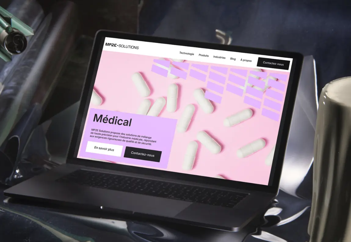
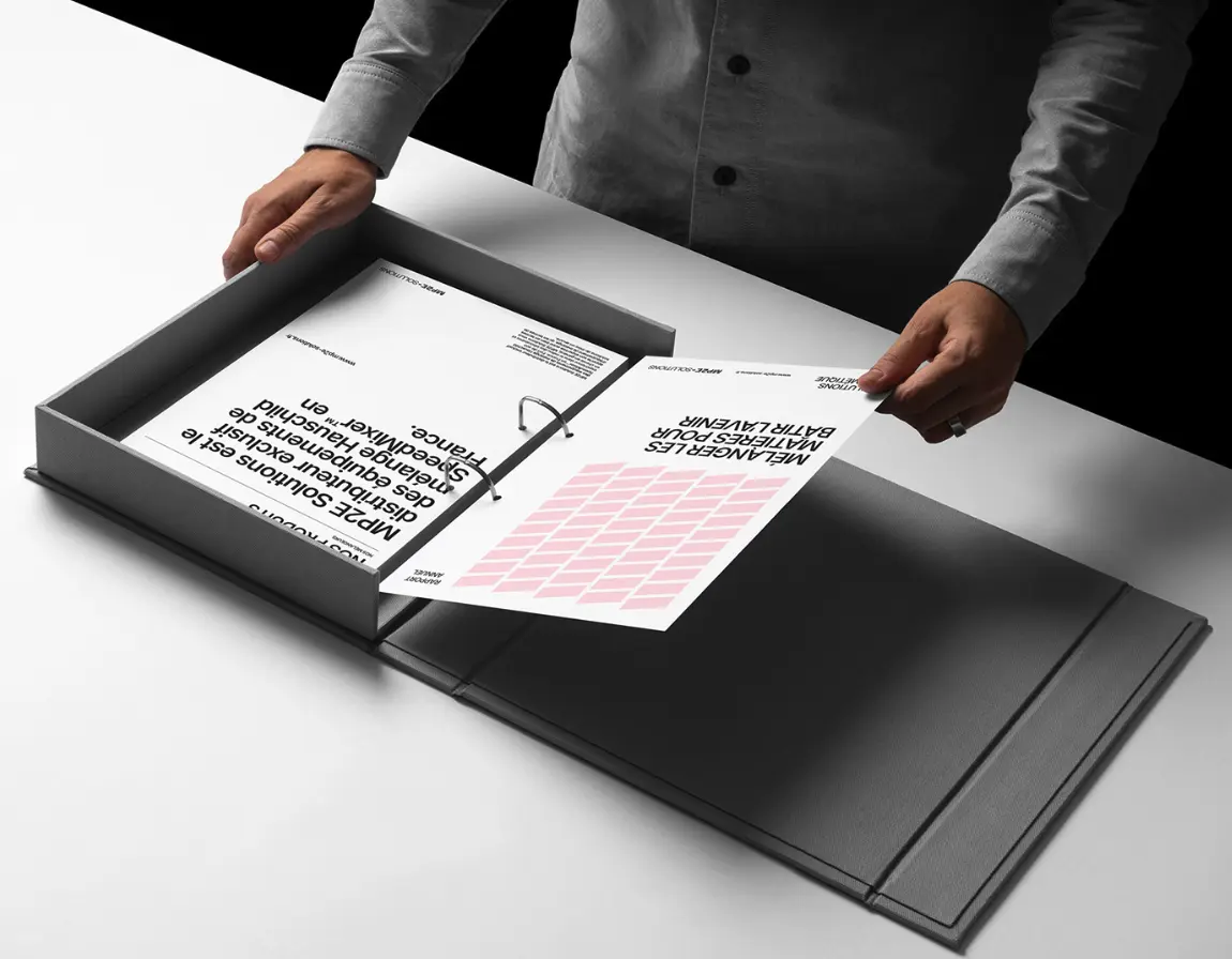
MP2E Solutions is a leading distributor of Hauschild SpeedMixer\u2122 technology\u2014highly specialized planetary mixers used across sectors like pharmaceuticals, electronics, food, and medical research. As the exclusive French distributor for nearly a decade, MP2E has played a key role in supplying industries with bladeless, vacuum-capable, and safe mixing equipment. Yet, its brand lacked the clarity and flexibility needed to reflect its technical precision and cross-sector reach. The goal was to signal a new era for the company and translate its complex capabilities into a simple, scalable brand system.
The Strategy
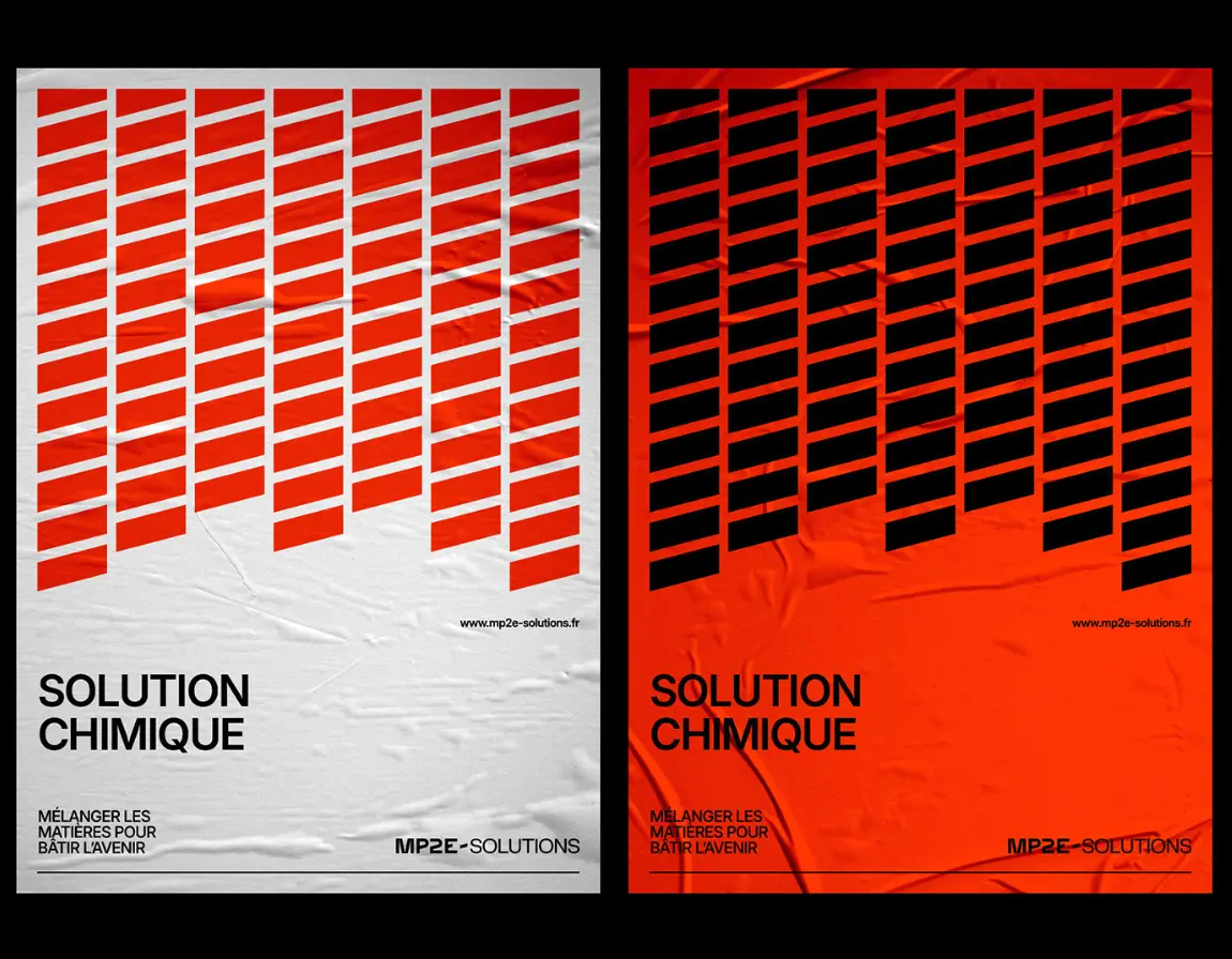
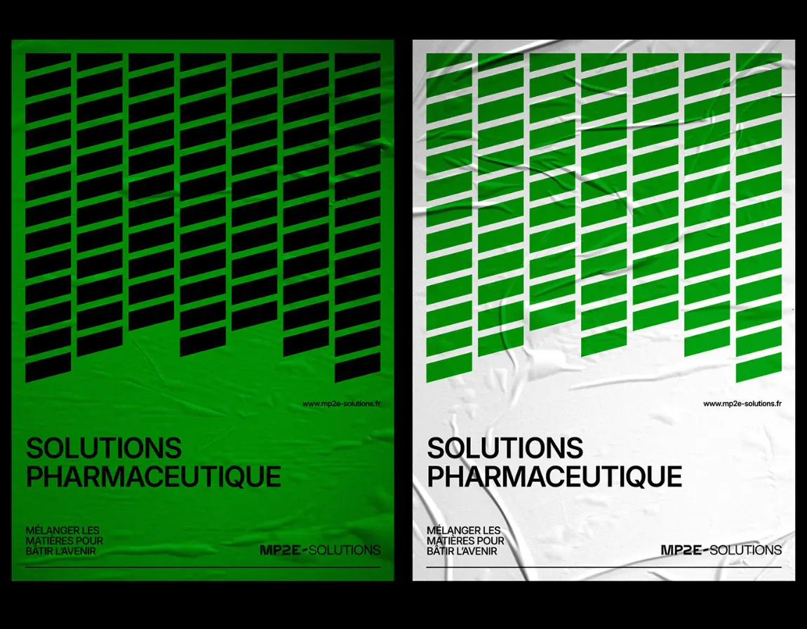
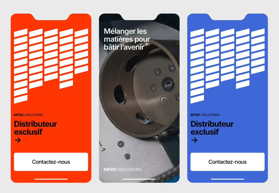
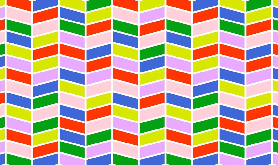
We built the brand around a central idea: Mixing Materials to Build the Future. The core of the identity is the hyphen\u2014a graphic representation of connection, balance, and transformation. It serves as a metaphor for MP2E’s role in uniting technologies, sectors, and processes.
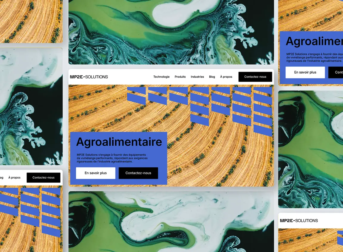
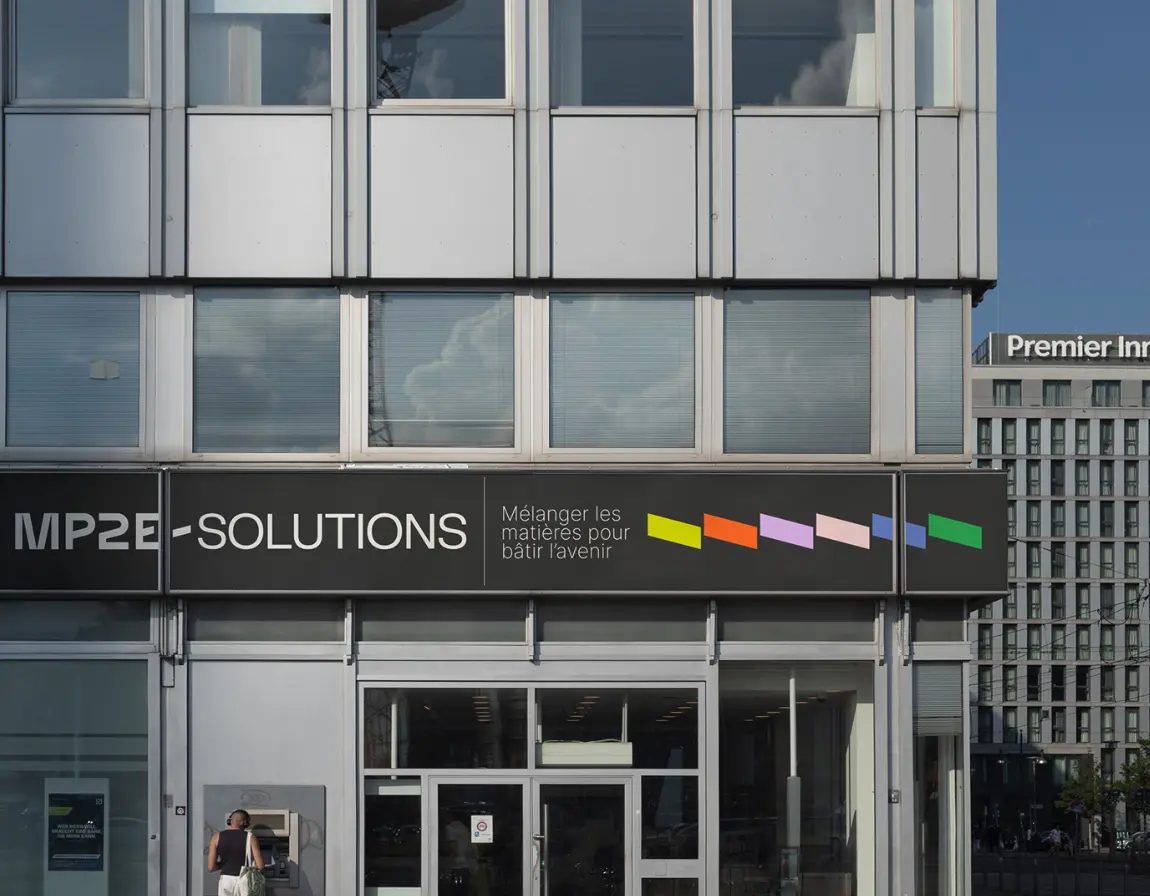
The visual system leverages this hyphen as a structural device, turning it into patterns, motion elements, and layout dividers. Combined with a bright, industrial-grade color palette and a dedicated icon system, the new identity is able to operate across applications with clarity and energy. Each color reflects a different industry, making the brand instantly recognizable within multiple ecosystems.
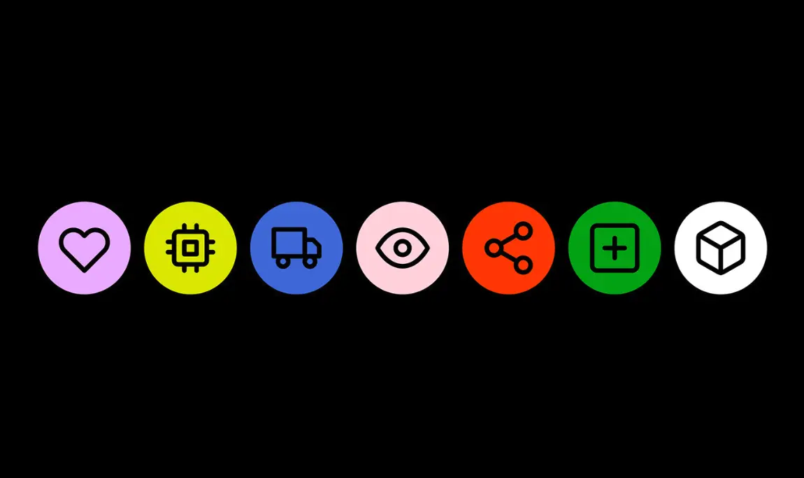

Icon System in Use
Each icon was designed to be clear at any size and universally understood. Placed within brightly colored circular backgrounds, these icons simplify navigation across MP2E’s communications – whether on product manuals, digital interfaces, or technical documentation. The color-coded system reinforces category clarity and cross-industry relevance.
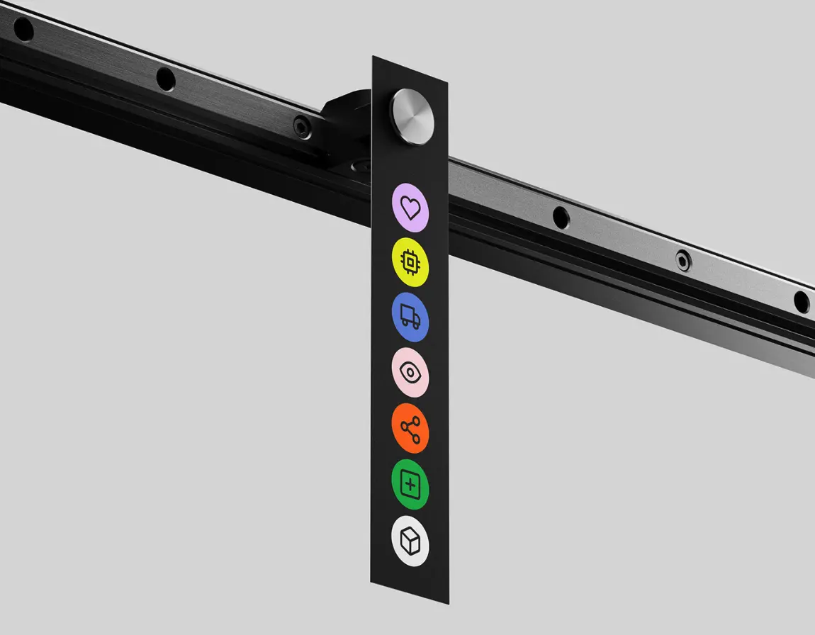
Symbol Pack
The core visual vocabulary is distilled into a tight yet flexible system of symbols and color markers. These can be applied across stickers, labels, infographics, and product packaging – ensuring brand consistency while remaining adaptable to new use cases and technologies.
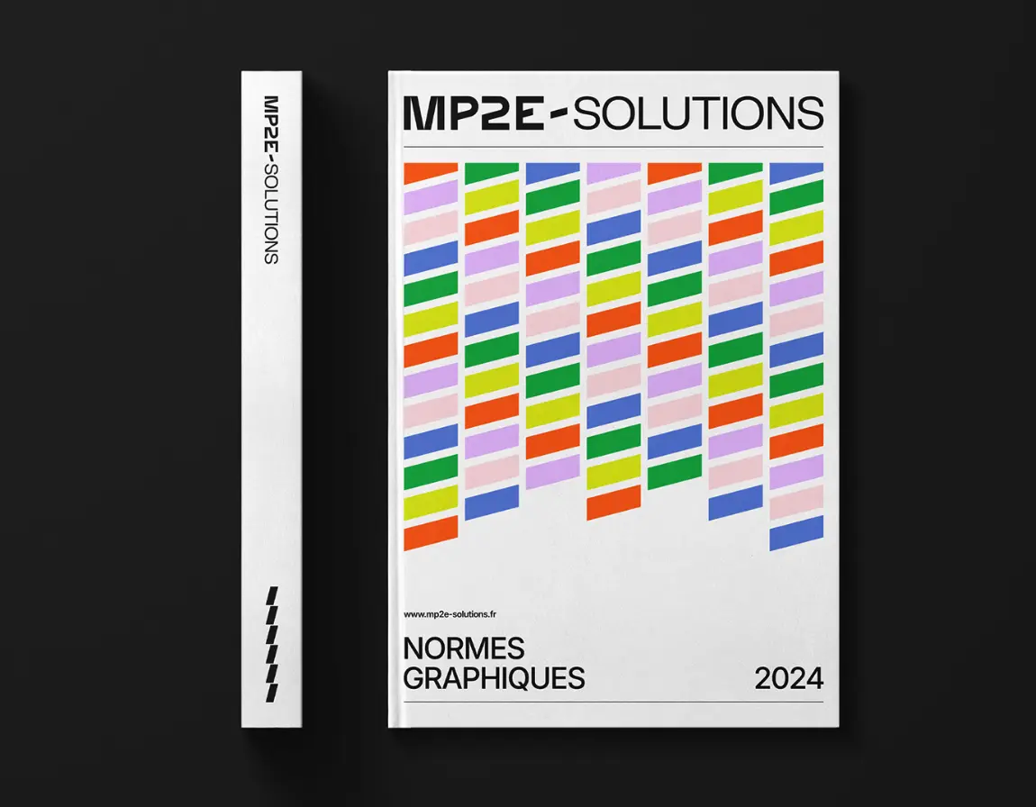
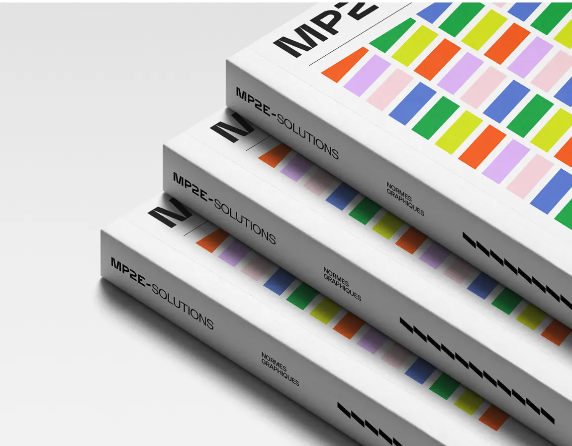
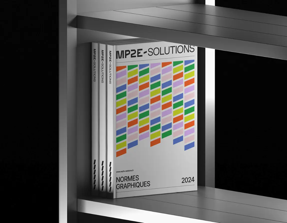
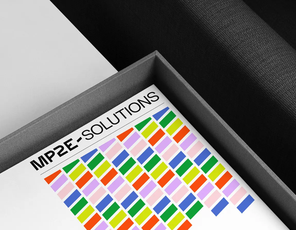
Normes Graphiques Book Cover
The brand’s design manual acts as a visual foundation – expressing structure, repeatability, and adaptability in one cohesive format. The use of diagonal hyphen shapes arranged in a rhythmic grid reflects the dual nature of the business: precise engineering and creative versatility. It’s a toolkit and a manifesto.