Dubai Burger Chain Branding
Year
2018
Location
Dubai, UAE
Services Rendered
- Logo Design
- Brand Identity
- Positioning Strategy
- Package Design
- Restaurant Branding
- Menu Design
Deliverables
- Final Source Files
- Brand Style Guide
Rael Premium Food is a food and beverage distribution company located in Dubai and operations throughout the Middle East.
When Burgisto wanted to launch a chain of Burger Fast Food outlets, it needed a brand strategy and visual identity that would help it penetrate a highly competitive market segment.
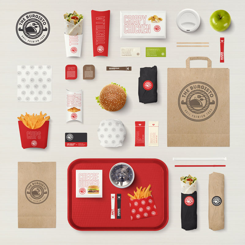
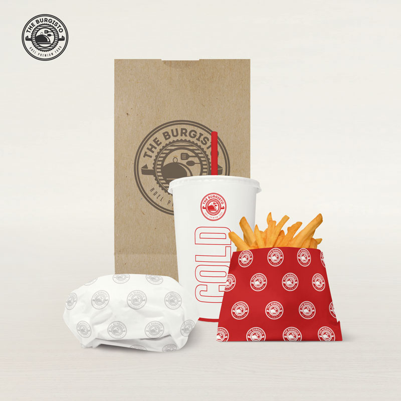
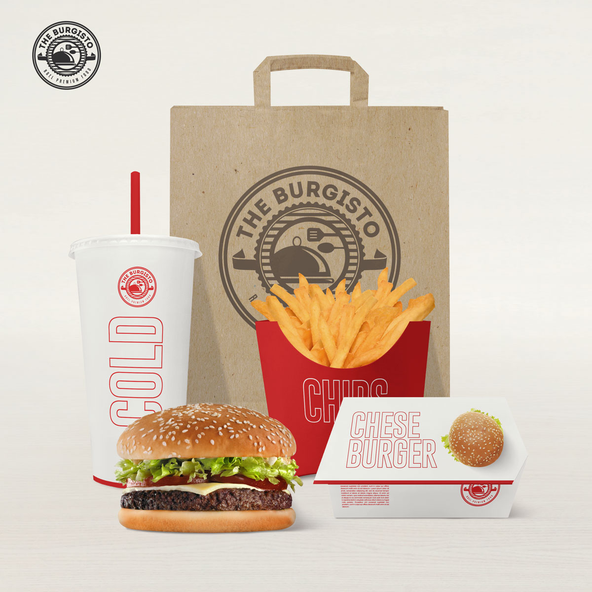
Brand Strategy: They reached out to SpellBrand Dubai to help them with their Dubai Burger Chain Branding journey. Rael has been distributing to fast food joints for over 25 years and has an infrastructure and network to rival any of the major fast-food brands. The UAE and other Middle Eastern countries are embracing “American style” fast-food chains and the market segment is maturing rapidly with saturation with insight. With these conditions, it is quite a challenge to enter and gain market share for a new entrant.
A positioning strategy is vital to be able to not only enter such a market but also gain vital “mind-share” to be able to then gain any market share. The talented Positioning Strategy team at SpellBrand, headed by master strategist Mash Bonigala, dug deep, researched, brainstormed, and came up with a positioning strategy that enables Rael to not only enter the market but also gain mind-share quickly and surely. Also outlaid were marketing campaigns and content marketing strategies.
To succeed with this brand, the client needed a brand name that not only sounded American but also had a bit of the European slant to it. We came up with a few names that matched these criteria and the name “The Burgisto” was finally chosen. It is a fun name that is easy to remember and can be used effectively in campaigns to build brand recall.
Brand Identity: After the name was chosen, we set to work creating a visual identity language that matched the brand strategy that we had set out. This included a simple yet iconic and powerful logo design incorporating a couple of elements from the parent brand’s old logo and also making it into an emblematic design that would work well within the fast-food market segment. We also incorporated the parent brand name into the logo to transition the company into this new venture and still tie back to its heritage.
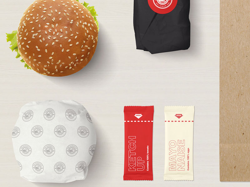
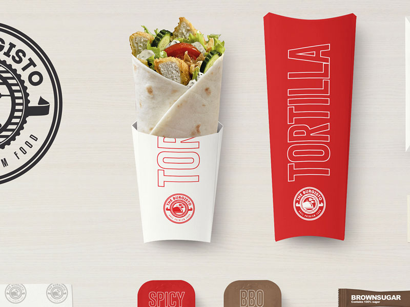
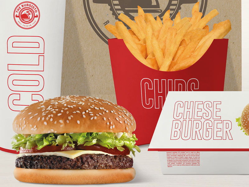
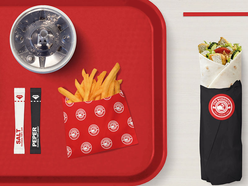
Extending the logo design into the package design as well as the various visual touchpoints of the fast-food joint was the next step and this included designing the burger boxes, napkins, chip holders, burger wrappers, coffee, and juice cups, trays, and more. In fact, we are currently working hard on designing the burger joint interiors after which we will start working on the various print and media exposure designs including billboards, adverts, and more.