120 Year Old Brewers Logo Design Branding
Year
2014
Location
St. Louis, Missouri
Services Rendered
- Logo Design
- Branding
- Label Design
- Brand Identity
- Brand Strategy
Deliverables
- Final Source Files
- Brand Style Guide
Opened in 1908, Highlands Brewers located in St. Louis, Missouri, has tons of history, fortune, and misfortune in a gripping story that reads like a Hollywood tale.
Within a few years of opening the brewery, the original partners died one after another which led to the shutting down of the brewery for over 5 years after which it was bought by an immigrant Italian family that persevered through prohibition, declining sales, and personal misfortune. In 1986, the Highlands was once again boarded up and left silent for another 15 years. It was then that the current owners bought the old brewery and mills and started making craft beer. With a new brand strategy, the clients want to create a fresh new logo that still retains aspects of the bygone era.
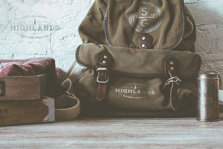
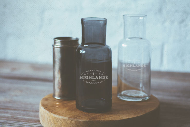
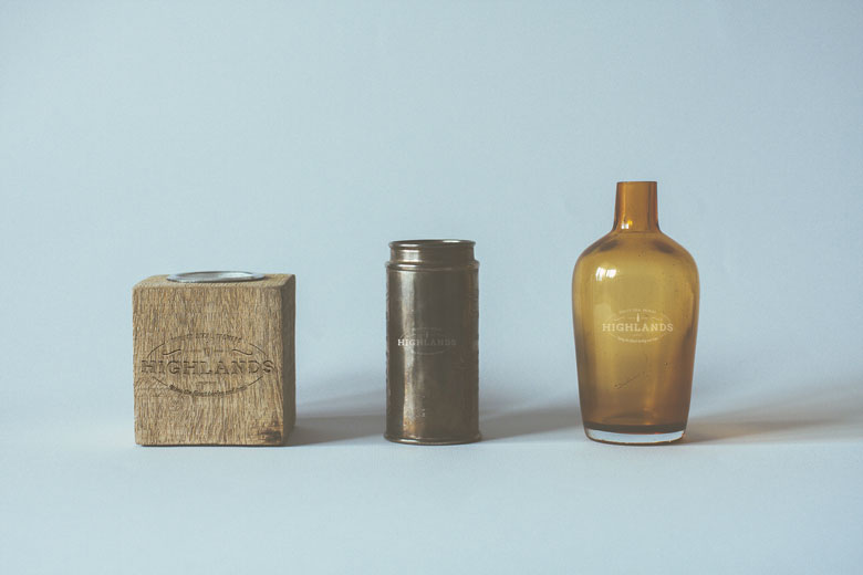
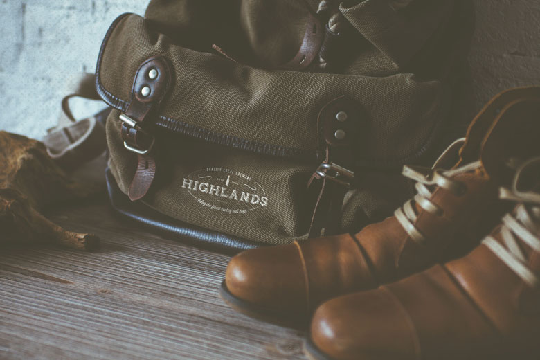

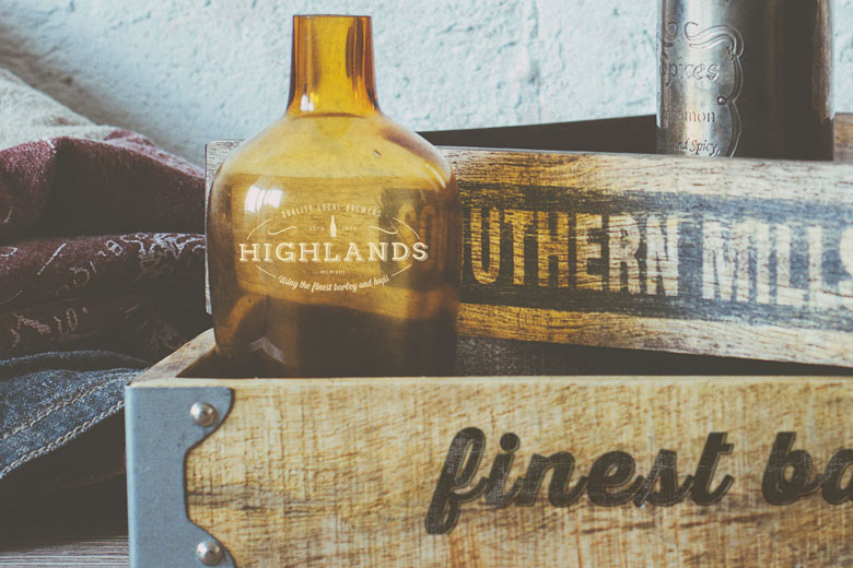
Because of the rich heritage and history of the brewery, we decided to implement the brief by creating a simple and unassuming design that would relate directly to the history and bring the brand into modern times. A symbolic seal-like design was the preferred way to take since that would lend itself well to branding on bottles, packaging, and other bit and pieces.
The final design that the client selected emphasizes the name “Highlands” which is the focus of the logo with a very simple and rustic-looking icon of an old beer bottle on top, flanked on both sides by the words “Estd 1908” on top. The whole design is encased in a broken ellipse with the words “Quality Local Brewers” on top and “Using the finest barley and hops” at the bottom.
This design brings back the nostalgia of the turn of the century design, typefaces and ornaments and gives the brand a quiet dignity and confidence.