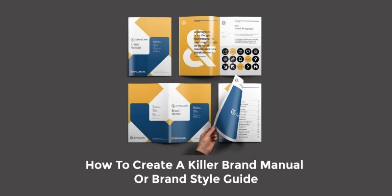
Brand Guidelines Elements: One of the most important brand assets for any company is their brand manual or brand style guide document. Being consistent in brand messaging is crucial to the growth and success of a brand. And a brand manual or brand guide does the job of ensuring this consistency.
When the brand identity of a brand is being created, the natural tendency is to simply focus on the logo design or primary brand mark and as soon as it is created to start using it and moving onto other activities such as marketing materials or website development.
However, the right way to create a brand identity is to actually focus on creating a brand identity system as I had outlined in my previous article. This brand identity system takes your brand from having just a shirt to a three-piece suit which enables the brand to look the best and be perceived appropriately.
Once the brand identity system is created, it is essential that a set of rules and guidelines are established on how the various elements of the brand identity system are implemented and executed in your branding endeavors and campaigns. A document that dictates these rules and guidelines on the elements of your brand identity system and how they should be used is called a brand manual or brand style guide document.
This article is one of the lessons from my Ultimate Brand Builder Course. By completing the course you will have built a robust and stunning brand that will be poised to attract your target audience and dominate your market space.
Essential Components Of A Brand Style Guide
What is a brand manual or brand style guide?
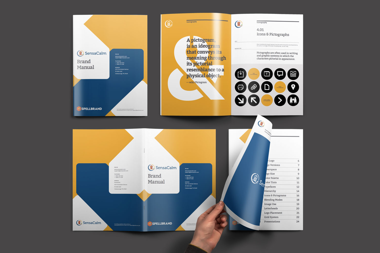
A brand manual or style guide must consist of the following components to create the right kind of brand recognition. We will explore each of these sections below. For this article we have taken a brand manual that we had created for one of our clients that represented their brand voice and included photos of the style guide to illustrate the various sections of the brand book. You can also the read the article on company logo design guidelines to get some more information.
- Cover page
- Table of contents
- Introduction
- Primary logo design
-
Logo introduction
- Logo application
- Logo elements
- Clearspace and computations
- Incorrect logo applications
-
- Corporate Color System
- Corporate colors
- Primary color
- Secondary color system
- Corporate Typography
- Corporate fonts
- Primary font
- Secondary font
- Font Hierarchy
- Corporate Iconography
- Grid Systems
- Print grid system
- Logo Placement
- Columns & grid margins
- Vertical grid system for tablets
- Images & Blending Modes
- Corporate image style
- Corporate image colors
- Corporate image black and white
- Blending modes and options
- Image grid systems
- Presentations & Other Print Assets
- Conclusion
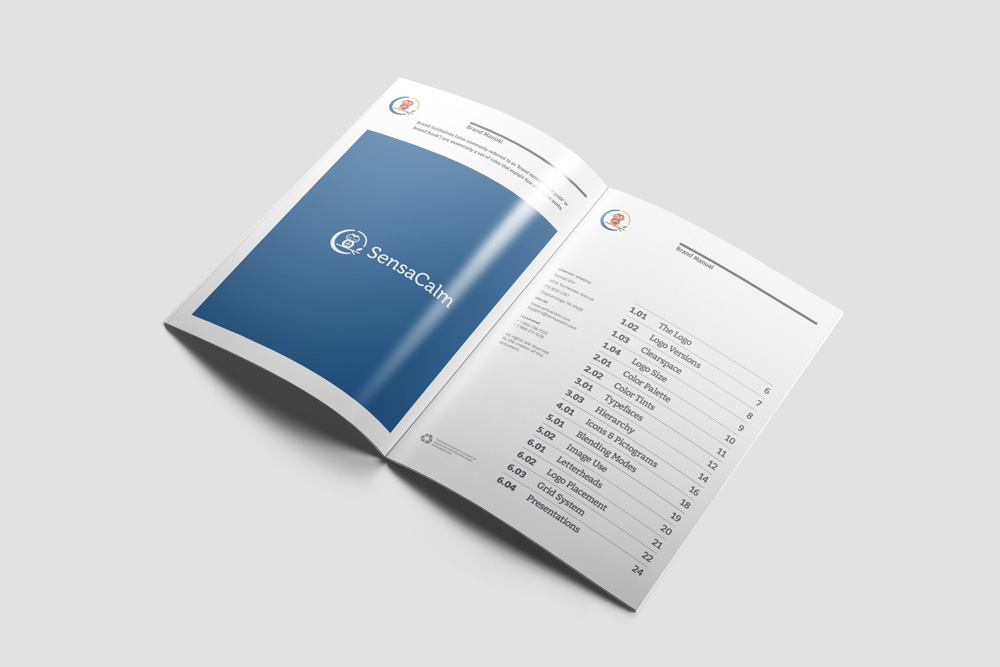
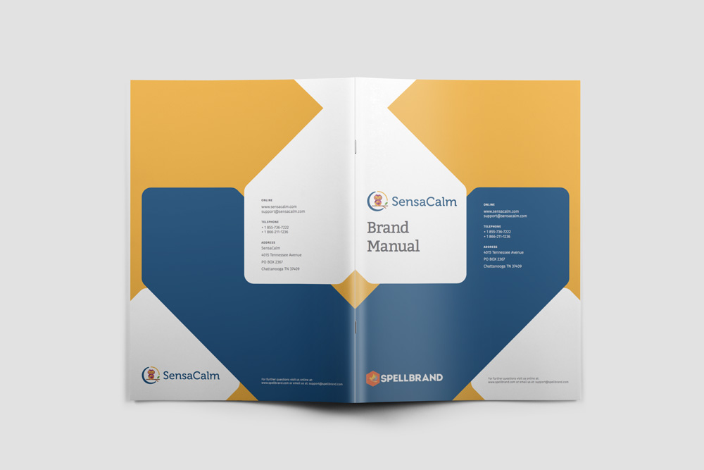
Cover Page and Table of contents
For every brand manual or style guide it is very essential to set up the context, the tone of voice, and the narrative and this can be done on the cover page, table of contents and the introduction section.
Start off with a large and beautiful layout of the primary logo design on the inner page. It would help if you can place the logo on a background of the primary color and use a version of the logo that would pop out on that background.
Include a complete table of contents on the opening page with page numbers. Break it down into sections if possible and number accordingly.
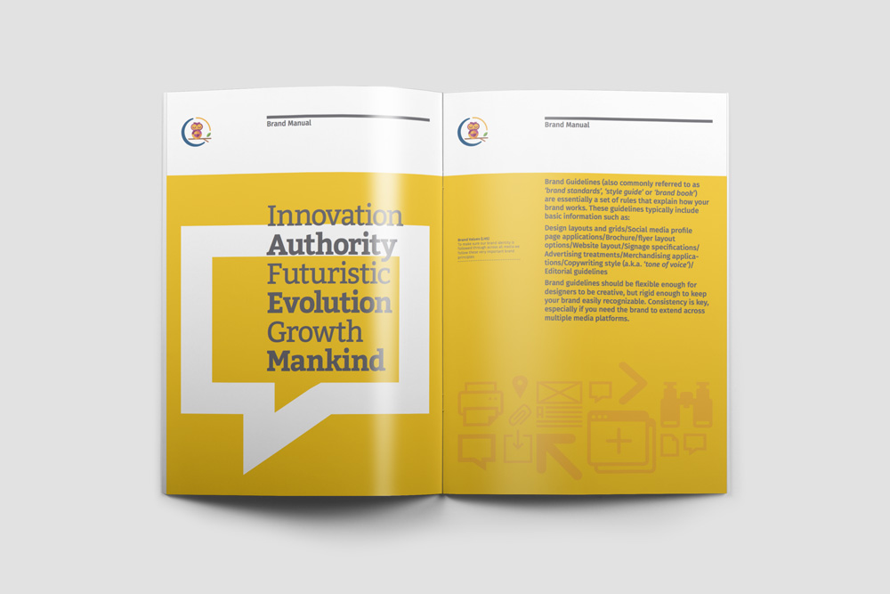
Introduction and Context
If you have a brand story, then this would be the place to talk about that. When the story is fresh and the inspiration is high, all the stakeholders and team members of your brand would connect with the brand story. But as time goes by the impact of the brand story tends to dim down.
Your brand manual would be a good place to reconnect with your brand story and the context of your brand.
At the very least include text that explains the importance of the brand manual or brand style guide and how it can be used.

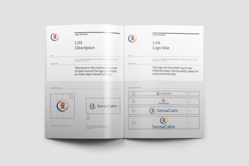
Primary Logo Design Specifications
In this section you lay out the fundamentals of your primary logo design. A separate section needs to be created if you have a secondary brand mark.
The purpose of this section of your brand style guide is to not only enumerate the technical specifications of your logo but also guidelines of how and how not to use your logo design.
Technical specifications of your logo design include measurements of the main components of your logo such as the icon and the typography, distance and ration between the two, spacing and padding around the logo and so on. Recommendations can also include files formats permitted and versions that make the cut or not.
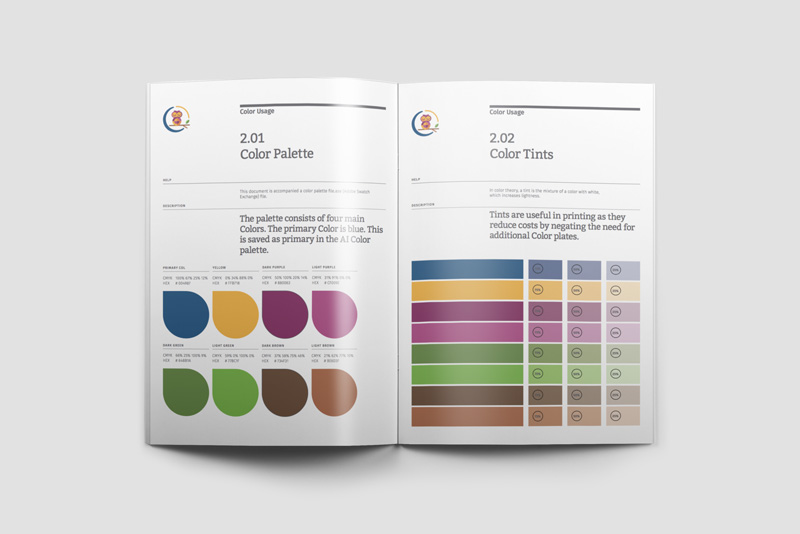
Color Palette & Tints
Illustrating the color palette is crucial to maintaining brand consistency and this section is a crucial part of any brand manual or brand style guide. Color schemes are one of the most important aspects of any successful brand or startup. If you look at any of the superbrands out there, you notice that they tend to own a color. Picking the right color and then applying that color consistently to all their branding strategies is the key to owing a color that creates the right kind of brand recall. Read more about owning a color for your brand success.
Color theory gives us a clear understanding of the harmonious relationships between colors. Colors are not just visual treats. They can also communicate messages by way of the various feelings they can inspire to people. Read more about the impact of color theory.
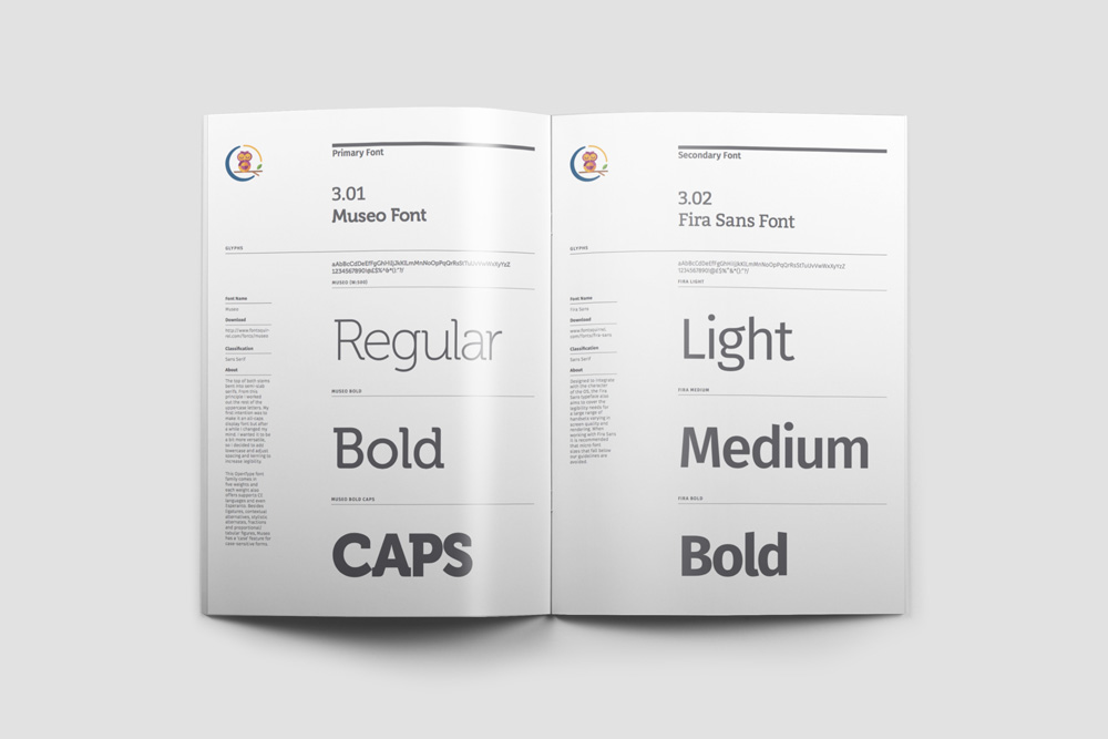
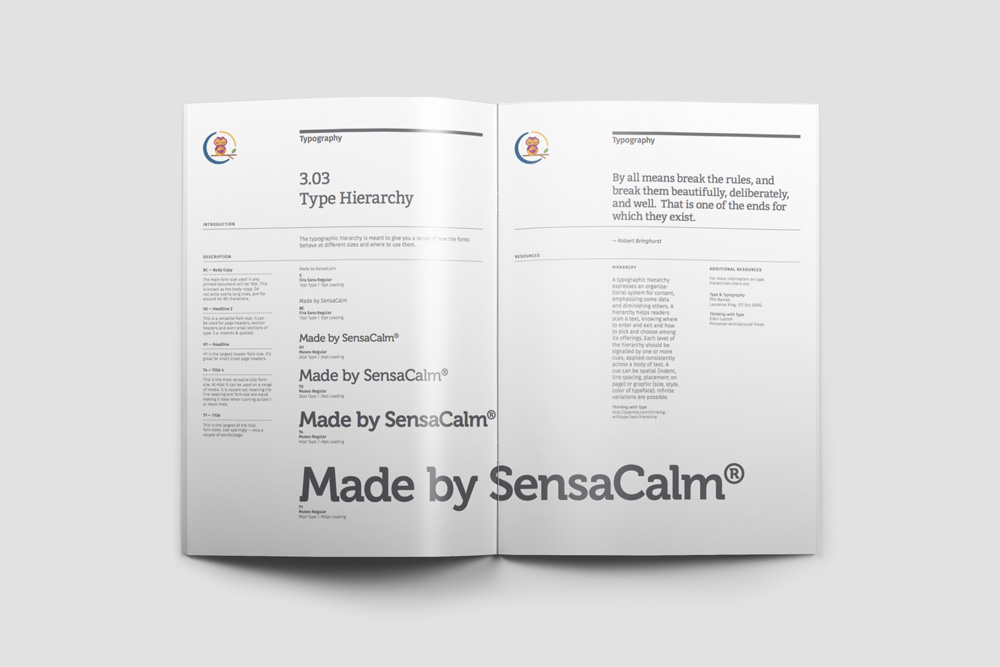
Typography & Type Hierarchy
When it comes to logo design, the value of typography can never be taken for granted. If the point of a logo is to communicate messages, there is no better way to do that than the use of letters and words. Since logos are all about aesthetics, it helps to choose the best lettering style for the design process. Read more about the value of typography in the logo designing process.
As such the typography section of the brand manual or brand style guide is a section that most vendors, web designers and others who come in contact with your brand would be referring to. You have list out your primary font and secondary or complimentary fonts in different weights and styles.
A Type Hierarchy is also very important and shows how the font and text looks at various sizes and in headings of various weights.
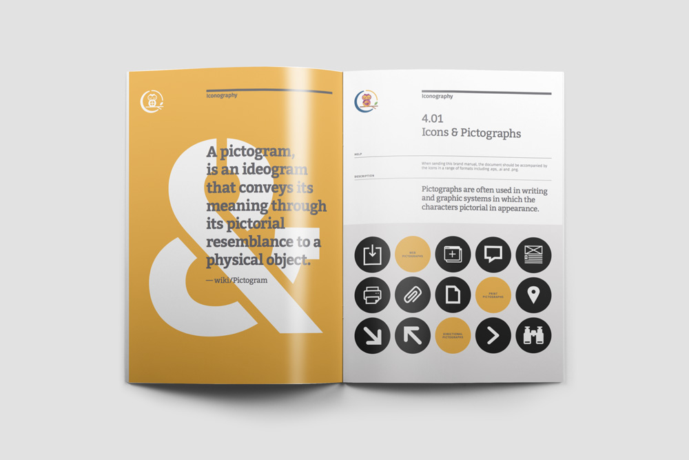
Corporate Iconography
Iconography, as a branch of art history, studies the identification, description, and the interpretation of the content of images: the subjects depicted, the particular compositions and details used to do so, and other elements that are distinct from artistic style.
When this is applied to a brand identity, we realize that creating icons that are consistent with the main brand identity and that add value to the visual system and help carry additional messages to the target audience.
It is recommended to create set of icons that can be used on the brand website or on print material that enhances the value of the brand. Resist the temptation to simply buy off the shelf clip art icons to represent your brand.
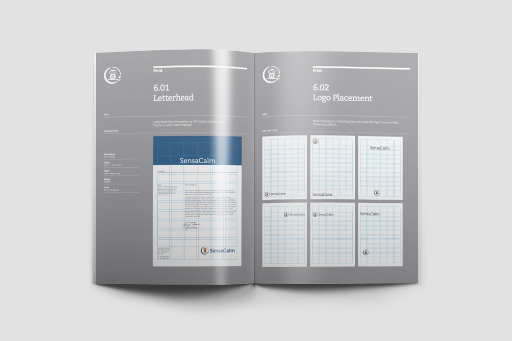
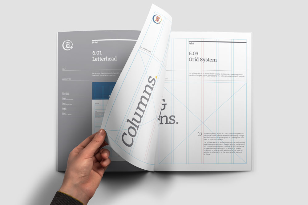
Grid Sytems
In graphic design, a grid is a structure (usually two-dimensional) made up of intersecting straight (vertical, horizontal, and angular) or curved guide lines used to structure content.
In branding, grid systems are critical to lay out a consistent architecture of how the various brand assets and components would look and feel. While being invisible, grid systems play a crucial role in what would be considered pleasing or not in the brand visual language.
Grid systems are critical in print materials such as letterheads, business cards, posters, and web and photo images.
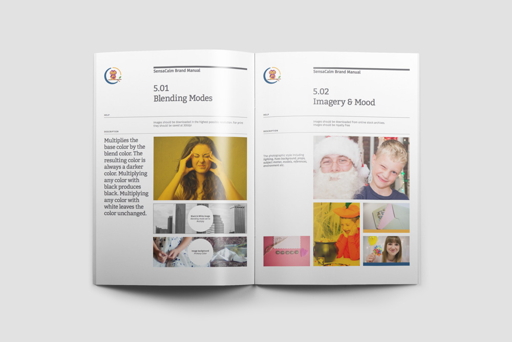
Images & Blending Modes
Visual language of a brand does not stop at the logo design or print design. It goes beyond the obvious touch points and into assets such as photos and images that the brand uses on it’s website, print or social media marketing.
It is important to figure out and establish a set of guidelines in terms of how photos or images published by the brand must look and feel. This includes not only the type of photos used but also the style.
Blending modes are quite important too to create a unique style that can come to be identified with the brand. Multiplies the base color by the blend color. The resulting color is always a darker color. Multiplying any color by black produces black. Multiplying any color with white leaves the color unchanged.
The mood of the photos and images is also important to consider before usage and must align with the brand core values and brand story.
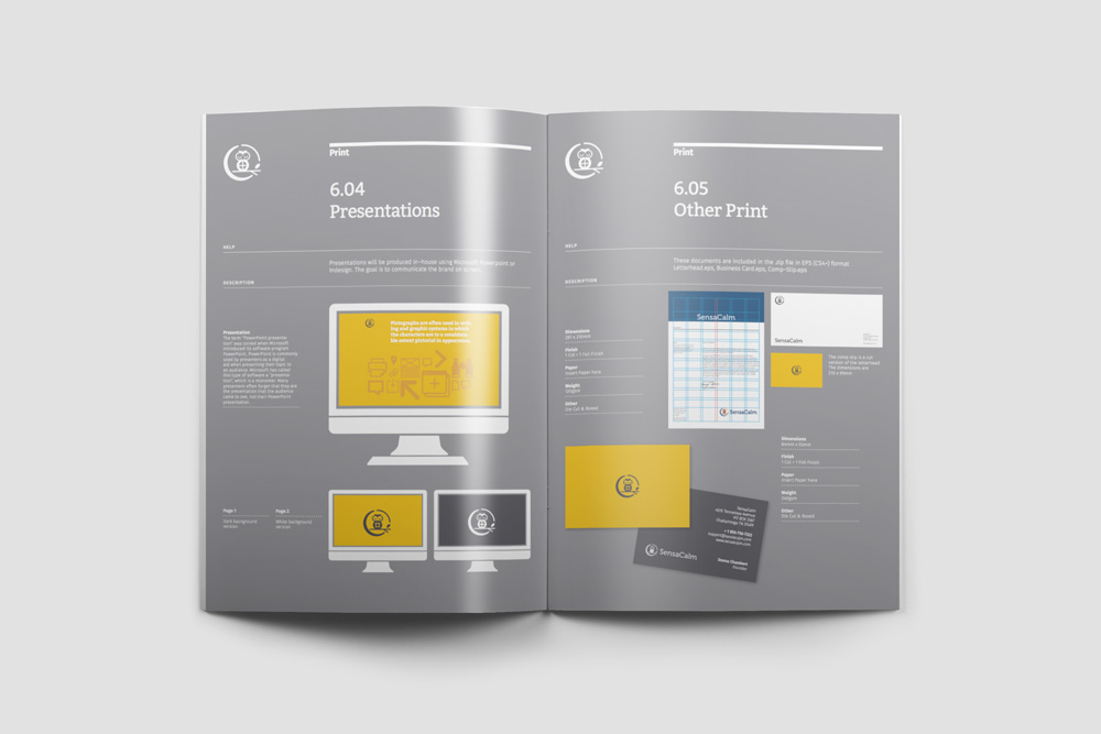
Presentations & Other Print Assets
Presentation and other print assets must also follow well established rules and brand guideline elements. Nothing should be left to chance or interpretation. Presentations can include PPT or Apple Keynote files as well as ad hoc slides, banners etc.
The style and design layout has to be figured out and a section created in the brand manual or style guide. This could include mention about backgrounds, colors, grids and more. Typically you would find grid templates in brand style guide templates as one of the essential elements. You might also find them as part of the brand book along with the brand voice, mission statement and brand colors.
Additional print assets such as comp slips, business cards, invoices etc should also be included in the manual along with the correct dimensions, bleed marks etc.