EZCare Auctions: Power and Prestige in Real Estate
Situation: Creating Brand Identity for Real Estate Brokerage in Transforming Market
EZCare Auctions Inc. is a real estate brokerage company that brokers real estate sales and purchases for property owners of all kinds—homeowners, investors, first-time buyers, large companies, and more. They specialize in auctions that are seamless and transparent, giving sellers a date certain for the sale of their asset on auction day.
The real estate industry is undergoing a massive transition. The largest market segment is Millennials at 32%, about half of all homeowners found listings on the Internet, and 70% of potential homeowners want to learn about companies through online content rather than advertisements. As a brand, you now have to work even harder to set yourself apart from the competition to capitalize on these technological and population trends.
The real estate brokerage market is competitive, requiring brands that communicate trust, professionalism, and unique value proposition. EZCare Auctions needed a brand identity that would differentiate them while communicating power and prestige.
![]()
Task: Create Brand Identity Standing Out in Transforming Market
The challenge required:
- Power communication: Brand identity that communicates power in marketplace
- Prestige communication: Visual identity that communicates prestige from reputation
- Market differentiation: Brand that sets apart from competition
- Trust building: Brand that builds trust with property owners
![]()
Action: Strategic Brand Development
Brand Strategy: Power and Prestige
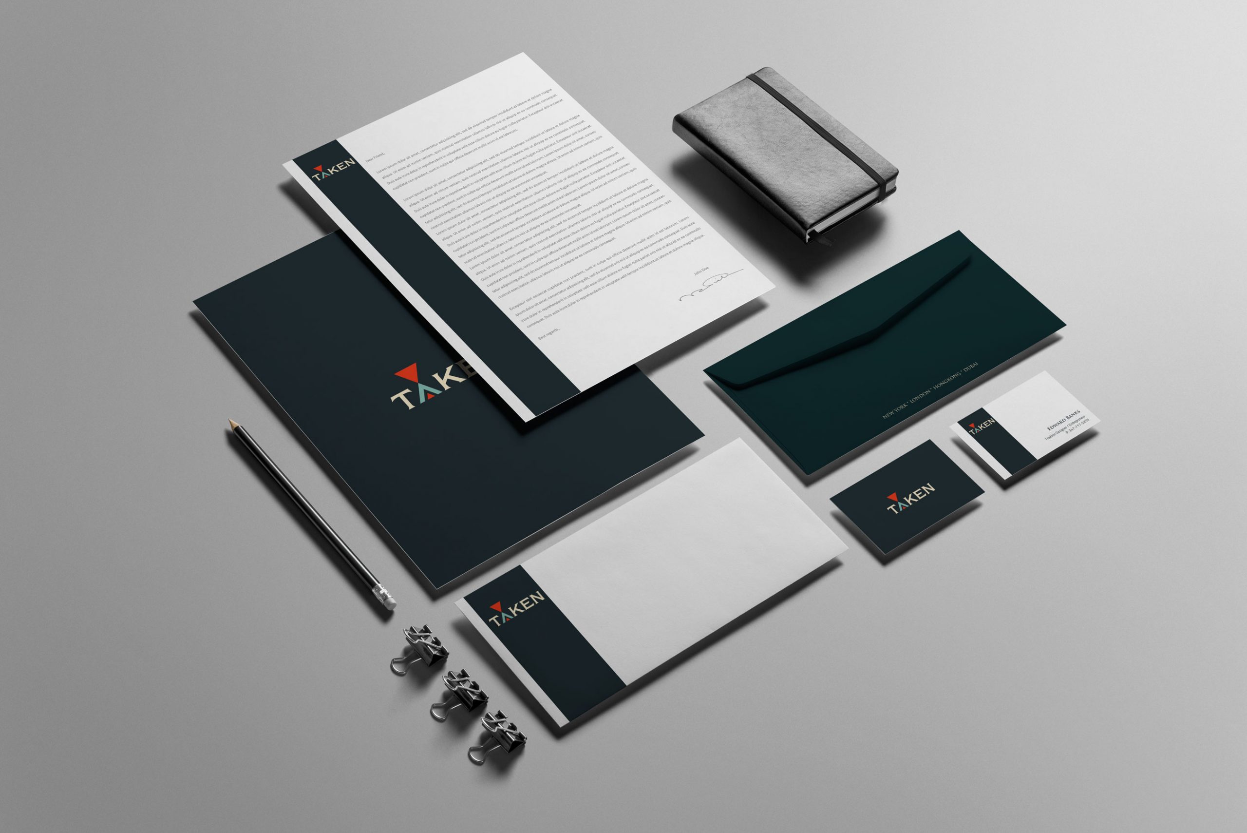
The client wanted a real estate logo that communicated power and prestige—two adjectives they used to describe their brand daily. They conduct their business with strong power in the marketplace and with the prestige that comes from their reputation for transparent, seamless auctions.
Our team got to work, thinking about how best to create a logo that showed off those characteristics. Thinking about prestige, one type of symbol emerged: a crest. Back in the day, family crests were marks that signified family values and showed others the power you possessed.
This strategy:
- Communicates power: Logo design communicates power in marketplace
- Communicates prestige: Visual identity communicates prestige from reputation
- Uses crest symbolism: Crest format suggests heritage and trustworthiness
- Shows family values: Crests signify family values and power
![]()
![]()
![]()
![]()
![]()
![]()
![]()
![]()
![]()
Logo Design: The Regal Lion and Gavel
Our team came up with a crest-like symbol for EZCare Auctions, featuring a regal lion carrying an auction gavel. This design works on multiple levels:
- Represents power: The lion represents strength and authority in the marketplace
- Suggests prestige: The crest format suggests heritage and trustworthiness
- Connects to industry: The auction gavel directly communicates their specialization
- Builds trust: The emblem-like design reinforces the idea of trust and heritage
Great care was taken to ensure that the logo played a crucial role in creating the right kind of impression on the target audience. When a consumer looks at this crest logo, they automatically see EZCare Auctions as a company they can trust, that is proud of their business, and can ensure quality work every time.
Result: Brand Identity That Commands Respect
The brand identity we created for EZCare Auctions successfully communicates power and prestige. The comprehensive brand transformation delivers:
Strategic Outcomes
- Power communication: Brand identity successfully communicates power in marketplace
- Prestige communication: Visual identity successfully communicates prestige from reputation
- Market differentiation: Brand successfully sets apart from competition
- Trust building: Brand successfully builds trust with property owners
- Complete brand system: Regal lion crest logo, brand identity system, and visual language create unified experience
Implementation Success
Today, EZCare Auctions uses this comprehensive brand identity to attract property owners—from homeowners to investors to large companies—who value the power and prestige that comes with working with a brokerage that conducts seamless, transparent auctions with a date certain for sale. The regal lion crest logo creates a memorable first impression that positions them as a trusted, professional brokerage specializing in transparent auctions, successfully differentiating them in the competitive Los Angeles real estate market while communicating power and prestige through heritage-inspired design.
Brand Name Strategy: Creating “EZCare Auctions”
The name “EZCare Auctions” was developed through Spellbrand’s strategic brand naming process. Our team researched the competitive landscape, target audience, and brand positioning to create a name that would resonate in the market and support long-term brand growth.
The naming process included linguistic analysis, trademark screening, domain availability verification, and brand storytelling to ensure “EZCare Auctions” would be distinctive, memorable, and legally protectable. Learn more about our brand naming service or explore our full naming portfolio.