M.O.R.E.: Magnanimous Over Resentment Every Day
Situation: Creating Brand That Promotes Positivity Through Apparel
The objective of M.O.R.E is to promote a message centered on positivity, helpfulness, and forgiveness notwithstanding a person’s past or present situation.
Inspiration: The name of the brand is M.O.R.E., which is a project (noun) to PROJECT (verb) the convergence of positive message, high quality clothing, Art and Style.
Objective: The objective of M.O.R.E is to promote a message centered around positivity, helpfulness, and forgiveness notwithstanding a person’s past or present situation.
M.O.R.E stands for magnanimous over resentment every day. As Ernest Bannister explained, “I thought magnanimous was great in physical size but magnanimity is to be forgiving, loving and kind, etc. which in a sense is still being big but from a psychological perspective.”
The positivewear apparel market is growing, with consumers seeking clothing that communicates values and positive messages. M.O.R.E. needed a brand identity that would communicate their unique mission while creating meaningful brand experience.
Task: Create Brand Identity That Promotes Positivity
The challenge required:
- Message communication: Brand identity that promotes positivity, helpfulness, and forgiveness
- Meaningful design: Logo design rich with symbolic meaning
- Apparel positioning: Brand that works for positivewear apparel market
- Value convergence: Brand that converges positive message, quality clothing, art, and style
Action: Strategic Brand Development
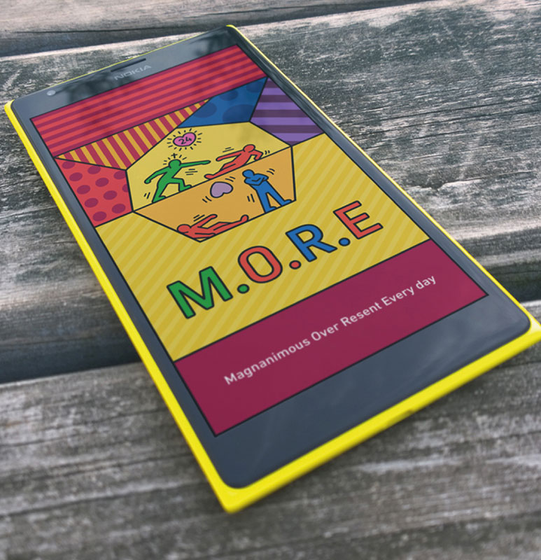
Logo Design: Symbolic Meaning
The logo design for M.O.R.E. is rich with symbolic meaning that communicates the brand’s core message:
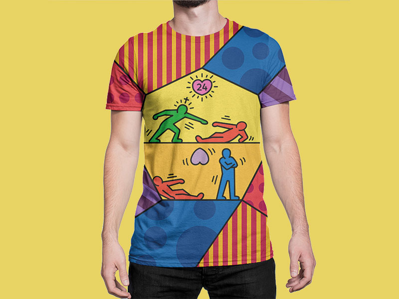
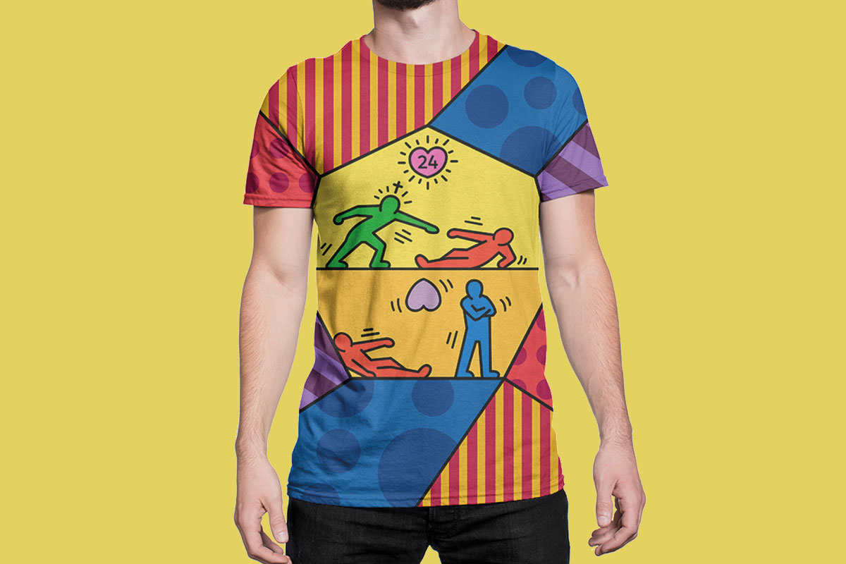
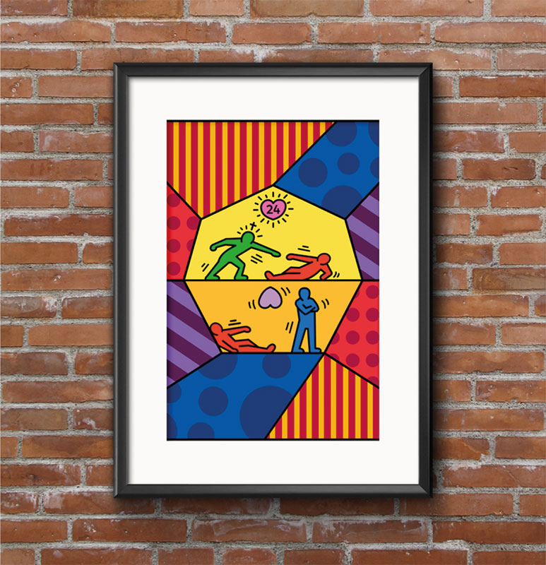
Heptagon – The seven-sided shape represents the seven days of the week. The illuminated heart – represents the mind of one that has reached or is practicing the principle of magnanimousness. The number 24 in the center of the heart represents the hours in the day that this mindset is being demonstrated.
The first two stick figures – represent a person in need of help and a person symbolizing the trait of magnanimous helping that person.
The line – The line represents the dividing line between the one who is magnanimous and one who does not also represent the “Over” part of the acronym.
The bottom stick figures – The bottom stick figures represent the opposite of these stick figures on the top and represent a person in need of help and someone with the ability to help that person with their back towards that person defiantly with their hands folded.
This design approach:
- Creates symbolic depth: Every element communicates the brand’s message
- Tells visual story: Logo tells a story of magnanimity vs. resentment
- Builds recognition: Unique heptagon shape creates brand recognition
- Reinforces values: Each symbol reinforces the brand’s core values
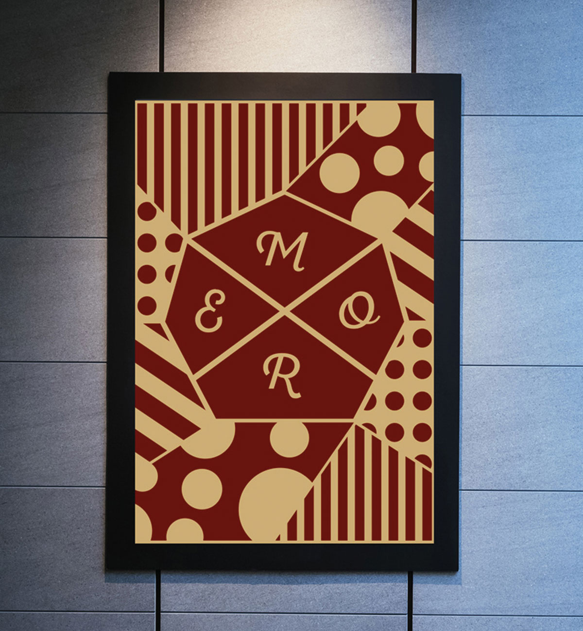
Secondary Brand Mark
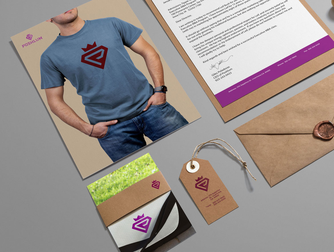
We also created a secondary brand mark that can be used on posters, marketing materials, t-shirts, packaging, and more.
Result: Brand Identity That Promotes Positivity
The brand identity we created for M.O.R.E. successfully communicates their mission of promoting positivity, helpfulness, and forgiveness. The comprehensive brand transformation delivers:
Strategic Outcomes
- Message communication: Brand identity successfully promotes positivity, helpfulness, and forgiveness
- Symbolic design: Logo design rich with symbolic meaning communicates core message
- Apparel positioning: Brand successfully works for positivewear apparel market
- Value convergence: Brand converges positive message, quality clothing, art, and style
- Meaningful experience: Brand creates meaningful brand experience for customers
Implementation Success
Today, M.O.R.E. uses this comprehensive brand identity to attract customers who want to wear clothing that promotes positive messages. The symbolic logo design with its heptagon shape, illuminated heart, and meaningful stick figures creates a powerful visual representation of the brand’s core message: magnanimous over resentment every day. The brand successfully positions M.O.R.E. as a positivewear apparel brand that converges positive messaging, high quality clothing, art, and style into a meaningful brand experience.
Brand Name Strategy: Creating “Positivewear”
The name “Positivewear” was developed through Spellbrand’s strategic brand naming process. Our team researched the competitive landscape, target audience, and brand positioning to create a name that would resonate in the market and support long-term brand growth.
The naming process included linguistic analysis, trademark screening, domain availability verification, and brand storytelling to ensure “Positivewear” would be distinctive, memorable, and legally protectable. Learn more about our brand naming service or explore our full naming portfolio.