Rail Stop Gastropub: Where Vintage Rails Meet Rustic Flavors
Situation: Creating Brand Identity for Gastropub Elevating Traditional Pub Experience
Rail Stop Gastropub is a bar-restaurant located in Virginia that elevates the traditional pub experience. They serve a carefully curated selection of craft beers, wines, and spirits alongside a slightly upmarket menu featuring rustic home-cooked food. From house-made sausage to fresh seafood, premium steaks, and gourmet burgers, every dish reflects their commitment to quality and authenticity.
The gastropub market requires brands that communicate quality, authenticity, and unique positioning. Rail Stop Gastropub needed a brand identity that would honor the rail heritage suggested by the name while appealing to modern diners who appreciate craft beverages and elevated pub fare.
Task: Create Brand Identity Honoring Rail Heritage
The challenge was creating a brand identity. The challenge required:
- Rail heritage: Brand identity that honors rail heritage suggested by name
- Modern appeal: Visual identity that appeals to modern diners
- Craft beverages: Brand that communicates craft beer, wine, and spirits focus
- Quality food: Brand that reflects commitment to quality and authenticity
- Rustic charm: Brand that communicates rustic home-cooked food philosophy

Action: Strategic Brand Development
Brand Strategy: Beyond the Train
The client’s initial brief was simple: they wanted to see a train in the design. But we knew that great branding goes deeper than just incorporating a requested element. We took a comprehensive approach by:
- Analyzing food philosophy: Understanding their commitment to rustic, home-cooked quality
- Studying clientele: Identifying the type of patrons who frequent the gastropub
- Developing story points: Creating a narrative that connects rail heritage with food culture
- Building emotional connections: Ensuring the brand resonates on multiple levels


Logo Design: Vintage Rail Aesthetics
From this strategic foundation, we developed iconic train designs based on vintage rail styles. The logo captures the essence of classic American railroading while feeling contemporary and relevant for a modern gastropub.
The design elements include:
- Vintage rail iconography: Honors transportation heritage
- Bold confident typography: Works in both formal and casual contexts
- Rustic color palette: Complements the food-focused experience
- Versatile applications: From signage to menus to merchandise


Visual Language: Spices and Rustic Charm
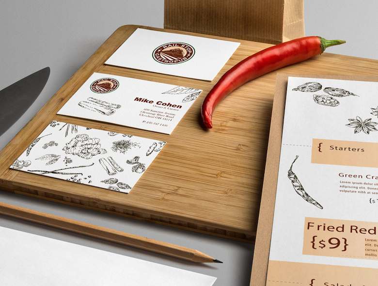
Recognizing that spices are a secondary but important aspect of their business, we created a visual language that celebrates this passion. We hand-drew spice illustrations and integrated them throughout the branding and package design, creating a very rustic vintage look and feel.
This approach adds depth to the brand identity by:
- Celebrating culinary craftsmanship: Through hand-drawn elements
- Creating texture and warmth: That reflects the food experience
- Building brand recall: Through distinctive visual elements
- Supporting packaging design: For takeaway items and merchandise
Result: Brand Identity That Creates Impact and Recall
The complete brand identity system creates significant impact and recall. The comprehensive brand transformation delivers:
Strategic Outcomes
- Rail heritage: Brand identity successfully honors rail heritage suggested by name
- Modern appeal: Visual identity successfully appeals to modern diners
- Craft beverages: Brand successfully communicates craft beer, wine, and spirits focus
- Quality food: Brand successfully reflects commitment to quality and authenticity
- Rustic charm: Brand successfully communicates rustic home-cooked food philosophy
- Complete brand system: Vintage rail logo, spice illustrations, and visual language create unified experience
Implementation Success
Today, Rail Stop Gastropub uses this comprehensive brand identity to attract modern diners who appreciate craft beverages and elevated pub fare. Patrons love coming to the restaurant not only for the great food and craft beer selection but also for the emotional connections that the branding creates. The vintage rail aesthetic combined with rustic spice illustrations creates a unique brand personality that stands out in the competitive gastropub market. The cohesive visual language extends across all touchpoints—from the exterior signage to the menu design to the packaging—creating a memorable brand experience that keeps customers coming back.


