Lohrenz Farms Branding
Lohrenz Farms
Location
Minnesota
Services Rendered
- Logo Design
- Branding
- Stationery Design
- Brochure Design
- Brand Strategy
- Print Design
Deliverables
- Final Source Files
- Brand Style Guide
Lohrenz Farms are a corporate farming operation. They have been in business for over 50 years and have established a respectable name.
Lohrenz Farms custom farm, or manage farmland for farmers that no longer wish to do the labor themselves, or are owners that wish to benefit from the profits of farming, but are not equipped to do the work. They also farm a significant amount of land themselves. Their main crops are corn and soybeans. They utilize the latest technology in the field to provide the highest level of efficiency for their customers and the best profit margins possible. After 50 years they decided to rebrand and came to Spellbrand for this important task.
Project Outcome
Brand Strategy
The client let us know that they were looking at color, imagery, and of course name recognition – all in one for their logo development. They also wanted a symbol incorporated in the logo, either an ear of corn, or a tractor, or an agricultural theme that would fit their industry and the services they provide (corn and soybeans, farming operations).
The primary goal of this project was to create a logo that would stand out from our competition and since the logo will potentially be displayed on their vehicles, their newsletters, correspondence, their future website, business cards, etc., we had to create some thing that would translate well onto different media.
We wanted to create a brand that stayed true to it’s roots, heritage and tradition. At the same time, we also wanted to hint at modernity because of the technological advancements they have made in their farming practices.
Brand Solution
The team at SpellBrand set to work on this project and came up with 10 different ideas incorporating the imagery that the client specifically wanted to see. Since we have worked with countless companies related to the food and drink industry, we were able to come up with some really stunning design ideas. When we presented the designs to the client, they were quote thrilled. They got back to us a couple of days later and selected the final design. They wanted to see a few tweaks and wrapped up the project in a few days to move on to creating matching stationery design.We came up with an emblem like shape for the logo design since that would not only lend itself well to reproduction across different media, but also look traditional. We then created an abstract illustration of rolling hills farm with an ear of corn rising above the horizon like the Sun. This indicates that Lohrenz Farms is a beacon of hope and light for their clients.
We used a traditional and conservative font for the main part of the name and a more modern and soft font for the sub text. The legibility factor was quite important and hence we framed the lettering with flat Earthy colors.
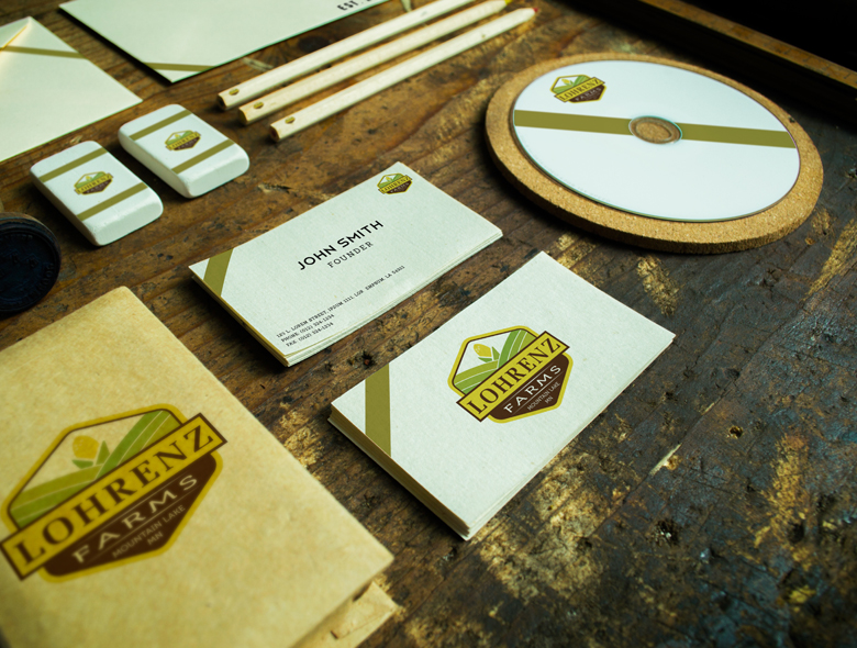
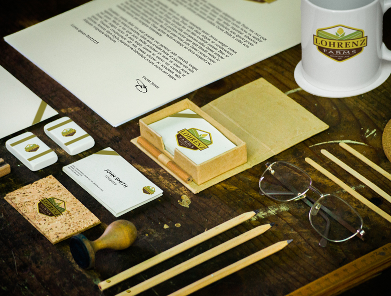
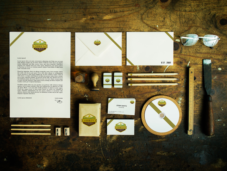
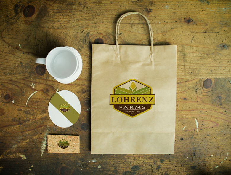
We also created stunning matching stationery design items including rustic looking business cards, letterhead, envelope design as well as paper bags, coffee mugs, erasers, CD cases and more.