What is a symbol based logo?
While it could be argued that every type of logo could be considered a symbol-based logo, in the strictest sense, a symbol-based logo is defined as a logo that has a simple yet meaningful design element that stands for something powerful.
Symbols are pictures that tell a story more than lettermark logos or even a pictorial mark. In the long history of mankind, many experts have noted that man has long been fascinated with symbols to communicate messages. We may not be in the time of Egyptian hieroglyphics and other cave drawings but symbols still have a huge role to play when it comes to abstract logo marks.
A logo is a visual representation of a business or an advocacy group. Many designers use symbols as a way to provide an edge in their logo designs. Symbols are easily identifiable. It can also shape the perception of people about a brand.
The Impact of Symbols
The aim of a logo is to create an identity for a business or a group and create brand recognition. It should also communicate its most valued ideals and objectives. In a fast-paced world where information moves at the speed of light, people usually get to know companies and groups first with the help of their logos.
This is where symbols are essential. Symbols can appeal to various perceptions of people including imagination and desire. They can easily associate a business with positive qualities such as trust, honesty, and reliability.
On the other hand, logo symbols are also open to misinterpretations. When done incorrectly, a symbol in a logo can make a client look laughable or incompetent.
Guidelines in Using Symbols for Logo Design
Storytelling
 Symbols can evoke a perception or tell a narrative with just the mere sight of it. Before a logo should use a symbol, it must be carefully researched to make sure it conveys clear and accurate representations. Great examples can be seen in church logo symbols.
The client should determine what message the symbol of a logo should represent. The designer should focus on maintaining clarity in communicating the message. The design should not lose its meaning with an incoherent and indecisive treatment. It is up to the designer to flawlessly execute the vision of the client. Here is a client project where we used abstract symbols.
Difference in Culture
 If a logo will be used for a global campaign, it should have no problem with multiple interpretations from various cultures. Different cultures assign different meanings to symbols. A logo with sights on international conquest should subject it to multiple perspectives.
This is also true for conflicts of interest. A symbol in a logo should not represent opposite ideas that can cause friction. Coherence and a unified message should be the goal of logo design with symbols.
Interaction of the Symbol
 All symbols can have a life of their own. The intent of a designer for the meaning of a symbol may change when viewed by different types of people. It is important in logo design that a symbol must strike a balance between creative interpretation and abstraction. Rallying and unifying symbols are common in the army.
Excellent Case Studies of Symbols
Before submitting a logo design, check the examples and lessons of successful logo symbols. Learn the factors that made these logos a hit:
- Nike’s Swoosh logo exudes a sense of movement and speed that is important in sports activities.
- Batman’s Bat logo inspires a dark and mysterious tone akin to the personality of the Dark Knight.
- The Playboy Bunny has an innocent yet playful vibe to it and its bowtie accessory gives it an appeal for gentlemen.
- McDonald’s Golden Arches emulates the welcoming atmosphere of a passage arch for good fortune. Its bright yellow colors also appeal to one’s appetite.
- Microsoft’s Windows logo may be a literal symbol but it evokes virtues of connectivity and transparency. It also has a flag symbol for victory and loyalty.
- The Clover symbol of the Girl Scouts denotes three profiles for female profiles: womanhood, equality, and the holy trinity.
Deciding on Symbols
The use of symbols is just one of many strategies for logo creation. But symbols are the ones that are most open to creative interpretation because it does not rely on words. A successful logo symbol can become the foundation of a business or company for years. Creativity goes a long way in making this possible.

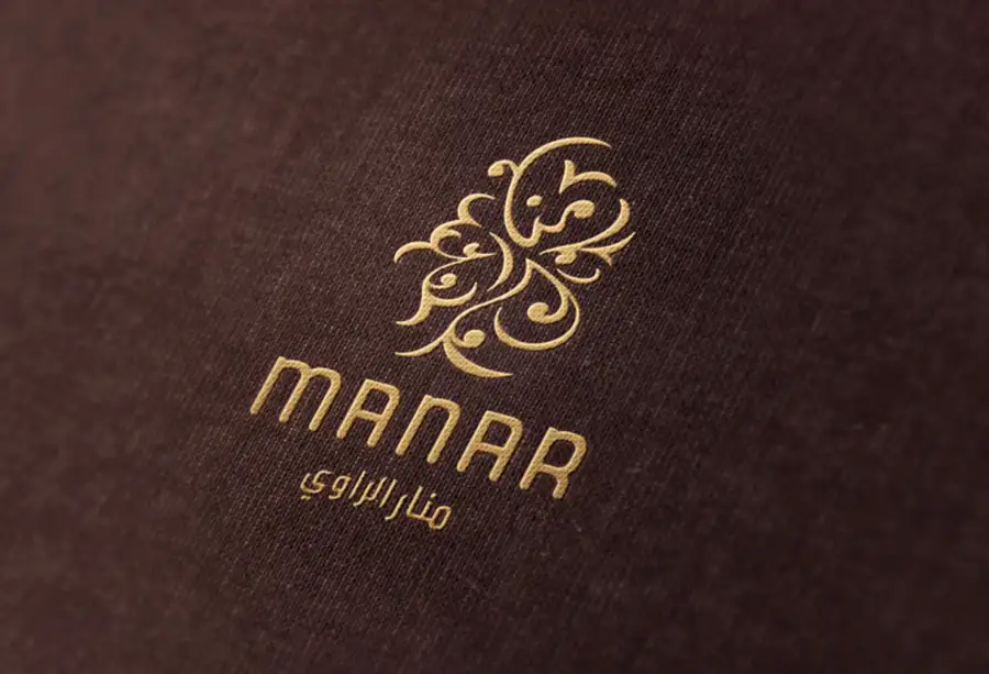
Jeddah, Saudi Arabia Fashion Abaya Branding by Spellbrand
Premium Abaya Design Symbol Logo
This is a great example of a logo symbol that goes beyond just aesthetics or even meaning – this symbol stands for the culture and heritage of the people behind the brand as well as the audience. We created this beautiful typographic logo design for a Jeddah-based abaya designer.
We created a calligraphic style logo icon of Arabic script that instantly sets the brand apart from other competitors that have the usual design elements in their logos. We then extended this logo into a complete brand identity. We also created a series of photos for the brand that continue the elegance of the logo identity.

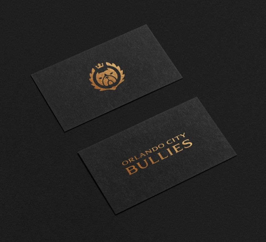
Exotic American Bull Dog Brand by Spellbrand
Symbol that represents the core
For this client, an Orlando-based bullies brand, we created a symbolic logo of the face of a bulldog that is cute and still powerful. The animal design is simple and yet stands for the whole idea of breeding and caring for bulldogs.
This design can also be considered as an emblematic logo due to the crest-like design element around the character symbol. However, due to its simplicity, it would be safer to categorize this logo as a symbol-based one. You can see how you sometimes do not need an illustrative logo to get your message across.

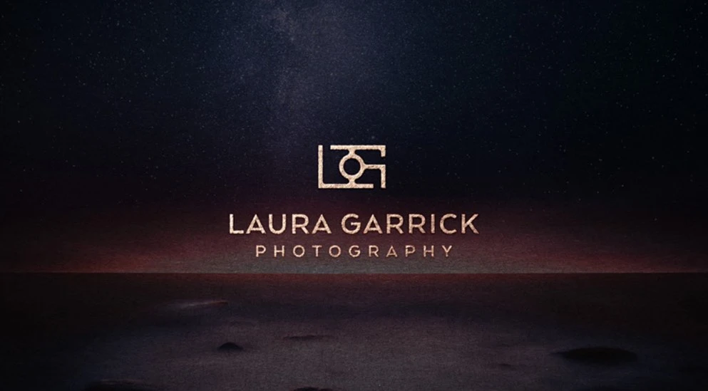
Photography Studio Branding & Website by Spellbrand
Symbol made out of an acronym
This is an interesting example of a symbol created out of the acronym of the brand’s name. For this client, a London wedding photographer branding, we created a stunning symbol of a camera made up of the letters L and G which stand for Laura Garrick, the photographer.
We also created an entire brand identity for this client along with a beautiful photographer website design. The design aesthetics for this brand echo the logo symbol and you can see this reflected in the website design too.

Humanitarian Organization Branding by Spellbrand
Cliche symbol with a twist
When you look at the symbol logo we created for one of our clients, a humanitarian organization called World Aid, you may initially think that the symbol is a cliche. A heart symbol is often seen used for brands within the charity, health, and other care-related sectors. But in this case, we created the symbol out of negative space – a heart shape created by bringing together an abstract logo style representation of people joining.
The result is a new twist to an exhausted symbol. The design of the people forming the heart shape is of different sizes giving the logo dynamism and also indicating that this brand deals with diversity!

Mental Health Awareness Logo Design by Spellbrand
A non-traditional symbol treatment
For this last example, I wanted to show how you can flip the narrative on traditional symbols for certain sectors like health or religion and create designs that push the boundaries of the core message.
For our client, a mental health awareness brand, we created a non-conformist symbol design of a lightbulb with two hands holding a star as the filament. Typically for a serious health-related brand, you would expect a stuffy and conservative logo design but here you can see how you can inform more through an unusual treatment.
These are just a few examples from our client portfolio. As we create more symbol based logos for our clients, we will keep updating this page.

