« 5 Simple Steps to Building a Company, Identity and Brand | What does Seth Godin say about logos? »
Fundamentals of building a better website
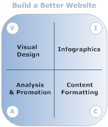
 There are four key elements, VICA, that we’ll focus on, as shown in the diagram at right and the bullet list below. (All definitions are for this site, so they may vary slightly from other definitions.) The series will include tutorials and video screencasts, when appropriate.
Stunning Visual Design.
Visual design includes elements such as page templates/ themes, logos, page banners, fonts, headings, leading (line spacing), color, icons. My favorite weblog that applies these elements well is Chris Pearson’s Pearsonified. There are also numerous “CSS gallery” sites that we’ll cover here in the future.
Clever Infographics.
Infographics is part of data visualization and also part of the overal visual design. However, it requires applying different techniques than the elements mentioned above in Visual Design. If you have data set, how can you represent it with some sort of diagram to make it more appealing and easier to absorb than a table or chart? Some great sites to check out are Infosthetics, David Armano’s Logic+Emotion, and Idagram. Make sure you go through all the pages on each of these sites. Another recent phenomenon is Edward Tufte’s Sparklines, which offer a convenient, easy to follow way to visualize numeric data. The diagram at right is a simple example of an infographic.
Content Formatting.
Content formatting is an extension of visual design, but does not necessarily require any illustration or CSS code tweaking, but may require a bit of HTML. For example, taking a long article and using a numbered bullet list makes the content easier to follow and absorb. So do using HTML headings.
Analysis & Promotion.
If you build it, will they come? That’s the question thousands of business owners ask about their websites. Unfortunately, the answer is probably “no”. So another aspect of improving your business website is to analyze what it offers readers, what they take away, and what you can do it improve their experience, including how to help them find you.
Core Elements of a great website
Visual elements of a better website go beyond just a good logo design and include formatting the text of your articles. If your website/ weblog’s pages are looking a little text-heavy and dense, there are some relatively easy ways to improve your look without having to be a typesetting or CSS expert. The rules of typesetting for computer screens are not that different than for print, but there are some nuances, and you have the benefit of special HTML tags and CSS code to make life easier en masse.
-
Font size should be appropriate.
Try for 11 or 12 pt as your base body text font. Not all your readers are in their 20s. Eyesight does start to slip, albeit slowly, after 30. The difference is that a computer screen is much farther from your face than the average book. So you have to factor in that distance. Not doing so guarantees you’ll lose those readers who don’t know how to increase font size on their browser. Even that is unreliable because some themes/ templates do not handle that well.
-
Font family choice must be made with great care.
The problem with computer screens is that very few fonts look good on them. Older research by Microsoft shows that Verdana, a sans serif font, works well for body text on the screen. Some designers say that any font works if it’s large enough, but serif fonts can look really blocky onscreen. Compare this to print, where serif fonts such as Times Roman is preferred. On the other hand, serif fonts such as Georgia are okay for onscreen headings. Jim Whimpey suggests that only three fonts look good onscreen: Verdana, Georgia, and Lucida Grande. Poynter Online also suggests Trebuchet. These four tend to be available on most home computers, so most readers will see text render the way the author meant them to be.
-
Line leading should complement the design.
Leading refers to the amount of vertical space used for each line of text in an article. The general rule of thumb is that an increase in leading should be proportional to an increase in width of the line of text. This is one primary reason why you should avoid “fluid” width web page templates/ themes, despite the fact that owners of gigantic monitors seem to love them. Keep in mind that even if readers are not aware of it, too little leading makes for reduced concentration for longer articles, and can even give some people headaches. You can control leading in CSS code: line-height: 1.25em;.
-
Character tracking should be a priority.
Space between characters is important. Characters should not touch, but neither should they be overly far apart.
-
Single space after punctuation logos.
Word processing and weblog software handle spacing differently. Use only one space between sentences.
-
Paragraph spacing is critical.
In addition to line leading, you can control the amount of vertical space between any two paragraphs. This can be done in a number of ways, including tweaking your paragraph CSS code.
-
Right-ragged or justified text.
Whether you use right-ragged (aka left-aligned) or fully-justified text depends on a couple of factors: the width of your articles and the length of the average word in your writing. Try both types of justification with a number of articles and see what looks better.
-
General whitespace is important.
Not everyone agrees that lots of whitespaces are good. It’s generally fine in print and is a good idea onscreen. However, too much whitespace surrounding text can also make the text look isolated. Generally speaking, you can control whitespace around text and other elements using “padding” in CSS.
-
Attractive blockquotes can be a bonus.
If you tend to quote other sources regularly, making blockquotes look better takes a few simple tweaks in CSS. This includes:
- Adding lines – with or without color.
- Using a different font.
- Using italics.
- Adding a light colored background.
-
Callouts should be powerful.
In print, callouts – aka pull-quotes – were used to fill column space. If you have two or more columns in your typesetting, you don’t want a big gap at the end of the rightmost column. Callouts served to take care of this. They also add a bit of visual texture, and work quite well onscreen, if handled properly. Here’s a rough guide to callouts using CSS – works for most weblog platforms. Chris Pearson also has a more in-depth discussion of how to do pull-quotes, which includes using blockquotes, divs, and spans. Pullquotes are a direct quote of actual text in your article. Callouts need not be.
-
Harmonious color palette is a must.
If you’re a non-designer like me, you may be able to tell when colors look good together but don’t know how to get there. Color Theory has a lot of rules and can take years to master. ColorBlender is a nice, easy tool for generating a set of six colors patches that are harmonious. Each resulting palette’s color codes are given in both RGB and Hex.
-
Headlines are the most important.
Improving your web pages can be as simple as modifying your article headlines. Or simply using sub-headlines. To do the latter means writing articles that can be sectioned off. Headline tweaking can include
- using different HTML headline tags,
- using a different font,
- uppercase letters,
- text color, or
- more space between characters.
-
Custom comment blocks should be unique.
If your site allows visitors to leave comments, consider customizing the comment blocks. This could include
- alternating indentation,
a font different from the article’s body text, - lightly colored backgrounds
- numbering of comments sequentially,
- alternating text colors in consecutive comments,
- special icons (scroll down to the comments),
- avatars, and
- photos.
- alternating indentation,
-
Bullet lists have to be styled.
Bullet lists are an ideal way to break up text visually. This, in turn, allows readers to quickly scan and absorb a lot of information, provided your bullet lists are used properly.
-
Colored links can look good.
Hyperlinks can be customized in several ways:
- Remove the underline.
- Change the color of the underline and/or the anchor text.
- Change the color of visited links
- Use a different color when a mouse cursor hovers over a link.
- Add a light background to the text, possibly on hover.
- Add a border.
All of these add visual texture to the text. You can even use several of these simultaneously on the same page.
There is of course more to website page improvement than just these tips, which have only touched superficially on the how-to aspects. However, they give you some options you can explore further. A deeper understanding will require some knowledge of CSS code, which we’ll touch upon in future articles.

