If you are a small business, startup or a venture then you would have realized how important your social media channels are to the success of your business. I will not go into why they are important. There are thousands of articles about that topic. I want to talk about the importance of branding to your social media channels and how it effects your brand perception.
Every social media channel must have some branding fundamentals nailed down. These include:
What is the tone of your channel?
One of the most critical things to look at is the tone of your social media channel. What are you trying to communicate through it? What message do you want to get out there. If your answer was that you want to promote your products or services, then you are wrong! Yes. Social media channels are not about simply promoting your product or service. They are about letting your audience know what kind of a brand you are. What you value most. How you align with their world view. What kind of an authority you are in your industry. And so on.
Here is an example of a Twitter channel – Arbys, that posts quirky, fun and hip stuff that makes their audience smile and love them even more!

Trust no one…except us. #TheXFiles pic.twitter.com/NwboOG4G8c
— Arby's (@Arbys) January 24, 2016
She’s a witch! https://t.co/2sd4Brc4hf
— Arby's (@Arbys) January 23, 2016
Here is an example of a Twitter channel – Delta, that posts inspiring videos and photos that tries to bring home the grandeur and scale of their brand.

We surprised this young Delta Super Fan with the ultimate Delta experience.https://t.co/Lu33y0CCQa
— Delta (@Delta) January 19, 2016
[tweet_box]Social media channels of brands should have a personality. Don’t be meek. Go polarize! [/tweet_box]
Here is an example of a Twitter channel – Orbitz, that uses a constant series of tips and reminders that indirectly ties into their service and keeps it relevant through out the day.

Reason to Travel #245: It reminds you how big the world really is. #TravelTuesday pic.twitter.com/KBZaa5tyfV
— Orbitz (@Orbitz) January 26, 2016
How creative are your channel visuals?
The next critical aspect of a social media channel is the visual consistency and creativity. It is not just about being visually pleasing but being in tune with the overall brand strategy. Is your channel branding creative? Does it look professional? Does it match your brand tone? Or does it look like you don’t want to invest in professional branding?
I don’t want to sound nasty. But let us face it. Most brands skimp on branding. Take a look around and you will see plenty of rotten branding – even for brands that can afford to get great stuff done!
Here is an example of a Facebook page that looks BAD! And guess who that brand is!

Starbucks is using a photo of a glass of coffee but unfortunately due to the weird dimensions of the Facebook cover image, the photo has been cropped awkwardly.
You would think the Avatar is the only feature of a social media page that is easy to brand well since it would usually be the brand logo design. But think again! Take a look at this example with an awful avatar!
Don’t get me wrong. Threadless is one of my favorite brands. But in this case the crudely cropped logo in the avatar looks BAD!
[tweet_box]Don’t be afraid to have a second version of your brand logo to make sure it looks great as an avatar![/tweet_box]
Are you just promoting your stuff?
As mentioned above, a fundamental mistake most brands make is to use their social media channels for just blasting their audience with product or service promos. This is because they are of the traditional marketing mindset where print or television adverts were just one way. There was no engagement or interaction.
But times have changed and if are still doing this then you brand is doomed to fail – at least online! Here is an example of a brand that shares random content that amuses and delights their audience.
Oh so THAT'S where the name Swadlincote comes from… Meet the #WasteLessSaveMore town: https://t.co/Tlr9JaKGu8 pic.twitter.com/BhV63KayRs
— Sainsbury's (@sainsburys) January 28, 2016
Although there is no rule of thumb, try to aim for the 80/20 ratio. 80% of your social media posts should be about others and 20% or less should be about your brand/product/service. Be generous in promoting other brands – even your competitors!
Becoming an authority is your primary goal. Not looking to generate some quick sales. The race to quick sales will almost always end up compromising your long term brand success. You become an authority by sharing knowledge. Spend time reading articles, new items and other posts and tweets. If you find related items that could be useful to your social media followers, then re-share them.
It is no secret that social media is an important and increasingly crucial part of small business success. However, there are times when social networking and marketing don’t seem to be working as well as they might. In these instances, your logo design just might be the problem. Read about the 5 ways social media marketing can help build your small business.
Your social media networking logo design is highly visible on social networking sites. People from all over the globe are seeing your logo and identifying it with the brand that you have defined for them. They are judging you and your business based solely on a single image. Here are a few ways that your logo design will either make or break your social networking.
Your logo introduces you.
Does your logo give a professional and memorable image or is it merely another face in the crowd? Does it assert itself with a firm handshake or shrink back shyly? On websites where no one sees your face (and likely never will), your logo is acting as your face. It’s important that it be professional, unique, and a good representative of your business.
Your logo tells people whether you are a professional.
If your logo design were a person, how would they act? How would they dress? If your logo design is amateur and messy, people will notice and project this image onto your business. Don’t think you can get away with a do-it-yourself job; today’s customers are far too savvy and discerning to fall for that.
Your logo distinguishes you from other businesses.
Whatever field you are in, there is likely a lot of competition in your area and more than you could imagine on the world wide web. While a business name is usually not that memorable, a professionally designed image should be. Your logo will make it easier for fans and potential customers to associate your internet presence with your business, preventing confusion and mistaken identity snafus.
Your logo sets you apart from the spam.
One of the key differences between spam and a legitimate business message is identification. Few people mind an occasional marketing message from a company we know and do business with, but we all mind the faceless randomness of spam. You can avoid being mistaken for a spammer by slapping your logo design—that is, your picture identification—on your social networking websites, business website, and all emails.
Your logo tells people that you are a business entity and not a single person.
It’s important to be clear about who and what you are to avoid hard feelings. Many people feel wronged when they reach out to someone on the internet for friendship and find that they are dealing with a corporate entity. Don’t let this type of mix up lose even one valuable customer.
As you can see, a logo design can have a huge impact on whether your social networking is as successful as you need for it to be. If you think your logo could use a little work, or if you don’t have one at all (tsk-tsk!), contact a logo design professional today. Be sure you do not make the top 5 social media mistakes for small businesses.
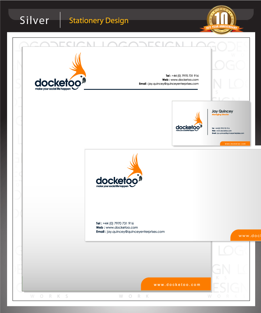
Client Name: Docketoo
Logo Category: Web 2.0 Logos
Logo Type: Iconic Logos
Client Location: UK
Project Summary:
The client is launching a social networking website, similar in essence to Facebook, but purely based around organizing social events (large or small) with your friends, family and colleagues. The client wanted a clean and fresh web 2.0 look incorporating a mascot character logo of a bird with a name which sounds similar to the brand name. There was a debate on weather to go for a full fledged mascot illustration or a more abstract route. We finally decided to take the abstract iconic route to make sure the logo design was flexible.
Target Market:
Focused on age range from teenagers to 40’s
Design Review:
The client had an idea that his company’s name sounded too much like a cockatoo, so he wanted us to make a mascot which would represent his company. The solution we gave him was a simple drawing of cockatoo incorporated with the text, making it simple yet very useful on the website. The client did not want any thing too childish and was looking for the right balance between fun and stylish. So our logo designer created a line art based design. The choice of logo colors is to inject some freshness into the design. The bird icon can be used as a stand alone branding icon too.
Here are a few of the social media networking logos out there.
« When to use a character in your logo design | Brand as Keyword? Google Says Yes. »