I have a great fondness for colour which can be found throughout my portfolio, and showcasing an upward trajectory was important with the font, to show the ambitious part of my brand. The solution was to capture a constantly evolving voice with both balance, trajectory and vibrance.
For me, the most important part of the process was creating a simple logo whilst still capturing my voice and my design personality.
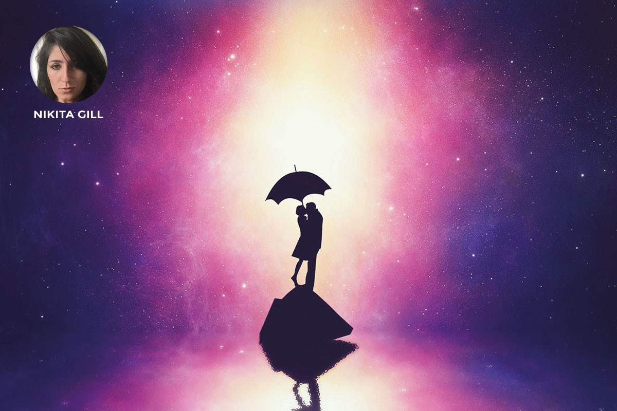
– Nikita Gill
© Paul Wilkinson Photography (See Paul’s work here)
When we decided to pursue photography as a full-time occupation back in 2008, we hunted around for all sorts of brand ideas but, in the end, decided that we were actually building a business around me as a photographer and an artist rather than around some sort of brand name. To that end, it seemed appropriate just to use my own signature as the logo device – though the actual use (framing, colour, positioning etc.) continues to evolve over time.
The current version of the signature has been smoothed to make it easy to reproduce in vinyl or stainless steel as well as being something a robot can use to reproduce on our frame mounts.
It should also be noted that this is not the same signature that I use for legal documents!
We have also developed a font based on my handwriting that we use when we want to create documents that have the feeling of being hand-written. I used to write these actually by hand but it’s much easier when I can type (it gives me the ability to use a spell-checker!)”
– Paul Wilkinson
© Recom Farmhouse Photography (See Christoph’s work here)
![]() The initial idea came from a lot of our clients being based in the automotive sector and derives from road markings and then developed towards the concept of fluorescent tubes. This idea also has been realised in physical installations of the logo. We use it white on black, black on white and in all kinds of colours, depending on context.
The initial idea came from a lot of our clients being based in the automotive sector and derives from road markings and then developed towards the concept of fluorescent tubes. This idea also has been realised in physical installations of the logo. We use it white on black, black on white and in all kinds of colours, depending on context.
After eight years I’m still very happy with the logo and people still comment on the quality of the design regularly. I think it is a very considered, yet elegant design – something we always strive for in our own work.
– Christoph Bolten
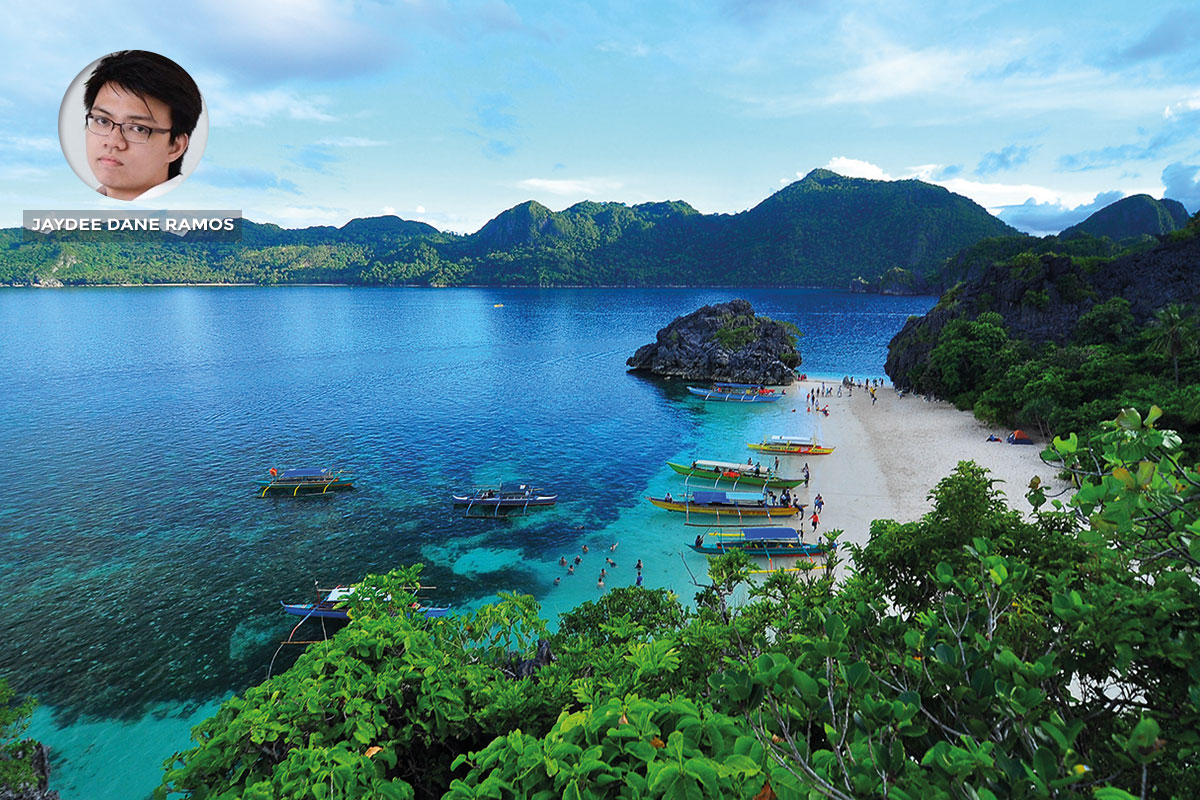
© Jaydee Dane Ramos Photography (See Jaydee’s work here)
 My personal branding design concept is inspired by the origin of my name. My second name, Dane, is of Scandinavian descent and means “from Denmark.”
Further research has deepen my knowledge regarding my roots which resulted in the incorporation of Proto-Norse Runes or Elder Futhark to my monogram design. In addition, I have utilized a quadrilateral as a base shape for my branding’s design. This coincides with my overall design aesthetic which mirrors my desire to pursue limitless possibilities that reflects the successful convergence and divergence of the past and present.
– Jaydee Dane Ramos
© Daniel Silfver Photography (See Daniel’s work here)
![]() The Silfver Creations logotype represents the Cosmos portrayed as a camera shutter.
The Silfver Creations logotype represents the Cosmos portrayed as a camera shutter.
There are only two colours used in the logotype. The tiny blue and white vectorised stars are arranged in order to give the illusion of a gradient and draw the attention into its centre – where the magic happens.
– Daniel Silfver
© Elton Mogg Photography, London UK
![]() I created this logo as my take on how the aperture rings on a camera work from small to large, so the graphic shows the various degrees of focus (depth of field) used when shooting.
I created this logo as my take on how the aperture rings on a camera work from small to large, so the graphic shows the various degrees of focus (depth of field) used when shooting.
“The logo also represents my desire to capture all the smallest details right through to the big picture of their wedding day. Finally, as the graphic is about focus it hopefully shows and reminds me that my focus is always on all my clients needs too. To balance the graphic I used a clean clear font, which I hope has a more art gallery feel to it.
– Elton Mogg
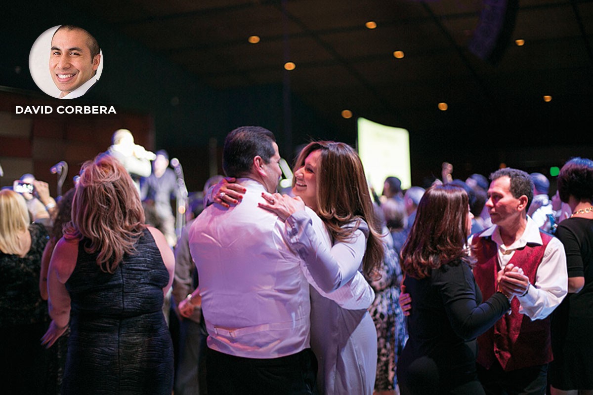
© David Corbera Photography, London UK (See David’s work here)
![]() I was looking for a unique logo that would be memorable, eye-catching and tell prospective clients about my company.
I was looking for a unique logo that would be memorable, eye-catching and tell prospective clients about my company.
Muhammad Ali Effendy helped with the design using my initials to create an ambigram logo that would represent and show the kind of service I provide as a creative professional.
– David Corbera
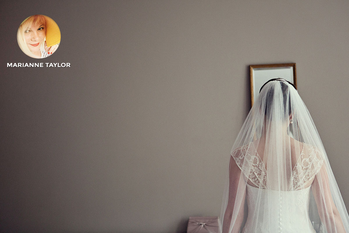
© Marianne Taylor Photography, London UK
![]() My logo started as a little doodle where I was playing with the idea of having my initials M & T incorporated into a heart design. I then designed the first version of the logo myself, but it was a bit boring and lacked a certain romantic vibe that a wedding photographer’s logo ought to have, so the first official version was eventually illustrated by Rose and Ruby. She is also responsible for developing the look of the logo, and adding variations, over the years.
My logo started as a little doodle where I was playing with the idea of having my initials M & T incorporated into a heart design. I then designed the first version of the logo myself, but it was a bit boring and lacked a certain romantic vibe that a wedding photographer’s logo ought to have, so the first official version was eventually illustrated by Rose and Ruby. She is also responsible for developing the look of the logo, and adding variations, over the years.
– Marianne Taylor
© Alejandro Lorenzo Photography, London UK (See Alex’s work here)
![]() I created this logo for one of my best friends. He started this personal project with his girlfriend, so I included on it the letters of their names: X (Xavi) and V (Vania).”
I created this logo for one of my best friends. He started this personal project with his girlfriend, so I included on it the letters of their names: X (Xavi) and V (Vania).”
He is a fan of surfing, so I came up with some elements related with the nature and the sea, such as the triangle, lighthouse and the anchor. The style is simple and minimal and the mains colours used were white and black, simple but solid.
– Alejandro Lorenzo
© Nousha Photography, London UK
![]() Our new logo was created by my daughter’s boyfriend, somewhat of a high flyer in the branding world, when Claire and I first saw it, I think we both gulped – it was such a departure from our previous logo: the ubiquitous Chanel copy.
Our new logo was created by my daughter’s boyfriend, somewhat of a high flyer in the branding world, when Claire and I first saw it, I think we both gulped – it was such a departure from our previous logo: the ubiquitous Chanel copy.
As we grew to like then really love it we realised why. It had so many references, it was a little early David Bailey and had a feel of the 60s with a pinch of Rolling Stones, which all sits very comfortably with what we do at Nousha Photography – a kind of stylish, a bit edgy but very groovy kinda’ look. We feel happy that our logo illustrates and represents what we do to a tee.
– Lionel Cherruault